Toeing the Line: Altuve and Trout
In these analyzed data, described below, Trout demonstrated slightly higher expected footspeed and slightly shorter expected times to first base than did Altuve; although their performance is close and we expect a near toss up, given the data used, as to who comes out ahead on any given play.
The conditions analyzed include use of 2016 regular season data on both players’ field coordinates when running. I subset these data in a few ways after deriving speed at each time measurement provided. Firstly, any speeds calculated to be greater than world record pace was discarded as unreliable due to measurement error. Also discarded were some data with missing sv_pitch_id. Secondly and as generally known, because runners do not always need maximum effort when running, the analysis attempted to single out circumstances where maximum effort was most likely.
Specifically, the analysis focused on runs where the batter made it near second base (whether or not they actually earned a double) or significantly passed first base along the foul line. Doing so makes it likely that the batter attempted maximum effort from crack of the bat through first base. Other scenarios were not studied as these data would be less likely to distinguish maximum effort from other efforts. The details and code for my analysis follow.
Analysis
Load and combine data
First, we load in and combine the given data.
altuve  <- read.csv('Altuve_baserunning.csv', header = T, stringsAsFactors = F)
altuve  <- within(altuve, Name <- factor('Altuve', levels = c('Altuve', 'Trout')))

trout   <- read.csv('Trout_baserunning.csv', header = T, stringsAsFactors = F)
trout   <- within(trout, Name <- factor('Trout', levels = c('Altuve', 'Trout')))

runners <- rbind(altuve, trout)
rm(altuve, trout)
Summarise and prepare data
Let’s first review the data structure. I’ve coded a custom function to more cleanly display the structure of the data.
str_as_df <- function(df) {
  data.frame(Variable = names(df), Class = sapply(df, class),
             `First Values` = sapply(df, function(x) paste0(head(x),  collapse = ', ')),
             row.names = NULL)
  }

kable(str_as_df(runners), caption = '')| Variable | Class | First.Values |
|---|---|---|
| sv_pitch_id | character | 160605_143038, 160605_143038, 160605_143038, 160605_143038, 160605_143038, 160605_143038 |
| time_offset | numeric | -0.397331343, -0.364331343, -0.331331343, -0.297331343, -0.264331343, -0.231331343 |
| id | integer | 10, 10, 10, 10, 10, 10 |
| id_b | integer | 514888, 514888, 514888, 514888, 514888, 514888 |
| id_r1b | integer | 0, 0, 0, 0, 0, 0 |
| id_r2b | integer | 0, 0, 0, 0, 0, 0 |
| x | numeric | -2.359, -2.327, -2.327, -2.295, -2.294, -2.326 |
| y | numeric | 0.31, 0.406, 0.47, 0.566, 0.693, 0.789 |
| Name | factor | Altuve, Altuve, Altuve, Altuve, Altuve, Altuve |
Of note, as with the player names, the various ids will be more useful as factors, and the sv_pitch_id as a date and time,
runners <- transform(runners,
                     id = factor(id),
                     id_b = factor(id_b),
                     id_r1b = factor(id_r1b),
                     id_r2b = factor(id_r2b),
                     gameday = as.Date(sv_pitch_id, format = '%y%m%d_%H%M%S'))
An overall summary indicates missing data in sv_pitch_id. Since we have no way of identifying these data in context, they will be ignored (discarded).
Getting running speed from timestamped coordinates
We are mindful that information important to understanding runner speed is not in these, including whether the runner expects the batted ball to be caught or a homerun. Both expected events would slow or hold up the runner in situations with, say, less than two outs. Let’s calculate speed from runner x and y coordinates and time_offset,
require(dplyr)

runners <-

  # original data
  runners %>%

  # unique key for run information
  group_by(sv_pitch_id, id_b) %>%

  # organize by time within the run
  arrange(time_offset) %>%

  # speed is euclidean distance / time ... also convert units
  mutate(ftsec = sqrt((x - lag(x)) ^ 2 + (y - lag(y)) ^ 2) /
                (time_offset - lag(time_offset)),
         mph = ftsec * 60 * 60 / 5280)
Define variables
The Variable definitions now include,
- sv_pitch_id: pitch timestamp, format yymmdd_hhmmss
- time_offset: time in seconds relative to when the pitch crossed the front of home plate
- id: identifier of player whose x,y coordinate data is recorded, 10 = batter-runner, 11 = first-base runner, 12 = second-base runner
- x, y: coordinates, in feet, of center of mass of the player’s body. Coordinate origin is the tip of home plate. The y-axis runs out through second base toward center field. The x-axis is perpendicular to the y-axis and the positive direction points toward the first-base side.
- id_b: MLBAM player id of batter
- id_r1b: MLBAM player id of runner at first base, if none then 0
- id_r2b: MLBAM player id of runner at second base, if none then 0
- ftsec: speed of runner in feet per second
- mph: speed of runner in miles per hour
Graphical overview of coordinates and running speeds
Let’s review the coordinate information along with a distribution of footspeeds for Altuve and Trout, setting an upper bound on speed as the 100 meter world record set by Usain Bolt (for various reasons, including measurement error, some speed calculations will be NA, Inf, or unreasonably high).
# MLB IDs
altuve_id <- '514888'
trout_id <- '545361'

# world record speed in 100 meters, mph, Usain Bolt 2009
# while the length here is more than three bases,
# runner speeds do not typically max until after 90 feet
record60m <- 27.8

require(ggplot2)
# -----------------------------------------------------------------------------
# create plot of available coordinates
location <-
  # create plot object with data
  ggplot(subset(runners, id_b %in% c(altuve_id, trout_id))) +

  # fix x y ratio
  coord_fixed(ratio = 1) +

  # plot batter coordinates
  geom_point(aes(x, y), alpha = .01) +

  # draw bases
  geom_point(aes(x = 0, y = 0),
             fill = 'white', color = 'white', shape = 22) + # home
  geom_point(aes(x = sin(pi/4) * 90, y = cos(pi/4) * 90),
             fill = 'white', color = 'white', shape = 23) + # 1st base
  geom_point(aes(x = 0, y = 127.28125),
             fill = 'white', color = 'white', shape = 23) + # 2nd base
  geom_point(aes(x = -sin(pi/4) * 90, y = cos(pi/4) * 90),
             fill = 'white', color = 'white', shape = 23) + # 3rd base

  # separate the two players
  facet_wrap(~Name, nrow = 1, ncol = 2) +

  # clean up non-data ink
  theme(panel.grid = element_blank(),
        panel.background = element_blank(),
        axis.ticks = element_blank(),
        axis.text = element_blank()) +
  labs(x = ' ', y = ' ')

location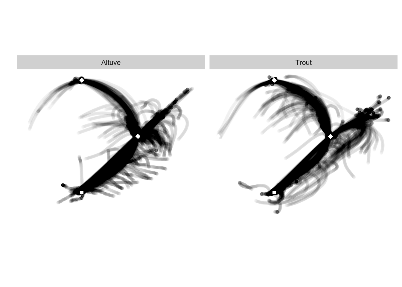
Runner coordinates show deviations from baserunning paths, which may arise in various contexts. One includes runners overshooting first base along the foul line in attempts to outrun a throw to first base. Another is consistent with runners leaving the field after an out (either by the runner or otherwise an out ending the half-inning). In such circumstances it may be difficult to know exactly when the runner is attempting max effort.
# -----------------------------------------------------------------------------
# create plot distributions of speeds at all observed times
speed <-
  # create plot object with data
  ggplot(subset(runners, id_b %in% c(altuve_id, trout_id))) +

  # plot histogram of speeds
  geom_histogram(aes(mph), bins = 80, fill = '#888888', color = 'white') +

  # limit speed to below world record pace
  xlim(0, record60m) +

  # separate the two players
  facet_wrap(~Name, nrow = 2, ncol = 1) +

  # clean up non-data ink
  theme(panel.grid = element_blank(), panel.background = element_blank()) +
  labs(x = 'mph', y = '')

# -----------------------------------------------------------------------------
# plot runner speeds as a function of observed times
time <-
  # organize data
  runners[runners$mph < record60m & !is.na(runners$mph),] %>%
  group_by(sv_pitch_id) %>% arrange(time_offset) %>%

  # create a plot object
  ggplot() +

  # plot speed across time
  geom_line(aes(time_offset, mph, group = sv_pitch_id), alpha = .01) +

  # separate the two players
  facet_wrap(~Name, nrow = 2, ncol = 1) +

  # clean up non-data ink
  theme(panel.grid = element_blank(),
        panel.background = element_blank(),
        axis.ticks = element_blank()) +
  labs(x = 'Seconds', y = 'MPH')

# -----------------------------------------------------------------------------
require(gridExtra)
grid.arrange(speed, time, ncol = 2)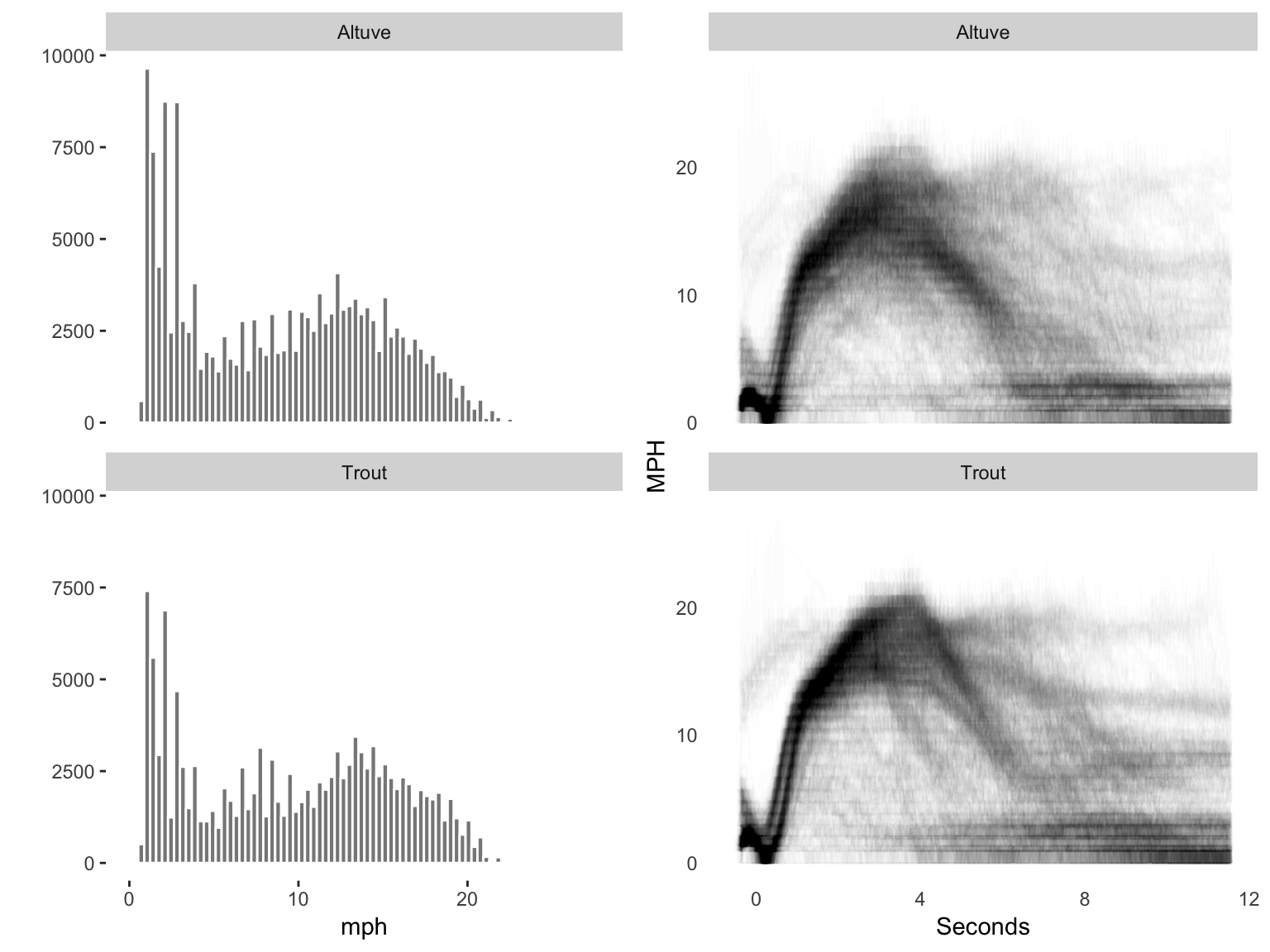
Differences in speed distributions between the players as shown here are subtle. We can also see that for both players, their speed changes over time within a given run. These plots suggest that Trout — at least in the circumstances reviewed — accelerates a bit more consistency (the lines showing initial accelleration are more concentrated and slightly steeper) and better holds his speed (his histogram shows more instances gathered at higher speeds).
Let’s go into more detail, keeping in mind that more likely estimates of max effort for part of the run may be found where batters — along with overshooting first base — have attempted to advance at least to second base. Unless due to a ground rule double or a home run, we may assume that max effort was likely at least to the penultimate base advanced. Max effort was likely at least through, say, first base when the batter ran at least near second base. Let’s study those scenarios, specifically including the reaction time from hitting to running since this scenario would seem to have the most impact on wins.
Scenario 1: times to first when attempting a double
Let’s start by identifying base locations, and plays where the runners were near these bases. We’ll choose some euclidean distance as a measure of “near”. Our first analysis will be of the two as batters where they appeared to earn a double.
Identifying time to first for each play in scenario 1
# base coordinates
base1 <- c(x = sin(pi/4) * 90, y = cos(pi/4) * 90)
base2 <- c(x = 0, y = 127.28125)
base3 <- c(x = -sin(pi/4) * 90, y = cos(pi/4) * 90)

# identify coordinates near (within 2 feet of) each base
runners[, 'firstbase'] <- FALSE
runners[sqrt( (runners$x - base1['x'])^2 + (runners$y - base1['y'])^2 ) < 4,
        'firstbase'] <- TRUE

runners[, 'secondbase'] <- FALSE
runners[sqrt( (runners$x - base2['x'])^2 + (runners$y - base2['y'])^2 ) < 15,
        'secondbase'] <- TRUE

runners[, 'thirdbase'] <- FALSE
runners[sqrt( (runners$x - base3['x'])^2 + (runners$y - base3['y'])^2 ) < 15,
        'thirdbase'] <- TRUE

# subset the plays where the batter attempted to earn a double
r1 <-
  runners %>%                                        # all data
  filter(id_b %in% c(altuve_id, trout_id)) %>%       # just the two as batters
  filter(id == '10') %>%                             # where x y is for batter
  group_by(Name, sv_pitch_id) %>%                    # group x, y into plays
  arrange(time_offset) %>%                           # order by time
  mutate(taggedsecond = (sum(secondbase) > 0)) %>%   # runner near second base
  mutate(taggedthird = (sum(thirdbase) > 0)) %>%     # runner near third base
  filter(taggedsecond == TRUE &
         taggedthird == FALSE) %>%                   # near second, not third
  filter(firstbase == TRUE) %>%
  filter(row_number() == 1) %>% ungroup()            # quickest time near first
Modeling estimates of expected time for scenario 1
From the code above, we have identified the earlierst time_offset in each play where the euclidean distance was within our (subjective) tolerance to first base. Let’s model these times, and compare expected estimates — and uncertainties in the estimations —between players.
require(rstanarm)
fit <- stan_glm(time_offset ~ -1 + Name,
                data = r1,
                iter = 2000,
                chains = 4,
                cores = 4)
While not shown here, all model checks (such as rhats and trace plots) looked good. We’ll trust the model, keeping in mind the data.
Posteriors of expected time to first slightly favor Trout
Expected times to first, from 8000 simulations,
# get posterior estimates for each player
set.seed(123)
trout <- posterior_predict(fit,
                           newdata = data.frame(time_offset = 0, Name = 'Trout'))
set.seed(123)
altuve <- posterior_predict(fit,
                            newdata = data.frame(time_offset = 0, Name = 'Altuve'))

# calculate percent of time Trout is expected to be faster
d <- sum((trout-altuve) <=0) / length(trout) * 100

# plot distribution of Trout minus distribution of Altuve
ggplot() +
  geom_histogram(aes(x = as.vector(trout-altuve)),
                 binwidth = 0.05, fill = "#DDDDDD", color = '#FFFFFF') +
  geom_vline(xintercept = 0) +
  geom_vline(aes(xintercept = mean(trout-altuve)), linetype = 'dashed') +
  geom_segment(aes(x=0,y=650,xend=mean(trout-altuve),yend=650),
               arrow = arrow(length = unit(0.1,"cm")), color = 'dodgerblue3') +
  annotate("text", x = -4, y = 400,
           label = paste('Trout faster to first base than\nAltuve in',
                         round(d, 1), 'percent of simulations.'),
           hjust = 0, color = '#000000') +
  annotate("text", x = -.3, y = 650, color = 'dodgerblue3',
           label = paste('On average,\n', round(mean(trout-altuve), 1),
                         'seconds difference.'),
           hjust = 1, color = '#000000') +
  labs(x = 'Trout - Altuve: Difference in seconds to first base',
       y = 'Number of simulations')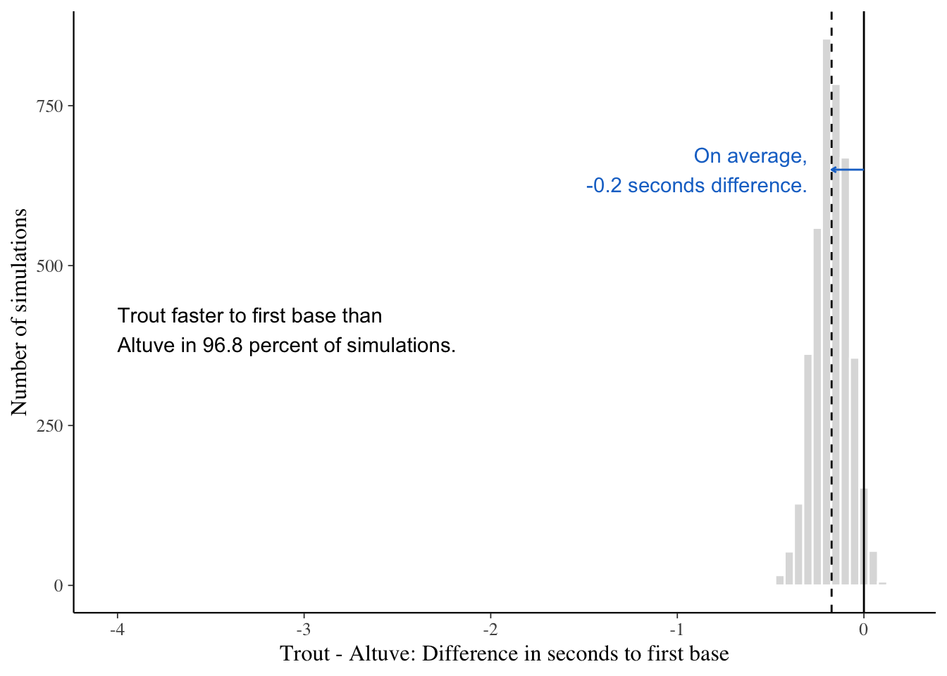
suggest that Trout was conditionally quicker to first base than Altuve 96.8 percent of the time. Though we also expect that either may be quicker on any given play. Next, let’s get our expectation of maximum speed with these data.
Identifying max speed to first for each play
First, as before, we setup the data,
r2 <-
  runners %>%                                        # all data
  filter(id_b %in% c(altuve_id, trout_id)) %>%       # just the two as batters
  filter(id == '10') %>%                             # where x y is for batter
  group_by(Name, sv_pitch_id) %>%                    # group x, y into plays
  mutate(taggedsecond = (sum(secondbase) > 0)) %>%   # near second base
  mutate(taggedthird = (sum(thirdbase) > 0)) %>%     # near third base
  filter(taggedsecond == TRUE &
         taggedthird == FALSE) %>%                   # near second, not third
  filter(firstbase == TRUE) %>%
  filter(mph == max(mph)) %>% ungroup()            # quickest time near first
Modeling maximum expected footspeed
Next, we model maximum footspeed to obtain posterior expectations.
fit_max <- stan_glm(mph ~ -1 + Name,
                    data = r2,
                    iter = 4000,
                    chains = 4)
Difference in posterior expected max speed slightly favors Trout
Consistent with models of time, the expected max speed gives Trout a (ever) slight edge.
# Get posterior estimates of both players
set.seed(123)
trout <- posterior_predict(fit_max,
                           newdata = data.frame(mph = 0, Name = 'Trout'))
set.seed(123)
altuve <- posterior_predict(fit_max,
                            newdata = data.frame(mph = 0, Name = 'Altuve'))

# calculate probability that trout is faster
d <- sum((trout-altuve) >=0) / length(trout) * 100

# Overlay mph density plots for both players
max1 <-
  ggplot() + geom_density(aes(as.vector(trout)),
                          fill = 'red', color = 'red', alpha = .3) +
  geom_density(aes(as.vector(altuve)),
               fill = 'blue', color = 'blue', alpha = .3) +
  labs(x = 'Max Speed: Trout (red), Altuve (blue)', y = '')

# plot distribution of Trout minus distribution of Altuve
max2 <-
  ggplot() +
  geom_histogram(aes(x = as.vector(trout-altuve)),
                 binwidth = 0.2, fill = "#CCCCCC", color = '#FFFFFF') +
  geom_vline(xintercept = 0) +
  geom_vline(aes(xintercept = mean(trout-altuve)), linetype = 'dashed') +
  geom_segment(aes(x=0,y=650,xend=mean(trout-altuve),yend=650),
               arrow = arrow(length = unit(0.1,"cm")), color = 'dodgerblue3') +
  annotate("text", x = -12, y = 200,
           label = paste('Trout had higher maximum\nspeed than Altuve in ',
                         round(d, 1), '\npercent of simulations.'),
           hjust = 0, color = '#000000') +
  annotate("text", x = 0, y = 600,
           label = paste('On average,\n',
                         round(mean(trout-altuve), 1), 'mph difference.'),
           hjust = 1, color = 'dodgerblue3') +
  labs(x = 'Trout - Altuve: Time diff to first base',
       y = 'Number of simulations')

# arrange both plots
grid.arrange(max1, max2, ncol = 2)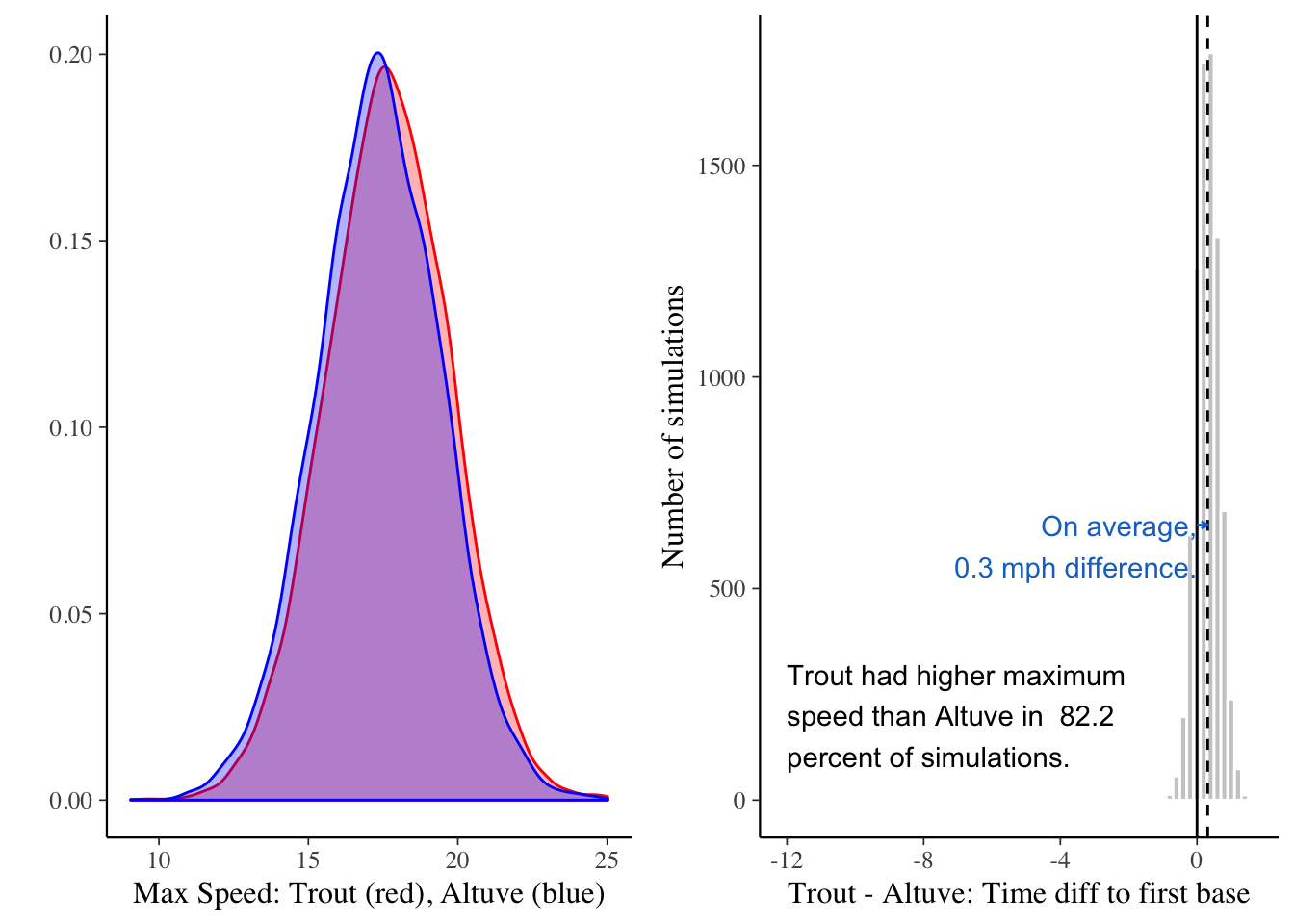
Scenario 2: batters trying to beat a throw to first
Let’s now compare these players as batters when presumaably (as the data suggests) attempting to beat a throw to first. As before, we’ll setup the data, model our expectations, and compare the two.
Identifying quickest times to first in scenario 2
base1past <- c(x = sin(pi/4) * 110, y = cos(pi/4) * 110)
runners[, 'pastfirst'] <- FALSE
runners[sqrt( (runners$x - base1past['x'])^2 +
              (runners$y - base1past['y'])^2 ) < 3,
        'pastfirst'] <- TRUE

r3 <-
  runners %>%                                        # all data
  filter(id_b %in% c(altuve_id, trout_id)) %>%       # just the two as batters
  filter(id == '10') %>%                             # where x y is for batter
  group_by(Name, sv_pitch_id) %>%                    # group x, y into plays
  arrange(time_offset) %>%                           # order by time
  mutate(taggedfirst = (sum(pastfirst) > 0)) %>%     # runner near second base
  filter(taggedfirst == TRUE) %>%                    # near second, not third
  filter(firstbase == TRUE) %>%
  filter(row_number() == 1) %>% ungroup()            # quickest time near first
Modeling expectations of quickest times to first in scenario 2
fit3 <- stan_glm(time_offset ~ -1 + Name,
                data = r1,
                iter = 4000,
                chains = 4)
Difference in posterior expectation slighltly favors Trout in scenario 2
# get posterior expectations of both players
set.seed(123)
trout <- posterior_predict(fit3,
                           newdata = data.frame(time_offset = 0, Name = 'Trout'))
set.seed(123)
altuve <- posterior_predict(fit3,
                            newdata = data.frame(time_offset = 0, Name = 'Altuve'))

# calculate probability that Trout's is better
d <- sum((trout-altuve) <=0) / length(trout) * 100

# plot distribution of Trout minus distribution of Altuve
ggplot() +
  geom_histogram(aes(x = as.vector(trout-altuve)),
                 binwidth = 0.1, fill = "#DDDDDD", color = '#FFFFFF') +
  geom_vline(xintercept = 0) +
  geom_vline(aes(xintercept = mean(trout-altuve)), linetype = 'dashed') +
  geom_segment(aes(x=0,y=2000,xend=mean(trout-altuve),yend=2000),
               arrow = arrow(length = unit(0.1,"cm")), color = 'dodgerblue3') +
  annotate("text", x = -4, y = 400,
           label = paste('Trout faster to first base than\nAltuve in',
                         round(d, 1), 'percent of simulations.'),
           hjust = 0, color = '#000000') +
  annotate("text", x = mean(trout-altuve), y = 2000,
           label = paste('On average,\n',
                         round(mean(trout-altuve), 1), 'seconds difference.'),
           hjust = 1, color = 'dodgerblue3') +
  labs(x = 'Trout - Altuve: Difference in seconds to first base',
       y = 'Number of simulations')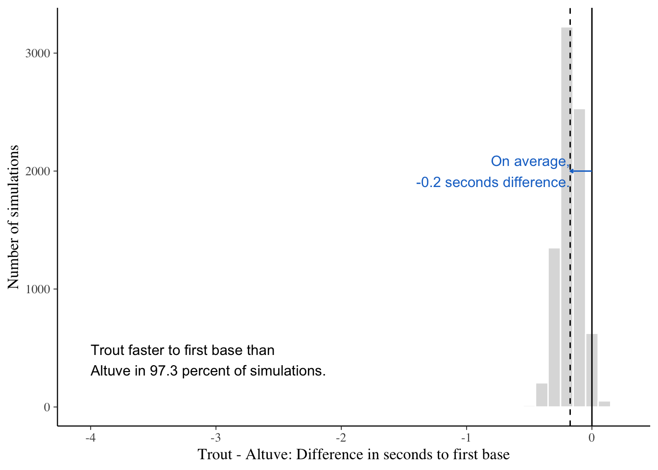
Conclusions and Next Steps
Let’s keep in mind several things with this analysis. First, we can expect significant variation as to who may be quicker — or generate a higher max speed — on any given play. This should be understandable as the model does not account for the many conditions that could affect their runs. We can conduct a similar analysis, folding into the above models additional variables from, say, MLBAM’s PITCHf/x system, which gives us outcome information on each play: did two outs exist, in which case we can expect the runner to provide max effort? Did a field create an error such that the runner, after slowing down, sped back up with new efforts? Last, this analysis suggests that should these two players ever toe the line — side-by-side — we’d see a great race!