Slide 9-17 - simulate per-county cancer rates
First, let’s load libraries to use data transformation and graphing functions.
library(tidyverse)  # for data transformations and grammar of graphics
library(ggthemes)   # for setting defaults on non-data ink
library(tidycensus) # for gathering US census county ids and populations
theme_set( theme_void() + theme(legend.position = "") )
Next, we’ll pull census data, including county ids and population thereof.
CENSUS_API_KEY <- Sys.getenv("CENSUS_API_KEY")

county_pop <- get_estimates(
  geography = "county",
  product = "population",
  year = 2019,
  key = CENSUS_API_KEY)
To set up a simulation study, we’ll simulate the rate of cancer by county:
data <-
county_pop %>%
pivot_wider(
names_from = "variable",
values_from = "value") %>%
left_join(county_laea) %>%
rowwise() %>%
mutate(
rate_cases = rbinom(n = 1, size = POP, prob = 0.01) / POP * 1000
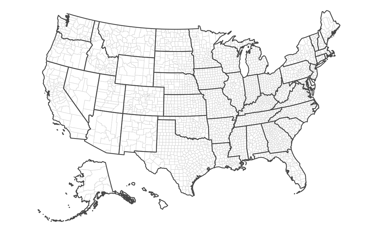
)Slide 10 - map encoding county areas
Now, we’ll draw the county map:
ggplot() +
  theme_void() +
  theme(legend.position = "") +
  geom_sf(
    data = data,
    mapping = aes(
      geometry = geometry),
    lwd = 0.2,
    color = '#dddddd',
    fill = NA
  ) +
  geom_sf(
    data = state_laea,
    fill = NA
  )
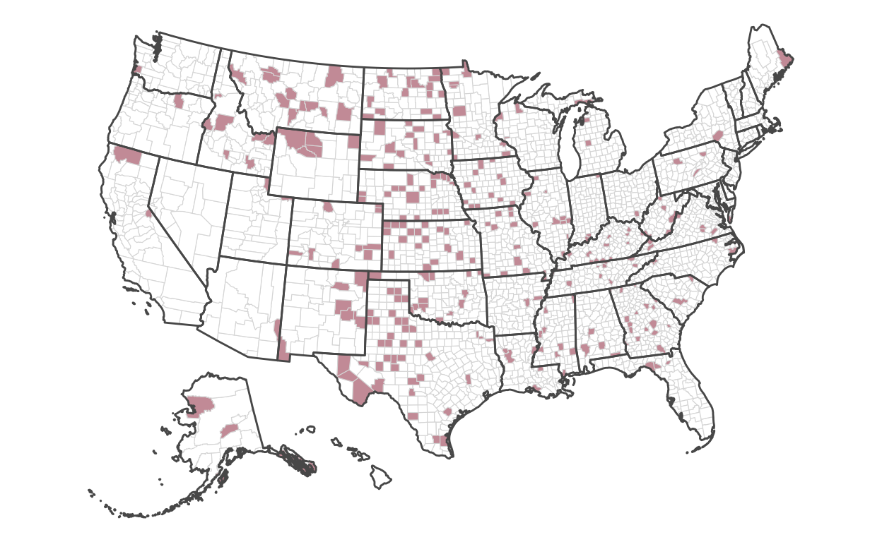
Slide 11 - map encoding counties with hightest rates
Encoding directly into the polygons of each county, we’ll encode the fill color of the highest 10 percent of rates:
ggplot() +
  geom_sf(
    data = data,
    mapping = aes(
      geometry = geometry,
      fill = rate_cases > quantile(rate_cases, probs = 0.9)
    ),
    lwd = 0.2,
    color = '#dddddd'
  ) +
  geom_sf(
    data = state_laea,
    fill = NA
  ) +
  scale_fill_manual(
    values = c("#ffffff", "#CD9DA7")
  )
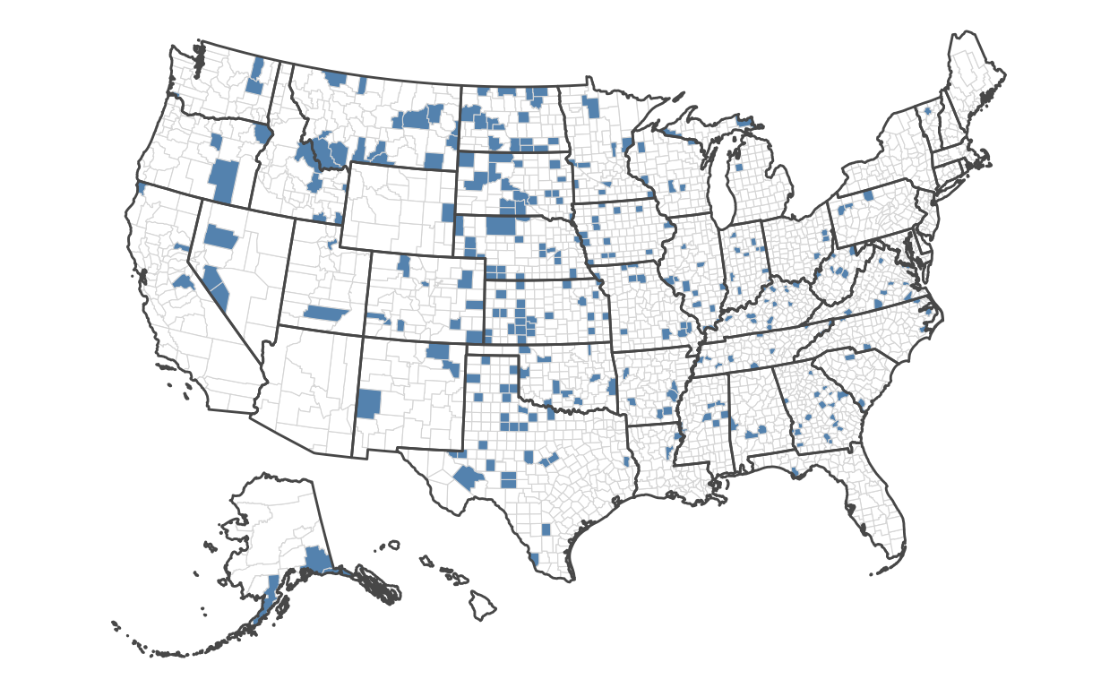
Slide 12 - map encoding counties with lowest rates
Now, we’ll do the same, but for those with the lowest rates:
ggplot() +
  geom_sf(
    data = data,
    mapping = aes(
      geometry = geometry,
      fill = rate_cases < quantile(rate_cases, probs = 0.1)
    ),
    lwd = 0.2,
    color = '#dddddd'
  ) +
  geom_sf(
    data = state_laea,
    fill = NA
  ) +
  scale_fill_manual(
    values = c("#ffffff", "#6695BC")
  )
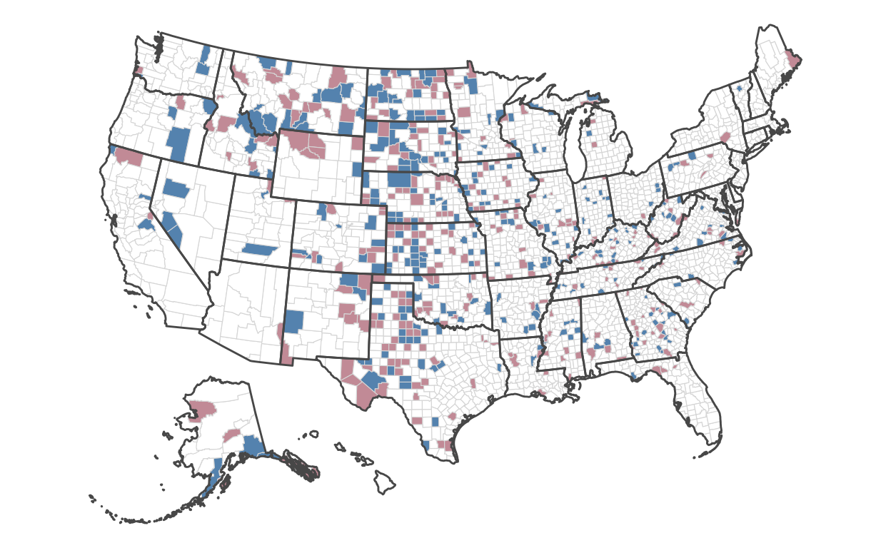
Slide 13 - map encoding lowest and hightest rates
Let’s combine both encodings to compare where the lowest and highest counties are:
ggplot() +
  scale_fill_identity() +
  geom_sf(
    data = data,
    mapping = aes(
      geometry = geometry,
      fill = case_when(
        rate_cases > quantile(rate_cases, probs = 0.9) ~ "#CD9DA7",
        rate_cases < quantile(rate_cases, probs = 0.1) ~ "#6695BC",
        TRUE ~ "#ffffff")
      ),
    lwd = 0.2,
    color = '#dddddd'
  ) +
  geom_sf(
    data = state_laea,
    fill = NA
  )
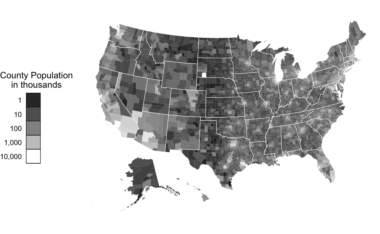
Slides 14-15 - map encoding county populations
Let’s now consider where the highest populations are across counties:
ggplot() +
  theme_void() +
  geom_sf(
    data = data,
    mapping = aes(
      geometry = geometry,
      fill = POP ),
    lwd = 0.2,
    color = NA) +
  geom_sf(
    data = state_laea,
    fill = NA,
    color = '#ffffff',
    lwd = 0.2
  ) +
  scale_fill_gradient(
    low = '#000000',
    high = '#ffffff',
    name = 'County Population\nin thousands',
    trans = 'log10',
    breaks = c(0, 1e3, 1e4, 1e5, 1e6, 1e7),
    labels = c(0, "1", "10", "100", "1,000", "10,000")
  ) +
  theme(
    legend.position = 'left',
    legend.text.align = 1,
    legend.title = element_text(hjust = 0),
    legend.key = element_rect(color = '#000000')
  ) +
  guides(
    fill = guide_legend(
      title.position = "top",
      title.hjust = 0.5,
      label.position = "left"
    )
) 
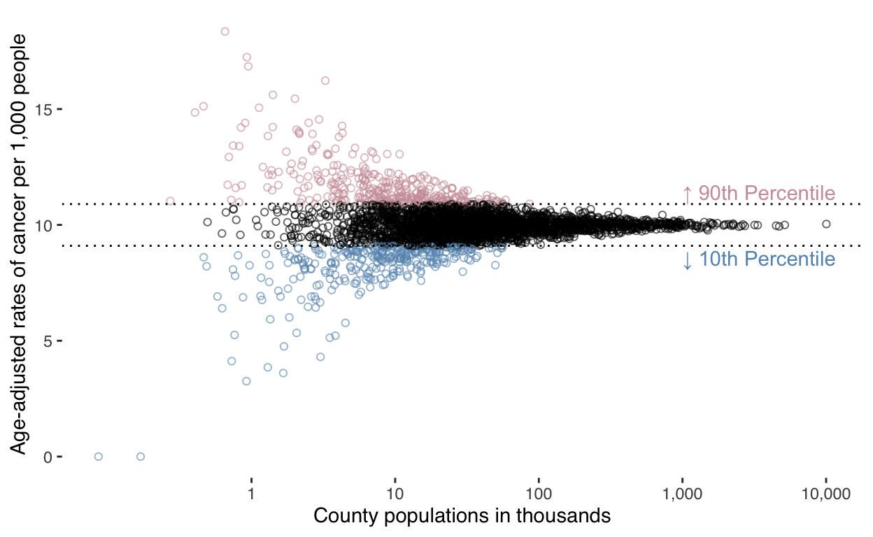
Slide 17 - graph encoding rates ~ population
Finally, let’s compare county population to cancer rate:
ggplot(data) +
  theme_tufte(base_family = 'sans') +
  geom_point(
    mapping = aes(
      x = POP,
      y = rate_cases,
      color = case_when(
        rate_cases > quantile(rate_cases, probs = 0.9) ~ '#CD9DA7',
        rate_cases < quantile(rate_cases, probs = 0.1) ~ '#6695BC',
        TRUE ~ '#000000'
      )
    ),
    size = 1.5,
    alpha = 0.6,
    shape = 21
  ) +
  geom_hline(
    mapping = aes(
      yintercept = quantile(rate_cases, probs = 0.9)
    ),
    linetype = 'dotted',
  ) +
  annotate(
    'text',
    x = 1e6,
    y = quantile(data$rate_cases, probs = 0.9) + 0.2,
    label = "↑ 90th Percentile",
    hjust = 0,
    vjust = 0,
    color = '#CD9DA7'
  ) +
  geom_hline(
    mapping = aes(
      yintercept = quantile(rate_cases, probs = 0.1)
    ),
    linetype = 'dotted'
  ) +
  annotate(
    'text',
    x = 1e6,
    y = quantile(data$rate_cases, probs = 0.1) - 0.2,
    label = "↓ 10th Percentile",
    hjust = 0,
    vjust = 1,
    color = '#6695BC'
  ) +
  scale_x_log10(
    breaks = c(0, 1e3, 1e4, 1e5, 1e6, 1e7),
    labels = c(0, "1", "10", "100", "1,000", "10,000")) +
  scale_color_identity() +
  theme(legend.position = '') +
  labs(
    x = "County populations in thousands",
    y = "Age-adjusted rates of cancer per 1,000 people"
  )
Slide 38 - quantile dotplots
People can generally reason about things better when thinking discretely than when confronted with continuous information. Let’s consider how this plays out when reasoning about a distribution of information.
Let’s say we have a population exhibiting a log normal distribution with a log mean of log(11) and a log standard deviation of 0.2:
set.seed(8)

# population information
mu <- log(11)
sigma <- 0.2
Example log normal distribution of population
Here’s the population distribution:
p1 <-
  ggplot() +
  stat_function(
    fun = dlnorm,
    args = c(meanlog = mu, sdlog = sigma),
    xlim = c(0, 30),
    geom = "density",
    fill = "lightblue",
    lwd = 0.1
  )

p1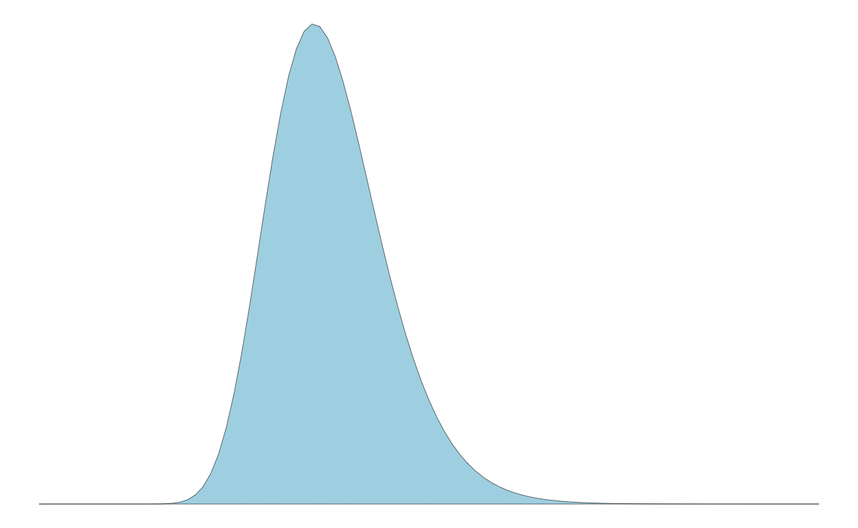
Example draws from population showing noise
Now, to discretize the distribution, we might take samples. But, as shown below, the samples can be noisy, not visually appearing as the population distribution and inconsistent across samples. To see this, let’s create three experiments of 50 samples:
runs <- 3L
n <- 50L

d <-
  tibble(
  idx = rep( seq(runs), each = n ),
  x = rlnorm( n = n * runs, mean = mu, sd = sigma )
)

p2 <-
  ggplot(d) +
  theme(strip.text = element_blank()) +
  geom_dotplot(
    mapping = aes(
      x = x
    ),
    fill = 'lightblue',
    dotsize = 0.8,
    stroke = 0.2
  ) +
  facet_wrap(
    ~ idx,
    nrow = 3
  ) +
  scale_x_continuous(
    name = 'x',
    limits = c(0, 30)
  ) +
  scale_y_continuous(
    name = 'p(x)',
    breaks = seq(0, 1, by = 0.25)
  )

p2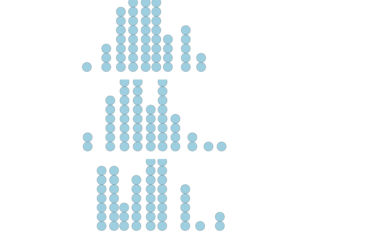
Creating quantile dotplot from scratch
Instead, we can represent the population discretely in another way.
First, I’ll show you manually doing everything. But there’s a function
in the package ggdist that does this for you:
geom_dots().
q <-
  tibble(
  p_x =
    seq(
      from = 1 / n / 2,
      to = 1 - (1 / n / 2),
      length = n
    ),
  x = qlnorm(
    p = p_x,
    meanlog = mu,
    sdlog = sigma
  )
)

# shape of the quantiles
p3 <-
  ggplot(q) +
  # draw lines from axes to CDF
  geom_segment(
    mapping = aes(
      x = 0, xend = x,
      y = p_x, yend = p_x
    ),
    color = 'lightgray',
    lwd = 0.2
  ) +

  geom_segment(
    mapping = aes(
      x = x, xend = x,
      y = p_x, yend = 0
    ),
    color = 'lightgray',
    lwd = 0.2
  ) +

  # draw CDF from generated data
  geom_line(
    mapping = aes(
      x = x,
      y = p_x
    ),
    color = 'darkred'
  ) +

  # draw dotplots from generateed data
  geom_dotplot(
    mapping = aes(
      x = x
    ),
    dotsize = 0.8,
    fill = 'lightblue',
    stroke = 0.2
  )

p3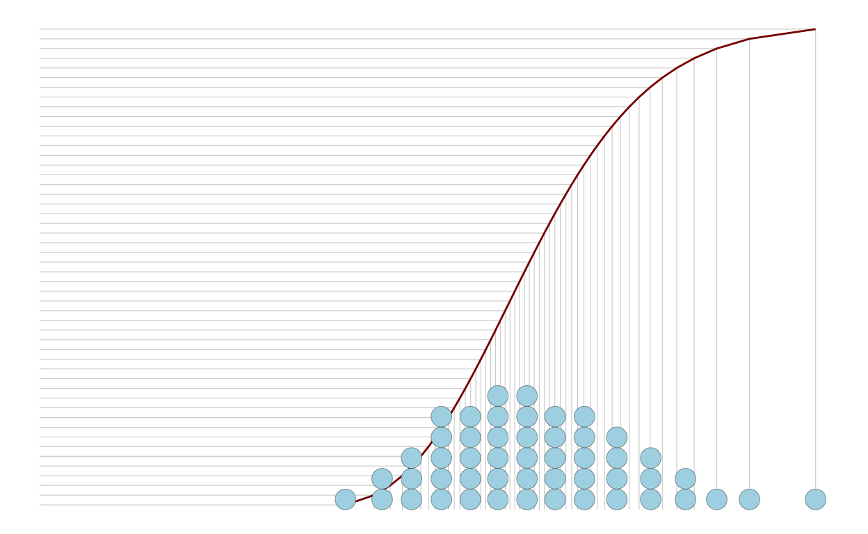
Users can just count the dots above or below a threshold:
p4 <-
  ggplot(q) +
  geom_dotplot(
    mapping = aes(
      x = x,
      fill = x < 8
    ),
    dotsize = 0.8,
    stroke = 0.2
  ) +
  scale_x_continuous(limits = c(0, 18)) +
  scale_fill_manual(
    breaks = c(FALSE, TRUE),
    values = c('lightblue', 'darkred'),
    guide = "none")

p4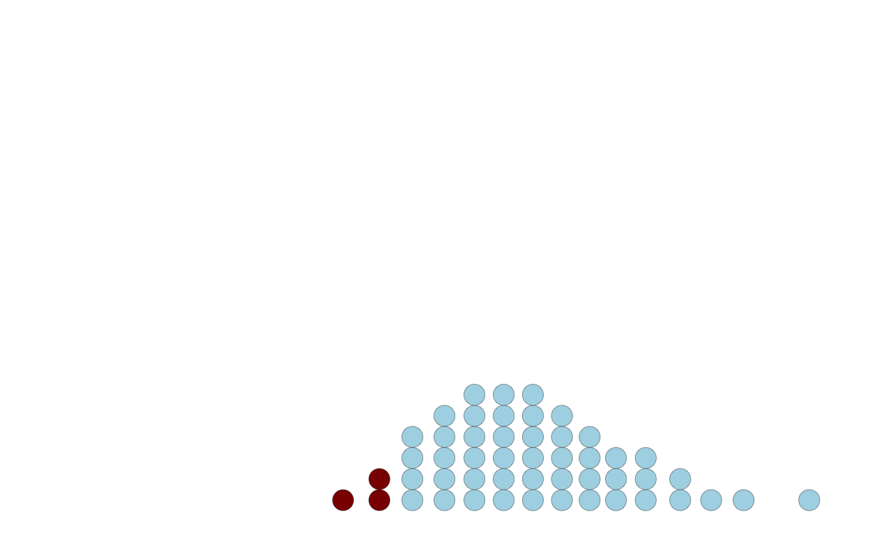
Using ggdist package function to create quantile dotplots
Here’s a function to do this for you:
library(ggdist)

ggplot(q) +
  stat_dots(
    mapping = aes(
      x = x
    ),
    dotsize = 0.8,
    quantiles = 50,
    fill = 'lightblue',
    color = 'black',
    lwd = 0.2
  ) +
  scale_x_continuous(limits = c(0, 18))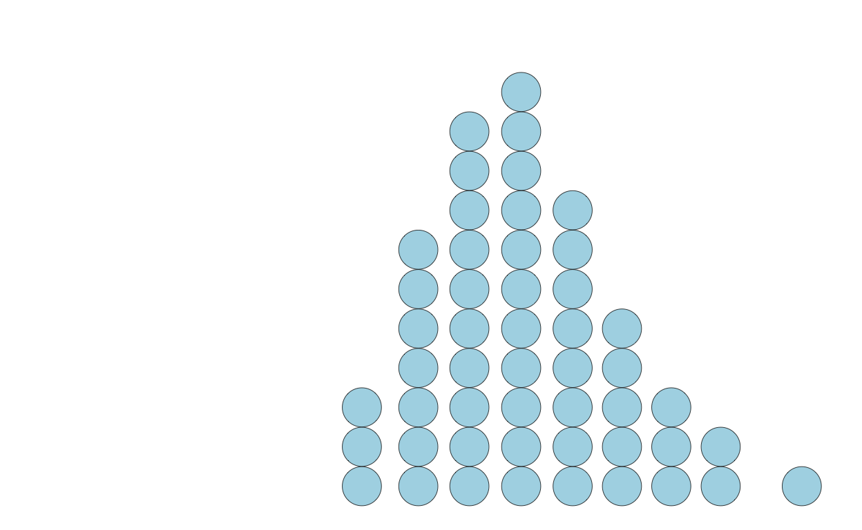
The exact shape of a quantile dotplot will depend — like histograms do with bin width / size — on the parameters you specify.