Slide 44 — layering as hierarchy of information
Let’s load libraries for functions we’d like to use,
library(tidyverse) # functions for data transformations, grammar of graphics
library(ggthemes)  # functions for templates of non-data ink
library(ggforce)   # functions for additional geom helper functions
library(ggtext)    # functions to use html/markdown in ggplot fonts
and use a theme to change several aspects of the “non data” ink.
default_theme <- theme_get()
theme_set( theme_classic(base_family = "sans") )
Now let’s simulate some data to graph:
set.seed(15)

n <- 15
d <-
  data.frame(
    x = rnorm(n),
    y = rnorm(n),
    z = rnorm(n),
    a = factor(rpois(n, 1), levels = seq(0, 5)),
    n = seq(n)
  )
Now, we’ll draw the first layer, the main x, y plane:
layer1 <-
  ggplot(d) +

  # coord_equal() +

  scale_x_continuous(
    name = "",
    limits = c(-1.5, 2),
    breaks = seq(-1.5, 1.5, by = 0.5),
    labels = rep("x", 7)
  ) +

  scale_y_continuous(
    name = "",
    limits = c(-1.5, 2),
    breaks = seq(-1.5, 1.5, by = 0.5),
    labels = rep("y", 7)
  ) +

  scale_fill_viridis_d() +

  scale_color_viridis_d() +

  theme(
    legend.position = "",
    # plot.background = element_blank(),
    plot.title = element_text(face = "bold", color = "#444444"),
    plot.subtitle = element_text(color = "#888888"),
    plot.caption = element_text(color = "#888888"),
    axis.text = element_text(color = "#888888"),
    axis.ticks = element_line(color = "#aaaaaa"),
    axis.title = element_text(color = "#888888")
  )

layer1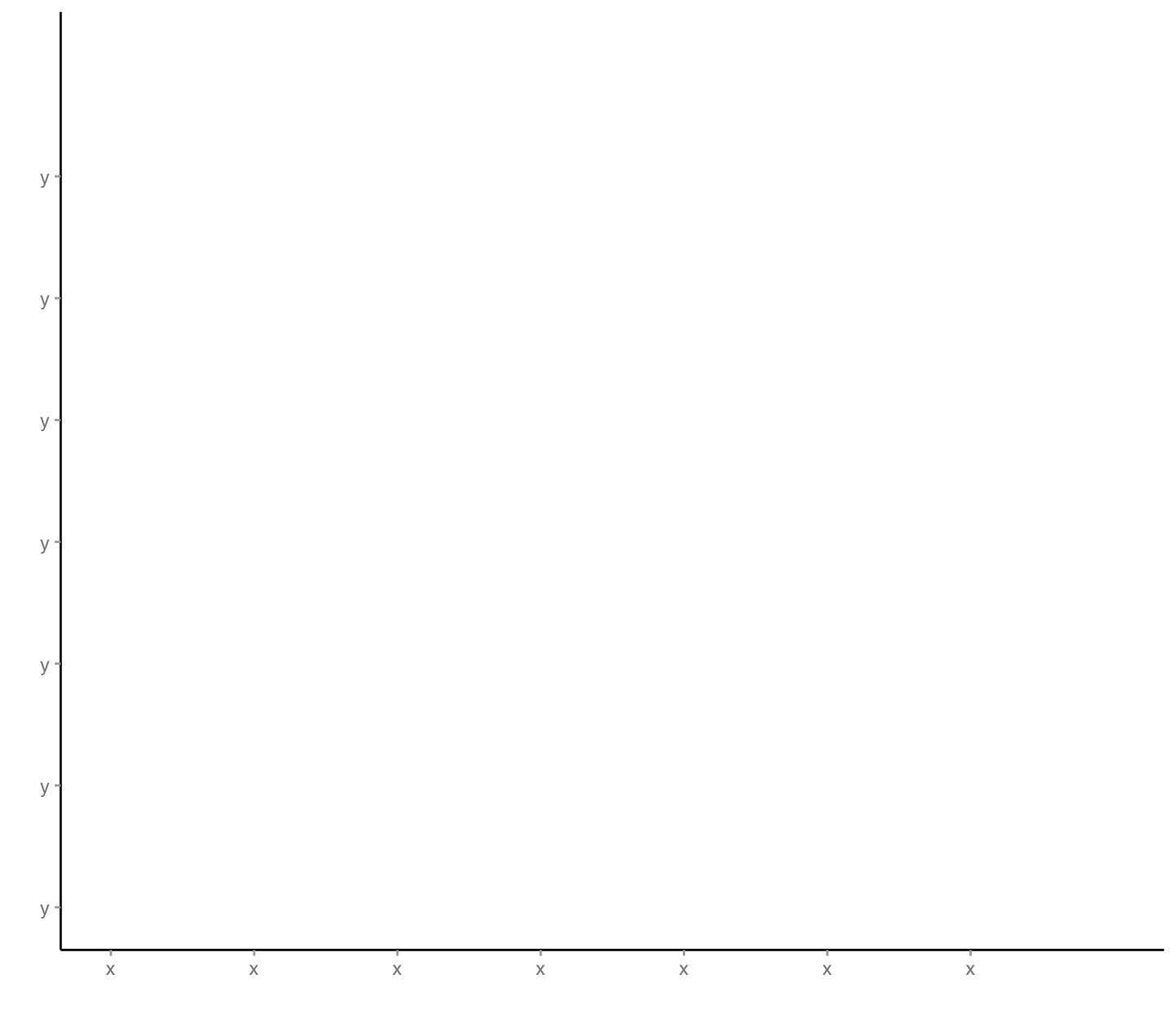
Next, we’ll layer our first two variables onto the x, y coordinates:
layer2 <-

  layer1 +

  geom_point(
    mapping = aes(
      x = x,
      y = y
    )
  )

layer2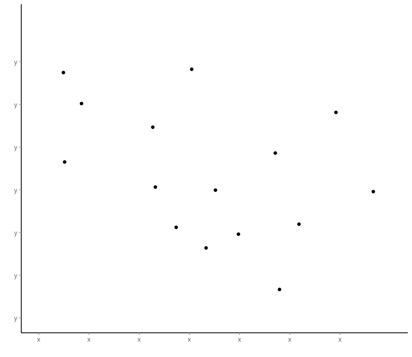
In our third layer, we’ll create custom shapes at the above data-mapped locations where the shapes at those locations in turn depend on data (and so, we get more dimensions to visualize at once):
layer3 <-

  layer1 +

  scale_x_continuous(
    name = "elements positioned by x parameter",
    limits = c(-1.5, 2),
    breaks = seq(-1.5, 1.5, by = 0.5),
    labels = rep("x", 7)
  ) +

  scale_y_continuous(
    name = "elements positioned by y parameter",
    limits = c(-1.5, 2),
    breaks = seq(-1.5, 1.5, by = 0.5),
    labels = rep("y", 7)
  ) +

  geom_rect(
    mapping = aes(
      xmin = x,
      xmax = x + pmax(abs(z) / 4, 0.03),
      ymin = y - 0.03,
      ymax = y + 0.03,
      fill = a
    )
  ) +

  geom_segment(
    mapping = aes(
      x = x,
      xend = x,
      y = y - 0.03,
      yend = y + 0.03
    ),
    color = "#000000",
    lwd = 1
  )

layer3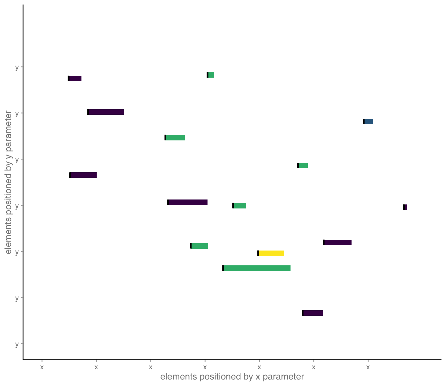
In our forth layer, we begin to include textual details that help our audience understand important aspects of our mappings of data to visual encodings. Here, we label important visual encodings:
layer4 <-

  layer3 +

  geom_text(
    mapping = aes(
      x = x,
      y = y + 0.05,
      label = "name",
      color = a
    ),
    hjust = 0,
    vjust = 0,
    size = 8/.pt,
    fontface = "italic"
  )

layer4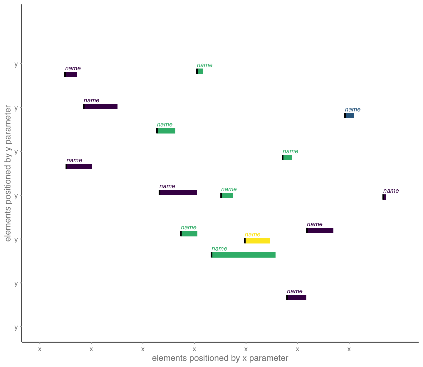
Then, we layer in annotations, tiny paragraphs, that help the audience understand context and insights. Of note, these functions try to automatically place the information and can seem a little finicky, so use a bit of trial and error in re-sizing the figure to work with the placement. Here, a figure size of 7.5 x 6.5 inches for the given font choices seemed pretty good.
layer5 <-

  layer4 +

  geom_mark_rect(
    mapping = aes(
      x = x + 0.06,
      y = y,
      filter = n == 15,
      label = "Explainer",
      description =
        str_c("Use these mini-paragraphs or explainers to say ",
              "something interesting about particular datum. ",
              "Draw your audience in to explore.")
    ),
    label.fontsize = 8,
    con.border = "one",
    con.cap = 0,
    expand = unit(5, "mm"),
    label.colour = "#3e4a89",
    con.colour = "#3e4a89",
    color = "#3e4a89"
  ) +

  geom_mark_rect(
    mapping = aes(
      x = x + 0.09,
      y = y,
      filter = n == 4,
      label = "Explainer",
      description =
        str_c("Use these mini-paragraphs or explainers to say ",
              "something interesting about particular datum. ",
              "Draw your audience in to explore.")
    ),
    label.fontsize = 8,
    con.border = "one",
    con.cap = 0,
    expand = unit(7, "mm"),
    label.colour = "#440154",
    con.colour = "#440154",
    color = "#440154"
  )

layer5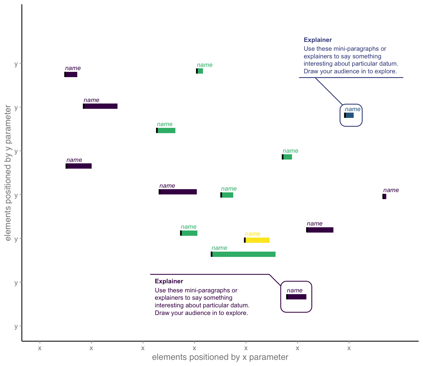
Finally, we add titles, and other surrounding information, to provide messages that provide our audence with added, intelligent insights. We also identify things like data sources and notes to create trust through transparency:
layer6 <-

  layer5 +

  labs(
    title =
      str_c("Use the graphic title to explain your main ",
            "takeaway as it\nrelates to your overall ",
            "narrative, not just what data are shown."),
    subtitle =
      str_c("You can say even more in the subtitle. What ",
            "pattern or comparison did you find\ninteresting? ",
            "By the way, notice the hierarchy of information ",
            "created by font sizes."),
      caption =
      str_c("Source: cite the source of your data ",
            "and explain your analysis.")
  )

layer6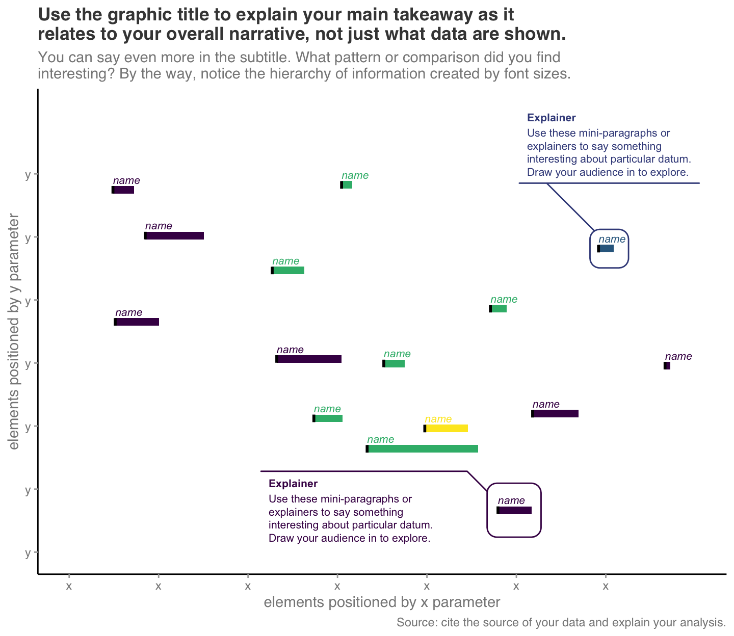
Slide 54 — BEA data, graphic
We’ll design the following published graphic: Bureau of Economic Analysis. “Gross Domestic Product by Industry: First Quarter 2020.” BEA Statistics. US Department of Commerce, July 6, 2020. https://www.bea.gov/sites/default/files/2020-07/gdpind120-fax.pdf. Here’s the original data that we’ll use to re-design:
d <-
  tribble(
    ~Industry,                             ~Quarter,  ~`Percent change`,
    "Overall GDP",                         "2019:Q4", +0.02,
    "Overall GDP",                         "2020:Q1", -0.05,
    "Finance and insurance",               "2019:Q4", +0.05,
    "Finance and insurance",               "2020:Q1", -0.09,
    "Health care and social assistance",   "2019:Q4", +0.03,
    "Health care and social assistance",   "2020:Q1", -0.078,
    "Arts, entertainment, and recreation", "2019:Q4", -0.01,
    "Arts, entertainment, and recreation", "2020:Q1", -0.347,
    "Accommodation and food services",     "2019:Q4", +0.002,
    "Accommodation and food services",     "2020:Q1", -0.278
  ) %>%
  mutate(
    Industry = factor( Industry, levels = unique(Industry) )
  )
I’ve used a “color picker” to identify each of the colors in the original graphic. Here are the hex codes for them:
bea_colors <- c("#1E4B92", "#97a3b3", "#CA672F", "#E8AC3B", "#DDDDDD")Now, let’s draw the original graphic:
p0 <-

  d %>%

  filter(Industry != "Overall GDP") %>%

  ggplot() +

  scale_fill_manual(
    values = bea_colors
  ) +

  scale_y_continuous(
    breaks = seq(-0.4, 0.1, by = 0.05),
    minor_breaks = NULL,
    limits = c(-0.40, 0.10),
    labels = scales::label_percent(accuracy = 1, suffix = "")
  ) +

  geom_bar(
    mapping = aes(
      x = Quarter,
      y = `Percent change`,
      fill = Industry
    ),
    stat = "identity",
    position = "dodge"
  ) +

  geom_hline(
    mapping = aes(
      yintercept = 0
    ),
    color = "black",
    size = 0.5
  ) +

  labs(
    title = "Real Value Added by Selected Industries",
    caption =
      str_c("U.S. Bureau of Economic Analysis, ",
            "Seasonally adjusted annual rates"),
    x = ""
  ) +

  theme_minimal() +

  theme(
    plot.title = element_text(face = "bold", hjust = 0.5),
    plot.caption = element_text(hjust = 0),
    panel.grid.major.x = element_blank(),
    panel.grid.major.y = element_line(size = 0.8),
    axis.text = element_text(face = "bold", size = 36/.pt),
    axis.title = element_text(face = "bold")
  )

p0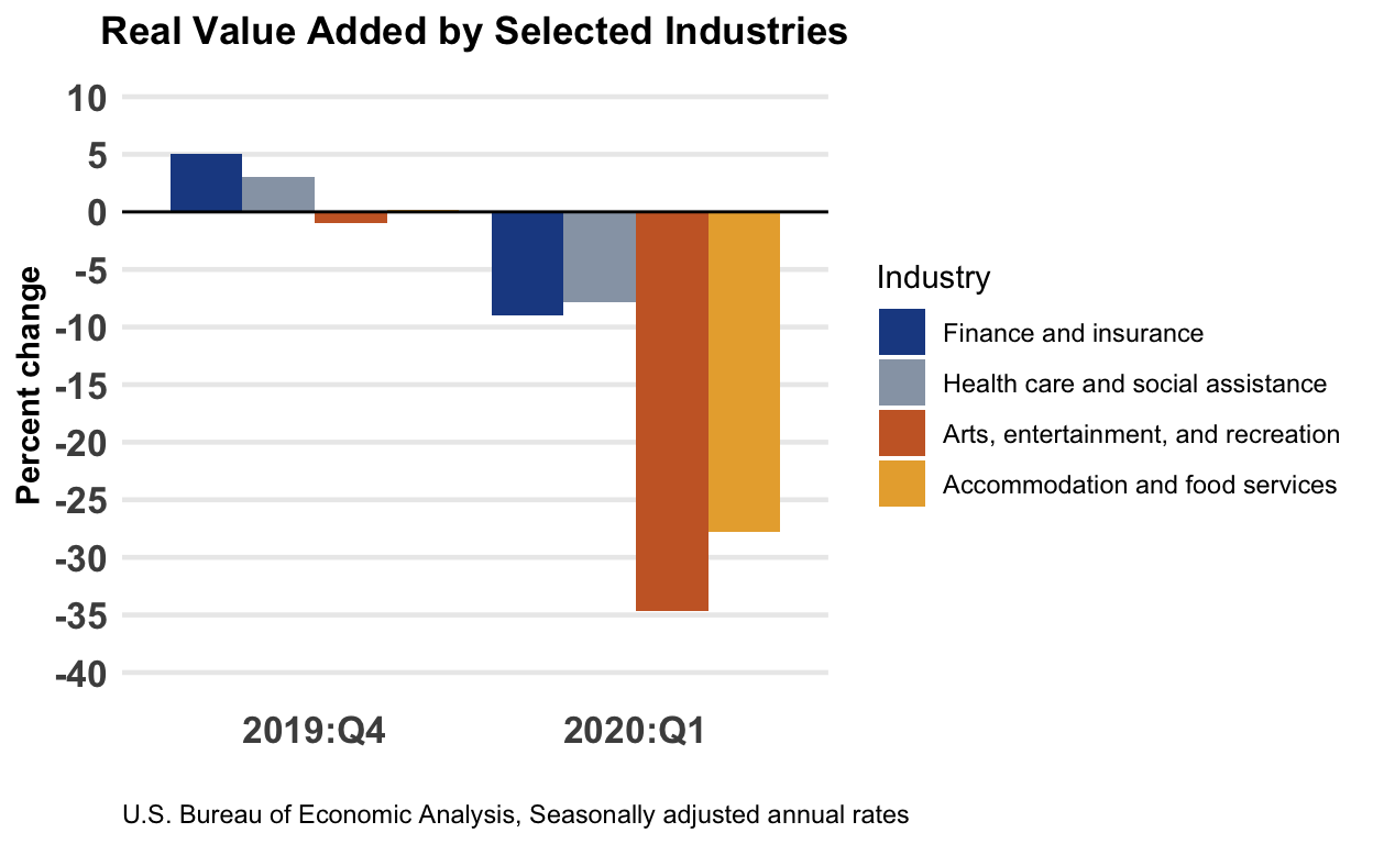
Slide 55 — redesign 1
Let’s try a different approach to both mapping the data and providing better textual details:
p1 <-

 d %>%

 ggplot() +

 theme_tufte() +

 scale_x_discrete(position = "top") +

 scale_y_continuous(
   breaks = seq(-0.4, 0.1, by = 0.1),
   minor_breaks = seq(-0.4, 0.1, by = 0.05),
   limits = c(-0.35, 0.07),
   labels = scales::label_percent(accuracy = 1, suffix = "")
 ) +

 scale_fill_manual(
   values = c("gold", "skyblue", "lightgray")
 ) +

 theme(
   plot.title = element_text(face = "bold", size = 48/.pt),
   plot.caption = element_text(hjust = 0),
   axis.title = element_blank(),
   axis.text.y = element_text(face = "bold", size = 30/.pt),
   axis.ticks = element_blank(),
   axis.text.x = element_text(face = "bold", size = 30/.pt),
   legend.position = "top",
   panel.grid.major.y = element_line(color = "#bbbbbb", linetype = "dotted"),
   panel.grid.minor.y = element_line(color = "#bbbbbb", linetype = "dotted")
 ) +

 geom_bar(
   mapping = aes(
     x = Industry,
     y = `Percent change`,
     fill = Quarter
   ),
   stat = "identity",
   position = position_dodge(),
   width = 0.7
 ) +

 geom_bar(
   data = filter(d, Industry == "Overall GDP"),
   mapping = aes(
     x = Industry,
     y = `Percent change`,
     group = Quarter
   ),
   stat = "identity",
   position = position_dodge(),
   width = 0.8,
   fill = "#dddddd"
 ) +

 geom_text(
   data = filter(d, Industry == "Overall GDP"),
   mapping = aes(
     x = Industry,
     y = sign(`Percent change`) * 0.01,
     label = Quarter,
     group = Quarter
   ),
   stat = "identity",
   position = position_dodge(width = 0.8),
   hjust = 0.5
 ) +

 geom_vline(xintercept = 1.5, color = "#dddddd") +

 geom_hline(yintercept = 0) +

 labs(
   title =
     str_c("As the pandemic set hold, most industries ",
           "shrank in real value\nadded to GDP, food ",
           "services and recreation more so than others."),
   subtitle = "(Percent change from previous quarter)",
   caption =
     str_c("Source: U.S. Bureau of Economic Analysis, ",
           "Seasonally adjusted annual rates")
 )

# note that we can set the width and height in the r markdown code chunk
# options, we I did for those in slide 44, or we can do something like
# this too:

ggsave("redesign01.svg", plot = p1, width = 15, height = 5)
knitr::include_graphics("redesign01.svg")
Slide 56 — redesign 2
Let’s try a second design.
p2 <-

 d %>%

 ggplot() +

 theme_tufte() +

 theme(
   plot.title = element_text(face = "bold", size = 48/.pt),
   plot.caption = element_text(hjust = 0),
   axis.title = element_blank(),
   axis.text.y = element_blank(),
   axis.ticks = element_blank(),
   axis.text.x = element_text(face = "bold", size = 36/.pt),
   legend.position = "top"
 ) +

 scale_x_continuous(
   breaks = seq(-0.4, 0.1, by = 0.05),
   minor_breaks = NULL,
   limits = c(-0.40, 0.20),
   labels = scales::label_percent(accuracy = 1, suffix = "")
 ) +

 scale_color_manual(
   values = c("gold", "skyblue")
 ) +

 geom_vline(
   xintercept = 0,
   color = "lightgray"
 ) +

 geom_line(
   mapping = aes(
     x = `Percent change` + if_else(Quarter == "2020:Q1", +0.006, -0.006),
     y = Industry,
     group = Industry
   ),
   size = 1,
   arrow = arrow(ends = "first", type = "closed", length = unit(0.2, "cm"))
 ) +

 geom_point(
   mapping = aes(
     x = `Percent change`,
     y = Industry,
     color = Quarter,
   ),
   size = 4
 ) +

 geom_label(
   data = filter(d, Quarter == "2019:Q4"),
   mapping = aes(
     x = `Percent change`,
     y = Industry,
     label = as.character(Industry),
   ),
   hjust = 0,
   nudge_x = 0.005,
   fontface = "bold",
   label.size = NA
 ) +

 labs(
      title =
        str_c("As the pandemic set hold, most industries ",
              "shrank in real value\nadded to GDP, food ",
              "services and recreation more so than others."),
      subtitle = "(Percent change from previous quarter)",
      caption =
        str_c("Source: U.S. Bureau of Economic Analysis, ",
              "Seasonally adjusted annual rates")
 )

ggsave("redesign02.svg", plot = p2, width = 15, height = 5)
knitr::include_graphics("redesign02.svg")
Slide 57 — redesign 3
And a third redesign. Try to think closely about what we are making comparisons between and how.
p3 <-
 d %>%

 ggplot() +

 theme_void() +

 theme(
   plot.title = element_markdown(face = "bold", size = 48/.pt),
   plot.caption = element_text(hjust = 0, size = 30/.pt),
   axis.text.x = element_text(face = "bold", size = 36/.pt),
   legend.position = ""
 ) +

 scale_color_manual(
   values = c("#000000", "#CA672F", "#E8AC3B", "#1E4B92", "#97a3b3")
 ) +

 scale_x_discrete(
   expand = expansion(add = c(0.8, 0.7))
 ) +

 scale_y_continuous(
   limits = c(-0.35, 0.07),
   labels = scales::label_percent(accuracy = 1, suffix = "")
 ) +

 geom_hline(
   yintercept = 0,
   color = "#888888",
   linetype = "dotted"
 ) +

 annotate(
   "text",
   x = "2020:Q1",
   y = +0.01,
   label = "↑ expanding from previous period",
   fontface = "bold",
   hjust = 0
 ) +

 annotate(
   "text",
   x = "2020:Q1",
   y = -0.01,
   label = "↓ shrinking",
   fontface = "bold",
   hjust = 0
 ) +

 geom_line(
   mapping = aes(
     x = Quarter,
     y = `Percent change`,
     group = Industry,
     color = Industry
   ),
   size = 1,
   arrow = arrow(ends = "last", type = "closed", length = unit(0.2, "cm"))
 ) +

 geom_label(
   data = filter(d, Quarter == "2019:Q4"),
   mapping = aes(
     x = Quarter,
     y = `Percent change`,
     label = str_c(as.character(Industry), " ",
                   str_c(format(`Percent change` * 100, 1), "%")),
     color = Industry
   ),
   hjust = 1,
   nudge_x = 0.005,
   fontface = "bold",
   label.size = NA
 ) +

 geom_label(
   data = filter(d, Quarter == "2020:Q1"),
   mapping = aes(
     x = Quarter,
     y = `Percent change`,
     label = str_c(format(`Percent change` * 100, 1), "%"),
     color = Industry
   ),
   hjust = 0,
   nudge_x = 0.005,
   fontface = "bold",
   label.size = NA
 ) +

 labs(
   title =
     str_c("As the pandemic set hold, most industries ",
           "shrank in real value<br>added to GDP, ",
           "<span style='color:#97a3b3;'>food ",
           "services</span> and <span style='color:#1E4B92;'>",
           "recreation</span> worse than others."),
   subtitle = "(Percent change from previous quarter)",
   caption =
     str_c("Source: U.S. Bureau of Economic Analysis, ",
           "Seasonally adjusted annual rates")
 )

ggsave("redesign03.svg", plot = p3, width = 15, height = 15)
knitr::include_graphics("redesign03.svg")
What other redesigns did you consider?