Below, I demonstrate and explain the code to create the visuals during our lecture.
Slide 3
In this first visual, we really do not setup data separately. Instead, we just specify locations on a grid from which we draw various shapes and include annotations.
ggplot() +
    theme_void() +
    coord_equal() +
    geom_circle(
      mapping = aes(
        x0 = -1,
        y0 = -1,
        r = 1.5
      ),
      fill = '#efefef',
      alpha = 0.3
    ) +
    geom_circle(
      mapping = aes(
        x0 = +1,
        y0 = -1,
        r = 1.5
      ),
      fill = '#777777',
      alpha = 0.3
    ) +
    geom_circle(
      mapping = aes(
        x0 = +0,
        y0 = +0.7,
        r = 1.5
      ),
      fill = '#efefef',
      alpha = 0.3) +

    annotate(
      'text', x = -1.1, y = -1.1,
      label = 'Narratives',
      size = 10/.pt,
      color = '#bbbbbb') +
    annotate(
      'text', x = +1.1, y = -1.1,
      label = 'Visuals',
      size = 10/.pt) +
    annotate(
      'text', x = +0,  y = +0.9,
      label = 'Data Analyses',
      size = 10/.pt,
      color = '#bbbbbb') +
    annotate(
      'text', x = +0,  y = -1.1,
      label = 'Engage',
      size = 10/.pt,
      color = '#bbbbbb') +
    annotate(
      'text', x = -0.7,  y = +0,
      label = 'Explain',
      size = 10/.pt,
      color = '#bbbbbb') +
    annotate(
      'text', x = +0.7,  y = +0,
      label = 'Enlighten',
      size = 10/.pt,
      color = '#bbbbbb') +
    annotate(
      'text', x = +0,  y = -0.4,
      label = 'Change',
      size = 10/.pt,
      color = 'white',
fontface = 'bold') 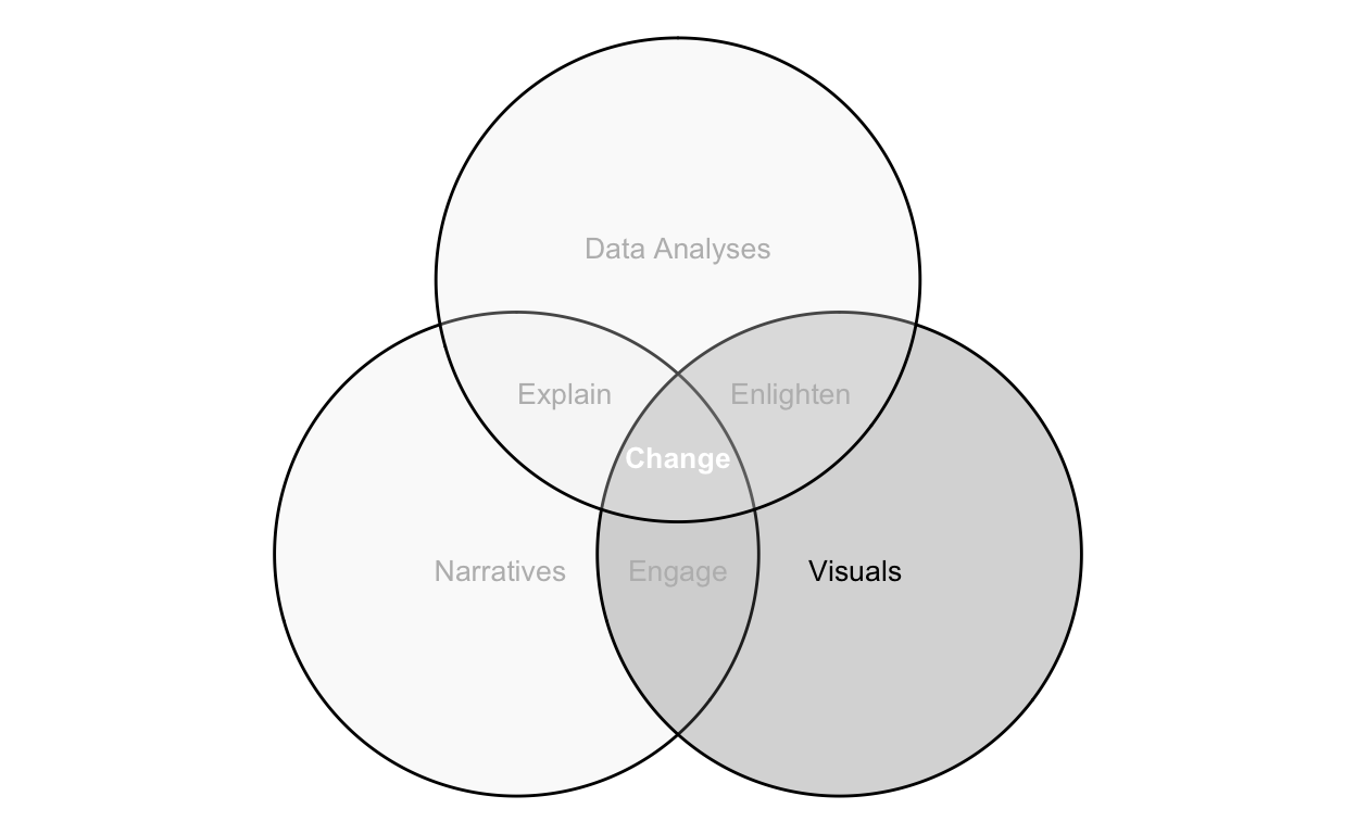
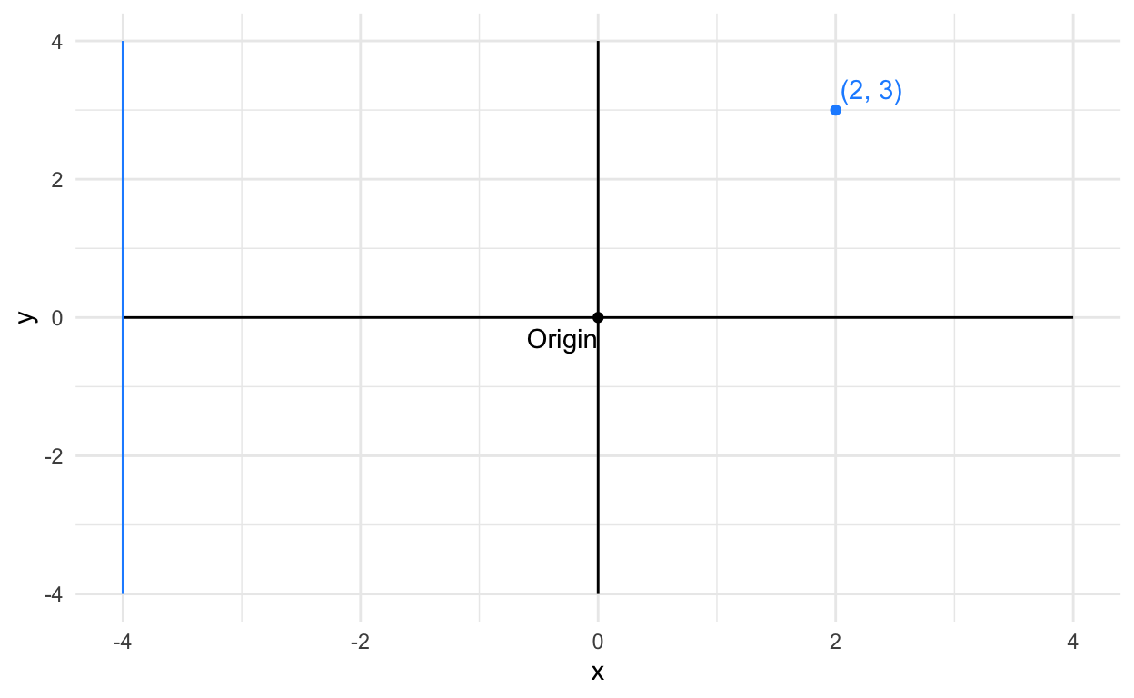
Slide 13
Again, I’m just specifying locations on a grid where I’m drawing various shapes and annotations.
# create graph object
ggplot() +

  # set non-data graph elements
  theme_minimal() +

  # choose cartesian coordinate system
  coord_cartesian(
    xlim = c(-4, 4),
    ylim = c(-4, 4),
  ) +

  # draw x and y axis
  geom_segment(
    mapping = aes(
      x = 0,
      y = -4,
      xend = 0,
      yend = 4
    ),
    color = 'black'
  ) +
    geom_segment(
    mapping = aes(
      x = -4,
      y = 0,
      xend = 4,
      yend = 0
    ),
    color = 'black'
  ) +

  # draw and label origin
  geom_point(
    mapping = aes(
      x = 0,
      y = 0
    ),
    color = 'black'
  ) +
  geom_text(
    mapping = aes(
      x = 0,
      y = 0,
      label = 'Origin'
    ),
    color = 'black',
    nudge_x = -0.3,
    nudge_y = -0.3
  ) +

  # draw and label blue point
  geom_point(
    mapping = aes(
      x = 2,
      y = 3
    ),
    color = 'dodgerblue'
  ) +
  geom_text(
    mapping = aes(
      x = 2,
      y = 3,
      label = '(2, 3)'
    ),
    color = 'dodgerblue',
    nudge_x = 0.3,
    nudge_y = 0.3
  ) +

  # draw blue vertical line
  geom_segment(
    mapping = aes(
      x = -4,
      y = -4,
      xend = -4,
      yend = 4
    ),
    color = 'dodgerblue'
  ) +
  labs(
    x = 'x',
    y = 'y'
  )
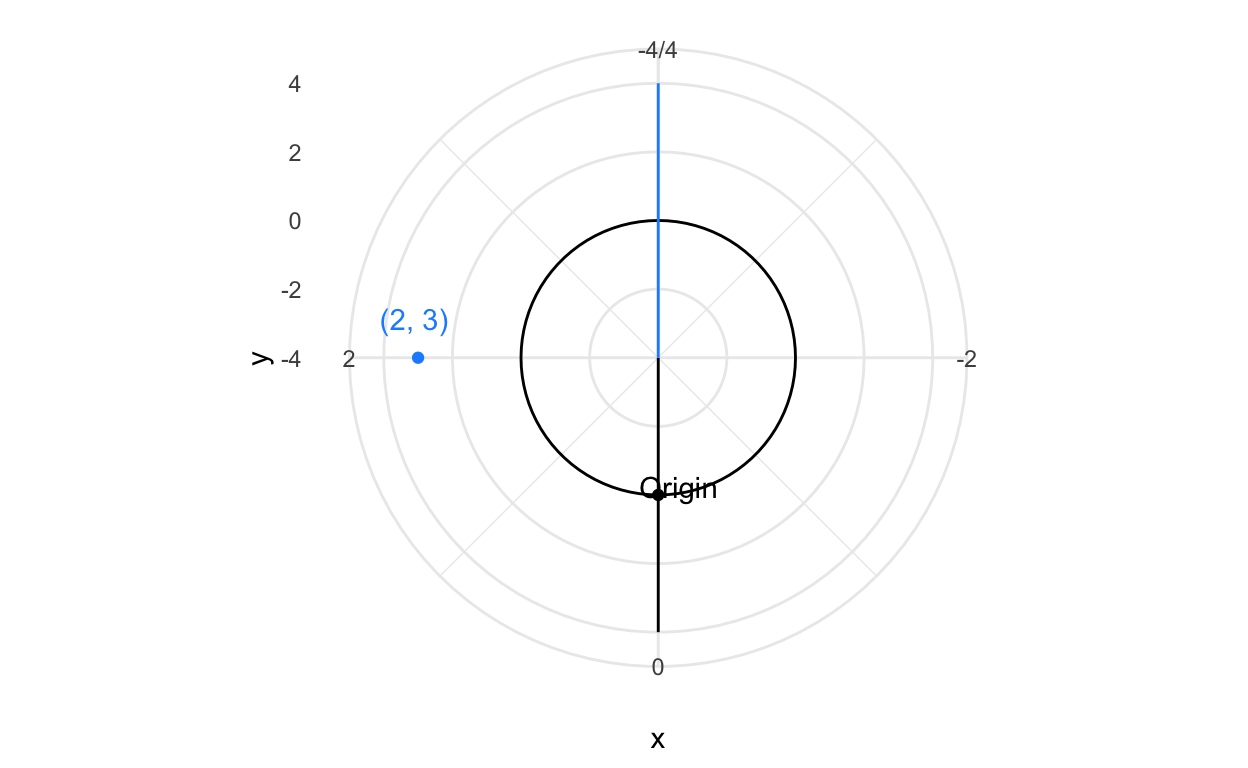
Slide 14
The graphic below is identical to the one above, except I’m using polar coordinates. Try to visually compare how the markings change across the two coordinate systems.
# create graph object
ggplot() +

  # set non-data graph elements
  theme_minimal() +

  # choose polar coordinate system
  coord_polar(
  ) +

  # draw x and y axis
  geom_segment(
    mapping = aes(
      x = 0,
      y = -4,
      xend = 0,
      yend = 4
    ),
    color = 'black'
  ) +
    geom_segment(
    mapping = aes(
      x = -4,
      y = 0,
      xend = 4,
      yend = 0
    ),
    color = 'black'
  ) +

  # draw and label origin
  geom_point(
    mapping = aes(
      x = 0,
      y = 0
    ),
    color = 'black'
  ) +
  geom_text(
    mapping = aes(
      x = 0,
      y = 0,
      label = 'Origin'
    ),
    color = 'black',
    nudge_x = -0.2,
    nudge_y = -0.2
  ) +

  # draw and label blue point
  geom_point(
    mapping = aes(
      x = 2,
      y = 3
    ),
    color = 'dodgerblue'
  ) +
  geom_text(
    mapping = aes(
      x = 2,
      y = 3,
      label = '(2, 3)'
    ),
    color = 'dodgerblue',
    nudge_x = 0.2,
    nudge_y = 0.2
  ) +

  # draw blue vertical line
  geom_segment(
    mapping = aes(
      x = -4,
      y = -4,
      xend = -4,
      yend = 4
    ),
    color = 'dodgerblue'
  ) +
  labs(
    x = 'x',
    y = 'y'
  )
Slide 15
To create a map, we need data to outline boundaries that we are familiar with. The grammar of graphics library includes some basic politial boundaries. Below we load those data, which are basically a group variable and, for each group, a set of x and y coordinates.
# get data of countries
countries <- map_data('world')
We’ll discuss encodings in a bit. But first, let’s see how the coordinate system alters how we view the same set of data. We’ll look at three projections of a spherical object (the earth) onto a 2-dimensional x, y plane. First, let’s draw these shapes onto a cartesian coordinate system.
p <-
  ggplot(
  data = countries,
  mapping = aes(
    x = long,
    y = lat
    )
  ) +
  geom_polygon(
    mapping = aes(
      group = group,
      ),
    fill = 'lightgray',
    color = 'black',
    lwd = 0.1
    ) +
  theme_minimal() +
  labs(x = '', y = '')


p_cartesian <- p

p_cartesian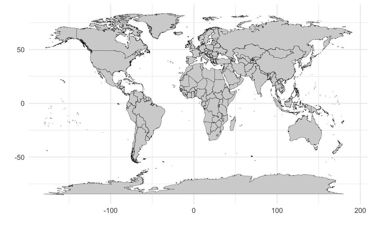
Next, compare how a different coordinate system, mercator coordinates, affects the shapes we see.
p_mercator <- p + coord_map('mercator', xlim = c(-180,180) )
p_mercator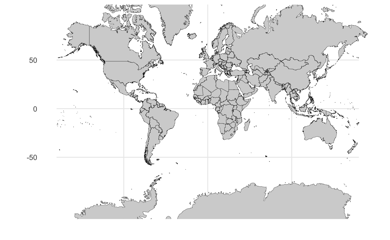
Finally, we’ll review and compare the above to an orthographic coordinate system.
p_ortho <- p + coord_map('ortho', orientation = c(41, -74, 0) )
p_ortho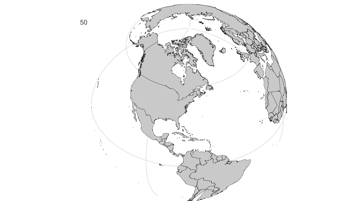
There is no single correct mapping of a sphere onto a 2-dimensional plane, each method has tradeoffs, and its complexity both depends on the task and is beyond the scope of this course.
Slide 16
Here, we demonstrate differences between raw data and a linear coordinate system with transforming the data into either its log or square root (two very common transformations) or transforming the coordinate system into those units.
Here’s our data:
d <-
  data.frame(x_linear = 1:10) %>%
  mutate(x_log10 = log(x_linear),
         x_sqrt = sqrt(x_linear))
And here are our transformations. We can first setup a base plot,
p <-
  ggplot(d) +
  scale_y_continuous(breaks = NULL) +
  theme_minimal() +
  theme(panel.grid.minor = element_blank()) +
  labs(x = '', y = '')
and then just modify it with the transformations:
# data linear, linear scale
p + geom_point(
  mapping = aes(
    x = x_linear,
    y = 0
  ),
  color = 'dodgerblue'
  ) +
  scale_x_continuous(
    n.breaks = 10,
    name = 'linear data, linear scale')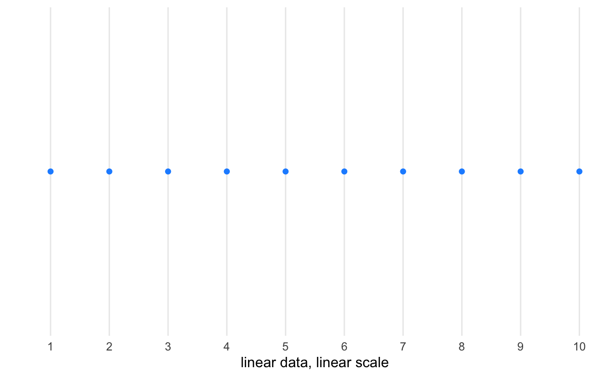
# data transformed to log, linear scale
p + geom_point(
  mapping = aes(
    x = x_log10,
    y = 0),
  color = 'dodgerblue') +
  scale_x_continuous(
    n.breaks = 10,
    name = 'log-transformed data, linear scale')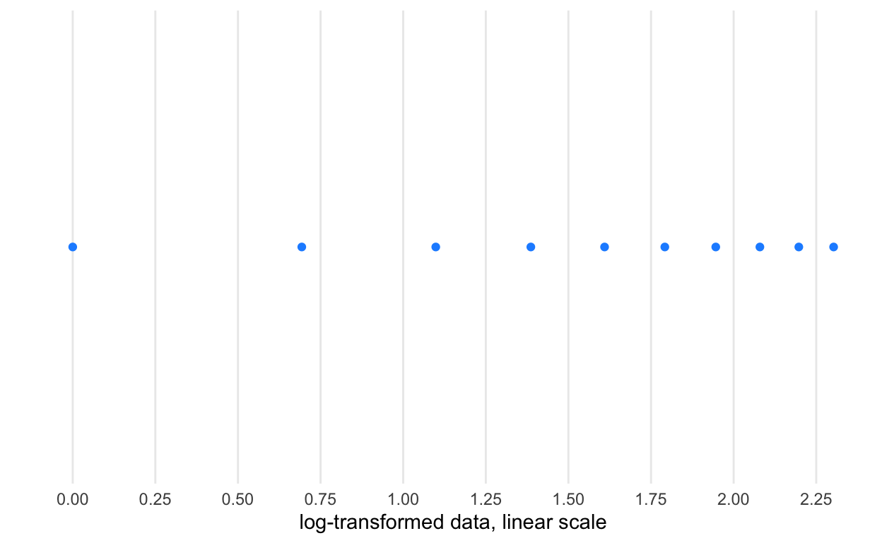
# linear data, log scale
p + geom_point(
  mapping = aes(
    x = x_linear,
    y = 0
    ),
  color = 'dodgerblue') +
  scale_x_log10(
    n.breaks = 12,
    name = 'linear data, log scale')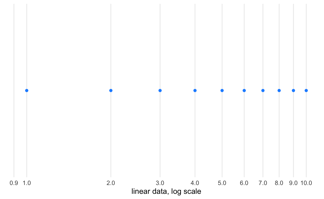
# data transformed to square root, linear scale
p + geom_point(
  mapping = aes(
    x = x_sqrt,
    y = 0),
  color = 'dodgerblue') +
  scale_x_continuous(
    n.breaks = 10,
    name = 'square-root-transformed data, linear scale')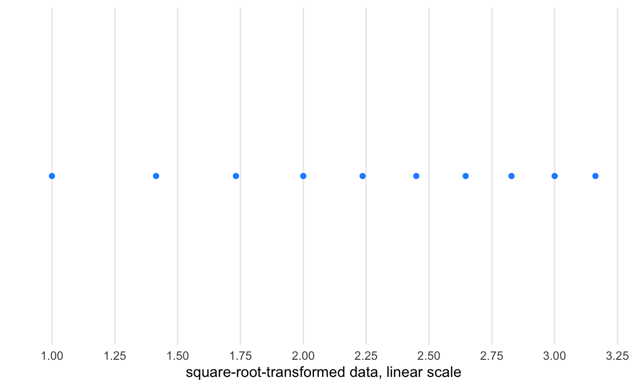
# linear data, square root scale
p + geom_point(
  mapping = aes(
    x = x_linear,
    y = 0
  ),
  color = 'dodgerblue') +
  scale_x_sqrt(
    n.breaks = 10,
    name = 'linear data, square-root scale')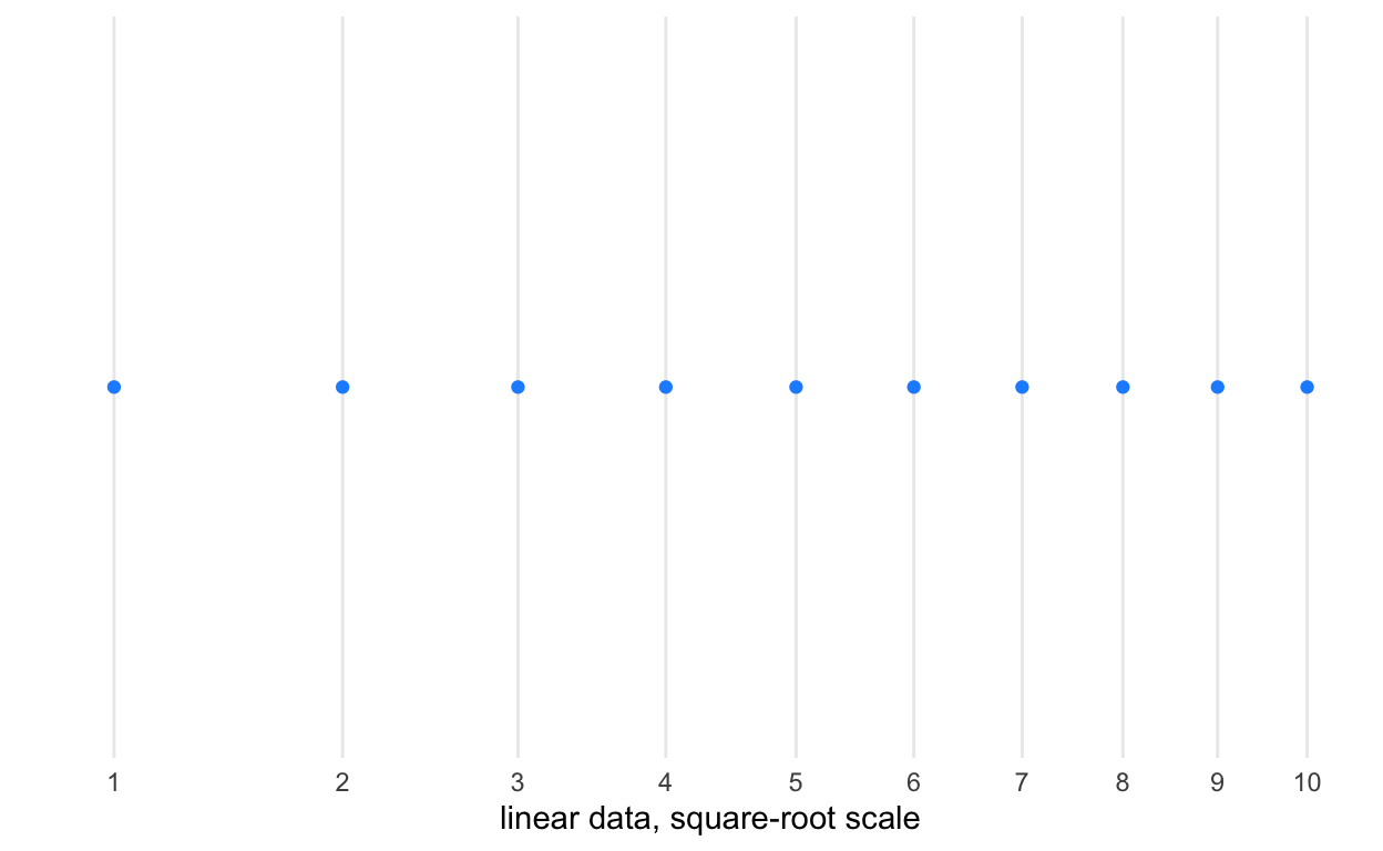
Slide 34
In this set of graphics, I introduce the importance of layers in graphics.
ggplot() +
  theme_void() +
  scale_x_continuous( limits = c(-5, 5) ) +
  scale_y_continuous( limits = c(-5, 5) ) +
  geom_point(
    mapping = aes(
      x = 0,
      y = 0),
    size = 50,
    color = 'orange') +
  geom_point(
    mapping = aes(
      x = 1,
      y = 1),
    size = 50,
    color = 'dodgerblue')
ggplot() +
  theme_void() +
  scale_x_continuous( limits = c(-5, 5) ) +
  scale_y_continuous( limits = c(-5, 5) ) +
  geom_point(
    mapping = aes(
      x = 1,
      y = 1),
    size = 50,
    color = 'dodgerblue') +
  geom_point(
    mapping = aes(
      x = 0,
      y = 0),
    size = 50,
    color = 'orange')
Slide 40
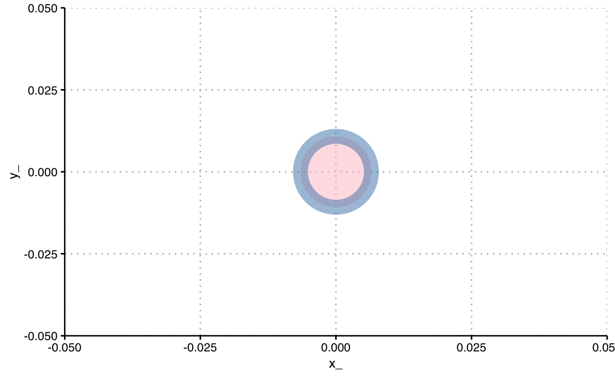
Just for ease, let’s set a custom default theme used for graphics.
theme_clean2 <-
  theme_clean() +
  theme(
    panel.grid.major.x = element_line(
      colour = 'gray',
      linetype = 'dotted'),
    plot.background = element_blank()
  )

theme_set(theme_clean2)
Let’s inspect a very simple mapping of data to a point, and consider various aspects of it.
d <- data.frame(x_ = 0, y_ = 0)

ggplot() +

geom_point(
  data = d,
  mapping = aes(
    x = x_,
    y = y_
  ),
  alpha = 0.5,
  color = 'steelblue',
  fill = 'pink',
  shape = 21,
  size = 20,
  stroke = 8
) 
Slide 42
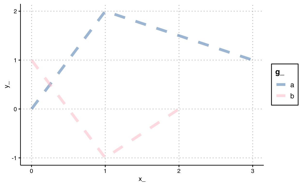
As with a point, let’s consider a basic mapping of data to a couple of lines.
d <- data.frame(

  x_ = c(0, 1, 3,
         0, 1, 2),

  y_ = c(0,  2, 1,
         1, -1, 0),

  g_ = c('a', 'a', 'a',
         'b', 'b', 'b')

  )

ggplot() +

geom_line(
  data = d,
  mapping = aes(
    x = x_,
    y = y_,
    group = g_,
    color = g_
  ),
  alpha = 0.5,
  linetype = 'dashed',
  size = 2
) +
scale_color_manual(
  breaks = c('a', 'b'),
  values = c('steelblue', 'pink')
)
Slide 44
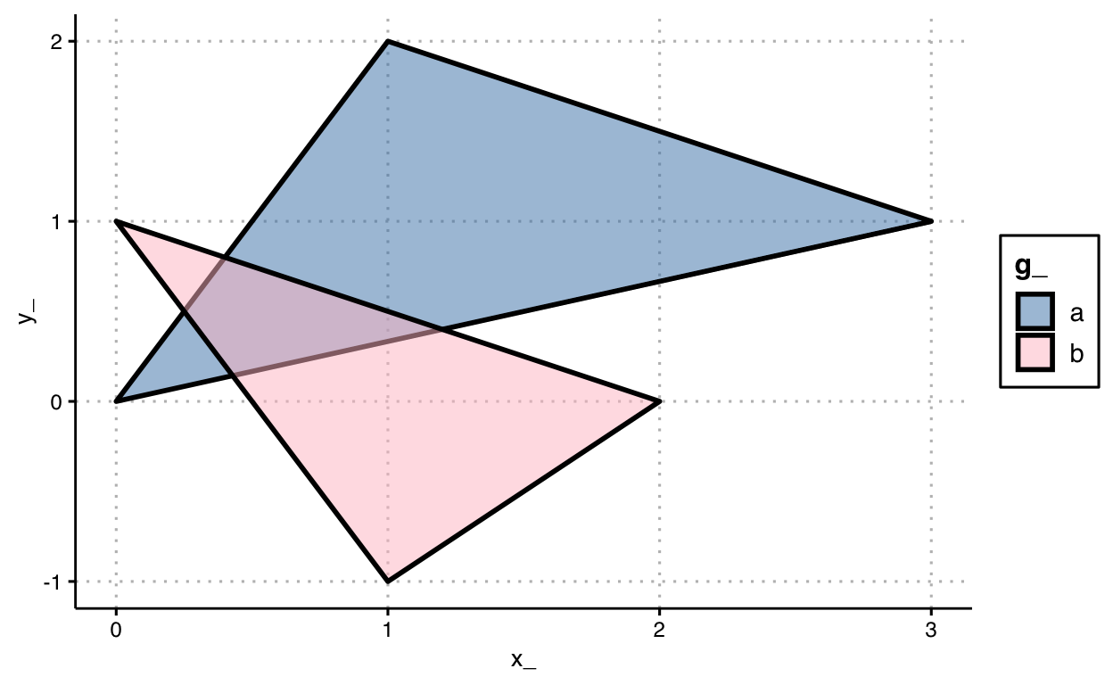
Finally, let’s use the same data as above, but draw a couple of areas or polygons.
ggplot() +

geom_polygon(
  data = d,
  mapping = aes(
    x = x_,
    y = y_,
    group = g_,
    fill = g_
  ),
  alpha = 0.5,
  color = 'black',
  linetype = 'solid',
  size = 1
) +
scale_fill_manual(
  breaks = c('a', 'b'),
  values = c('steelblue', 'pink')
)
Slide 56
We map data for longitude onto a visual channel, the x-axis of a plane, data for latitude onto the y-axis of a plane, and mark the observation as a point. The typology of this graphic is commonly categorized as a scatter plot.
# load data
df_trips <- read_csv('data/201901-citibike-tripdata.csv')

df_trips %>%
  # transform data
  distinct(`start station id`, .keep_all = TRUE) %>%

  # graph data
  ggplot() +
  coord_equal() +
  geom_point(
    mapping = aes(
      x = `start station longitude`,
      y = `start station latitude`
    )
  )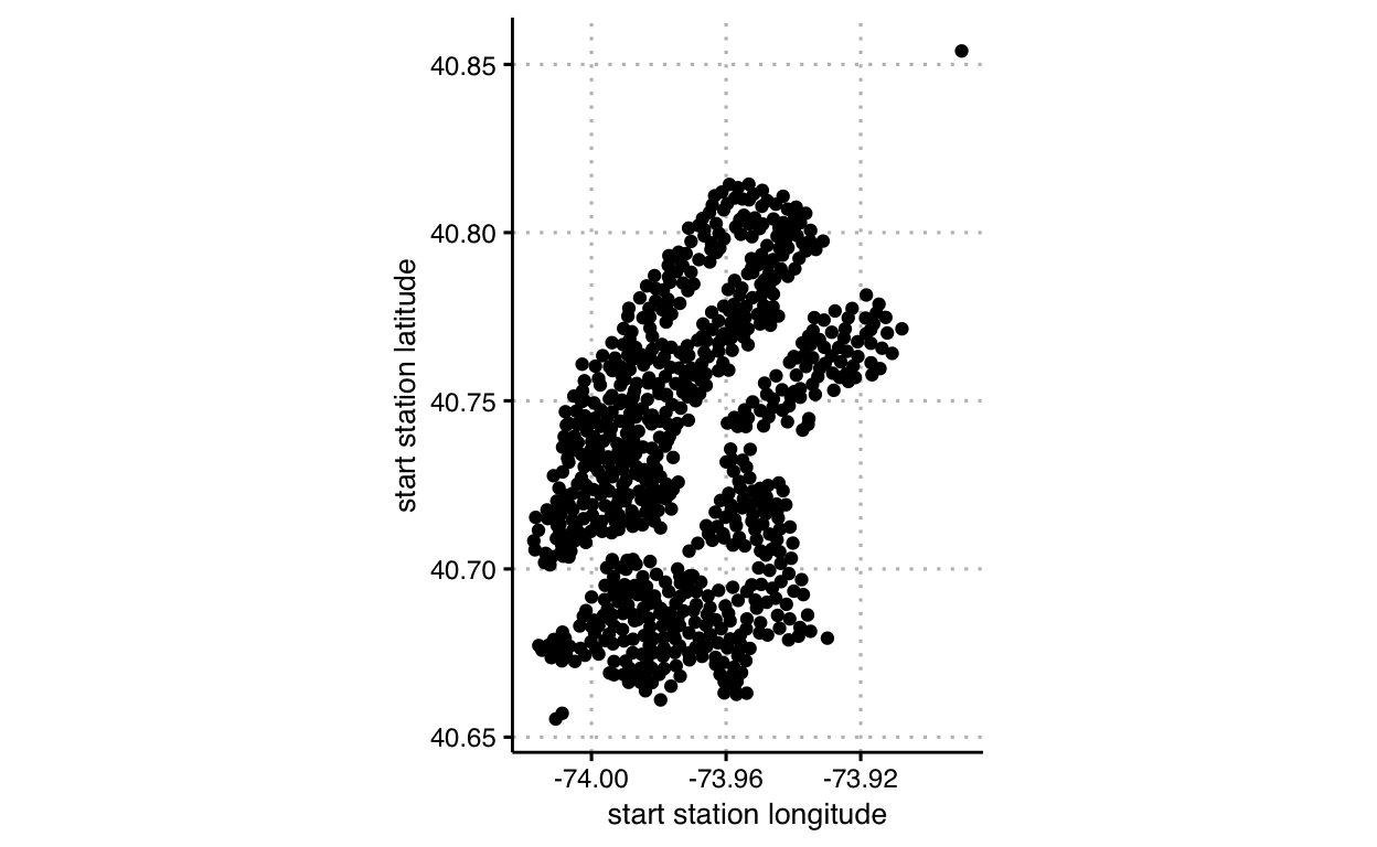
This combination of channels and markings generally enable comparisons between observations across two dimensions. The audience, thus, decodes the visual variables back to their data meaning. Notably, comparisons in each dimension use a common base line, making decoding more precise (less error prone) than other channels / markings (we’ll cover later). Also note, however, that accuracy in comparing decodings depends on how adjacent in space the two points are in the other dimension.
Slide 57
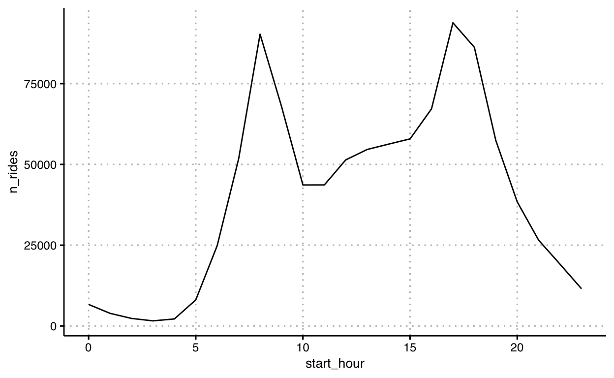
We map data for start hour onto the x-axis of a plane, data for number of rides (a transformed variable) onto the y-axis of a plane, and mark the series as a line. The type, or typology, of this graphic is commonly categorized as a line chart.
df_trips %>%
  # transform data
  mutate(start_hour = hour(starttime)) %>%
  group_by(start_hour) %>%
  summarise(n_rides = n()) %>%

  # graph data
  ggplot() +
  geom_line(
    mapping = aes(
      x = start_hour,
      y = n_rides
    )
  )
Slide 58
For the code to make this graphic, review last week’s code demonstration and discussion. Here’s the code again.
df_r <- df_trips %>%
  filter(!is.na(`start station id`)) %>%
  arrange(starttime) %>%
  group_by(bikeid) %>%
  mutate(
    rebalanced =
      if_else(row_number() > 1 &
             `start station id` != lag(`end station id`),
             TRUE, FALSE)
  ) %>%
  ungroup()

ggplot(data = df_r) +
  geom_bar(
    mapping = aes(x = rebalanced),
    stat = 'count'
  )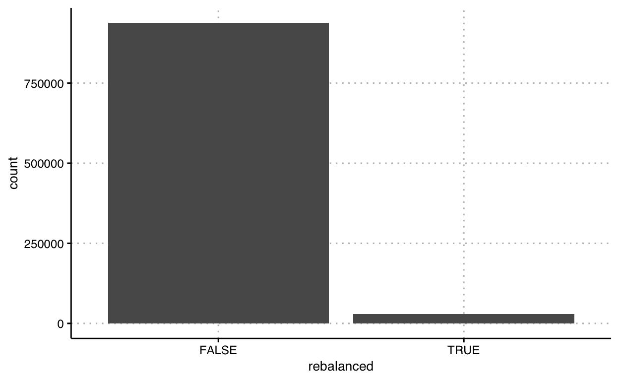
The type, or typology, of this graphic is commonly categorized as a bar chart or bar graph. But instead of remembering it by name, let’s understand it using Bertin’s visual variables. In Bertin’s terms, we mapped the variable rebalanced to the x-axis, and mapped a binned count (binned by true and false) onto the y-axis; and marked the location from a common baseline using a line segment (or proportional height rectangle, however you’d like to think about it).
The function we used to map counts onto a bar here, is actually a convenience function. Instead, we could just calculate the counts ourselves and map the counts to either a line segment or a rectangle.
Let’s do this for graphic related in mappings next.
Slide 59
Let’s map data for riders’ birth year onto the x-axis of a plane, data for count of observations at a given year onto the y-axis of a plane, and mark the length from the x-axis as line segments. Let’s review three approaches. Here’s one way to code this mapping:
df_trips %>%
  # transform data
  group_by(`birth year`) %>%
  summarise( count = n() ) %>%
  ungroup() %>%

  # graph data
  ggplot() +
  geom_segment(
    mapping = aes(
      x = `birth year`,
      y = 0,
      xend = `birth year`,
      yend = count
    ),
    lwd = 1
  )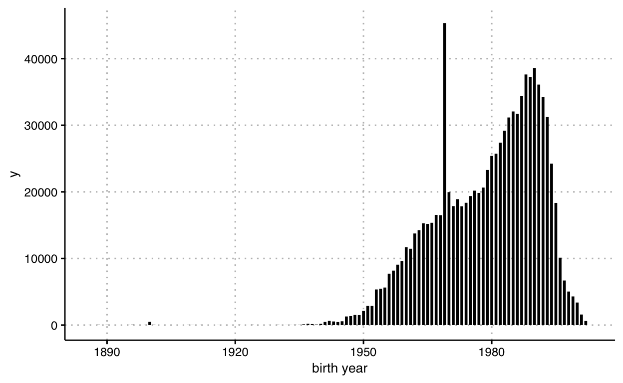
The lines have a constant width, which we set at 1 unit above, but we could also think of those marked line segments as marked rectangles, right? Here’s how we can code this graphic using rectangles as our marks. We can use geom_rect to draw rectangles:
df_trips %>%
  # transform data
  group_by(`birth year`) %>%
  summarise( count = n() ) %>%
  ungroup() %>%

  # graph data
  ggplot() +
  geom_rect(
    mapping = aes(
      xmin = `birth year` - 0.3,
      xmax = `birth year` + 0.3,
      ymin = 0,
      ymax = count
    )
  )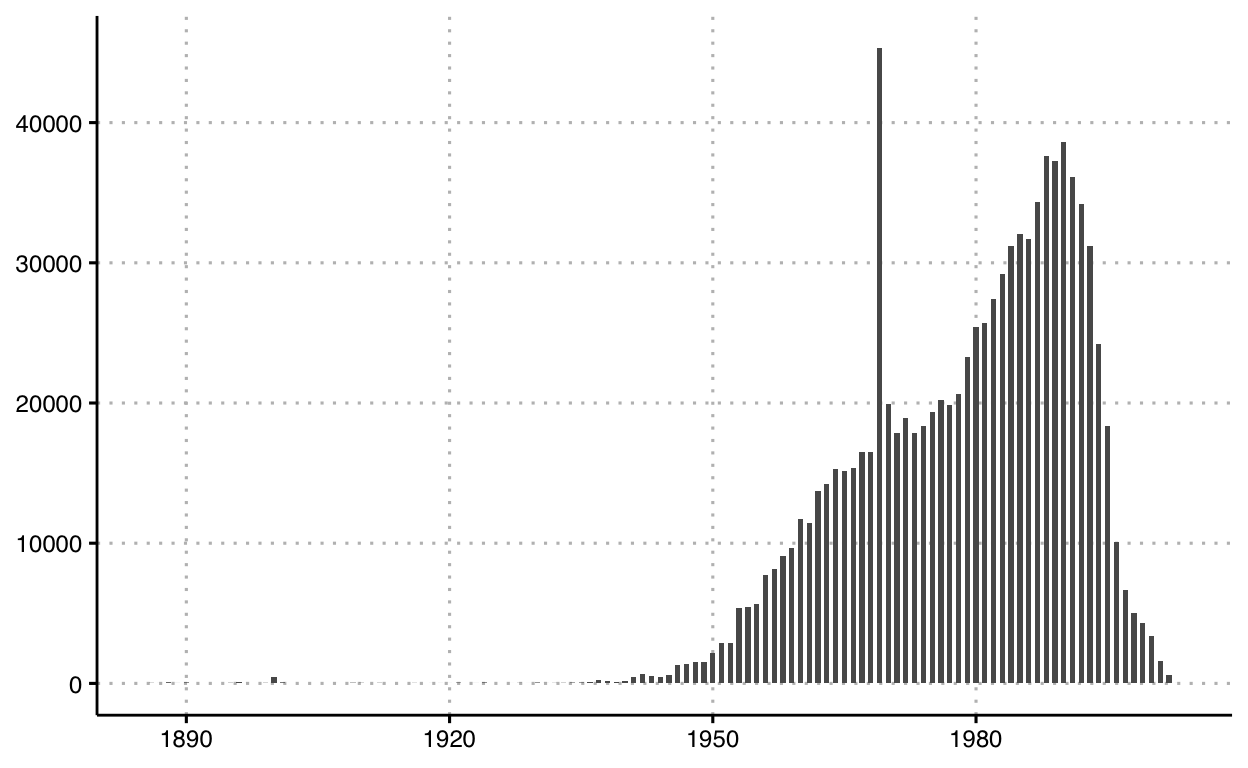
You’ll notice that although we did not specify stroke or fill colors, they show up. That’s because ggplot provides defaults to many parameters.
The type, or typology, of this graphic is commonly categorized as a histogram, and ggplot has a corresponding helper geometry: geom_histogram that bins the data and counts within each bin for you. Here’s a third approach using this helper function:
df_trips %>%
  ggplot() +
  geom_histogram(
    mapping = aes(
      x = `birth year`
    ),
    binwidth = 1,
    color = 'white'
  )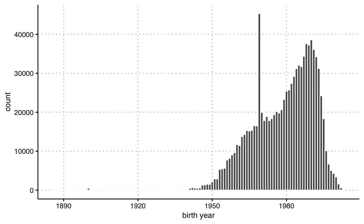
This combination of channels and markings enable our audience to compare the frequency across a range of one variable’s observed values. Again, in this comparison, our audience has the benefit of comparing the proportional length of each value against from a common base line (here, x-axis).
Slide 60
Next, let’s review an example mapping data to the x and y dimensions of a plane, marked by area. One such type of data we’re all familiar with are geographic boundaries shown on maps. First, we’ll load some data — in this case geographic boundaries of New York City — and transform it into a tidy data frame:
# load spatial data
spdf <- geojson_read('data/Borough_Boundaries.geojson', what = 'sp')
# transform spatial data to tidy dataframe
df_map <- fortify(spdf)
Finally, let’s graph the data as areas. As before, we have multiple ways to accomplish this. First, we’ll just use the basic drawing polygons (shapes):
ggplot() +
  theme(
    panel.background = element_blank()
  ) +
  geom_polygon(
    data = df_map,
    mapping = aes(
      group = group,
      x = long,
      y = lat
    ),
    fill = NA,
    color = 'black'
  ) +
  coord_equal()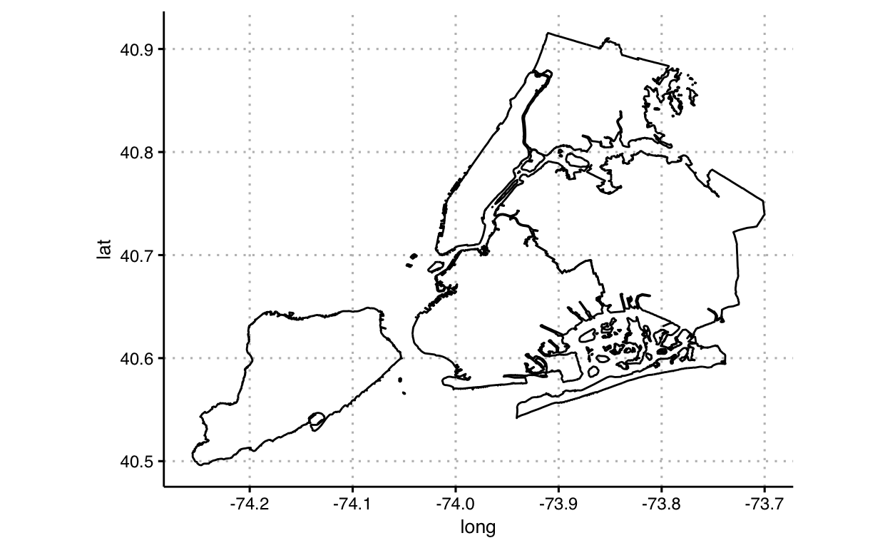
Next, let’s use helper functions, geom_map and coord_map, specific for geographic maps and handling projections:
ggplot() +
  theme(
    panel.background = element_blank()
  ) +
  coord_map(projection = 'mercator') +
  geom_map(
    data = df_map,
    map = df_map,
    mapping = aes(
      map_id = id,
      x = long,
      y = lat
    ),
    fill=NA,
    color = 'black'
  )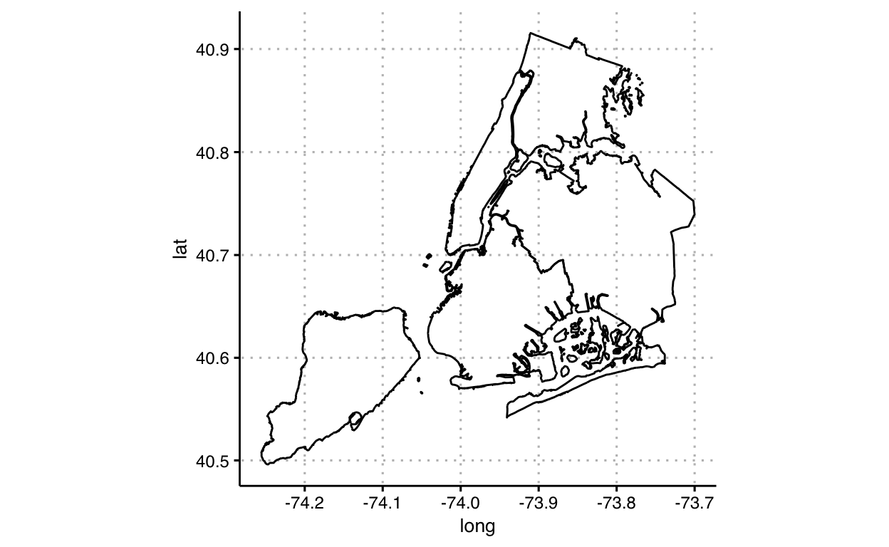
As mentioned previously, mapping spheres onto a planar surface are complex. Look at the help file for some of the projections available: ?mapproject
Slide 61
Next, we’ll take the above example, and map one attribute of color (luminance) to the areas. In the first case, we’ll take advantage of layering, and just map the entire background a light gray (compare with the above where we removed the background) and map each grouping of area to the fill color white:
ggplot() +
  theme(
    panel.background = element_rect(fill = '#eeeeee')
  ) +
  geom_polygon(
    data = df_map,
    mapping = aes(
      group = group,
      x = long,
      y = lat,
    ),
    fill = 'white',
    color = 'black'
  ) +
  coord_equal()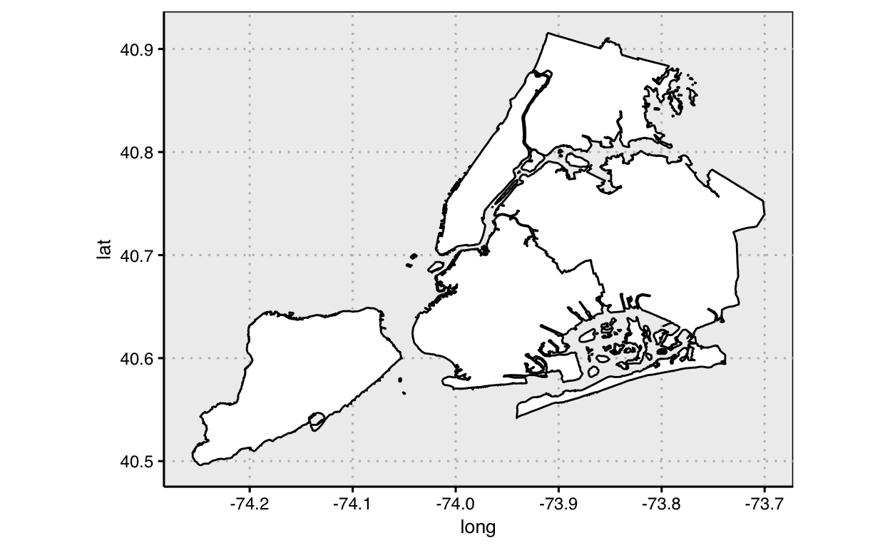
Notice that we did not actually need data above since each area used the same color; we were just visually distinguishing them from the background (which we New Yorker’s know to be water).
Slide 62
Next, let’s actually map data to the area fill color.
ggplot() +
  theme(
    panel.background = element_rect(fill = '#eeeeee')
  ) +
  geom_polygon(
    data = df_map,
    mapping = aes(
      group = group,
      x = long,
      y = lat,
      fill = factor(id)
    ),
    color = 'black'
  ) +
  coord_equal()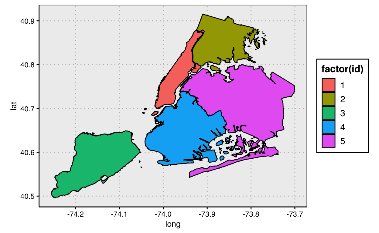
Notice we moved the parameter called fill inside the function aes() and assigned fill to a data variable, the id of the area or group in the data frame. Also note, we did not specify what colors we wanted to assign for each data group; thus ggplot used default values. We can assign our own specific attributes of color to the fill by including a scale for fill: e.g., scale_fill_manual(). We’ll do this later.
Slide 63
Let’s keep practicing mapping data to other channels and visual elements. We’ll start with our example on slide 35, and map another data variable, number of rides from each start station to another visual channel, point size. First, we’ll need to transform the data to obtain this variable, then map the variable onto size.
df_trips %>%

  # transform data
  group_by(`start station id`) %>%
  mutate( n_rides = n() ) %>%
  slice(1) %>%

  # graph data
  ggplot() +
  coord_equal() +
  geom_point(
    mapping = aes(
      x = `start station longitude`,
      y = `start station latitude`,
      size = n_rides
    ),
    shape = 21,
    fill = '#eeeeee',
    color = '#000000'
  )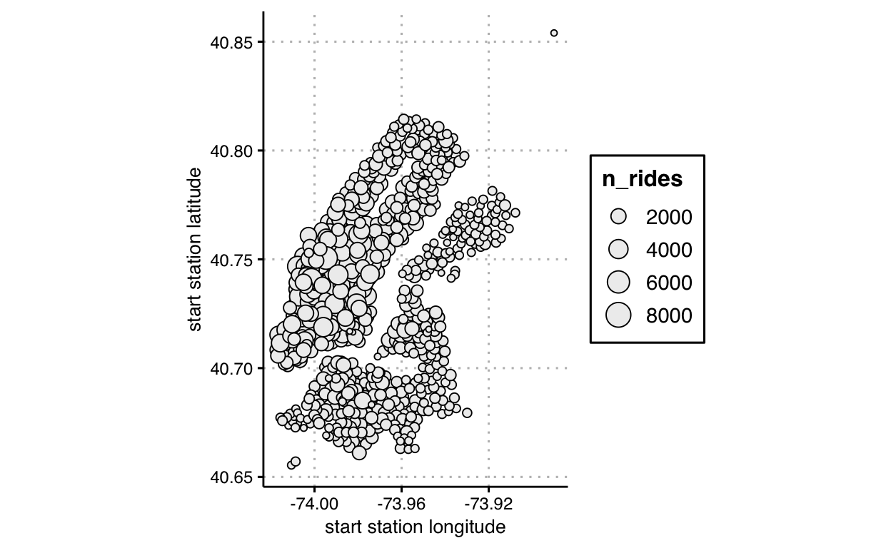
Notice that, as above when we mapped an area id to fill without specifyig a scale for fill color, here we did not specify any scale for size. Defaults, again, are setup when we do not specify this parameter, but we can, and should, specify a scale for size too: see e.g., scale_size_manual. The typology of this graphic is commonly categorized as a bubble chart.
Slide 64
Instead of mapping number of rides to size, let’s map that transformed data variable to fill color and, this time, specify a scale using scale_fill_gradient.
df_trips %>%

  # transform data
  group_by(`start station id`) %>%
  mutate(n_rides = n()) %>%
  slice(1) %>%

  # graph data
  ggplot() +
  coord_equal() +
  scale_fill_gradient(low = '#ffffff', high = '#000000') +
  geom_point(
    mapping = aes(
      x = `start station longitude`,
      y = `start station latitude`,
      fill = n_rides
    ),
    shape = 21,
    color = '#000000',
    size = 2,
    lwd = 0.1
  )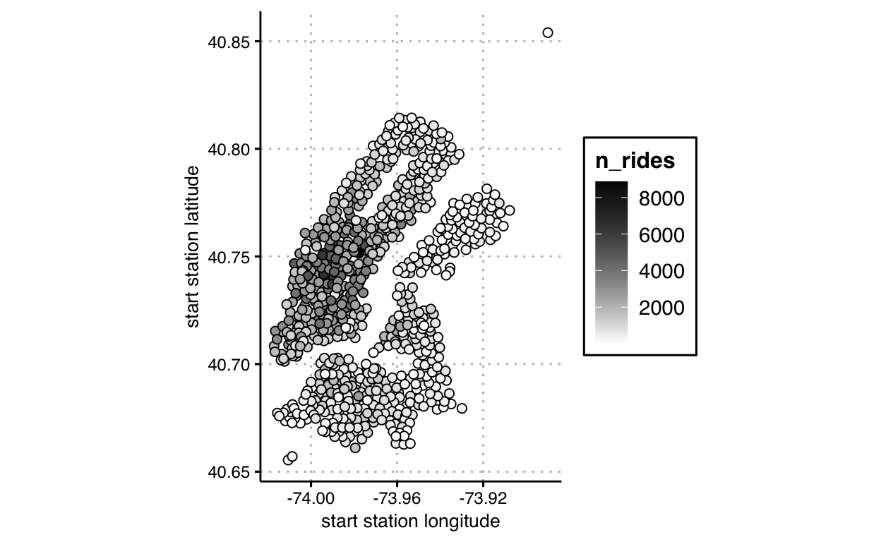
Do you find that either mapping, size or fill, seems more effective than the other in this context? In answering, try to articulate why. Here this is akin to a scatter plot, but with extra features; we’re already beginning to venture into charts that are not cleanly classified by a particular chart type. We can easily keep extending ideas because we’re thinking in terms of mapping data to layers of visual variables, not chart types.
Slide 65
Now let’s take advantage of layering in the grammar of graphics and continue making our graphics more interesting. Let’s use different data for each layer in the next graphic. For the first layer, we’ll map the geographic boundaries and shade the areas. For a second layer, we’ll transform the data for a new calculation, and map that transformed data to fill color, as before. We’ll calculate balance or difference between number of rides starting from, and leaving, each station.
First, let’s transform our data to get our new variable:
d_station_balance <-

  df_trips %>%

  pivot_longer(
    cols = c(`start station id`, `end station id`),
    names_to = 'start_end',
    values_to = 'station_id'
  ) %>%

  group_by(station_id) %>%
  summarise(
    imbalance = sum( if_else(start_end == 'start station id', -1, +1) )
  ) %>%

  ungroup() %>%

  right_join(
    df_trips %>%
    select(
      `start station id`,
      `start station longitude`,
      `start station latitude`) %>%
    unique(),
    by = c('station_id' = 'start station id')
  )
Note that both data sets — df_map and d_station_balance — include common values to map onto the x and y axes. Now, map the two data sets onto different visual layers, as explained:
ggplot() +
  theme(
    panel.background = element_rect(fill = '#eeeeee')
  ) +
  coord_equal(
    xlim = range(d_station_balance$`start station longitude`),
    ylim = range(d_station_balance$`start station latitude`)
    ) +

  # first data mapping
  geom_polygon(
    data = df_map,
    mapping = aes(
      group = group,
      x = long,
      y = lat
    ),
    fill = 'white',
    color = 'black'
  ) +

  # second data mapping
  scale_fill_gradient2(low = 'blue', mid = 'white', high = 'red') +
  geom_point(
    data = d_station_balance,
    mapping = aes(
      x = `start station longitude`,
      y = `start station latitude`,
      fill = imbalance
    ),
    shape = 21,
    color = '#000000',
    size = 1.5,
    lwd = 0.1
  )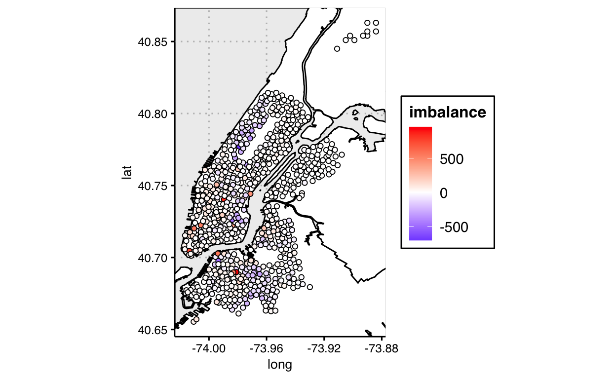
The typology of this, and similar graphics, isn’t clear: some might categorize this as, say, a proportional symbol map. But not knowing an agreed-upon name is no hindrance to us mapping whatever data to whatever visual variables, and layering them however we’d like. We’re not thinking in terms of charts to choose; we’re just drawing what makes sense for the point we wish to explore or communicate with our audience.
Once we can create anything we can dream up, discovering what is effective for our purpose becomes the hard part.