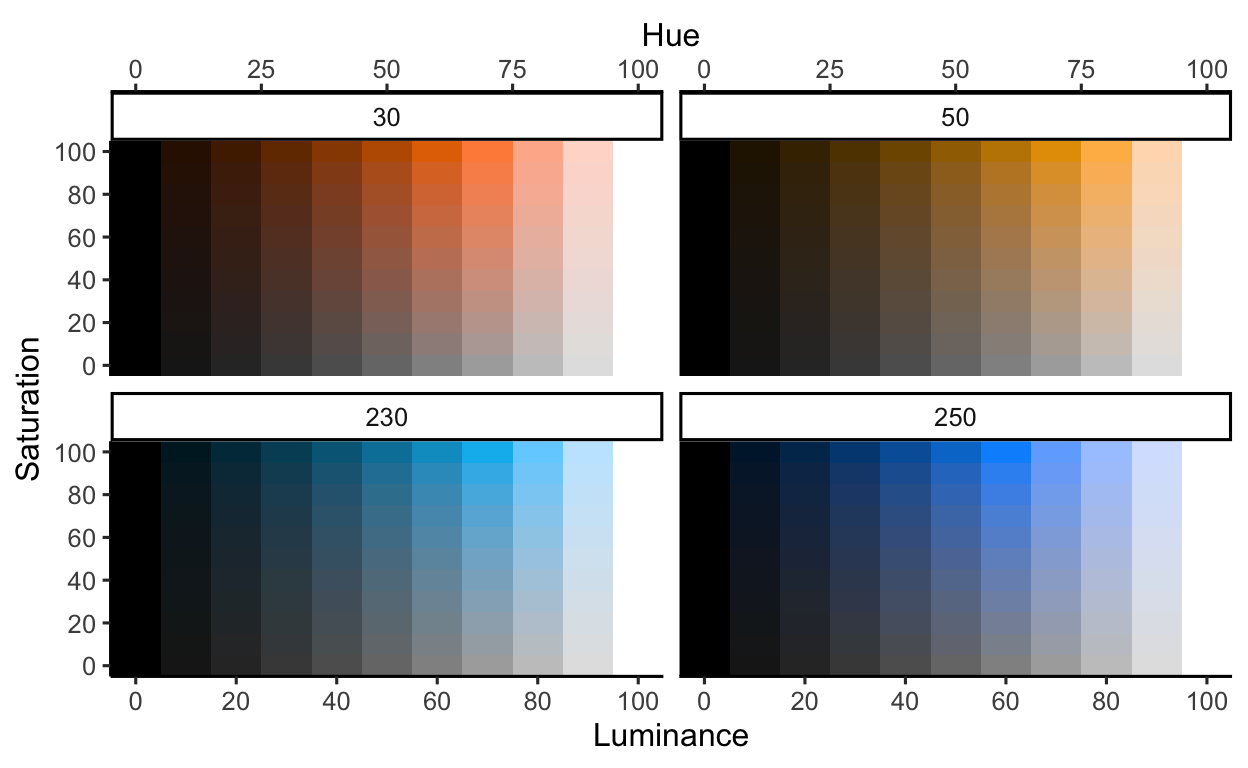
Slide 22
Note that in this example, we do not really need to use rescale for our variables H, S, and L because they are already in the correct visual range. In other circumstances, however, our raw data may (most likely) be on a different scale than the visual channels of color, so we’ll need to rescale the raw data to the visual channel.
Also note, to use a function hsluv_hex() inside the mapping function ( mapping = aes() ) we need to use the corresponding scale for that parameter called identity (here, scale_fill_identity()) which just means use the exact value we gave it.
library(HSLuv)

df <- expand.grid(
  H = c(30, 50, 230, 250),
  S = seq(0, 100, by = 10),
  L = seq(0, 100, by = 10))

library(scales)

df <- df %>%
  mutate(
    H = rescale(H, from = c(0, 360), to = c(0, 360) ),
    S = rescale(S, from = c(0, 100), to = c(0, 100) ),
    L = rescale(L, from = c(0, 100), to = c(0, 100) ))

ggplot(df) +

  facet_wrap(~ H ) +

  scale_x_continuous(
    name = 'Luminance',
    breaks = seq(0, 100, by = 20),
    expand = c(0,0),
    sec.axis = sec_axis(~., name = 'Hue')) +

  scale_y_continuous(
    name = 'Saturation',
    breaks = seq(0, 100, by = 20),
    expand = c(0,0)) +

  scale_fill_identity() +

  geom_raster(
    mapping = aes(
      x = L,
      y = S,
      fill = hsluv_hex(H, S, L)),
    )
Slide 26
Here, we demonstrate partial transparency. Note that we can tell that multiple circles are stacked, but we can’t really tell which circles are on top.
ggplot() +
  theme_void() +
  coord_equal() +
  ggforce::geom_circle(
    mapping = aes(
      x0 = seq(from = 0, to = 1, length.out = 5),
      y0 = c(0, .1, .2, .4, .8),
      r = 1),
    fill = "#000000",
    alpha = 0.4)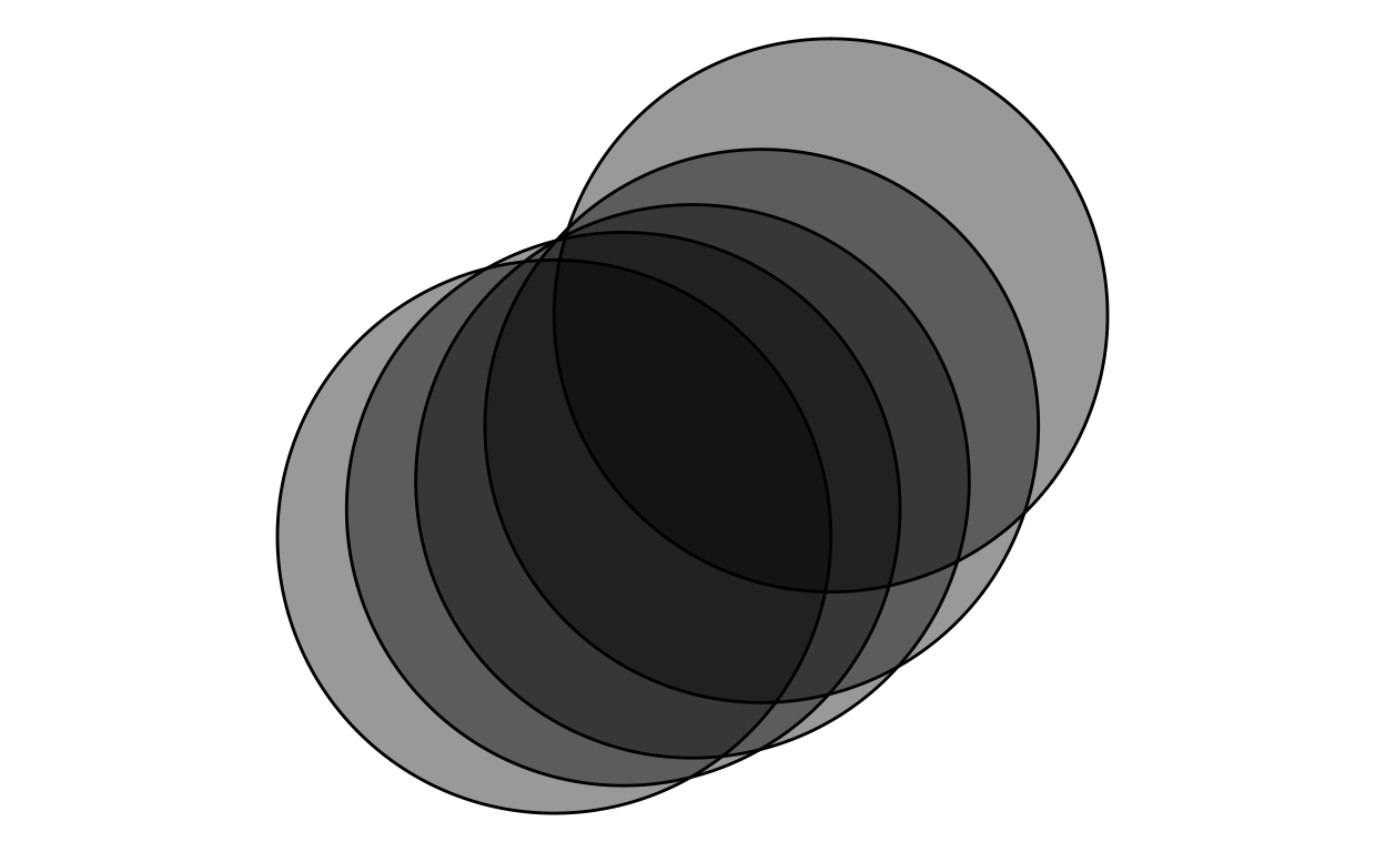
Slide 27
When we want to understand the density of points that are close together, and thus, are overplotted, we can adjust the opacity (alpha) to see this density.
x <- rnorm(1000)
y <- rnorm(1000)

ggplot() +
  theme_void() +
  scale_x_continuous(limits = c(-5, 5)) +
  scale_y_continuous(limits = c(-5, 5)) +
  geom_point(
    mapping = aes(
      x = x,
      y = y),
    size = 4,
    color = "black",
    alpha = 0.2)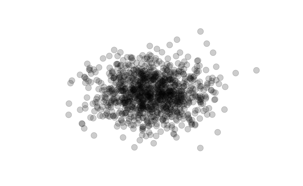
Slide 28
This approach can cause problems when we also map categorical information to something like hue. Note this example where we set two colors, orange and blue, but setting partitial transpaency causes a new color that does not have meaning corresponding to our categories. Yikes!
ggplot() +
  theme_void() +
  scale_x_continuous(limits = c(-5, 5)) +
  scale_y_continuous(limits = c(-5, 5)) +
  geom_point(
    mapping = aes(
      x = 0,
      y = 0),
    size = 50,
    color = "orange",
    alpha = 0.4) +
  geom_point(
    mapping = aes(
      x = 1,
      y = 1),
    size = 50,
    color = "dodgerblue",
alpha = 0.4) 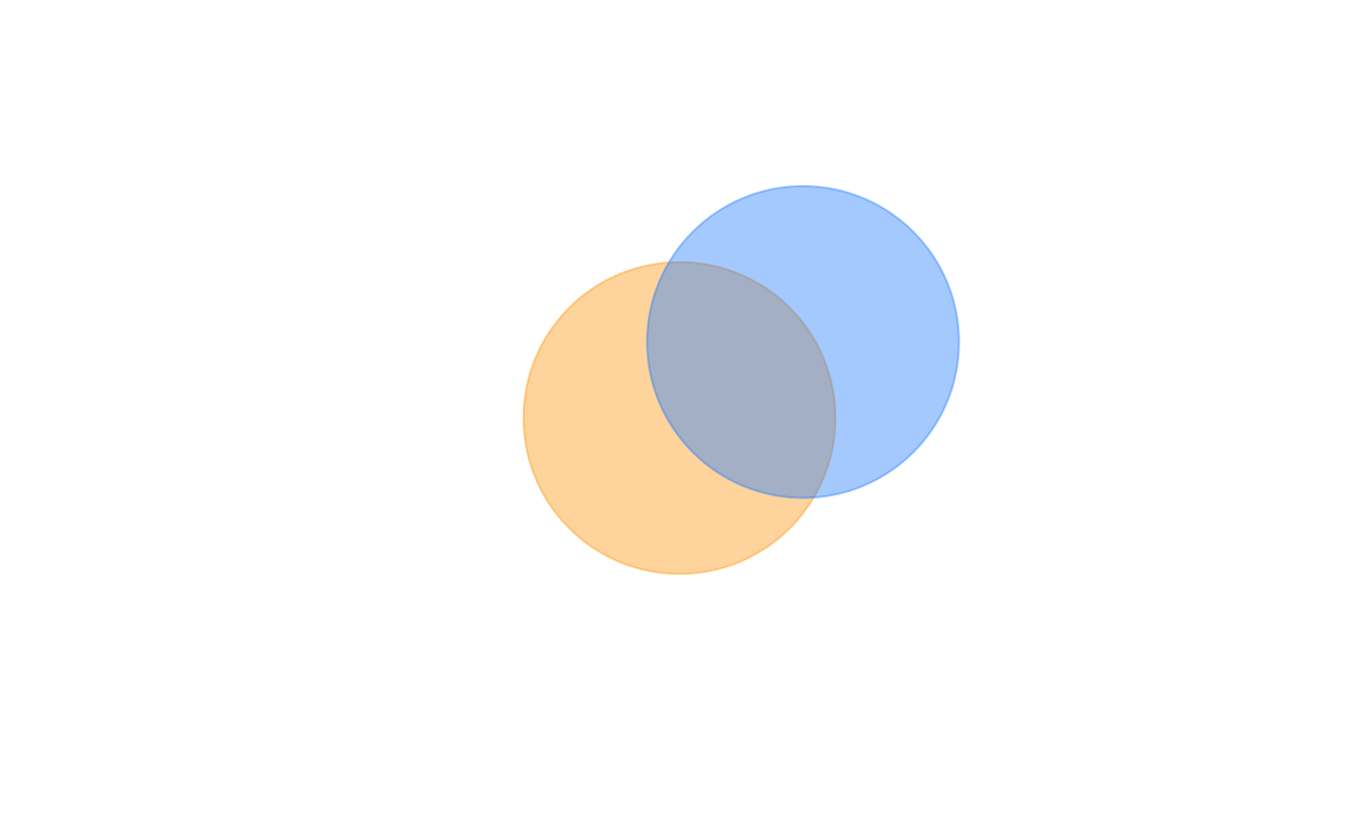
Slides 61-62
Inspecting how we calculate y_, you’ll see that while it follows the function of the square of x_, we add noise that does not depend on the value of x_: instead that variation is rnorm(), a normal distribution with a mean of zero and a standard deviation of 3. Thus, the variation across x_ will be the same.
# reproducibility
set.seed(TRUE)

# create dummy data
n <- 100
x_ <- seq(from = -10, to = 10, length.out = n) + rnorm(n)
y_ <- x_ ^ 2 + rnorm(n, sd = 3)

d <- data.frame(x_, y_)
Despite this, our human minds tend to compare each point using the shortest distance from the shortest path to the blue line. But that’s not correct. Instead, we need to compare the distance of the point from the line where it shares the same value of x.
To help our audience draw the correct comparison, we can use the principle of connection to connect the point to the line along the same x values. Uncomment the code below to see how this helps.
ggplot(data = d) +

# un-comment the below code to add the line segments

# geom_segment(
#     mapping = aes(
#       x = x_,
#       y = y_,
#       xend = x_,
#       yend = x_^2
#     ),
#     lwd = 0.5,
#     color = "#333333"
#   ) +

geom_line(
  mapping = aes(
    x = x_,
    y = x_^2
  ),
  color = "steelblue",
  lwd = 0.6,
  alpha = 1
) +

geom_point(
  mapping = aes(
    x = x_,
    y = y_
  ),
  size = 2,
  shape = 21,
  fill = "pink"
) +

scale_x_continuous(
  name = "",
  breaks = seq(-11, 11, by = 2)
) +

scale_y_continuous(
  name = "y",
  breaks = seq(0, 120, by = 20)
) +

annotate(
  'text',
  x = 0, y = 20,
  label = as.character(expression(paste("y = ", (x^2)))),
  color = "steelblue",
  size = 12/.pt,
parse = TRUE) 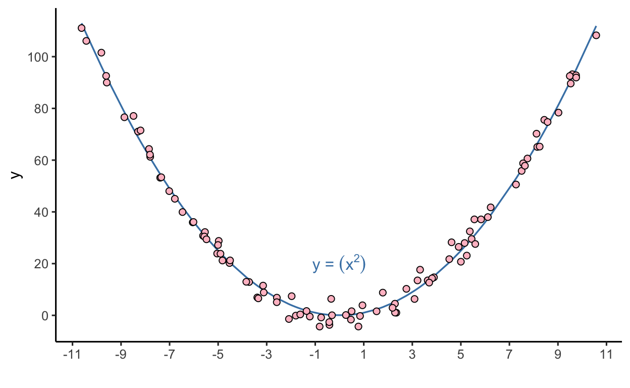
Now, there may be even better approaches. If what we want to compare are the distances, then we can transform the data to map those distances directly, shown in the slides, like so:
ggplot(data = d) +

  geom_segment(
    mapping = aes(
      x = x_,
      y = 0,
      xend = x_,
      yend = y_ - x_^2
    ),
    lwd = 0.5,
    color = "#333333"
  ) +

  geom_hline(
    yintercept = 0,
    color = "steelblue",
    lwd = 0.6
  ) +

  geom_point(
    mapping = aes(
      x = x_,
      y = y_ - x_^2
    ),
    size = 2,
    shape = 21,
    fill = "pink"
  ) +

  scale_x_continuous(
    name = "x",
    breaks = seq(-11, 11, by = 2)) +
  scale_y_continuous(
    name = "Residuals (point - line | x)",
breaks = seq(-10, 10, by = 1)) 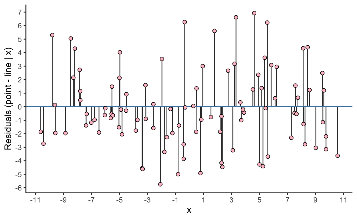
Of note, I did not (yet) show you the interactive code yet that was used to make the slide version: in time, in time.