libraries
library(tidyverse)
library(ggiraph)
library(patchwork)
Slide 21 — drawing static graphic with ggplot
First, we’ll load the data for our field boundaries and fences.
fields <- readRDS("data/outfields.rds")
fields <-
  fields %>%
  mutate(
    is_infield = ifelse(id > 30, TRUE, FALSE),
    ysh = -ysh
  ) %>%
  group_by(id) %>%
  mutate(
    xshend = lead(xsh, default = last(xsh)),
    yshend = lead(ysh, default = last(ysh)),
  ) %>%
  ungroup()

fences <- readRDS("data/fences.rds")
fences <- fences %>%
  mutate(ysh = -ysh) %>%
  group_by(id) %>%
  mutate(
    xshend = lead(xsh, default = last(xsh)),
    yshend = lead(ysh, default = last(ysh)),
  ) %>%
  ungroup()
Next, we’ll draw a static grammar of graphics plot of thse. For the boundaries, we aren’t filling in the polygons, so we’ll map the data to paths. For the infield, we want it colored like dirt, so we’ll map those data to a polygon that we can assign a fill color.
gg_boundaries <-
  ggplot() +
  theme_void() +
  coord_equal() +
  geom_segment(
    data = subset(
      fields,
      is_infield == FALSE),
    mapping = aes(
      x = xsh, xend = xshend,
      y = ysh, yend = yshend,
      group = id),
    color = '#000000',
    alpha = 0.5) +

  geom_polygon(
    data = subset(
      fields,
      is_infield == TRUE),
    mapping = aes(
      x = xsh,
      y = ysh,
      group = id),
    fill = '#FAD9B4',
    color = '#FAD9B4')

gg_boundaries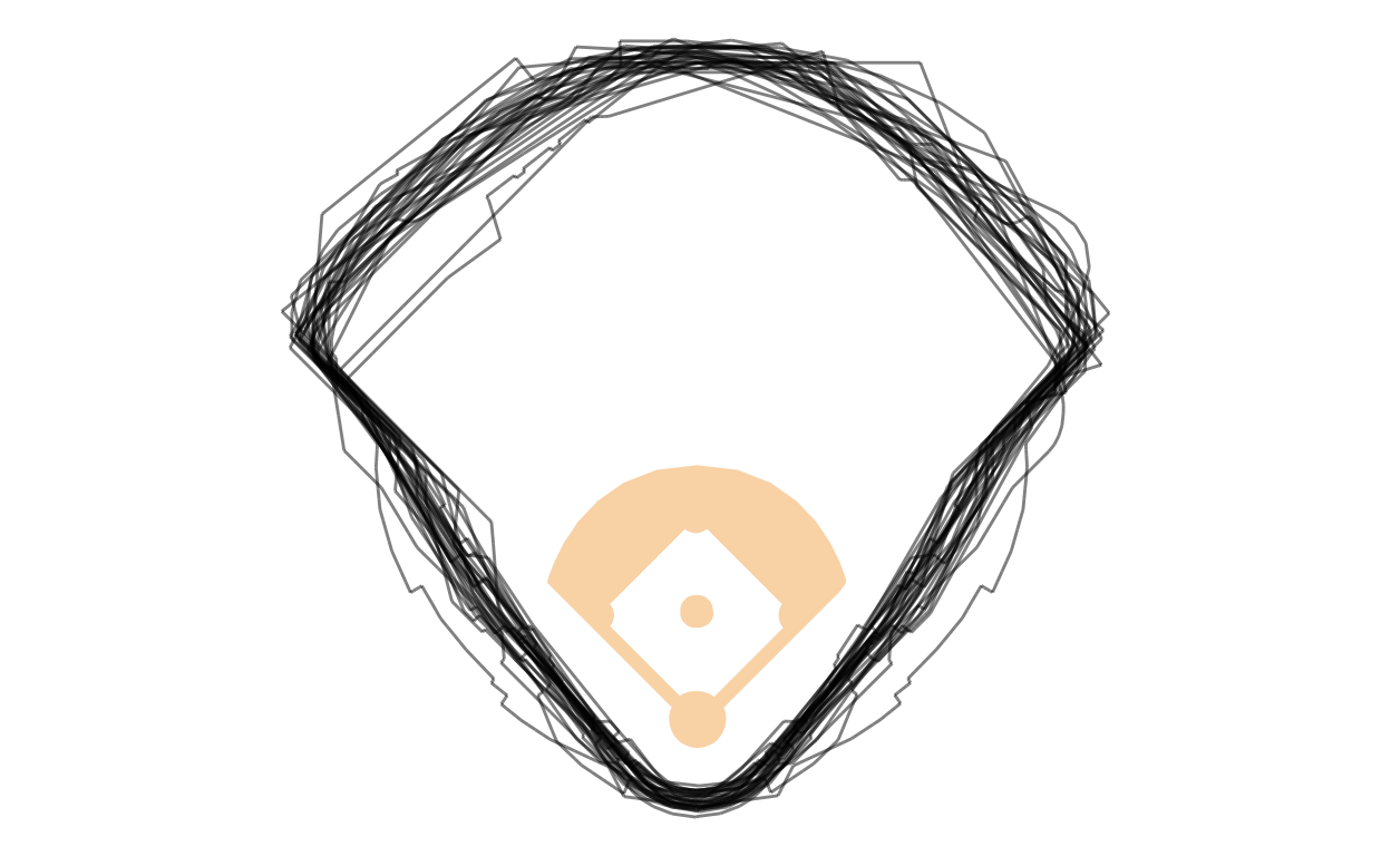
Slide 22 — interactive with ggplot + ggiraph
Next, we’ll convert our static ggplot graphic to interactivity. Now we could just wrap the ggplot object, here gg_boundaries, inside the function girafe and let the software choose default interactivity for us. But it won’t suit our purpose. So, instead, we also specify options inside girafe that let’s us customize what the interactivity looks like using css styles that will be applied to things our pointer hovers over, and other svg objects and the remaining interactive objects that are not hovered over. More specifically, we change the stroke width and opacity.
library(ggiraph)

gg_boundaries <-
  ggplot() +
  theme_void() +
  coord_equal() +
  geom_segment_interactive(
    data = subset(
      fields,
      is_infield == FALSE),
    mapping = aes(
      x = xsh, xend = xshend,
      y = ysh, yend = yshend,
      group = id,
      tooltip = id,
      data_id = id
      ),
    color = '#000000',
    alpha = 0.5) +

  geom_polygon(
    data = subset(
      fields,
      is_infield == TRUE),
    mapping = aes(
      x = xsh,
      y = ysh,
      group = id),
    fill = '#FAD9B4',
    color = '#FAD9B4')

girafe(
  code = print(gg_boundaries),
  options = list(
    opts_hover(
      css = 'stroke-width:3;'),
    opts_hover_inv(
      css = 'stroke-opacity:0.1;')
    )
  )
Slide 24 — combining interactive objects sharing data keys
Building on the earlier graphic, we create another ggplot interactive object almost identical to the above one, except this one is for the height of outfield fences. Of note, we use a data_id in this graphic just like in the earlier graphic so that the common boundary and fence heights work together.
The last step is to pass them together into the girafe function. We use one more package to make it easy for us to organize where they are in relation to each other: patchwork. With that package, we can use math-like symbols, among other many other conveniences. Here we ue the divide symbol (/) to place one graphic on top of the other.
gg_fences <-
    ggplot() +
    theme_void() +
    theme( axis.text.x = element_text() ) +
    coord_equal() +
    scale_x_continuous(
      breaks = c(100, 300, 500),
      labels = c("Left Field",
                 "Center Field",
                 "Right Field")) +
    geom_segment_interactive(
      data = fences,
      mapping = aes(
        x = xsh, xend = xshend,
        y = ysh, yend = yshend,
        group = id,
        tooltip = id,
        data_id = id),
      color = 'black',
      alpha = 0.5)

girafe(
  code = print(gg_fences / gg_boundaries),
  options = list(
    opts_hover(
      css = 'stroke-width:3;'),
    opts_hover_inv(
      css = 'stroke-opacity:0.1;')
    )
  )
Slide 26 — linking graphics with tables
Another option that we may find useful is linking graphics with tables. One easy approach is to create a key inside our data frame using the function highlight_key from plotly, creating a ggplot object using that new data frame, passing making it interactive in a way that can “talk” to other objects, again using a plotly function, highlight. Creating an interactive table with the datatable function in DT, and, finally, linking the two objects using the function bscols from crosstalk.
library(ggplot2)
library(plotly)
library(crosstalk)
library(DT)

m <- highlight_key(mpg)

p <- ggplot(
  data = m,
  mapping = aes(
   x = displ,
   y = hwy)) +
  geom_point()

gg <- highlight(
  p = ggplotly(p),
  on = "plotly_selected")

bscols(gg, datatable(m))
Slide 28 — combining R with d3.js
We can also combine the powers of R for data transformations and preparation, and then pass that data into raw d3.js code for graphing. We might use this approach when 1) the code for a highly custom graphic has already been made in d3.js, 2) what we want cannot more easily be accomplished with ggplot code, or 3) you just want to. ;)
Here’s a very simple example where we embed inside an r markdown file an r code chunk creating the data, then creating a d3 code chunk and passing the chunk the R object from above. Inside the d3 chunk, we use the R data in raw d3.js code. Pretty cool, right?!
library(r2d3)
bars <- c(10, 20, 30)
svg.selectAll('rect')
.data(data)
.enter()
.append('rect')
.attr('width', function(d) { return d * 10; })
.attr('height', '20px')
.attr('y', function(d, i) { return i * 22; })
.attr('fill', 'orange');Slide 31 — creating custom layouts
Here are the html and CSS to make a custom grid to use as, say, a dashboard (that you would obviously highly annotate and explain). Notice, you see css styles to make the grid and format the text. Then, you see fenced dividers using that style information.
code for layout
Here’s the combined code:
```{=html}
<style>

.main-container {
  min-width: 950px;
  max-width: 950px;

}

.gridlayout {
  display: grid;
  position: relative;
  margin: 10px;
  gap: 5px;
  grid-template-columns:
    repeat(8, 1fr);
  grid-template-rows:
    repeat(8, 140px);
}

.gridlayout * {
  max-width: 100%;
  object-fit: contain;

}

.titlegrid {
  background: lightgray;
  grid-column: 1 / 9;
  grid-row: 1 / 2;
  font-size: 14pt;
}

.large-left {
  background: lightblue;
  grid-column: 1 / 5;
  grid-row: 2 / 5;
}

.medium-middle {
  background: lightblue;
  grid-column: 5 / 7;
  grid-row: 2 / 5;
}

.medium-right {
  background: lightblue;
  grid-column: 7 / 9;
  grid-row: 2 / 5;
}

.bottom-left {
  background: pink;
  grid-column: 1 / 5;
  grid-row: 5 / 8;
}

.bottom-middle {
  background: pink;
  grid-column: 5 / 7;
  grid-row: 5 / 8;
}

.bottom-right {
  background: pink;
  grid-column: 7 / 9;
  grid-row: 5 / 8;
}

</style>
```
::: gridlayout
::: titlegrid
This is sample content placed in the area defined by our title class.
:::

::: large-left
This is sample content placed in the area defined by our large-left class.

<div class="layout-chunk" data-layout="l-body">

```r
plot(pressure)
```

<img src="spencer-storytelling-10-code_files/figure-html5/unnamed-chunk-9-1.png" width="624" />

</div>

:::

::: medium-middle
This is sample content placed in the area defined by our medium-middle class.

<div class="layout-chunk" data-layout="l-body">

```r
plot(pressure)
```

<img src="spencer-storytelling-10-code_files/figure-html5/unnamed-chunk-10-1.png" width="624" />

</div>

:::

::: medium-right
This is sample content placed in the area defined by our medium-right class.

<div class="layout-chunk" data-layout="l-body">

```r
plot(pressure)
```

<img src="spencer-storytelling-10-code_files/figure-html5/unnamed-chunk-11-1.png" width="624" />

</div>

:::

::: bottom-left
This is sample content placed in the area defined by our bottom-full class.

<div class="layout-chunk" data-layout="l-body">

```r
plot(pressure)
```

<img src="spencer-storytelling-10-code_files/figure-html5/unnamed-chunk-12-1.png" width="624" />

</div>

:::

::: bottom-middle
This is sample content placed in the area defined by our bottom-middle class.

<div class="layout-chunk" data-layout="l-body">

```r
plot(pressure)
```

<img src="spencer-storytelling-10-code_files/figure-html5/unnamed-chunk-13-1.png" width="624" />

</div>

:::

::: bottom-right
This is sample content placed in the area defined by our bottom-right class.

<div class="layout-chunk" data-layout="l-body">

```r
plot(pressure)
```

<img src="spencer-storytelling-10-code_files/figure-html5/unnamed-chunk-14-1.png" width="624" />

</div>

:::
:::
Results of layout
And here’s what it looks like:
This is sample content placed in the area defined by our title class.
This is sample content placed in the area defined by our large-left class.
plot(pressure)
This is sample content placed in the area defined by our medium-middle class.
plot(pressure)
This is sample content placed in the area defined by our medium-right class.
plot(pressure)
This is sample content placed in the area defined by our bottom-full class.
plot(pressure)
This is sample content placed in the area defined by our bottom-middle class.
plot(pressure)
This is sample content placed in the area defined by our bottom-right class.
plot(pressure)
Slide 31 1/2 — Example embedding Tableau into html
For whatever reason, you may be interested in mixing R-based graphics and Tableau graphics into a single document. I’ve created an example of that here, which embeds an example publicly, hosted-Tableau graphic from one of my former TAs websites, and you may access the underlying r markdown file that I used to create this here.
Slide 52 — Example draft interactive graphic
Here is the knitted, interactive html file providing interactivity.
And you can access the underlying r markdown file used to create this graphic here. Recall this graphic was designed as a draft with deficiencies so that we can consider whether it meets our communication goals and, where insufficient, how we might improve it.
The r markdown file uses the same tools we’ve discussed in class.