Slide 9-16 - simulate per-county cancer rates
First, let’s load libraries to use data transformation and graphing functions.
library(tidyverse)  # for data transformations and grammar of graphics
library(ggthemes)   # for setting defaults on non-data ink
library(tidycensus) # for gathering US census county ids and populations
theme_set( theme_void() + theme(legend.position = '') )
Next, we’ll pull census data, including county ids and population thereof. The function Sys.getenv gets my private key off my computer. To do this, you’ll need to get your own key. Look in the package tidycensus for instructions.
CENSUS_API_KEY <- Sys.getenv('CENSUS_API_KEY')

county_pop <- get_estimates(
  geography = 'county',
  product = 'population',
  year = 2019,
  key = CENSUS_API_KEY)
To set up a simulation study, we’ll simulate the rate of cancer by county:
data <-
county_pop %>%
pivot_wider(
names_from = 'variable',
values_from = 'value') %>%
left_join(county_laea) %>%
rowwise() %>%
mutate(
rate_cases = rbinom(n = 1, size = POP, prob = 0.01) / POP * 1000
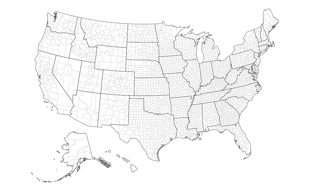
)Slide 10 - map encoding county areas
Now, we’ll draw the county map:
ggplot() +
  theme_void() +
  theme(legend.position = '') +
  geom_sf(
    data = data,
    mapping = aes(
      geometry = geometry),
    lwd = 0.2,
    color = '#dddddd',
    fill = NA
  ) +
  geom_sf(
    data = state_laea,
    fill = NA
  )
Slide 11 - map encoding counties with hightest rates
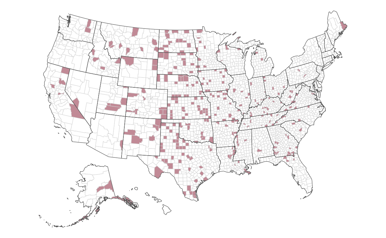
Encoding directly into the polygons of each county, we’ll encode the fill color of the highest 10 percent of rates:
ggplot() +
  geom_sf(
    data = data,
    mapping = aes(
      geometry = geometry,
      fill = rate_cases > quantile(rate_cases, probs = 0.9)
    ),
    lwd = 0.2,
    color = '#dddddd'
  ) +
  geom_sf(
    data = state_laea,
    fill = NA
  ) +
  scale_fill_manual(
    values = c('#ffffff', '#CD9DA7')
  )
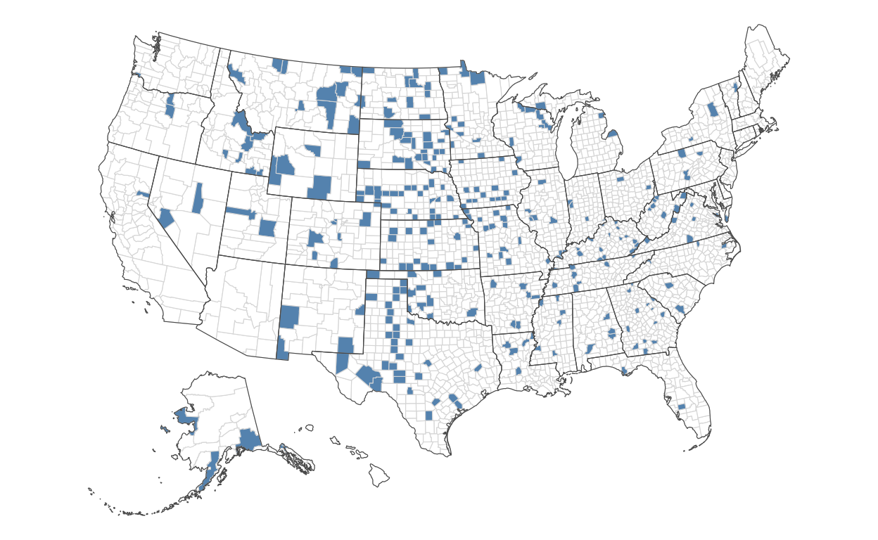
Slide 12 - map encoding counties with lowest rates
Now, we’ll do the same, but for those with the lowest rates:
ggplot() +
  geom_sf(
    data = data,
    mapping = aes(
      geometry = geometry,
      fill = rate_cases < quantile(rate_cases, probs = 0.1)
    ),
    lwd = 0.2,
    color = '#dddddd'
  ) +
  geom_sf(
    data = state_laea,
    fill = NA
  ) +
  scale_fill_manual(
    values = c('#ffffff', '#6695BC')
  )
Slide 13 - map encoding lowest and hightest rates
Let’s combine both encodings to compare where the lowest and highest counties are:
ggplot() +
  scale_fill_identity() +
  geom_sf(
    data = data,
    mapping = aes(
      geometry = geometry,
      fill = case_when(
        rate_cases > quantile(rate_cases, probs = 0.9) ~ '#CD9DA7',
        rate_cases < quantile(rate_cases, probs = 0.1) ~ '#6695BC',
        TRUE ~ '#ffffff')
      ),
    lwd = 0.2,
    color = '#dddddd'
  ) +
  geom_sf(
    data = state_laea,
    fill = NA
  )
Slides 14-15 - map encoding county populations
Let’s now consider where the highest populations are across counties:
ggplot() +
  theme_void() +
  geom_sf(
    data = data,
    mapping = aes(
      geometry = geometry,
      fill = POP ),
    lwd = 0.2,
    color = NA) +
  geom_sf(
    data = state_laea,
    fill = NA,
    color = '#ffffff',
    lwd = 0.2
  ) +
  scale_fill_gradient(
    low = '#000000',
    high = '#ffffff',
    name = 'County Population\nin thousands',
    trans = 'log10',
    breaks = c(0, 1e3, 1e4, 1e5, 1e6, 1e7),
    labels = c(0, '1', '10', '100', '1,000', '10,000')
  ) +
  theme(
    legend.position = 'left',
    legend.text.align = 1,
    legend.title = element_text(hjust = 0),
    legend.key = element_rect(color = '#000000')
  ) +
  guides(
    fill = guide_legend(
      title.position = 'top',
      title.hjust = 0.5,
      label.position = 'left'
    )
) 
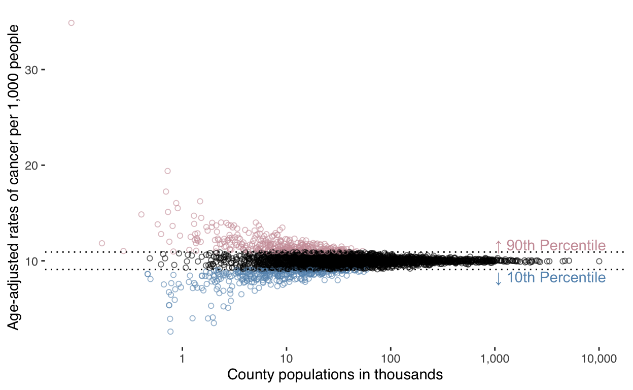
Slide 16 - graph encoding rates ~ population
Finally, let’s compare county population to cancer rate:
ggplot(data) +
  theme_tufte(base_family = 'sans') +
  geom_point(
    mapping = aes(
      x = POP,
      y = rate_cases,
      color = case_when(
        rate_cases > quantile(rate_cases, probs = 0.9) ~ '#CD9DA7',
        rate_cases < quantile(rate_cases, probs = 0.1) ~ '#6695BC',
        TRUE ~ '#000000'
      )
    ),
    size = 1.5,
    alpha = 0.6,
    shape = 21
  ) +
  geom_hline(
    mapping = aes(
      yintercept = quantile(rate_cases, probs = 0.9)
    ),
    linetype = 'dotted',
  ) +
  annotate(
    'text',
    x = 1e6,
    y = quantile(data$rate_cases, probs = 0.9) + 0.2,
    label = '↑ 90th Percentile',
    hjust = 0,
    vjust = 0,
    color = '#CD9DA7'
  ) +
  geom_hline(
    mapping = aes(
      yintercept = quantile(rate_cases, probs = 0.1)
    ),
    linetype = 'dotted'
  ) +
  annotate(
    'text',
    x = 1e6,
    y = quantile(data$rate_cases, probs = 0.1) - 0.2,
    label = '↓ 10th Percentile',
    hjust = 0,
    vjust = 1,
    color = '#6695BC'
  ) +
  scale_x_log10(
    breaks = c(0, 1e3, 1e4, 1e5, 1e6, 1e7),
    labels = c(0, '1', '10', '100', '1,000', '10,000')) +
  scale_color_identity() +
  theme(legend.position = '') +
  labs(
    x = 'County populations in thousands',
    y = 'Age-adjusted rates of cancer per 1,000 people'
  )
Slides 18-30 variation in controlled experiments
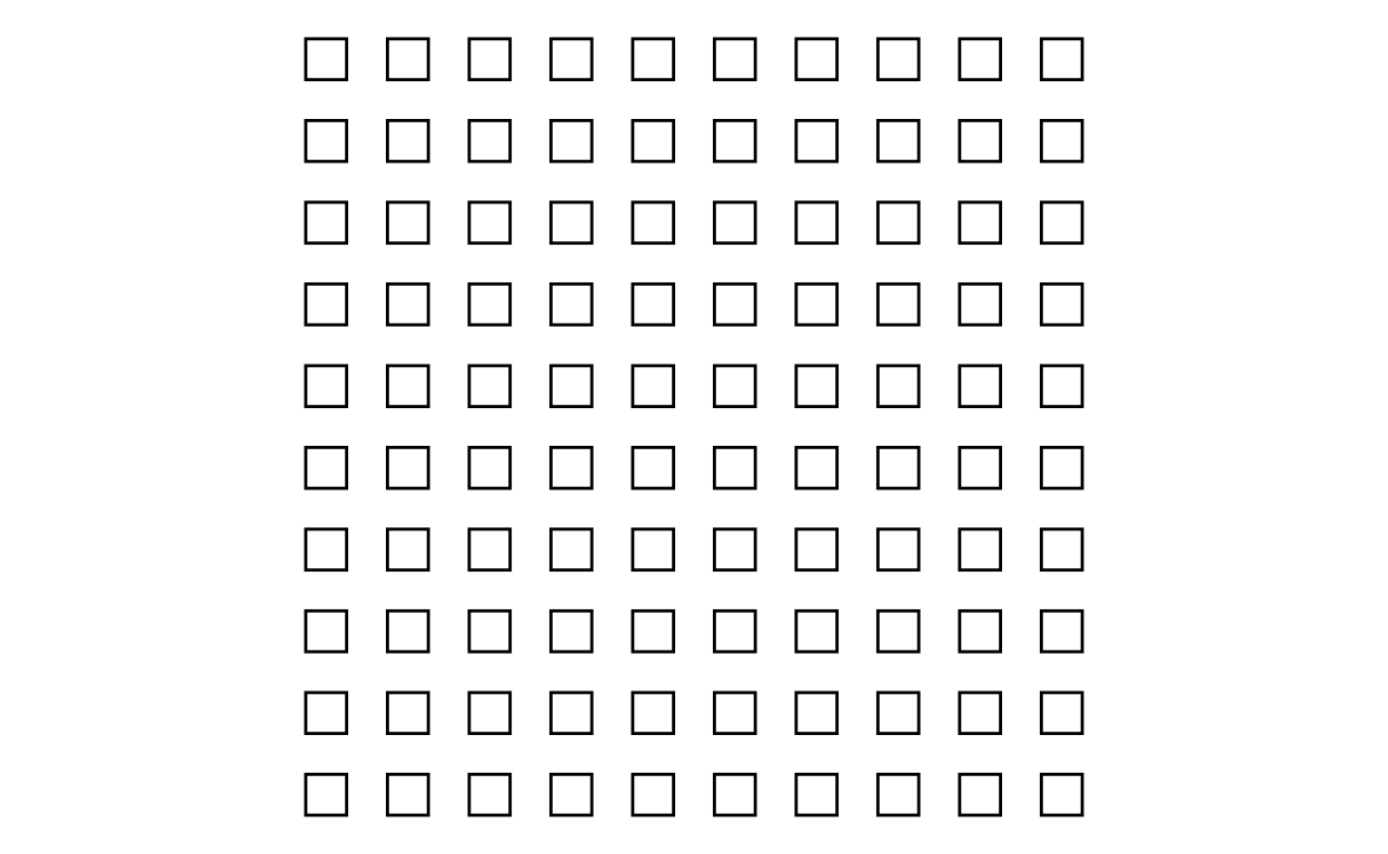
Slides 19-21 - creating the population
Since we’ll use two colors to represent experiments, we’ll typedef (define them as types) them:
A_color <- '#91bfdb'
B_color <- '#fc8d59'
Next, we’ll create a population of 100.
N <- 100

set.seed(9)

d <-
  tibble(
    S = seq(N),
    A = rbinom(N, 1, 0.3) == 1,
    B = rbinom(N, 1, 0.4) == 1,
    x = rep(1:10, times = 10),
    y = rep(1:10, each = 10)
  )
Slide 19 - graph the population
d %>%
  ggplot() +
  theme_void() +
  coord_equal() +
  geom_tile(
    mapping = aes(
      x = x,
      y = y,
      width = 0.5,
      height = 0.5
    ),
    lwd = 0.5,
    color = 'black',
    fill = 'white'
) 
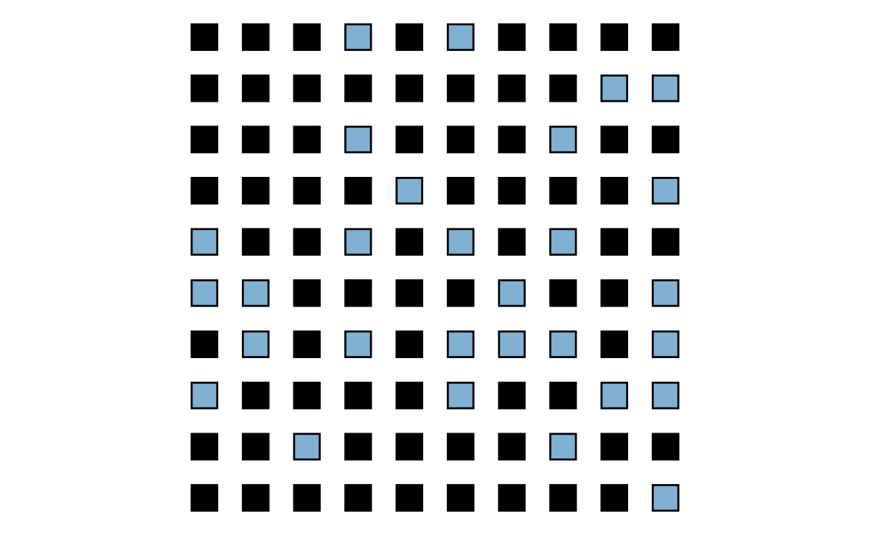
Slide 21 - summarise and graph population responses
Let’s summarize the population:
d %>%
  summarise(
    a = sum(A),
    b = sum(B),
    n = n(),
    d = b / n - a / n)
# A tibble: 1 × 4
a b n d
<int> <int> <int> <dbl>
1 29 38 100 0.09Graph the control group:
d %>%
  ggplot() +
  theme_void() +
  coord_equal() +
  geom_tile(
    mapping = aes(
      x = x,
      y = y,
      width = 0.5,
      height = 0.5,
      fill = A
    ),
    lwd = 0.5,
    color = 'black',
    show.legend = FALSE
  ) +
  scale_fill_manual(
    values = c('black', A_color)
  )
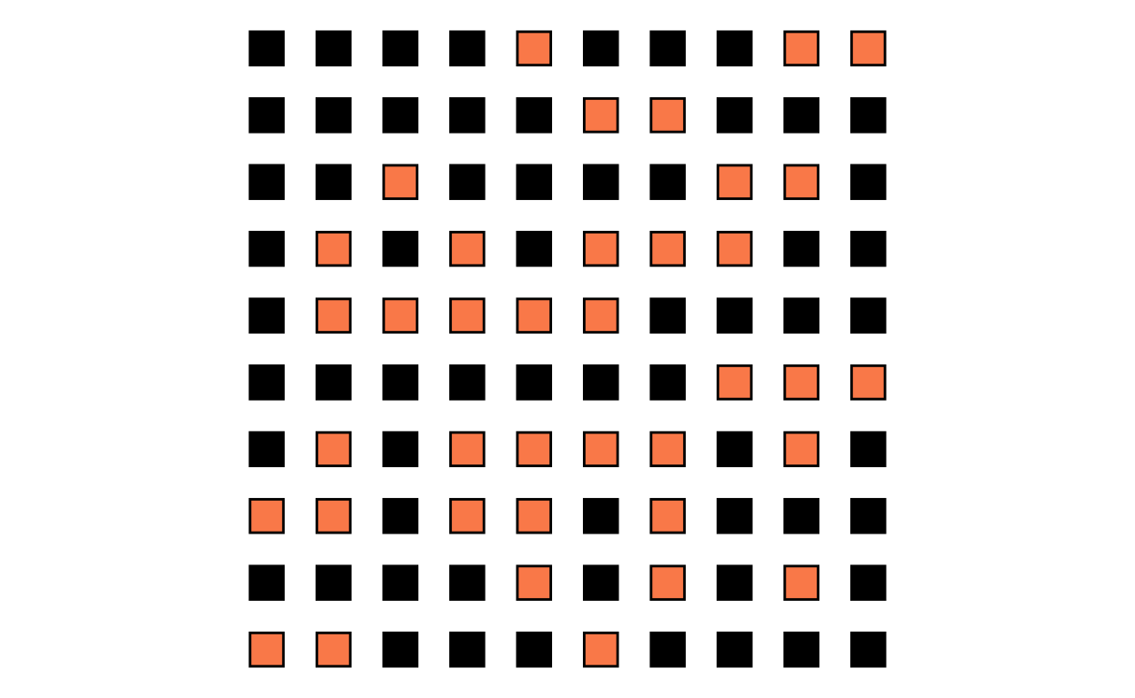
Graph the treatment group:
d %>%
  ggplot() +
  theme_void() +
  coord_equal() +
  geom_tile(
    mapping = aes(
      x = x,
      y = y,
      width = 0.5,
      height = 0.5,
      fill = B
    ),
    lwd = 0.5,
    color = 'black',
    show.legend = FALSE
  ) +
  scale_fill_manual(
    values = c('black', B_color)
  )
Slide 22-27 - simulate 1,000 experiments
First, we’ll create a function to run an experiment:
experiment <- function(N) {


  d_ <- bind_cols(d, C = sample(c('control', 'treatment'), N, replace = TRUE))

  d_ <- d_ %>%
    mutate(
      n_control = sum(ifelse(C == 'control', 1, 0)),
      r_control = sum(ifelse(C == 'control' & A, 1, 0)),
      f_control = round(r_control / n_control, digits = 2),
      n_treatment = sum(ifelse(C == 'treatment', 1, 0)),
      r_treatment = sum(ifelse(C == 'treatment' & B, 1, 0)),
      f_treatment = round(r_treatment / n_treatment, digits = 2)
    )

  d_[-1,7:12] <- NA
  d_
}
Next, we’ll simulate them:
set.seed(12)
x <- lapply(
  1:1000,
  FUN = function(a) bind_cols(Experiment = a, experiment(100) )
  ) %>%
  bind_rows()
Slide 23 - Graph selection of treatment on population
Let’s graph our randomized selection of the population into treatment and control groups. We’ll represent these by coloring the border of the squares.
x %>%
  filter(Experiment == 1) %>%
  ggplot() +
  theme_void() +
  coord_equal() +
  geom_tile(
    mapping = aes(
      x = x,
      y = y,
      width = 0.5,
      height = 0.5,
      color = C
    ),
    lwd = 0.5,
    fill = NA,
    show.legend = FALSE
  ) +
  geom_text(
    mapping = aes(
      x = 4,
      y = 0,
      label = n_control
    ),
    color = A_color
  ) +
  geom_text(
    mapping = aes(
      x = 6,
      y = 0,
      label = n_treatment
    ),
    color = B_color
  ) +
  annotate('text', x = 5, y = 0, label = '/') +
  scale_color_manual(values = c(A_color, B_color ))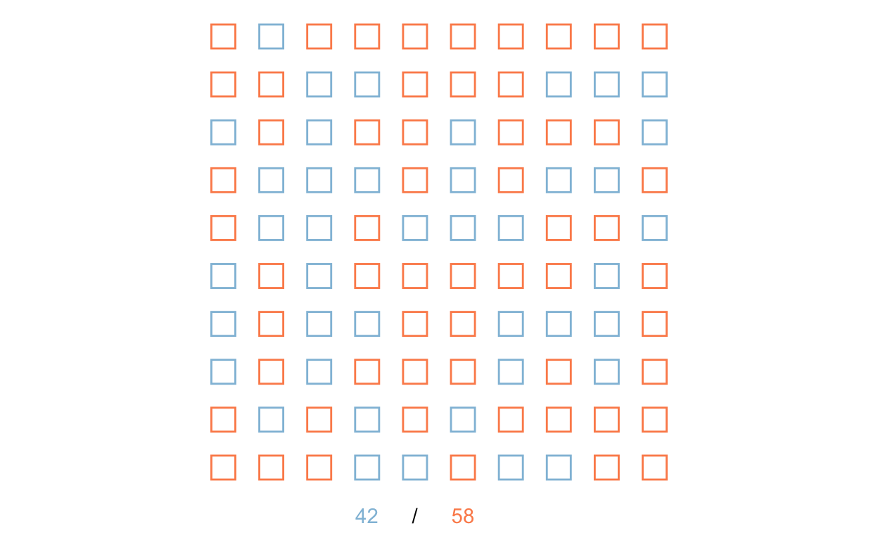
Slide 24 - first experimental results
Next, let’s graph selection of control on population. Here, we’ll gray out or lighten those we did not select, and make the responses of those selected into the control group darker:
x %>%
  filter(Experiment == 1) %>%
  ggplot() +
  theme_void() +
  coord_equal() +
  geom_tile(
    mapping = aes(
      x = x,
      y = y,
      width = 0.5,
      height = 0.5,
      fill = A,
      alpha = (C == 'control'),
      color = (C == 'control'),
      group = Experiment
    ),
    lwd = 0.5,
    show.legend = FALSE
  ) +
  geom_text(
    mapping = aes(
      x = 3,
      y = 0,
      group = Experiment,
      label = r_control
    ),
    color = A_color
  ) +
  geom_text(
    mapping = aes(
      x = 5,
      y = 0,
      group = Experiment,
      label = n_control
    ),
    color = 'darkgray'
  ) +
  annotate('text', x = 4, y = 0, label = '/') +
  geom_text(
    mapping = aes(
      x = 7,
      y = 0,
      group = Experiment,
      label = f_control
    ),
    color = A_color
  ) +
  annotate('text', x = 6, y = 0, label = '=') +
  scale_fill_manual(values = c('darkgray', A_color)) +
  scale_color_manual(values = c('white', 'black' )) +
  scale_alpha_manual(values = c(0.3, 1))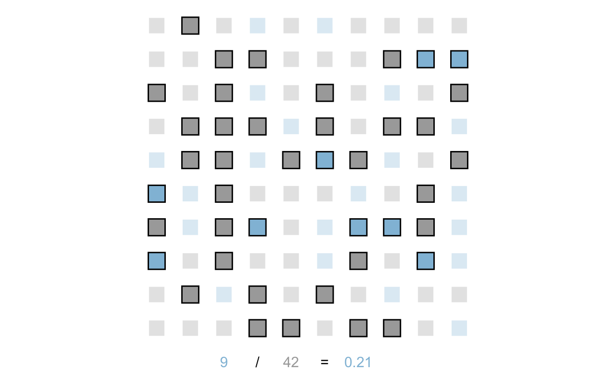
And we’ll do the same for the treatment group:
x %>%
  filter(Experiment == 1) %>%
  ggplot() +
  theme_void() +
  coord_equal() +
  geom_tile(
    mapping = aes(
      x = x,
      y = y,
      width = 0.5,
      height = 0.5,
      fill = B,
      alpha = !(C == 'control'),
      color = !(C == 'control'),
      group = Experiment
    ),
    lwd = 0.5,
    show.legend = FALSE
  ) +
  geom_text(
    mapping = aes(
      x = 3,
      y = 0,
      group = Experiment,
      label = r_treatment
    ),
    color = B_color
  ) +
  geom_text(
    mapping = aes(
      x = 5,
      y = 0,
      group = Experiment,
      label = n_treatment
    ),
    color = 'darkgray'
  ) +
  annotate('text', x = 4, y = 0, label = '/') +
  geom_text(
    mapping = aes(
      x = 7,
      y = 0,
      group = Experiment,
      label = f_treatment
    ),
    color = B_color
  ) +
  annotate('text', x = 6, y = 0, label = '=') +
  scale_fill_manual(values = c('darkgray', B_color)) +
  scale_color_manual(values = c('white', 'black' )) +
  scale_alpha_manual(values = c(0.3, 1))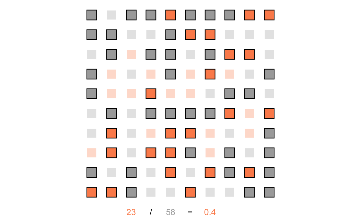
Slide 27 - table of first 10 experiments
Let’s create a table of our first 10 experiments. We’ll color code some of the information to be consistent:
x %>%
  filter(Experiment <= 10) %>%
  group_by(Experiment) %>%
  slice(1) %>%
  select(
    r_control, n_control, f_control,
    r_treatment, n_treatment, f_treatment
  ) %>%
  mutate(difference = f_treatment - f_control) %>%
  ungroup() %>%
kbl(format = 'html', digits = 2, padding = 20,
    col.names = c('Experiment',
                  'Response', 'Total', 'Frequency',
                  'Response', 'Total', 'Frequency',
                  'T - C')) %>%
  kable_classic() %>%
  add_header_above(c(' ', 'Control' = 3, 'Treatment' = 3, ' ')) %>%
  column_spec(c(2, 4), color = A_color) %>%
  column_spec(c(5, 7), color = B_color) %>%
column_spec(c(4, 7, 8), bold = TRUE)|
Control
|
Treatment
|
||||||
|---|---|---|---|---|---|---|---|
| Experiment | Response | Total | Frequency | Response | Total | Frequency | T - C |
| 1 | 9 | 42 | 0.21 | 23 | 58 | 0.40 | 0.19 |
| 2 | 20 | 58 | 0.34 | 14 | 42 | 0.33 | -0.01 |
| 3 | 16 | 56 | 0.29 | 17 | 44 | 0.39 | 0.10 |
| 4 | 14 | 50 | 0.28 | 17 | 50 | 0.34 | 0.06 |
| 5 | 15 | 54 | 0.28 | 16 | 46 | 0.35 | 0.07 |
| 6 | 14 | 45 | 0.31 | 25 | 55 | 0.45 | 0.14 |
| 7 | 17 | 59 | 0.29 | 19 | 41 | 0.46 | 0.17 |
| 8 | 12 | 49 | 0.24 | 20 | 51 | 0.39 | 0.15 |
| 9 | 20 | 57 | 0.35 | 17 | 43 | 0.40 | 0.05 |
| 10 | 17 | 59 | 0.29 | 16 | 41 | 0.39 | 0.10 |
Slide 29 - Animations
This was a little too complex for an introduction; we’ll get there ;)
Slide 34 - model experiment number 8
To communicate our uncertainty, we first need to know it. So, we’ll model the data.
Now, we’ll predict the entire distribution of possible outcomes for a new experiment.
newdata <- data.frame(
  G = c('C', 'T'),
  y = c(0,   0),
  n = c(100, 100)
)

pp <- posterior_predict(fit, newdata = newdata)
Finally, we’ll summarize that distribution:
y_c <- pp[,1]; y_t <- pp[,2]
mean(y_t > y_c)
[1] 0.90875quantile( x = y_t - y_c, probs = c(0.05, 0.5, 0.95) ) 5% 50% 95%
-3 15 33 And that’s what we’ll use to communicate.
Slide 54 - quantile dotplots
People can generally reason about things better when thinking discretely than when confronted with continuous information. Let’s consider how this plays out when reasoning about a distribution of information.
Let’s say we have a population exhibiting a log normal distribution with a log mean of log(11) and a log standard deviation of 0.2:
set.seed(8)

# population information
mu <- log(11)
sigma <- 0.2
Example log normal distribution of population
Here’s the population distribution:
p1 <-
  ggplot() +
  stat_function(
    fun = dlnorm,
    args = c(meanlog = mu, sdlog = sigma),
    xlim = c(0, 30),
    geom = 'density',
    fill = 'lightblue',
    lwd = 0.1
  )

p1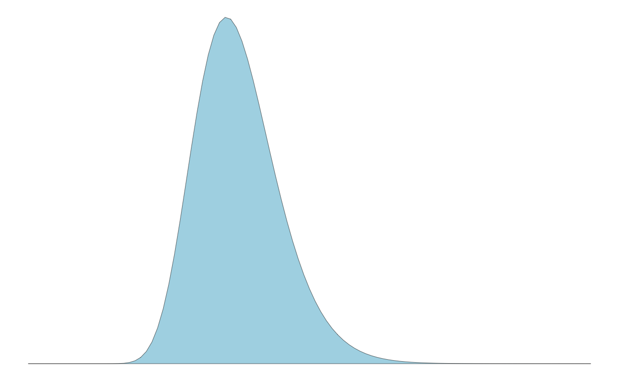
Example draws from population showing noise
Now, to discretize the distribution, we might take samples. But, as shown below, the samples can be noisy, not visually appearing as the population distribution and inconsistent across samples. To see this, let’s create three experiments of 50 samples:
runs <- 3L
n <- 50L

d <-
  tibble(
  idx = rep( seq(runs), each = n ),
  x = rlnorm( n = n * runs, mean = mu, sd = sigma )
)

p2 <-
  ggplot(d) +
  theme(strip.text = element_blank()) +
  geom_dotplot(
    mapping = aes(
      x = x
    ),
    fill = 'lightblue',
    dotsize = 0.8,
    stroke = 0.2
  ) +
  facet_wrap(
    ~ idx,
    nrow = 3
  ) +
  scale_x_continuous(
    name = 'x',
    limits = c(0, 30)
  ) +
  scale_y_continuous(
    name = 'p(x)',
    breaks = seq(0, 1, by = 0.25)
  )

p2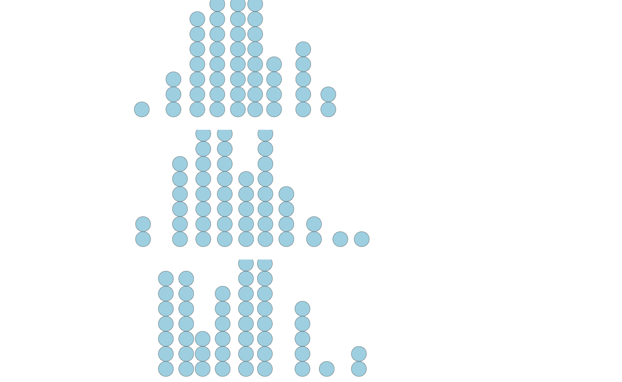
Creating quantile dotplot from scratch
Instead, we can represent the population discretely in another way. First, I’ll show you manually doing everything. But there’s a function in the package ggdist that does this for you: geom_dots().
q <-
  tibble(
  p_x =
    seq(
      from = 1 / n / 2,
      to = 1 - (1 / n / 2),
      length = n
    ),
  x = qlnorm(
    p = p_x,
    meanlog = mu,
    sdlog = sigma
  )
)

# shape of the quantiles
p3 <-
  ggplot(q) +
  # draw lines from axes to CDF
  geom_segment(
    mapping = aes(
      x = 0, xend = x,
      y = p_x, yend = p_x
    ),
    color = 'lightgray',
    lwd = 0.2
  ) +

  geom_segment(
    mapping = aes(
      x = x, xend = x,
      y = p_x, yend = 0
    ),
    color = 'lightgray',
    lwd = 0.2
  ) +

  # draw CDF from generated data
  geom_line(
    mapping = aes(
      x = x,
      y = p_x
    ),
    color = 'darkred'
  ) +

  # draw dotplots from generateed data
  geom_dotplot(
    mapping = aes(
      x = x
    ),
    dotsize = 0.8,
    fill = 'lightblue',
    stroke = 0.2
  )

p3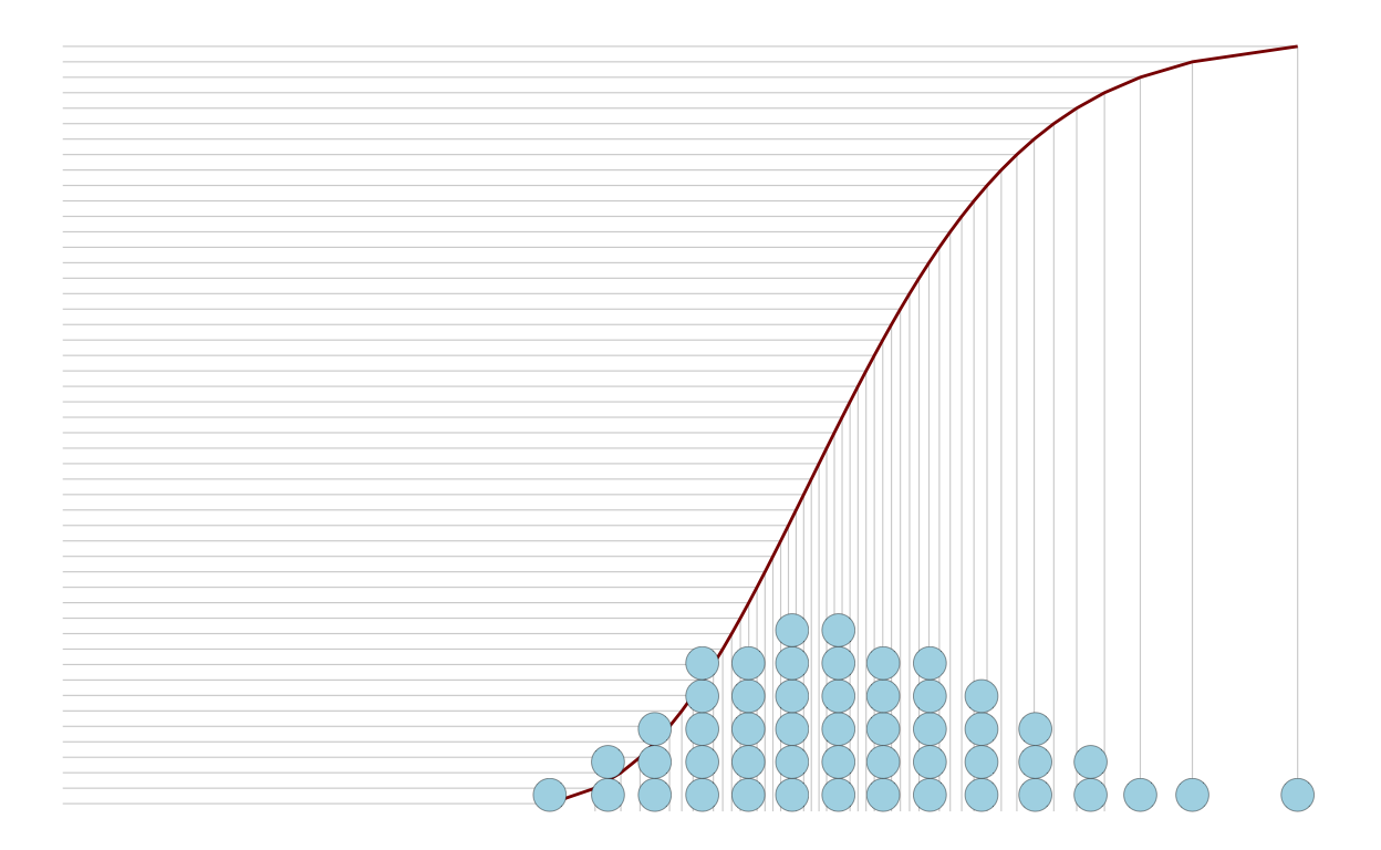
Users can just count the dots above or below a threshold:
p4 <-
  ggplot(q) +
  geom_dotplot(
    mapping = aes(
      x = x,
      fill = x < 8
    ),
    dotsize = 0.8,
    stroke = 0.2
  ) +
  scale_x_continuous(limits = c(0, 18)) +
  scale_fill_manual(
    breaks = c(FALSE, TRUE),
    values = c('lightblue', 'darkred'),
    guide = 'none')

p4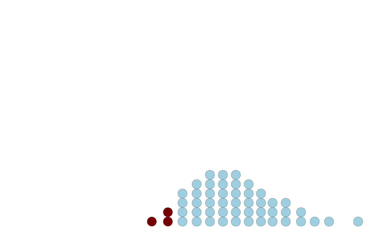
Using ggdist package function to create quantile dotplots
Here’s a function to do this for you:
library(ggdist)

ggplot(q) +
  stat_dots(
    mapping = aes(
      x = x
    ),
    dotsize = 0.8,
    quantiles = 50,
    fill = 'lightblue',
    color = 'black',
    lwd = 0.2
  ) +
  scale_x_continuous(limits = c(0, 18))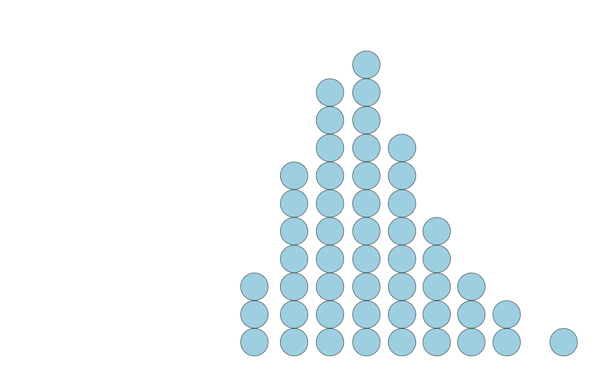
The exact shape of a quantile dotplot will depend — like histograms do with bin width / size — on the parameters you specify.