6 Integrating Text and Data
6.1 Layout, hierarchy, integration
Visual presentation is communication.
6.2 Typography
For visual presentation of communication, we may first think about a data graphic. But consider this paragraph from Strunk and White (2000), white space removed:
Vigorouswritingisconcise.Asentenceshouldcontainnounnecessarywords,aparagraphnounnecessarysentences,forthesamereasonthatadrawingshouldhavenounnecessarylinesandamachinenounnecessaryparts.Thisrequiresnotthatthewritermakeallhissentencesshort,oravoidalldetailandtreatsubjectsonlyinoutline,butthateverywordtell.Asingleoverstatement,whereverorhoweveritoccurs,diminishesthewhole,andacarefreesuperlativehasthepowertodestroy,forreaders,theobjectofyourenthusiasm.
The visual presentation of communication involves all best practices in typography and design. Adding white space between words, just one of many components of typography, is an obvious decision. It makes the advice from Strunk and White1 more readable, more understandable:
Vigorous writing is concise. A sentence should contain no unnecessary words, a paragraph no unnecessary sentences, for the same reason that a drawing should have no unnecessary lines and a machine no unnecessary parts. This requires not that the writer make all his sentences short, or avoid all detail and treat subjects only in outline, but that every word tell. A single overstatement, wherever or however it occurs, diminishes the whole, and a carefree superlative has the power to destroy, for readers, the object of your enthusiasm.
Best practices in visual presentation of communication go well beyond spacing between words. Butterick (2018) credits a great deal to, among others, Bringhurst (2004), explaining best practices, well, best. Typography is the visual component of the written word. “Typography is for the benefit of the reader”:
Most readers are looking for reasons to stop reading. . . . Readers have other demands on their time. . . . The goal of most professional writing is persuasion, and attention is a prerequisite for persuasion. Good typography can help your reader devote less attention to the mechanics of reading and more attention to your message.
The typographic choices in the PDF versions of our memo examples Example 3.1 and Example 3.2 and proposal follow Butterick (2018)’s advice:
Those best practices do more than aid readability. Experiments have demonstrated that “high quality typography can improve mood [of the reader]” (Larson and Picard 2005), and the better their mood, the more likely they are to consider what you say.
Butterick’s recommendations, and as implemented in the example memos, are designed functionally. When designing communications for the interwebs, also consult Rutter (2017). There will be occasions, however, when more creativity can be used in combination with functionality. Information graphics are an example. You may find inspiration in Bartolo, Coles, and Spiekermann (2019), which studies the creative placement of text. Not just for text, typography — layout — is for all communication: text, numbers, data graphics, and images.
6.3 Laying out numbers: tables
Stand-alone numbers should generally fit in the context of a sentence. When reporting multiple numbers, though, consider a table within a paragraph to aid comparisons (Tufte 2001).
Tables require design. Text and numbers are best when aligned to an invisible grid that creates negative or white space between columns and other components of the table. Invisible is key, as grid lines between all rows and columns detract from the data Wong (2013). Wainer (2016) works through an example series of tables for multivariate comparisons, and considers its design, data transformations, and organization to aid audience understanding.2 Along with Tufte, Wainer, and Wong, Miller (2015) provides us another great resource for advice on creating, and showing examples of, tables.
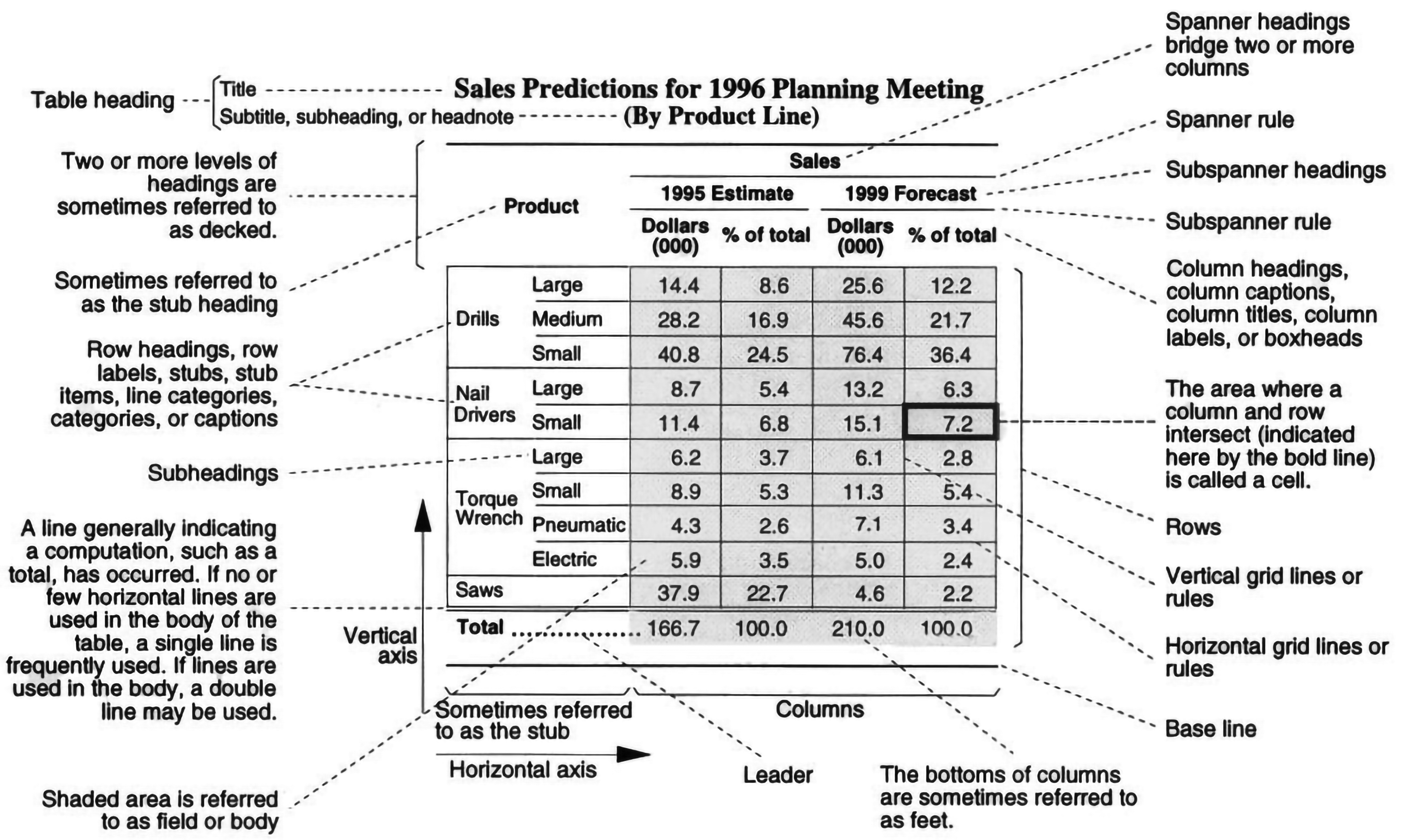
Harris (1999) names and describes the components of a typical table, not all of which are always used or if used should be visible:

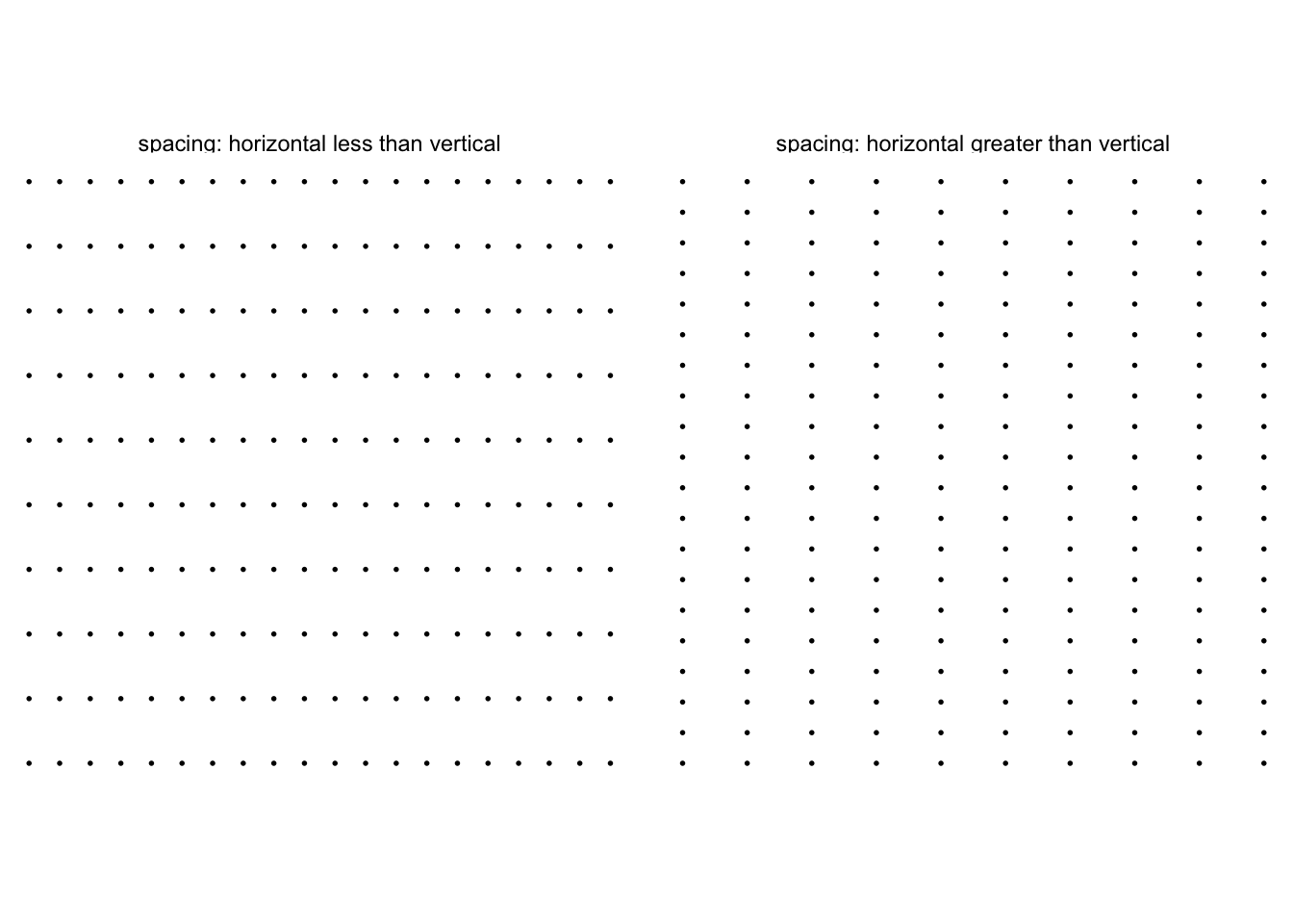
The better designed tables will minimize any markings other than the data and annotations explaining the data, relying on Gestalt (a subset of design) principles, two3 of which are proximity and similarity. The Gestalt principle of proximity reflects that we perceive markings closer together — relative to other markings — as belonging to the same group.

As with proximity, we can create the perception of groupings based on similarity of color, or shape, or another attribute. Here’s an example in which the horizontal spacing and vertical spacing are equal to demonstrate the color attributes ability to group:

Consider these Gestalt principles at work in this example table:
Notice the components, think about the underlying grid system organizing the content, the alignment and position of each type of information, and how proximity and similarity help to separate these different information types.
Along with placing numbers in text — sentences — or in tables, we can re-organize them into a hybrid form, having attributes of a table and a graph. This hybrid, called a stem-and-leaf diagram, has attributes of a table because it is constructed with actual numbers, just more compactly than a pure table. It’s also like a graphic in that its profile conveys distributional information similar to a histogram. Figure 6.6 below provides an example, which is interactive, too. Hover your cursor over a number among the “leaves” for instructions interpreting the number:
Harris (1999) thoroughly explains variations on stem-and-leaf diagrams.
6.4 Grid systems, narrative layout
Another aspect of typography and design rely on grid systems. A very basic grid is shown in Figure 6.1, some of its components drawn in brown and labeled in gray: gutters, module, and margin. The gutters between the gridlines create white space that separate information placed into columns, rows, modules, or spatial zones (a spatial zone comprises multiple modules or rows or columns). Of course, the grid lines are not part of the final communication; we create them temporarily to layout and align information. That layout is informed by visual perception and the way we process information in a given culture. When reading English, for example, we generally start processing the information from the top, left, our eyes scanning to the right, and then returning left and down, in a repeating zig-zag pattern. Hebrew is right to left. We call this type of narrative structure linear (Koponen and Hildén 2019). And various graphic design choices can purposefully or inadvertently guide the reader through the material in other ways. Images, unlike sentences, create an open narrative structure, allowing us to reason differently (Koponen and Hildén 2019). We’ll come back to this concept.
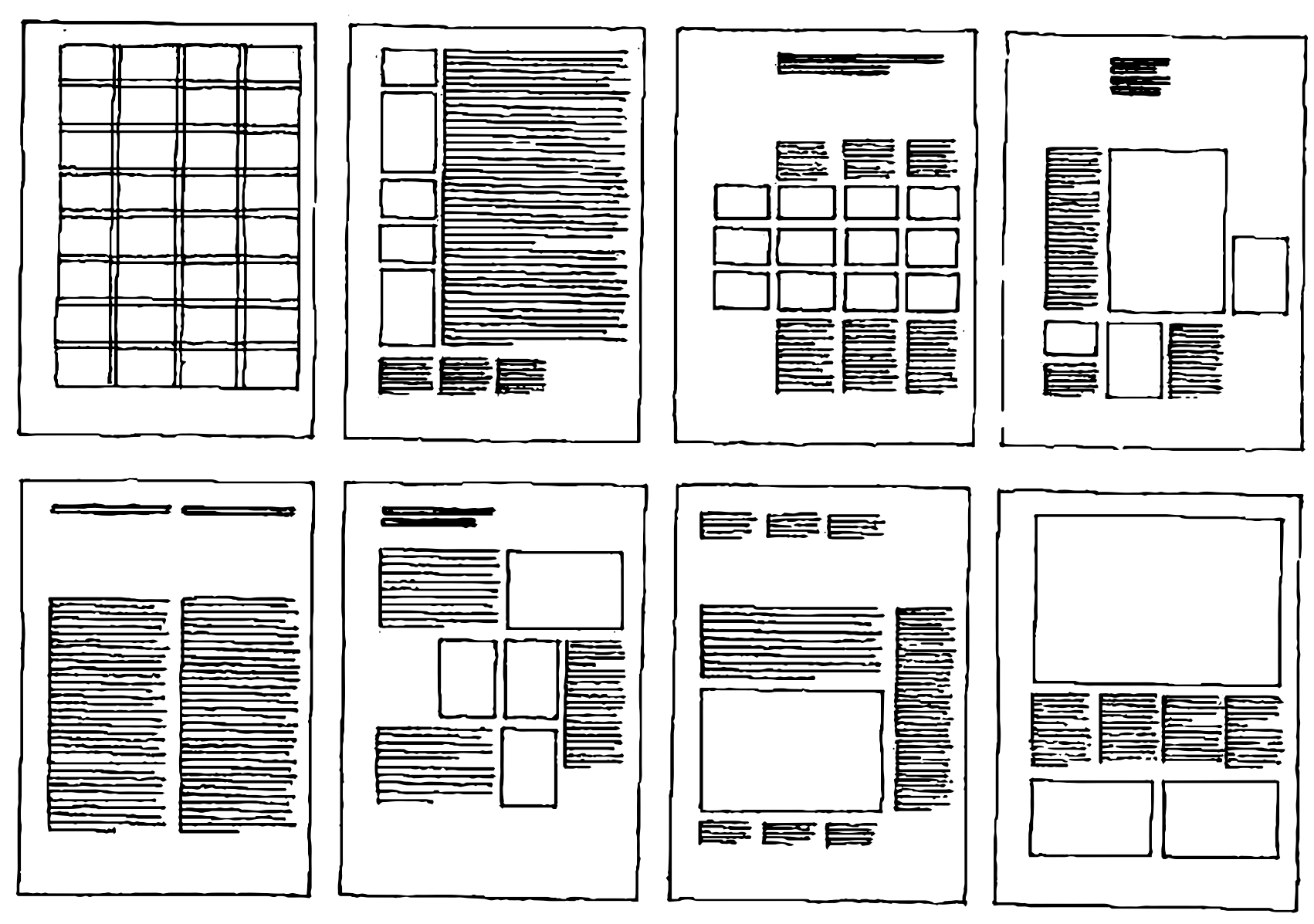
Grid systems can be much more complex. We are guided by Muller-Brockmann in his seminal reference, “Arranging surfaces and spaces into a grid creates conformity among texts, images and diagrams. The size of each implies its importance. Reducing elements in a grid suggests planning, intelligibility, clarity, and orderliness of design. One grid allows many creative ways to show relationships” (Müller-Brockmann 1996). A grid with 8 rows by 4 columns and gutter spacing between the blocks, for example, can lead to numerous arrangements of disparate, but related, information:

Yet the commonly aligned sides of word blocks, images, and data graphics can help connect related information. By connect, we mean the layout creates or enables a path that the audience’s eye follows, a scan path. In this paragraph of text, you started reading at its beginning and followed horizontally until the end of the line, then scanned to the left beginning of the line below and repeated the process. In strip comics, the sequentially arranged images encourage a similar linear narrative. But other layouts enable an open narrative. These include radial layouts in which the order we scan relies on focal points, which are prominent components due to, say, their size or color in relation to the surrounding information. Of note, in some circumstances we my intend a serial narrative within an open narrative. Consider labeling or numbering the features, using gestalt principles, or both, to guide the audience.
Thus, as Müller-Brockmann (1996) explained, grids enable orderliness, adds credibility to the information, and induces confidence. Information presented with clear and logically set out titles, subtitles, texts, illustrations and captions will not only be read more quickly and easily but the information will also be better understood.
Exercise 6.1 Try to identify placement of the (invisible) grid lines used to align information in the Dodgers proposal, which is primarily text.
Exercise 6.2 Consider the poster version of the information graphic Bremer (2016). Try to identify placement of the (invisible) grid lines used for alignment.
6.5 Meaning of words, images
Words, graphics, and images — when combined — can provide some extent what Doumont (2009) prescribed: effective redundancy. This is sometimes called dual coding. And to maximize their combination, we first consider that we process languages and images differently (Ware 2020). Words are read, and processed in linear fashion, serially, one after the other. Images, on the other hand, can be processed or understood as a whole, in parallel.
Secondly, each type of medium conveys meaning differently; neither exactly overlap: a description of an image never actually represents the image. Rather, … it is a representation of thinking about having seen a picture — it’s already formulated in its own terms (Sousanis 2015), paraphrasing (Baxandall 1985). Each is better at conveying certain types of messages. Sousanis puts it: “while image is, text is always about.” Text is usually better for expressing abstract concepts, and procedure, such as logic or programming. Diagrams help when explaining structural relationships.
We can benefit from various studies into the interplay of words and images found in comics, (Cohn 2016); (Sousanis 2015); (McCloud 1993), and extrapolate those concepts into information visualization. Done right, each informs and enriches the other. Images and graphics also enable a unique form of comparison, juxtaposing one image or encoding to another — or to the absence of another — to form meaning.
6.6 Integrating graphics and text
Good design and typography also enable visual connections between words and sentences to, say, data graphics. Tufte (2001) explains, at their best, graphics are instruments for reasoning about quantitative information. Often the most effective way to describe, explore, and summarize a set of numbers—even a very large set—is to look at pictures of those numbers. Furthermore, of all methods for analyzing and communicating statistical information, well-designed data graphics are usually the simplest and at the same time the most powerful. And if “a means of persuasion is a sort of demonstration,” and we now agree with Aristotle that it is, then graphics are frequently the most effective way to demonstrate things, especially for understanding patterns and comparisons.
But it isn’t a Hobson’s choice, words or graphics. Instead, we should use both. Tufte (2001) explains how they work together: “The principle of data/text integration is: data graphics are paragraphs about data and should be treated as such.”
Visual displays may be integrated directly within the text. Tufte’s book is a living example, and explains the approach:
We were able to integrate graphics right into the text, sometimes into the middle of a sentence, eliminating the usual separation of text and image — one of the ideas Visual Display advocated.
Experiments support Tufte’s advice. Koponen and Hildén (2019) summarizes an experiment of eye-tracking movements and comprehension when reading communications in various layouts (Holsanova, Rahm, and Holmqvist 2006), from which we learned that layouts integrating images within text columns improve communication over both radial layouts and layouts that separate text from images. The integrated approach promoted careful reading of the text between images while layouts separating text from images promoted the reading of a title, skipping the body text, and focusing on the images. Radial layouts were reviewed more quickly than linear, integrated text-image layouts, and less information was retained.
For effective integration, visual display need only be large enough to clearly convey the information as intended for our audience in the manner to be consumed. To make the point, consider the word-sized graphics Tufte (2006) calls sparklines: .4 Also note that when the graphic is large enough to include annotation,
The principle of text / graphic / table integration also suggests that the same typeface be used for text and graphic and, further, that ruled lines separating different types of information be avoided.
Locate two or three narratives with data graphics as paragraphs that you believe the graphic helped persuade audiences of the point of the narrative. Explain why the graphic explained better than words as used.
6.7 Annotating data graphics
Annotations add explanations and descriptions to introduce the graph’s context, which is important for almost any audience. Annotation plays a crucial role in asynchronous data storytelling as the surrogate for the storyteller. They can also explain how to read the graph, which helps readers unfamiliar with the graph — whether a simple line chart or an advanced technique like a treemap or scatterplot. When done right, the annotation layer will not get in the way for experienced users. Consider, for example, Figure 6.8.
From a cognitive perspective, Ware writes that “plac[ing] explanatory text as close as possible to the related parts of a diagram, and us[ing] a graphical linking method” will “reduce [the] need to store information temporarily while switching back and forth between locations” (Ware 2020). Figure 6.8, published in newspaper article Schleuss and Lin II (2013), displays a scatter plot that encodes the rate change of crime on the x-axis, change of property crime on the y-axis, and rate of crimes as size of the location or point. Note the plot is segmented into quadrants, color-coded to indicate better and worse conditions, and annotations are overlain that explain how to interpret the meaning of a data point located within quadrants of the graphic. The various annotations greatly assist its general audience in decoding the data and considering insights.
Rahlf (2019) provides over 100 examples of annotating and modifying exploratory graphics for presenting in communication., and should be consulted along with this text’s section on visual communication.
6.8 Linking words with graphics
Placement of data graphics within words and annotating graphics with words are the first step in integrating the information. Another best practice includes using color encodings and other explicit markings, linking words to encodings, such as adding lines connecting related information (Riche et al. 2018):
The link between the narrative and the visualization helps the reader discern what item in the visualization the author is referencing in the text. Create links with annotation, color, luminosity, or lines.
For example, color words in annotations on a data graphic and in the paragraphs surrounding that graphic with the same hue as used in the data encodings of the graphic. This follows the principle of similarity, discussed earlier. Let’s consider an example table, the example we created in Section 6.3, placing it into a paragraph and linking its data to surrounding words (a form of data display):
Using Table 1, we can calculate the value of a strike by subtracting the expected run value of a strike, given the game state and count, from the value of a ball, starting from the same game state and count. Let’s say there is a runner on first and second with one out, and the count is 1 ball, 1 strike, suggesting we should expect 0.99 more runs this inning:
Assuming the batter doesn’t swing on the next pitch, a strike lowers expected runs to 0.86 while a ball raises it to 1.11. Thus, in this scenario, the expected value of a strike would be 0.86 - 1.11, or -0.25 runs.
Consider the ways we apply the principles of proximity and similarity. Does in-paragraph placement (proximity) and text-data coloring (similarity) help us in learning to use the table? For other examples, see Kay (2015), which provides example uses of color for linking words to data encodings. Yet for another great example of linking paragraphs with illustrations, see Byrne’s revision of Euclid’s first six books (Byrne 2017).
6.9 Linking multiple graphics
If individual graphs reveal information and structure from the data, an ensemble of graphs can multiply the effect. By ensemble, we mean multiple graphs simultaneously displayed, each containing different views of the data with common information linked together by various techniques. We’ve already seen one form of an interactive linkage between two graphics in Figure 1.1, which dynamically linked each baseball stadium field boundary to the corresponding fence. And while Cleveland (1985) describes “brushing and linking” — where items selected in on one visual display highlights the same subset of observations in another visual display — as an interactive tool, he effectively shows the technique by highlighting the same data across static displays. Authors Unwin and Valero-Mora (2018) provide a nice example, walking through use of ensembles in exploring data quality, comparing models, and presenting results. As the authors explain,
Coherence in effective ensembles covers many different aspects: a coherent theme, a coherent look, consistent scales, formatting, and alignment. Coherence facilitates understanding.
The additional effort for coherence “are more design than statistics, but they are driven by the statistical information to be conveyed, and it is therefore essential that statisticians concern themselves with them.” Along with using the same theme styles, their choice of placement is informed by best practices in graphic design, which apply a grid system, already discussed.
We’ve covered a lot of material. We can use all these techniques to help in writing a brief proposal to a chief analytics officer, asking him or her to approve our analytics project. Recall the Dodgers memo, Example 3.2? Let’s continue that example with a 750-word brief proposal, see Spencer (2019). To assess whether the example proposal accomplishes its goals, note the audience. As previously explained, his background includes a doctor of philosophy in Statistics, and experience with machine learning and statistical programming in R.
Exercise 6.3 Try to identify the document structure in the example brief proposal. Does it identify problems and goals? Data? Methods? Compare the structure, specificity and level of detail to both the memos, Example 3.1 and Example 3.2. Next, consider the tools we’ve covered in business writing, starting with messages and goals, applying typographic best practices, aligning information with grids, integrating graphics within paragraphs, linking words and graphics, annotation, and use of comparison, metaphor, patterns, and examples or analogies to persuade. How many can you find? If you were the director would you be persuaded to approve of the project? Why or why not? How might you edit the proposal to make it more persuasive?
Their very-short, classic book on writing would not be in its 50th Edition were it not still valuable. Leading by example, this tiny book provides dos and don’ts with examples of each. Re-read.↩︎
In doing so, he introduces another idea, inside out plots, which reverse a table’s numbers and labels in certain contexts.↩︎
We will cover other Gestalt and design principles later. Many great references discuss Gestalt principles e.g., (Ware 2020), usually in the context of design generally or data visualizations, but these apply universally: including for tables!↩︎
For an example implementation, in R, and more details, see Vaidyanathan, Russell, and Watts (2016) and Kowarik, Meindl, and Templ (2015).↩︎