8 Perceptions of visual decoding
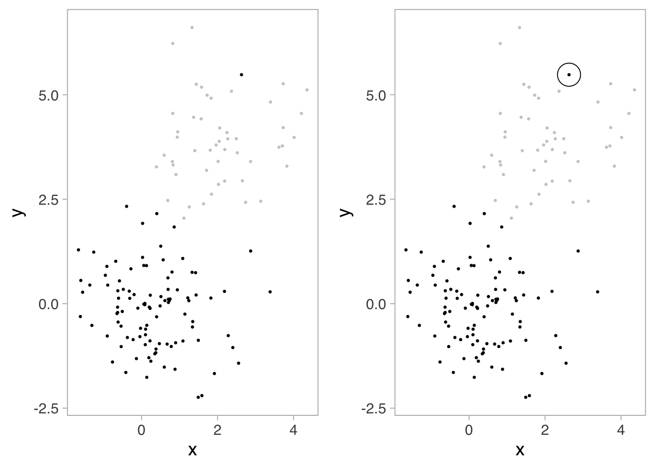
We assemble mental models of grouping through differences in similarity, proximity, enclosure, size, color, shading, and hue, to name a few. In Figure 7.1, for example, we recognize dataset three as having a grouped linear relationship with one outlier based on proximity. Using shading, for example, we can separate groups of data. In the left panel of Figure 8.1, we naturally see two groups, one gray, and the other black, which has an outlier. We could even enclose the outlier to further call attention to it, as shown on the right panel.

Several authors1 provide in-depth reviews of these ideas. We can, and should, use these ideas to assist us in understanding and communicating data through graphical displays.
Graphical interpretation, however, comes with its own limitations. Our accuracy in estimating the quantities represented in visual encoding depends on the geometries used for encoding. In other words, it can be easy for us, and less familiar readers, to misinterpret a graph. Consider the example in Figure 8.2 where the slope of the trend changes rapidly. Considering the left panel alone, it may seem deviations from the fitted line decrease as x increases. But the residuals encoded in the right panel show no difference.
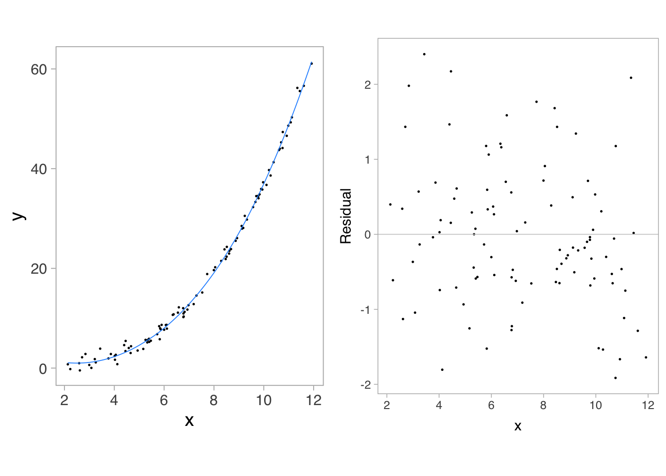
The misperception arises if we mistakenly compare the minimal distance from each point to the fitted line instead of comparing the vertical distance to the fitted line. Cleveland (1985) has thoroughly reviewed our perceptions when decoding quantities in two or more curves, color encoding (hues, saturations, and lightnesses for both categorical and quantitative variables), texture symbols, use of visual reference grids, correlation between two variables, and position along a common scale. Empirical studies by Cleveland and McGill (1984) and Heer and Bostock (2010) have quantified our accuracy and uncertainty when judging quantity in a variety of encodings.
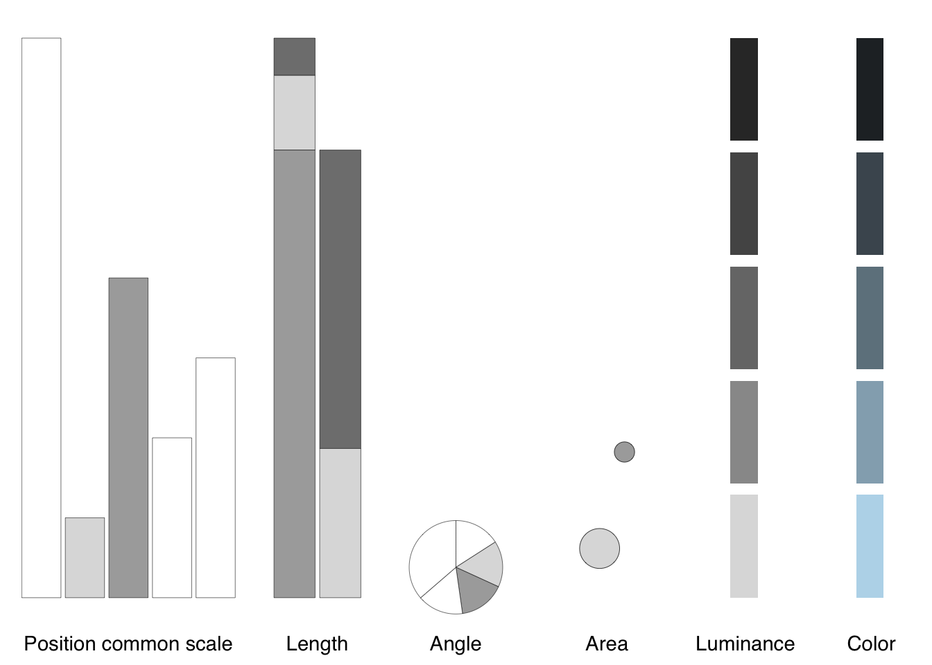
The broader point is to become aware of issues in perception and consider multiple representations to overcome them. Several references mentioned in the literature review delve into visual perception and best practices for choosing appropriate visualizations.@koponen2019, for example, usefully arranges data types within visual variables and orders them by our accuracy in decoding, shown in Figure 8.3:
Placing encodings in the context of chart types, Figure 8.4, we decode them from more to less accurate, position encoding along common scales (e.g., bar charts, scatter plots), length encodings (e.g., stacked bars), angles (e.g., pie charts), circular areas (e.g., bubble charts), luminance, and color (Munzner 2014):
A thorough visual analysis may require multiple graphical representations of the data, and each require inspection to be sure our interpretation is correct.
8.1 Color
As mentioned, We can encode data using color spaces, which are mathematical models. The common color model RGB has three dimensions — red, green, and blue, each having a value between 0 and 255 (\(2^8\)) — where those hues are mixed to produce a specific color.
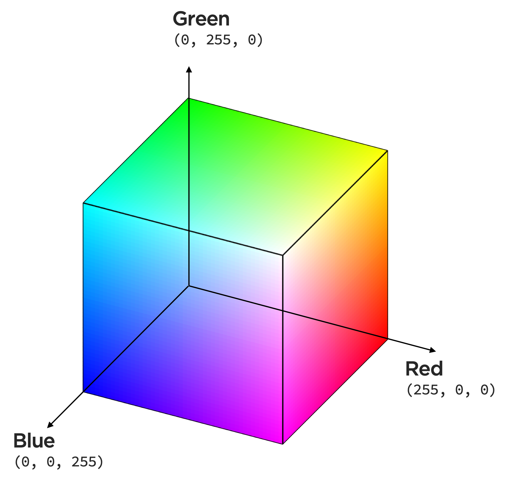
Notice the hue, chroma (saturation), and luminance of this colorspace,
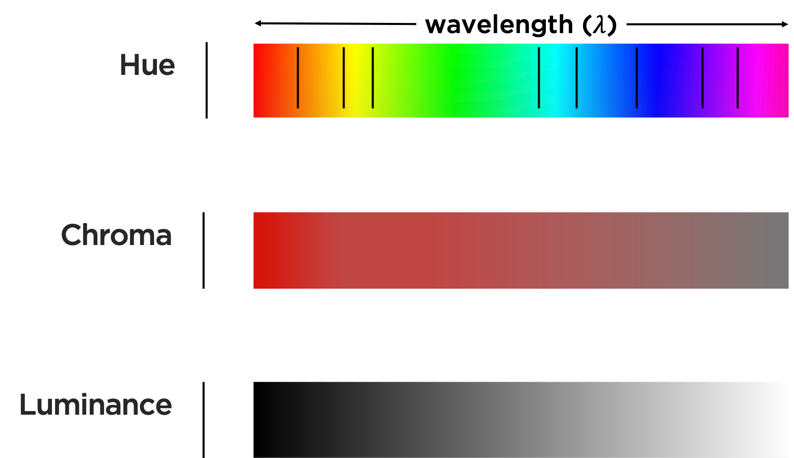
seems to have uneven distances and brightness along wavelength.
Let’s consider how we might, as illustrated below, map data to these characteristics of color.
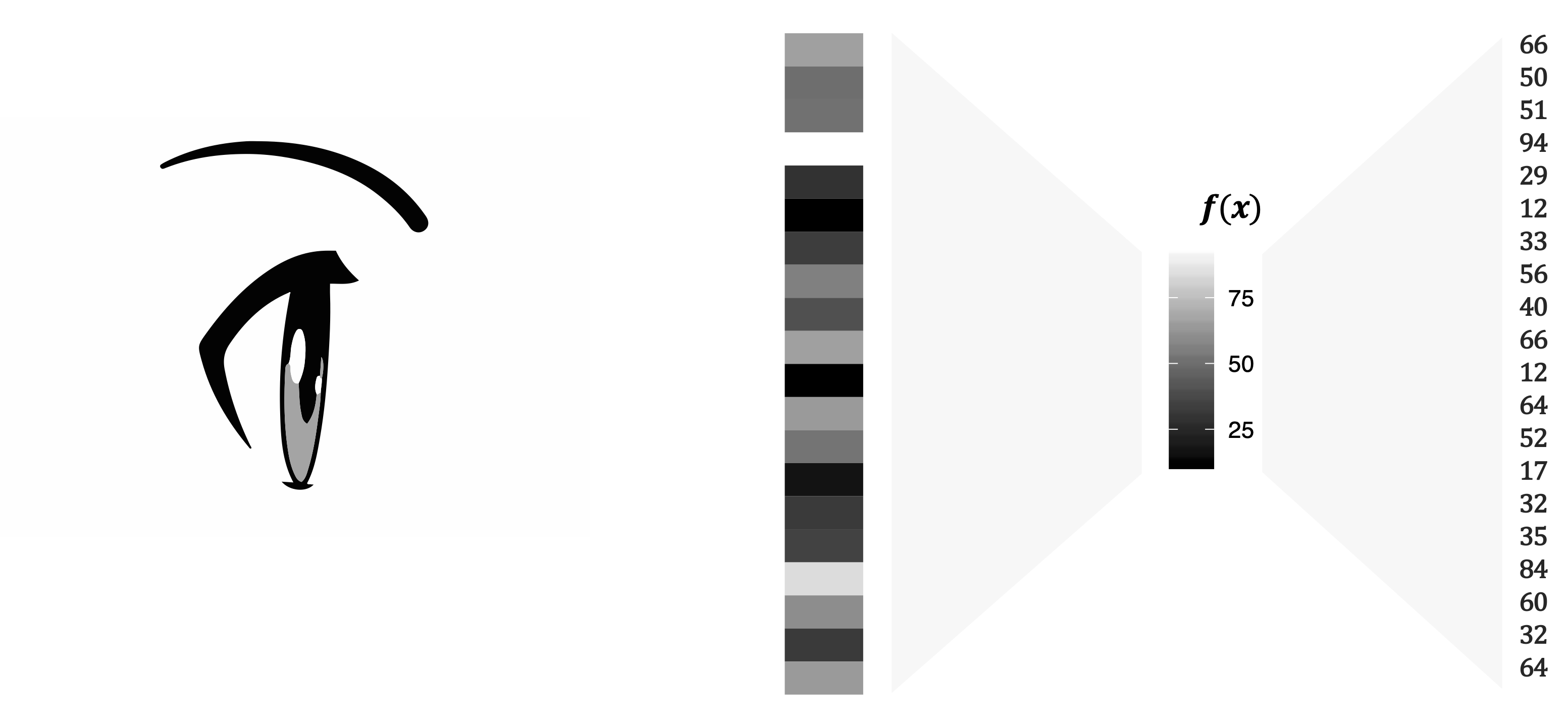
Luminance is the measured amount of light coming from some region of space. Brightness is the perceived amount of light coming from that region of space. Perceived brightness is a very nonlinear function of the amount of light emitted. That function follows the power law:
\[ \begin{equation} \begin{split} \textrm{perceived brightness} = \textrm{luminance}^n \end{split} \end{equation} \]
where the value of \(n\) depends on the size of the patch of light. Ware (2020) reports that, for circular patches of light subtending 5 degrees of visual angle, \(n\) is 0.333, whereas for point sources of light \(n\) is close to 0.5. Let’s think about this graphically. Visual perception of an arithmetical progression depends upon a physical geometric progression (Albers 2006). In a simplification shown in Figure 8.8, this means: if the first 2 steps measure 1 and 2 units in rise, then step 3 is not only 1 unit more (that, is, 3 in an arithmetical proportion), but is twice as much (that is, 4 in a geometric proportion. The successive steps then measure 8, 16, 32, 64 units.
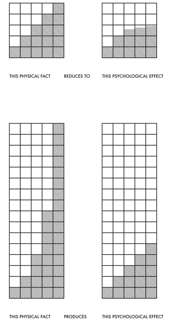
Color intervals are the distance in light intensity between one color and another, analogous to musical intervals (the relationship between notes of different pitches).
Uneven wavelengths between what we perceive as colors, as we saw in the RGB color space, results in, for example, almost identical hues of green across a range of its values while our perception of blues change more rapidly across the same change in values. We also perceive a lot of variation in the lightness of the colors here, with the cyan colors in the middle looking brighter than the blue colors.
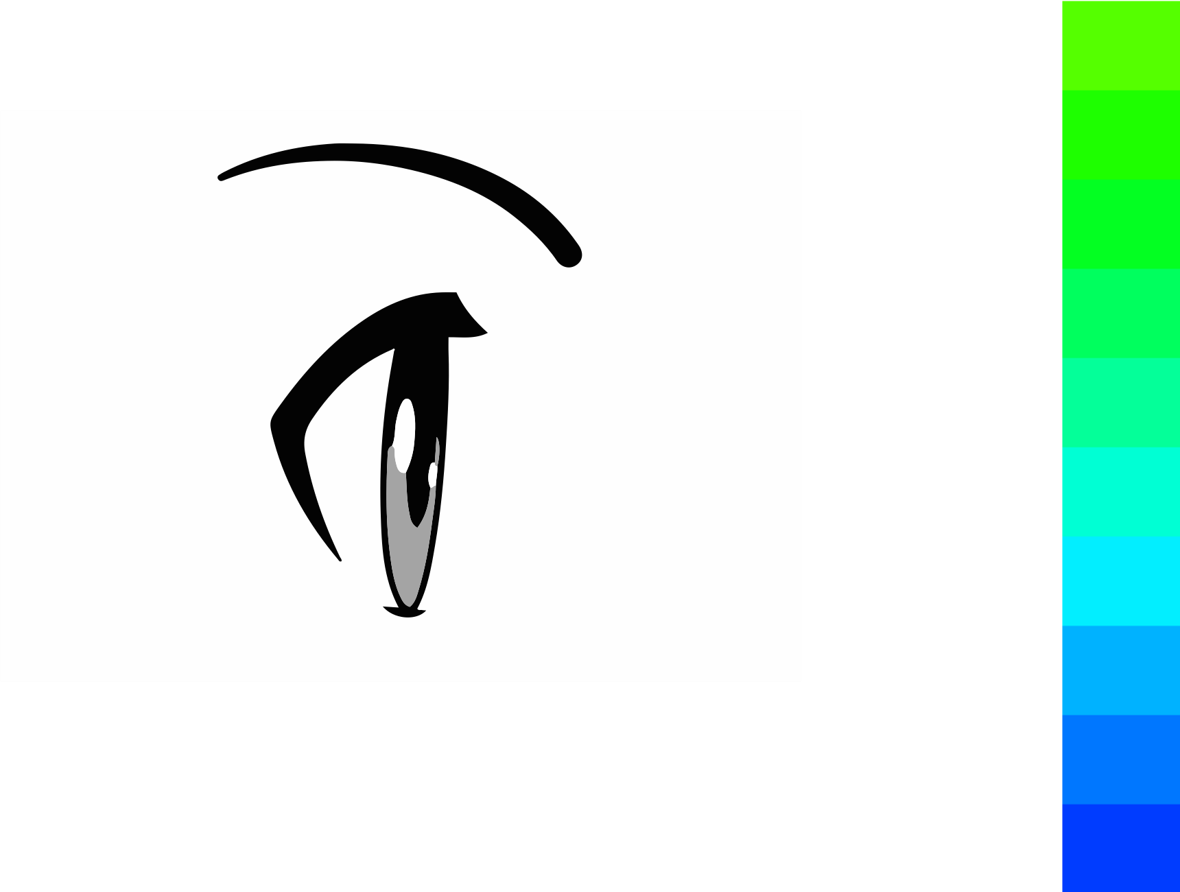
The problem exists in each channel or attribute of color. Let’s consider examples by comparing the hue, saturation, and luminance of two blocks. Do we perceive these rectangles as having the same luminance or brightness?
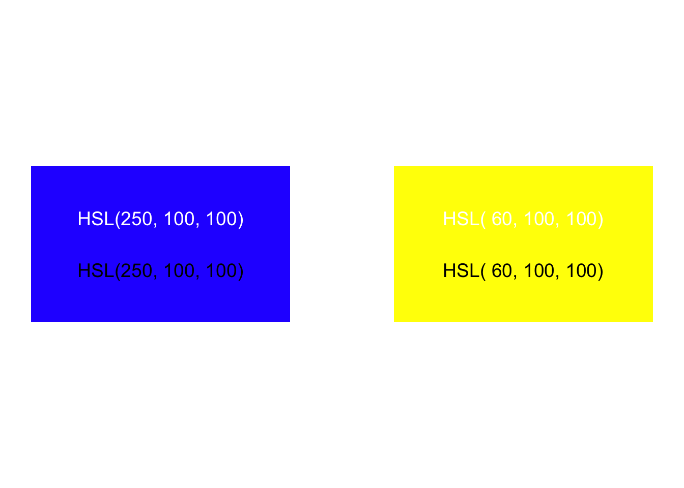
Do we perceive these as having the same saturation?
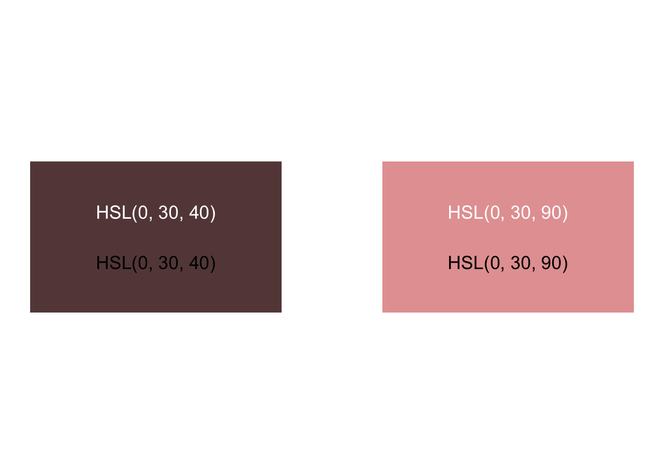
Do we perceive these as having equal distance between hues?
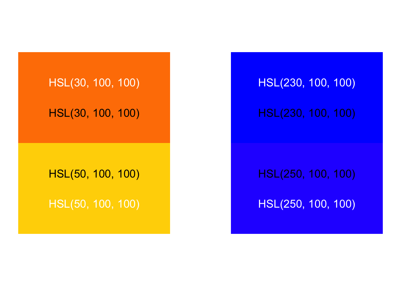
There’s a solution, however. Other color spaces show changes in color we perceive as uniform. Humans compute color signals from our retina cones via an opponent process model, which makes it impossible to see reddish-green or yellowish-blue colors. The International Commission on Illumination (CIE) studied human perception and re-mapped color into a space where we perceive color changes uniformly. Their CIELuv color model has two dimensions — u and v — that represent color scales from red to green and yellow to blue.
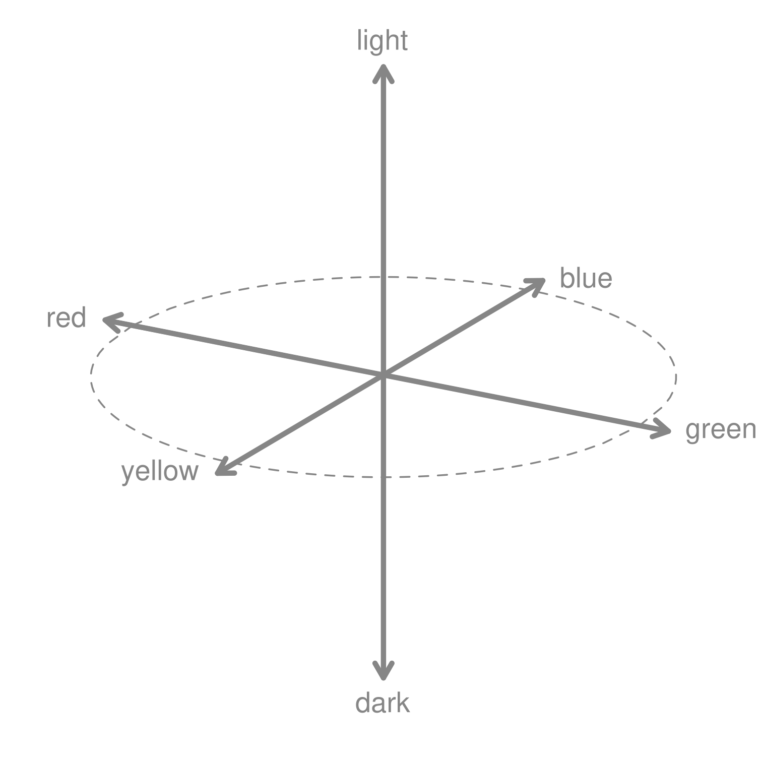
More modern color spaces improve upon CIELuv by mapping colors as perceived into the familiar and intuitive Hue-Chroma-Luminance2 dimensions. Several modern color spaces, along with modification to accommodate colorblindness, are explained in the expansive Koponen and Hildén (2019). In contrast with the perceptual change shown with an RGB colorspace above, the change in value shown below of our green-to-blue hues in 10 equal steps using the HCL model are now perceptually uniform.
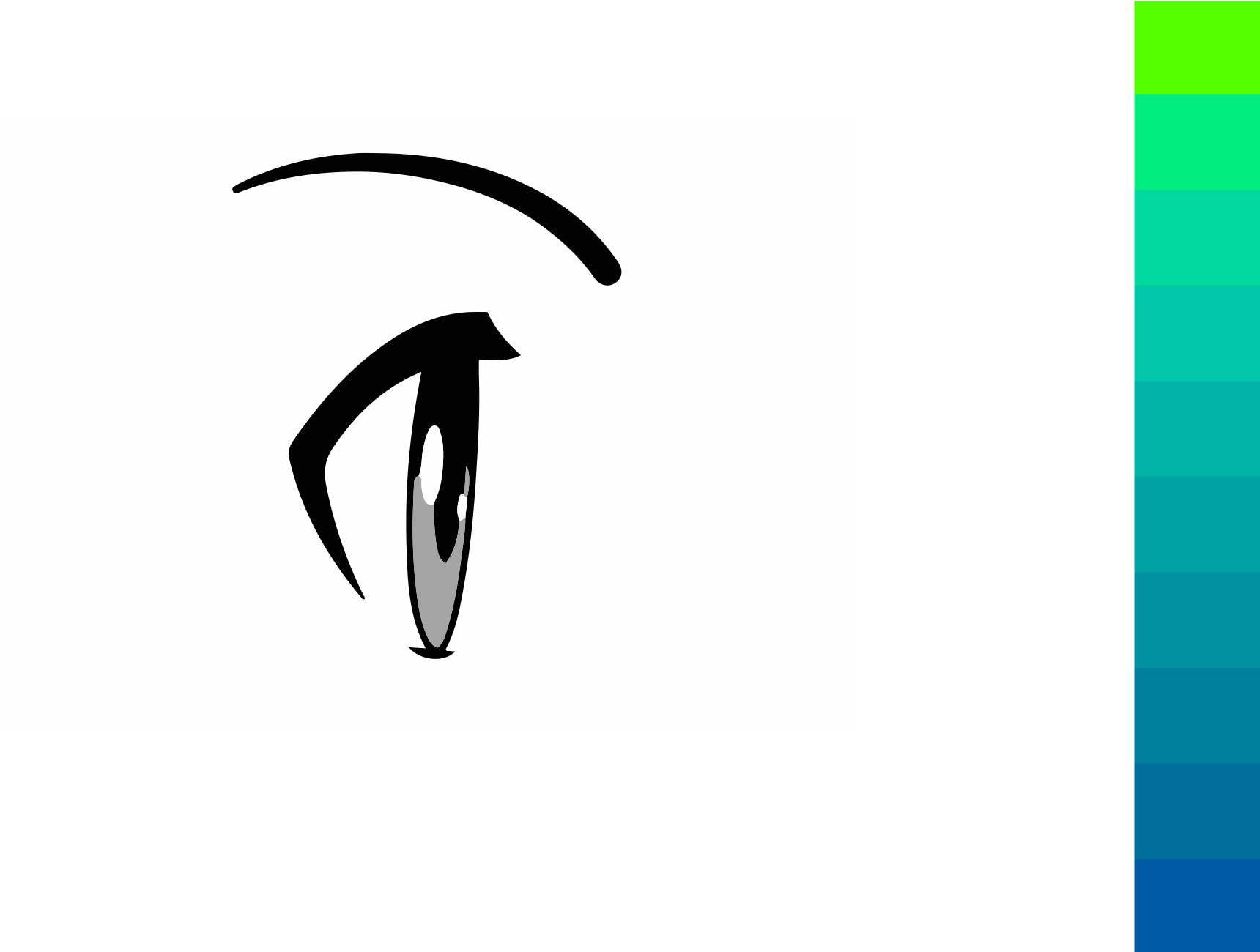
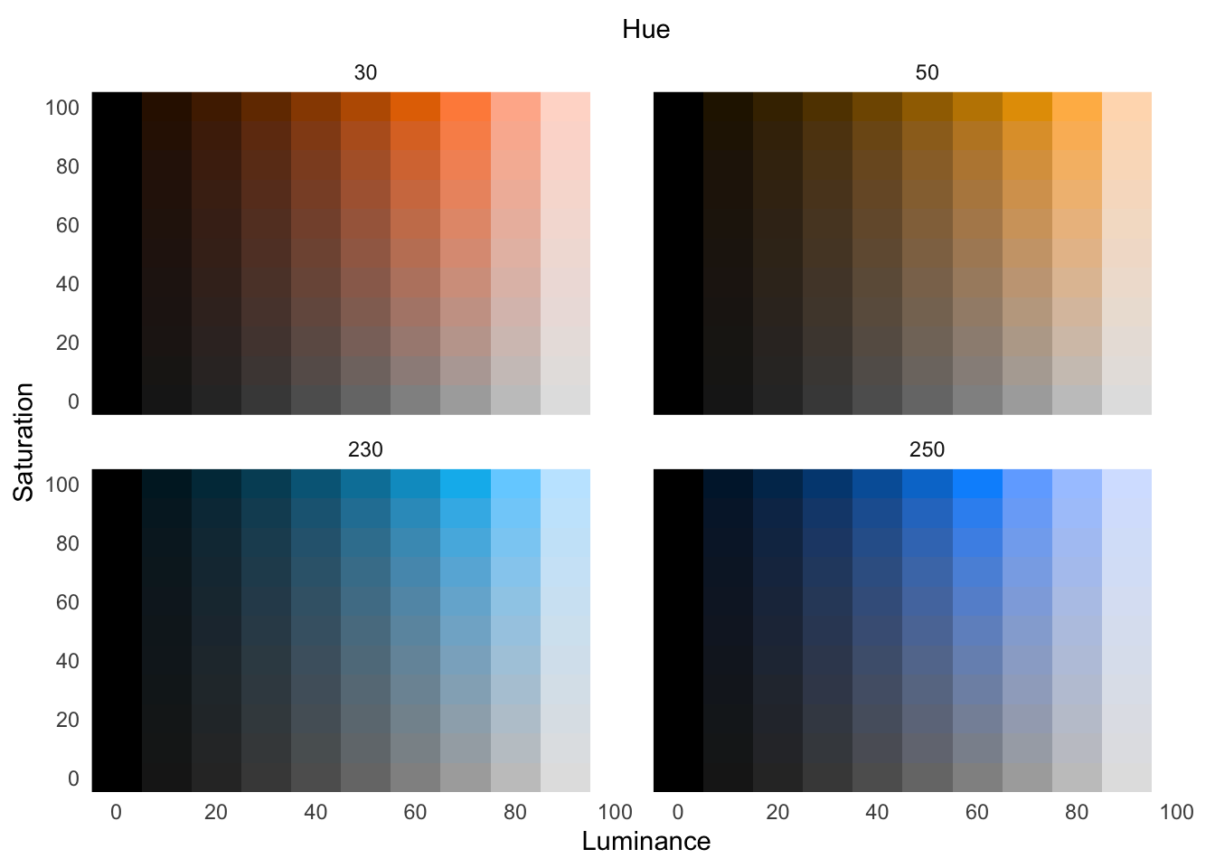
For implementations of perceptually uniform color spaces in R, see Spencer (2020) and Zeileis, Hornik, and Murrell (2009). Using the perceptually uniform colorspace HSLuv, let’s explore the above hue changes, across various saturation and luminance:
With categorical data, we do not want one color value to appear brighter than another. Instead, we want to choose colors that both separate categories while holding their brightness level equal.
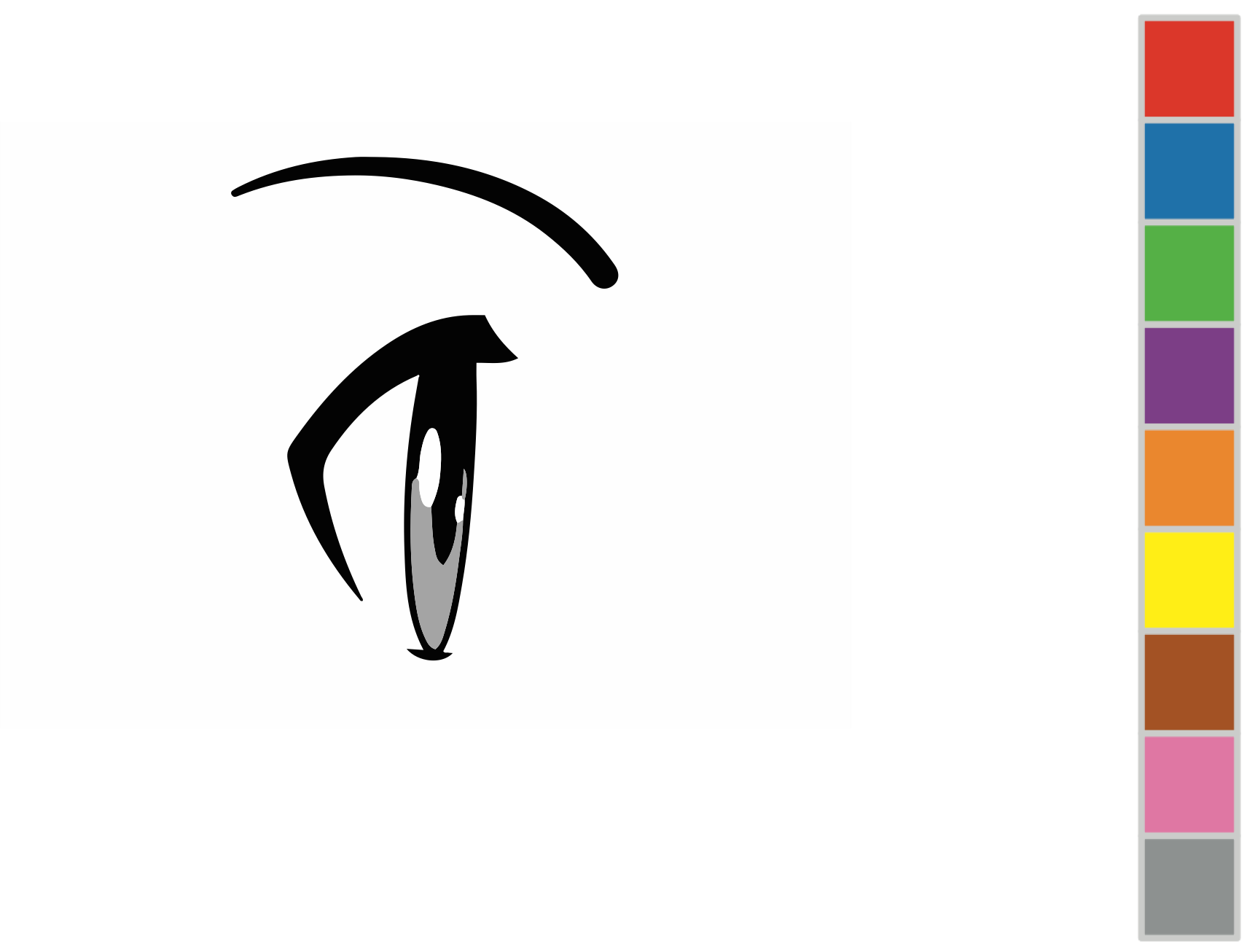
When mapping data to color channels — hue, saturation, or lightness — use a perceptually uniform colorspace.
8.2 Relativity of color
Notice, by the way, that each of the above 10 equal blocks from green to blue appear to show a gradient in hue. We also see this for each step in luminance (but not across blocks of saturation) in our HSLuv comparisons. That isn’t the case, the hue is uniform within each block or step. Our eyes, however, perceive a gradient because the adjacent values create an edge contrast. Humans have evolved to see edge contrasts, as in Figure 8.17.
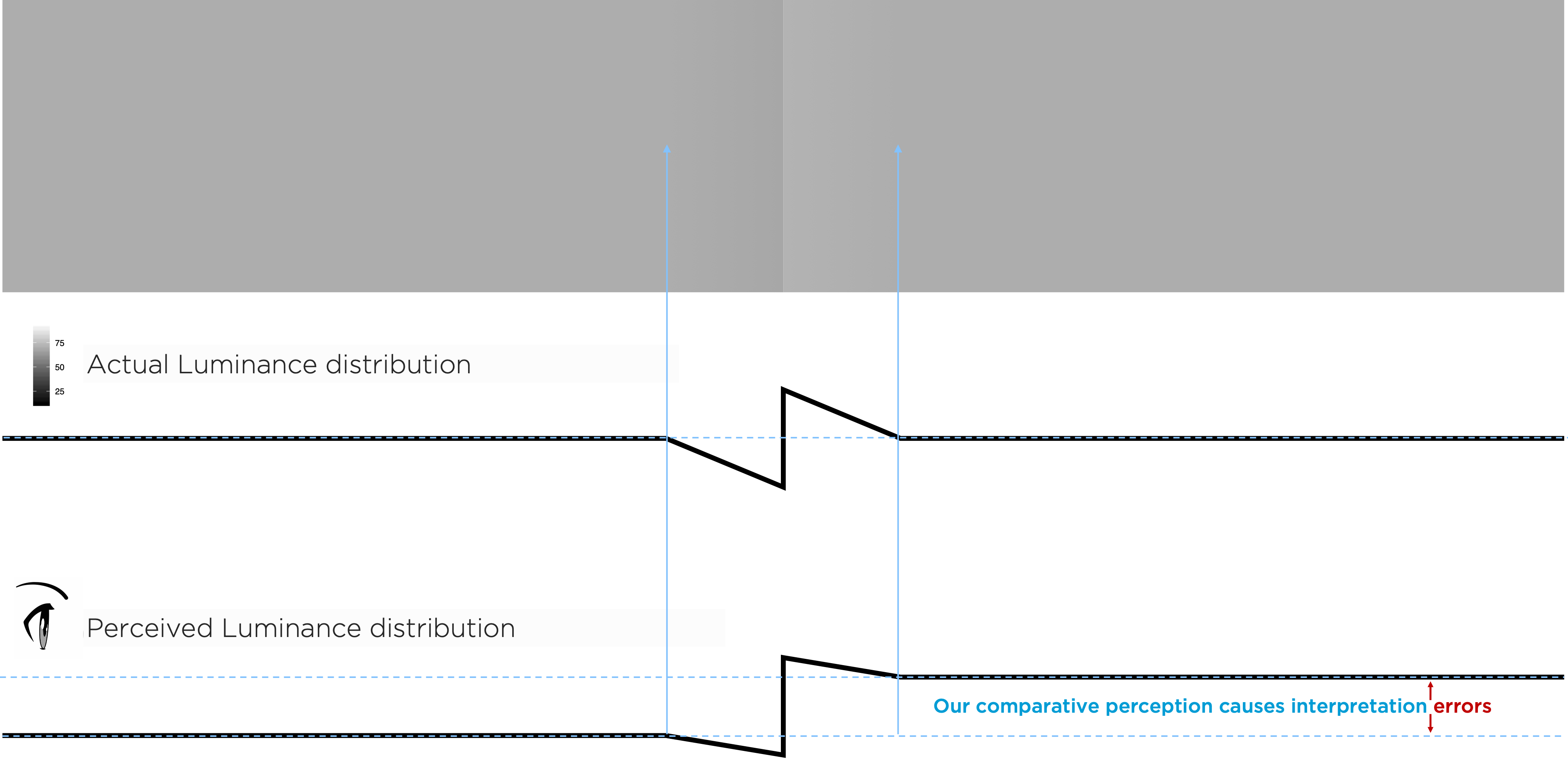
We see comparative — not absolute — luminance value. The edge between the left and right gray rectangles in Figure 8.17, created by a luminance adjustment tricks us into seeing each rectangle as uniform and differing in shade, though the outer portions of each have the same luminance. Need proof? Cover the edge portion between them!
Similarly, our comparative perception has implications for how to accurately represent data using luminance. Background or adjacent luminance — or hue or saturation — can influence how our audience perceives our data’s encoded luminance value. The small rectangles in the top row of Figure 8.18 all have the same luminance, though they appear to change. This misperception is due to the background gradient.

One color can interact to appear as two. The inner blocks on the left are the same color, and the two inner blocks on the right are the same, but different background colors change our perception:
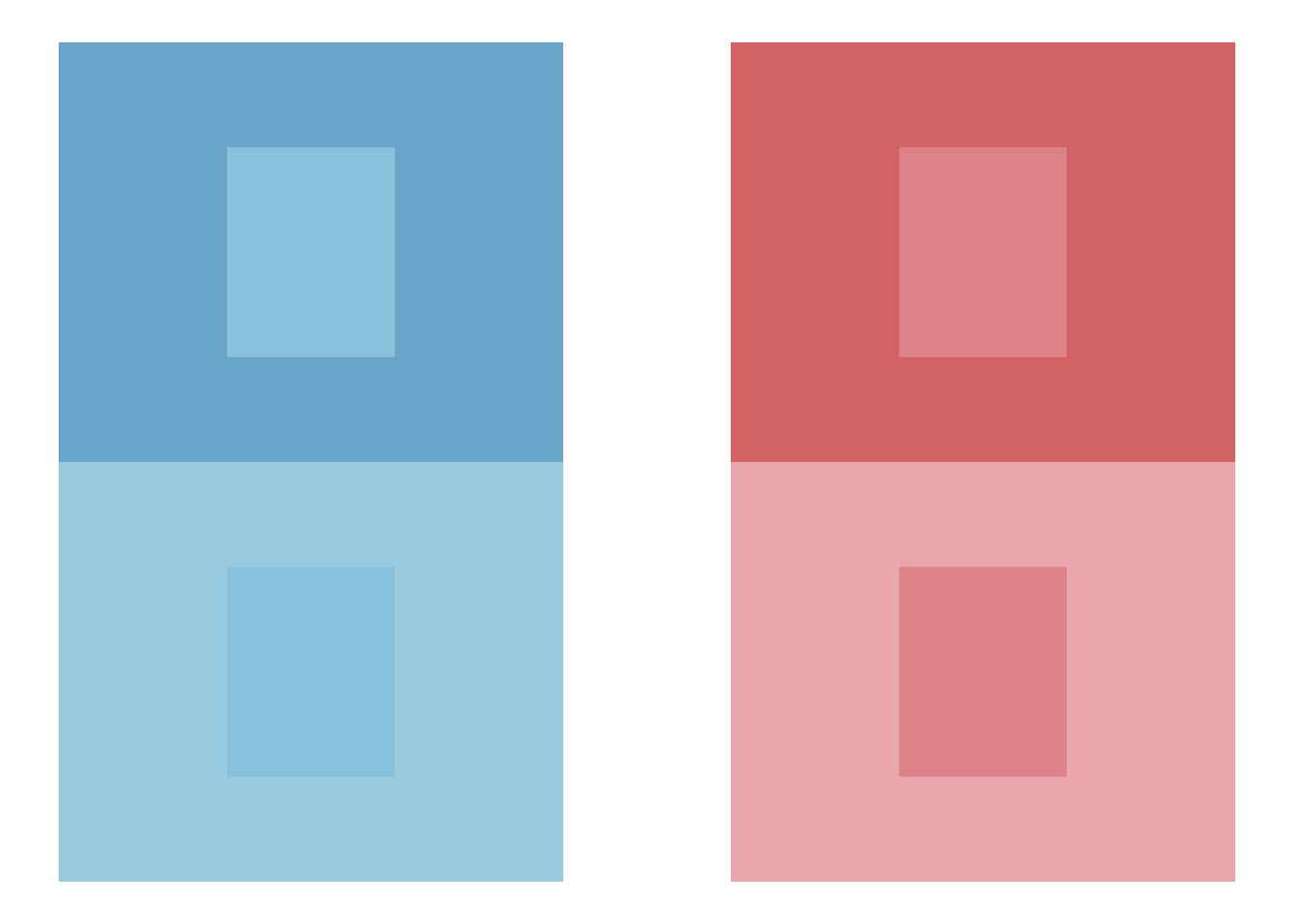
Two different colors can interact to appear as one. In this case, the background colors change our perceptions of the two different inner blocks such that they appear the same:

And contrasting hues with similar luminance can create vibrating boundaries:
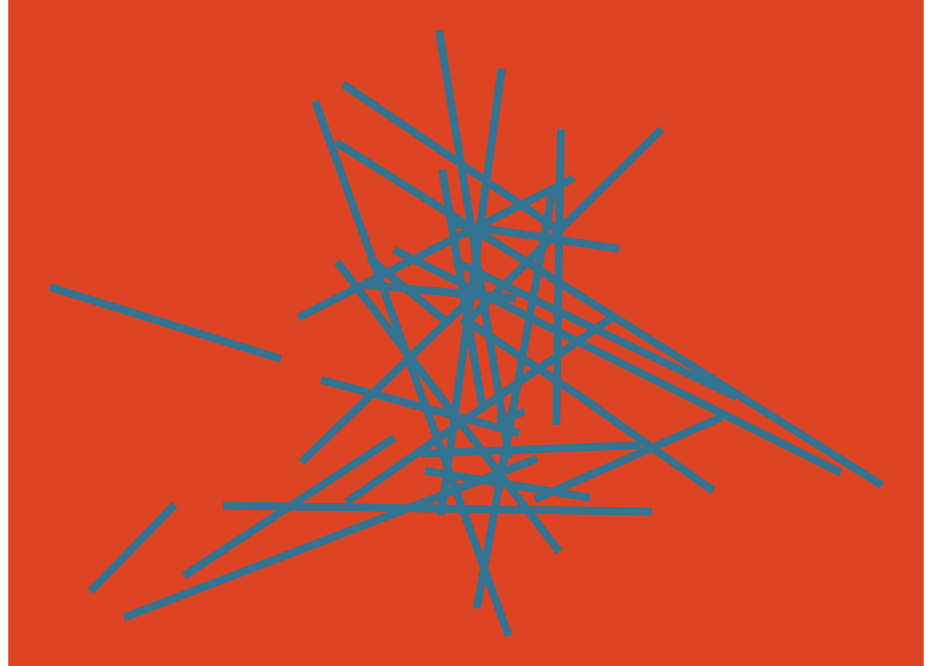
These examples were adapted from those in Albers (2006), which discusses yet more ways the relativity of color can mislead us.
Exercise 8.1 Locate two or three graphics on the internet, each with different types of data-ink encodings you believe are well-designed. Be adventurous. Describe those encodings without using names of charts.
Exercise 8.2 Locate two graphics, each with different types of data-ink encodings you believe are problematic. Describe the encodings, what makes them problematic, and suggest a more appropriate encoding.
Exercise 8.3 Explain how you might use the apparent problem of vibrating boundaries to help an audience. Hint: think about why we use gestalt principles.
8.3 Color blindness
Accounting for the relative nature of color is already challenging. To make our work more difficult, individuals experience color differently. Some individuals, for example, have difficulties differentiation hues like between red and green.
8.4 Maximize information
Maximize the information in visual displays within reason. Tufte (2001) measures this as the data-ink ratio:
\[ \begin{aligned} \textrm{data-ink ratio} =\; &\frac{\textrm{data-ink}}{\textrm{total ink used to print the graphic}} \\ \\ =\; &\textrm{proportion of a graphic's ink devoted to the} \\ &\textrm{ non-redundant display of data-information}\\ \\ =\; &1.0 - \textrm{proportion of a graphic that can be} \\ &\textrm{erased without loss of data-information} \\ \\ \end{aligned} \]
That means identifying and removing non-data ink. And identifying and removing redundant data-ink. Both within reason. Just how much requires experimentation, which is arguably the most valuable lesson3 from Tufte’s classic book, The Visual Display of Quantitative Information. In it, he systematically redesigns a series of graphics, at each step considering what helps and what may not. Tufte, of course, offers his own view of which versions are an improvement. His views are that of a designer and statistician, based on his experience and theory of graphic design.
Some of his approaches have also been subject to experiments (Anderson et al. 2011), which we should consider within the context and limitations of those experiments. More generally, for any important data graphic for which we do not have reliable information on its interpretability, we should perform tests on those with a similar background to our intended audiences.
Let’s reconsider the example figure from Knaflic:
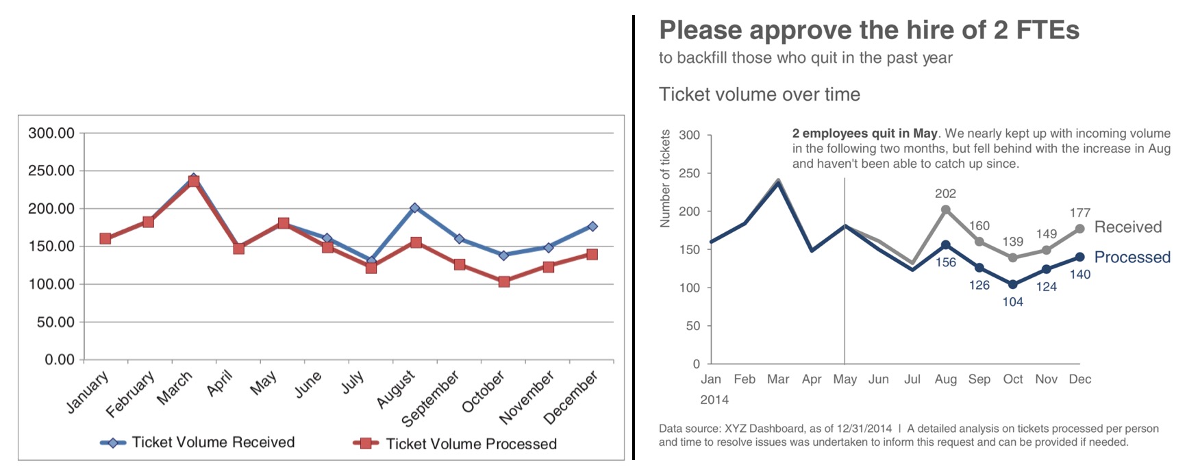
Compare Knaflic’s before-and-after example.
Exercise 8.4 Try to articulate all differences. Consider whether her changes follow Tufte’s principles, and whether each of her changes would improve her audience’s understanding of the intended narrative and supporting evidence.
For the next example, revisiting the Dodgers, consider the following example analysis related to understanding game attendance as a function of fan preferences for game outcome certainty, since maximizing attendance is a marketing objective:
Example 8.1 To help us understand game attendance as a function of fan preference for certainty or uncertainty of the game outcome, we created a model. It included variables like day of the week, time of day, and the team’s cumulative fraction of wins. We believe that some uncertainty helps attract people to the game. But how much? It also seems reasonable to believe that the function is non-linear: a change in probability of a win from 0 percent to 1 percent may well attract fewer fans than if from 49 percent to 50 percent. Thus, we modeled the marginal effect of wins as quadratic. Our overall model, then, can be described as:
\[ \textrm{Normal}(\theta, \sigma) \]
for game \(i\), where \(\theta\) represents the mean of attendance, \(\sigma\) the variation in attendance, and \(\theta\) itself decomposed:
\[ \begin{equation} \begin{split} \theta_i \sim &\alpha_{1[i]} \cdot \textrm{day}_i + \alpha_{2[i]} \cdot \textrm{time}_i + \\ &\beta_{1[i]} \cdot \frac{\sum{\textrm{wins}_i}}{\sum{\textrm{games}_i}} + \beta_{2[i]} \cdot p(\textrm{win}_i) + \beta_{3[i]} \cdot p(\textrm{win}_i)^2 \end{split} \end{equation} \]
With posterior estimates from the model, we calculated the partial derivative of estimates of win uncertainty (\(\beta_2\) and \(\beta_3\)) to find a maximum:
\[ \textrm{Maximum} = \frac{-\beta_2}{2 \cdot \beta_3 } \]
For the analysis, we used betting market odds as a proxy for fans’ estimation of their team’s chances of winning. The betting company Pinnacle made these data available for the 2016 season, which we combined with game attendance and outcome data from Retrosheets.
The analysis included the exploratory graphic on the left, using default graphic settings, in Figure 8.23, and the communicated graphic on the right.
Exercise 8.5 Try to articulate all differences between the exploratory and communicated graphic. Consider whether the changes follow Tufte’s principles, if so, which, and whether each of the changes would improve the marketing audience’s understanding of the intended narrative and supporting evidence. Can you imagine other approaches?
In-depth reviews are in Ware (2020), Bertin (1983), Meirelles (2013), and Healey and Enns (2012).↩︎
Same as Hue-Saturation-Brightness.↩︎
Indeed, most criticisms of Tufte’s work misses the point by focusing on the most extreme cases of graphic representation within his process of experimentation, completely losing what we should learn — how to reason and experiment with data graphics. Focus on learning the reasoning and experimentation process.↩︎