10 Encoding uncertainty, estimates, and forecasts
10.1 Motivation to communicate uncertainty
Most authors do not convey uncertainty in their communications, despite its importance (Hullman 2020). Yet good decisions rely on knowledge of uncertainty (B. Fischhoff and Davis 2014); (Baruch Fischhoff 2012). Scientists are often hesitant to share their uncertainty with decision-makers who need to know it. With an understanding of the reasons for their reluctance, decision-makers can create the conditions needed to facilitate better communication. The failure to express uncertainty has a negative value. Communicating knowledge can worsen results if it induces unwarranted confidence or is so hesitant that other, overstated claims push it aside. Quantifying uncertainties aids verbal expression.
If we perceive the concern: people will misinterpret quantities of uncertainty, inferring more precision than intended. We might respond: Most people like getting quantitative information on uncertainty, from them can get the main message, and without them are more likely to misinterpret verbal expressions of uncertainty. Posing clear questions guide understanding. Concern: people cannot use probabilities. Response: laypeople can provide high-quality probability judgments, if they are asked clear questions and given the chance to reflect on them. Communicating uncertainty protects credibility. Concern: credible intervals may be used unfairly in performance evaluations. Response: probability judgments give us more accuracy about the information; i.e., won’t be too confident or lack enough confidence.
10.2 Research in uncertainty expression
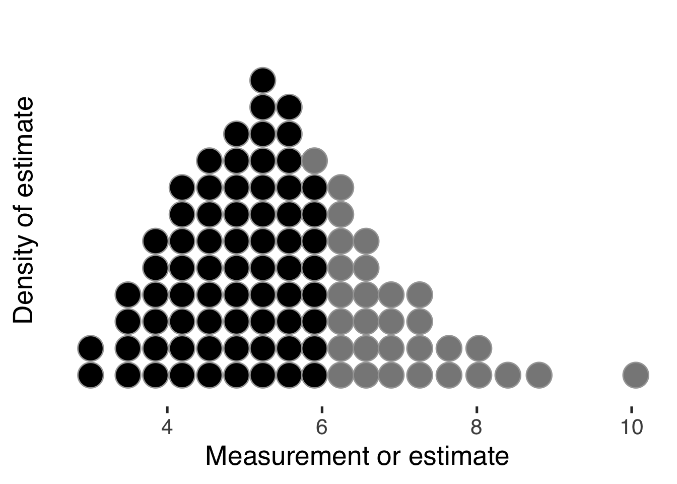
Hullman (2019) provides a short overview of some ways we can represent uncertainty in common data visualizations, along with pros and cons of each. Recent ideas include hypothetical outcome plots (Kale et al. 2018), quantile dotplots Fernandes et al. (2018)] and (Kay et al. 2016), like this,

where the reader can count or estimate the relative frequency occurring at at given measurement, and compare the numbers above or below some threshold. Or values coded with hue and luminosity to create a value-suppressing uncertainty palette (Correll, Moritz, and Heer 2018),
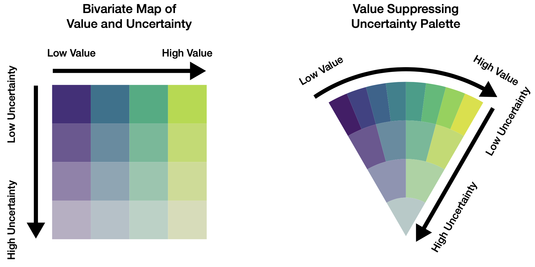
and gradient and violin plots (Correll and Gleicher 2014), as used below in, for example, Figure 10.5.
Missing data create another form of uncertainty, and are common in data analytics projects. The worst approach, usually, is to delete those observations, see (Little and Rubin 2019) and (Baguley and Andrews 2016). Instead, we should think carefully about an appropriate way to represent our uncertainty of those values, usually through multiple imputation. This approach means we treat each missing value as an estimated distribution of possible values. We also need to communicate about those missing values. There are other approaches (Song and Szafir 2018) for visualizing missing data.
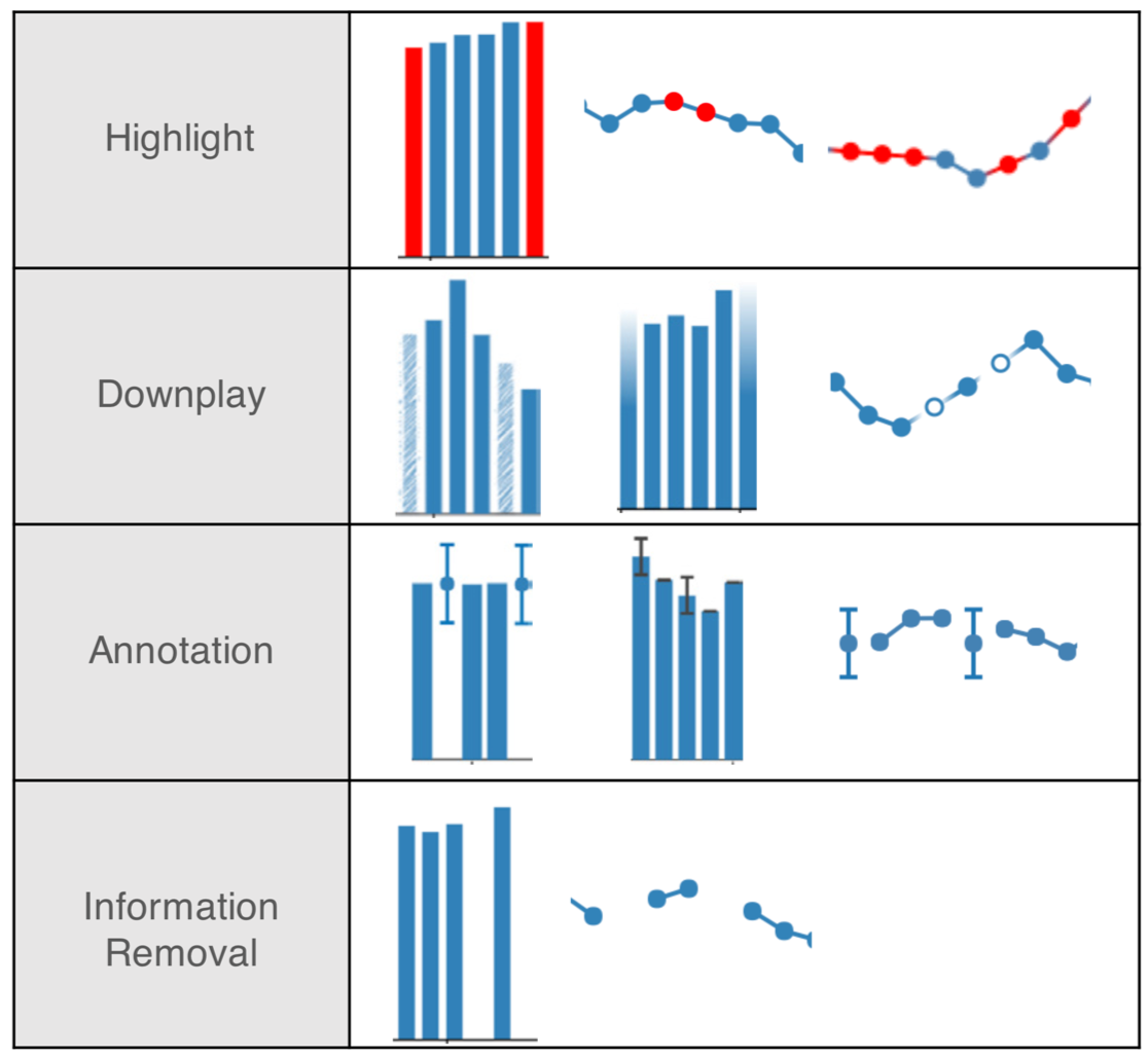
Data are part of our models; understanding what is not there is important.
10.3 Estimations and predictions from models
To persuasively communicate estimates and predictions, we must understand our models. Our goal in modeling is most typically to understand real processes and their outcomes, to understand what has happened, why, and to consider what may transpire.
Data represent events, outcomes of processes. Let’s call the data observed variables. Typically, we do not know enough about the process to be certain about which outcome will be next: if we did, we wouldn’t need to model it!
But with some knowledge of the process — even before knowing the observed variables — we have an idea of its possible outcomes and probability of each outcome. This knowledge, of course, comes from some kind of earlier (prior) data, perhaps from various sources.
We’ve mentioned that visualization is a form of mental modeling of the data. Visual displays enable us to find relationships between the variables of interest. But not all relations lend themselves to the displays at our disposal. This is especially true as the quantity and type of variables grow.
10.3.1 Conceptualizing models
Complementary to visual analyses, we code models to identify, describe, and explain relationships. We have already used a basic regression model earlier when exploring Anscombe’s Quartet. That linear regression could be coded in R as simply lm(y ~ x). But mathematical notation can give us a more informative, equivalent description. Here, that might be1,
\[ \begin{equation} \begin{split} y &\sim \textrm{Normal}(\mu, \sigma) \\ \mu &= \alpha + \beta \cdot x \\ \alpha &\sim \textrm{Uniform}(-\infty, \infty) \\ \beta &\sim \textrm{Uniform}(-\infty, \infty) \\ \sigma &\sim \textrm{Uniform}(0, \infty) \end{split} \end{equation} \]
Considering a second example, if we are given a coin to flip, our earlier experiences with such objects and physical laws suggest that when tossed into the air, the coin would come to rest in one of two outcomes: either heads or tails facing up. And we are pretty sure, but not certain, that heads would occur around 50 percent of the time. The exact percentage may be higher or lower, depending on how the coin was made and is flipped. We also know that some coins are made to appear as a “fair” coin but would have a different probability for each of the two outcomes. Its purpose is to surprise: a magic trick! So let’s represent our understanding of these possibilities as an unobserved variable called \(\theta\). \(\theta\) is distributed according to three, unequal possibilities: The coin is balanced, heads-biased, or tails-biased.
10.3.2 Visually communicating models
Then, we can represent our prior understanding of the probability of heads as distributed, say, \(\textrm{Beta}(\theta \mid \alpha, \beta)\) where \(\theta\) is the probability, and \(\alpha\) and \(\beta\) are shape parameters, and the observed data distributed \(\textrm{Binomial}(\textrm{heads} \mid \textrm{flips}, \theta)\). If we were very confident that the coin was fair, we could keep the prior distribution narrowly near a half, but in this example we will leave extra uncertainty for the possibility of a trick coin, say, \(\alpha = \beta = 10\), as shown in the left panel of Figure 10.4. For 8 heads in 10 flips, our model distribution with this data are shown in the middle panel of Figure 10.4.
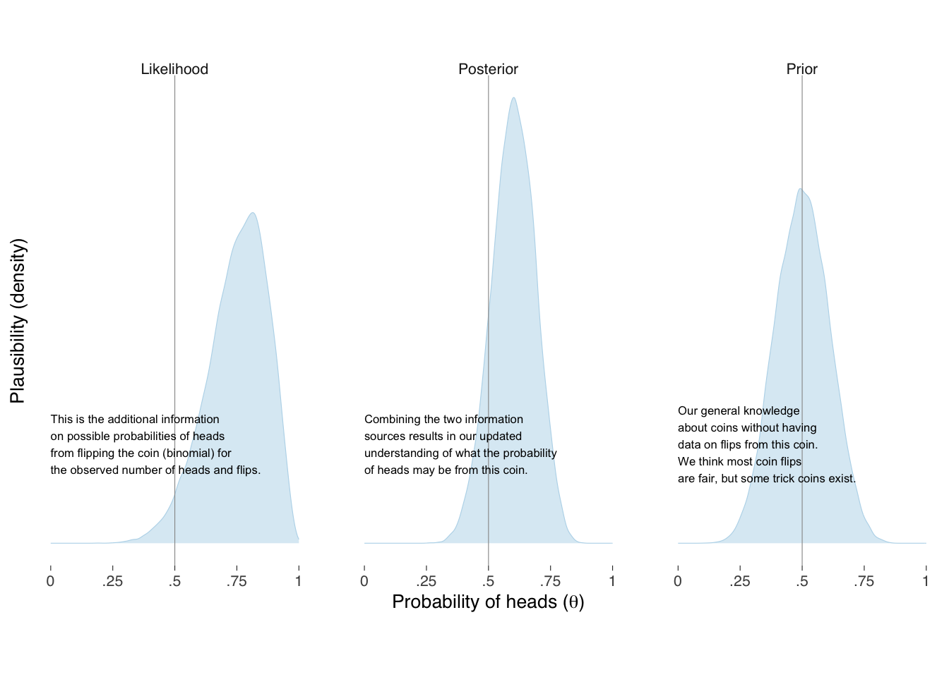
When our model combines the two sources of knowledge together, shown on the right panel of Figure 10.5, we get our updated information on, and uncertainty of, what the underlying probability of heads may be for this coin. Such distributions most fully represent the information we have about, and should be considered when describing our modeling. With the distributions in pocket, of course, we can summarize them in whatever way makes sense to the questions we are trying to answer and for the audience we intend to persuade. Figure 10.5 provides one alternative for expressing our knowledge and uncertainty.
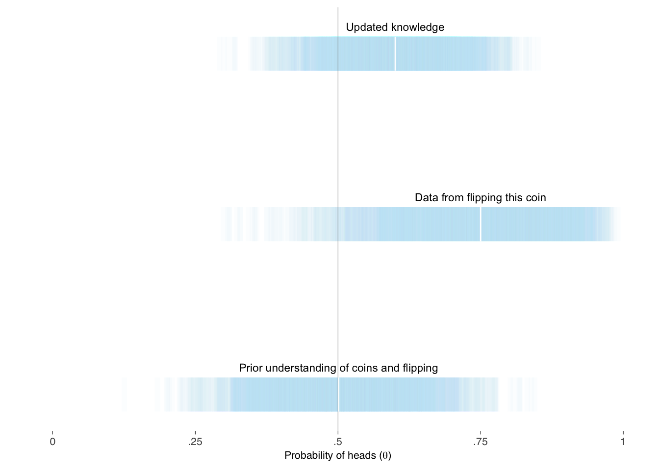
The above is a more intuitive representation of the variation than in table Table 10.1. Tables may, however, complement the information in a graph display.
| Knowledge | Min | 25th | 50th | 75th | Max |
|---|---|---|---|---|---|
| Prior | 0.10 | 0.42 | 0.50 | 0.58 | 0.86 |
| Likelihood | 0.19 | 0.67 | 0.76 | 0.84 | 0.99 |
| Posterior | 0.25 | 0.54 | 0.60 | 0.66 | 0.88 |
Modeling is usually, of course, more complex than coin flipping and can be a vast, complex subject. That does not mean it cannot be visualized and explained persuasively. Much can be learned about how to explain what we are doing by reviewing well-written introductions on the subject of whatever types of models we use. There are several references — for example, (McElreath 2020) and (Stan Development Team 2019) — that thoroughly introduce applied Bayesian modeling.
McElreath explains what models are, and step-by-step explains various types in words, mathematically, and through corresponding code examples. These models are various: continuous outcome with one covariate, a covariate in polynomial form, multiple covariates, interactions between covariates, generalized linear models, such as when modeling binary outcomes, count outcomes, unordered and ordered categorical outcomes, multilevel covariates, covariance structures, missing data, and measurement error. Along the way, he explains their interpretations, limitations, and challenges.
10.3.3 Causal relationships
McElreath also introduces the importance of thinking causally when modeling. This is especially important in selecting variables. One variable may mask — confound — the relationship between two other variables. We can think about relationships and causation with a tool called a directed acyclic graph (DAG). McElreath discusses four types of confounds, and the solutions to avoid them, so that we may better understand the relationships between variables of interest. His instruction is especially helpful as it is provided an applied setting with examples. For more in-depth understanding of causation, consult Pearl (2009).
10.4 Combining data graphics in a visual narrative
Recall our first layer of messages for a graphic should be annotation of the graphic itself, as first discussed in section ?sec-annotating-data-graphics, and that we should consider data graphics as paragraphs about data and include them directly into the paragraph text, as discussed in section ?sec-integrating-graphics-text. We can broaden the concept of integrating or combining graphics and text to think about graphics as part of the overall narrative.
References: (Rendgen 2019); (Boy, Detienne, and Fekete 2015); (Hullman et al. 2013).
Note that in this toy example the “priors” or “unobserved variables” \(\alpha\), \(\beta\), and \(\sigma\) are distributed \(\textrm{Uniform}\) over infinity, which is what the above
lm()assigns. This is poor modeling as we always know more than this about the covariates and relationships under the microscope before updating our knowledge with data \(x\) and \(y\).↩︎