| x | y | x | y | x | y | x | y |
|---|---|---|---|---|---|---|---|
| 10 | 8.04 | 10 | 9.14 | 10 | 7.46 | 8 | 6.58 |
| 8 | 6.95 | 8 | 8.14 | 8 | 6.77 | 8 | 5.76 |
| 13 | 7.58 | 13 | 8.74 | 13 | 12.74 | 8 | 7.71 |
| 9 | 8.81 | 9 | 8.77 | 9 | 7.11 | 8 | 8.84 |
| 11 | 8.33 | 11 | 9.26 | 11 | 7.81 | 8 | 8.47 |
| 14 | 9.96 | 14 | 8.10 | 14 | 8.84 | 8 | 7.04 |
| 6 | 7.24 | 6 | 6.13 | 6 | 6.08 | 8 | 5.25 |
| 4 | 4.26 | 4 | 3.10 | 4 | 5.39 | 19 | 12.50 |
| 12 | 10.84 | 12 | 9.13 | 12 | 8.15 | 8 | 5.56 |
| 7 | 4.82 | 7 | 7.26 | 7 | 6.42 | 8 | 7.91 |
| 5 | 5.68 | 5 | 4.74 | 5 | 5.73 | 8 | 6.89 |
7 Visual design and perception
The value of data graphics can be grasp from a brief analysis of the following four datasets (1-4) of (x, y) data in table Table 7.1 from a famous data set:
For most of us, reviewing the table for comparing the four datasets from Anscombe (1973) is cognitively taxing, and especially when scanning for differences in the relationships between x and y across datasets. Processing the data this way occurs sequentially; we review data pairs with focused attention. And, here, summary statistics do not differentiate the datasets. All x variables share the same mean and standard deviation (Table 7.2). So do all y variables.
| x | y | x | y | x | y | x | y | |
|---|---|---|---|---|---|---|---|---|
| mean | 9.00 | 7.50 | 9.00 | 7.50 | 9.00 | 7.50 | 9.00 | 7.50 |
| sd | 3.32 | 2.03 | 3.32 | 2.03 | 3.32 | 2.03 | 3.32 | 2.03 |
Further, the linear regression on each dataset (Table 7.3) suggests that the (x, y) relationship across datasets are the same. Are they?
| Parameter | Mean | Std Err | t-val | p-val |
|---|---|---|---|---|
| Dataset 1 | ||||
| (Intercept) | 3.000 | 1.125 | 2.667 | 0.026 |
| x | 0.500 | 0.118 | 4.241 | 0.002 |
| Dataset 2 | ||||
| (Intercept) | 3.001 | 1.125 | 2.667 | 0.026 |
| x | 0.500 | 0.118 | 4.239 | 0.002 |
| Dataset 3 | ||||
| (Intercept) | 3.002 | 1.124 | 2.670 | 0.026 |
| x | 0.500 | 0.118 | 4.239 | 0.002 |
| Dataset 4 | ||||
| (Intercept) | 3.002 | 1.124 | 2.671 | 0.026 |
| x | 0.500 | 0.118 | 4.243 | 0.002 |
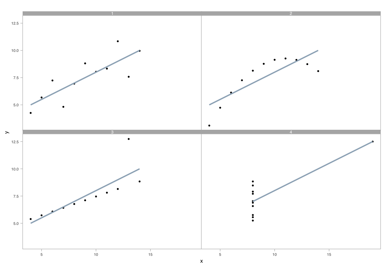
A well-crafted visual display, however, can instantly illuminate any differing (x, y) relationships among the datasets. To demonstrate, we arrange four scatterplots in Figure 7.1 showing the relationships between (x,y), one for each dataset. Overlain on each, we show the linear regression calculated above.
`geom_smooth()` using formula = 'y ~ x'
As the example shows, exploratory data analysis using visual and spatial representations add understanding. It allows us to find patterns in data, detecting or recognizing the geometry that encodes the values, assembling or grouping these detected elements, and estimating the relative differences between two or more quantities (Cleveland 1985); (Cleveland 1993). In estimating, we first discriminate between data: we judge whether \(\textbf{a}\) is equal to \(\textbf{b}\). Then we rank the values, judging whether \(\textbf{a}\) is greater than, less than, or equal to \(\textbf{b}\). Finally, we consider the ratio between them using encoded geometries (e.g., relative distance from a common line). Unlike with sequential processing required for table lookups, pattern recognition — and outliers from those patterns — seem to occur in parallel, quickly because we are attuned to preattentive attributes (Ware 2020).
7.1 Reasoning with images
We previously mentioned how, unlike processing text in linear fashion, images enable an open narrative, which we process differently (Koponen and Hildén 2019); (Sousanis 2015); (Kosslyn, Thompson, and Ganis 2006); (Baxandall 1985).
We may also combine linear and open narrative structures in various ways (Segel and Heer 2010).
…
7.2 Components of a graphic
Graphics include a coordinate system, arranged spatially, and have numerous attributes that we may make visible in some way, if it helps users understand the graphic. These components can be understood in two categories. Those encoding data (data-ink) and all the rest (non-data-ink).
7.3 Non-data-ink
We’ll use an R ggplot implementation of graphics to discuss these components1. Figure 7.2 shows the names for most of the non-data-ink components of a visual display.
Most of the aesthetics of each labeled component can be set, modified, or removed using the ggplot function theme(), which takes plot components as parameters. We set parameters equal to other formatting functions like, say, element_text() for formatting its typography, element_rect() for formatting its various shape or coloring information, or element_blank() to remove entirely the element. In Figure 7.2 , for example, we set the panel border attribute linetype and color using,
theme(panel.border = element_rect(color = "gray60",
                                  linetype = "dashed",
                                  fill = NA))
We can use the ggplot function annotate() to include words or draw directly onto the plotting area. Figure 7.3 shows the basic code structure.
In the pseudocode of Figure 7.3, we map variables in the data to aesthetic characteristics of a plot that we see through mapping = aes(<aesthetic> = <variable>)2. Particular aesthetics depend on the type of geometric encoding we choose. A scatter plot, say, would at least include x and y aesthetics. The geometric encodings are created through functions named for their geometries: e.g., geom_point(<...>) for the scatter plot, which we generalize to geom_<type>(<...>). The geometry is then mapped onto a particular coordinate system and scale: coord_<type>(<...>) and scale_<mapping>_<type>(<...>), respectively. Finally, we annotate and label the graph. These can be thought as layers that are added (+) over each previous layer.
The remaining markings of a graphic are the data-ink, the data encodings, discussed next.
7.4 Data-ink
Encodings depend on data type, which we introduced in section Section 1.1.1. As Andrews (2019) explains, “value types define how data is stored and impact the ways we turn numbers into information.” To recap, these types are either qualitative (nominal or ordered) or quantitative (interval or ratio scale).
“A component is qualitative” and nominal, Bertin3 explains, “when its categories are not ordered in a universal manner. As a result, they can be reordered arbitrarily, for purposes of information processing” (Bertin 2010). The qualitative categories are equidistant, of equal importance. Considering Citi Bike, labeled things such bikes and docking stations are qualitative at the nominal level.
“A component is ordered, and only ordered, when its categories are ordered in a single and universal manner” and “when its categories are defined as equidistant.” Ordered categories cannot be reordered. The bases in baseball are ordinal, or ordered: first, second, third, and home. Examples of qualitative ordering may be, say, temporal: morning, noon, night; one comes before the other, but we would not conceptually combine morning and night into a group of units.
When we have countable units on the interval level, the data of these counts are quantitative. A series of numbers is quantitative when its object is to specify the variation in distance among the categories. We represent these numerically as integers. The number of bike rides are countable units. The number of stolen bases in baseball are countable units. We represent these as integers.
Finally, ratio-level, quantitative values represent countable units per countable units of something else. The number of bike rides per minute and the number of strike outs per batter would be two examples, represented as fractions, real numbers.
The first and most influential structural theory of statistical graphics is found the seminal reference, Bertin (1983).
Based on Bertin’s practical experience as a cartographer, part one of this work is an unprecedented attempt to synthesize principles of graphic communication with the logic of standard rules applied to writing and topography.
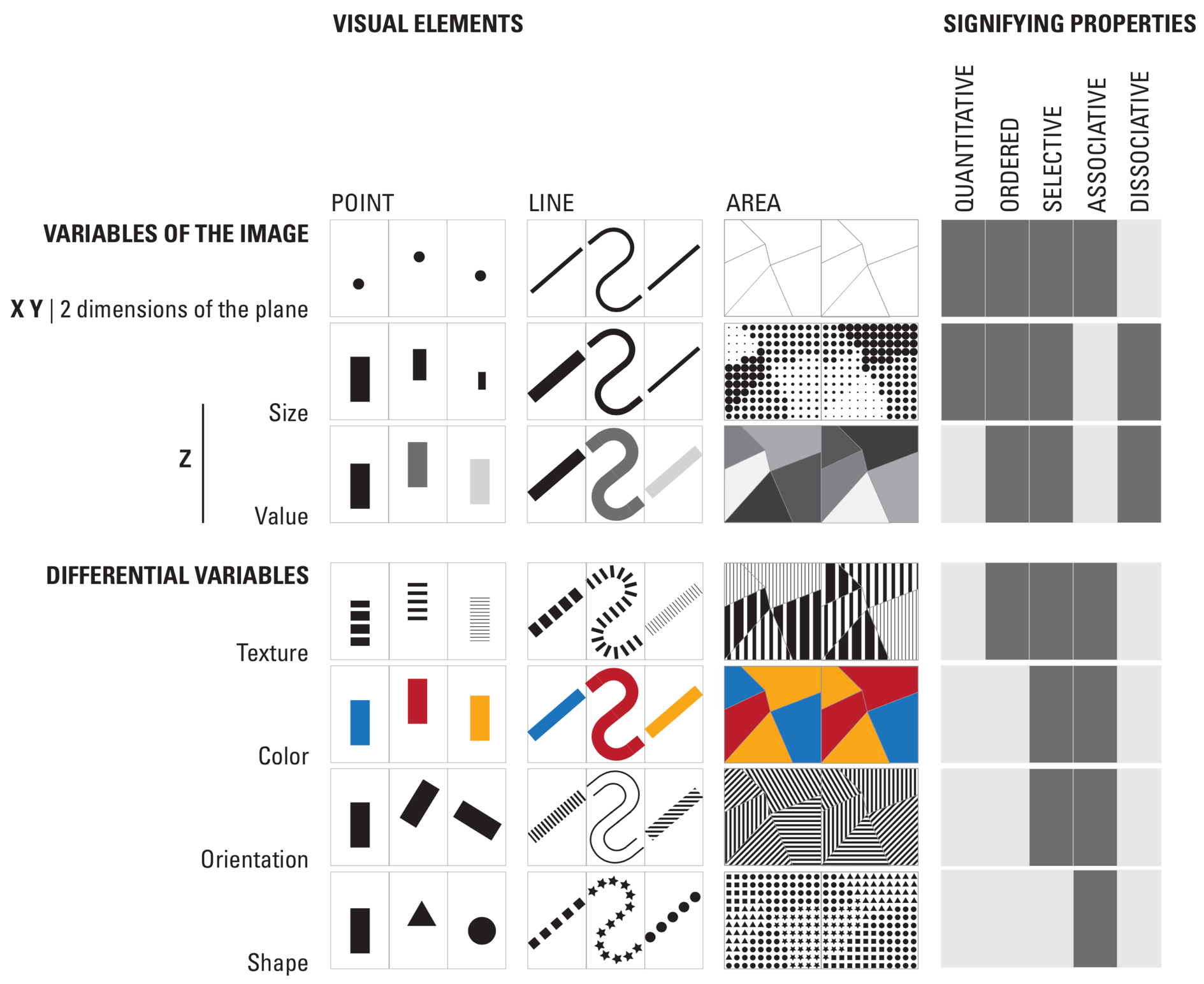
Part two brings Bertin’s theory to life, presenting a close study of graphic techniques, including shape, orientation, color, texture, volume, and size, in an array of more than 1,000 maps and diagrams. Here are those encoding types:

Less commonly discussed is Bertin’s update (Bertin 2010) to his original work. In the update, after defining terms he reviews the natural properties of a graphic image. The essence of the graphic image is described in three dimensions. The first two describe spatial properties (e.g. x and y axes) while the third dimension (denoted z) encodes the characteristics of each mark — e.g. size, value, texture, color, orientation, shape — at their particular spatial (x, y) locations.
Bertin’s ideas, over 50-years old, have proven reliable and robust (MacEachren 2019); (Garlandini and Fabrikant 2009).
7.5 Grammar
Graphics are not charts, explains Wilkinson (2005):
We often call graphics charts. There are pie charts, bar charts, line charts, and so on. [We should] shun chart typologies. Charts are usually instances of much more general objects. Once we understand that a pie is a divided bar in polar coordinates, we can construct other polar graphics that are less well known. We will also come to realize why a histogram is not a bar chart and why many other graphics that look similar nevertheless have different grammars…. Elegant design requires us to think about a theory of graphics, not charts.
We should think of chart names only as a shorthand for what they do. To broaden our ability to represent comparisons and insights into data, we should instead consider their representation as types of measurement: length along a common baseline, for example, or encoding data as color to create Gestalt groupings.
In Leland Wilkinson’s influential work, he develops a grammar of graphics. That grammar respects a fundamental limitation, a difference from pictures and other visual arts:
We have only a few rules and tools. We cannot change the location of a point or the color of an object (assuming these are data-representing attributes) without lying about our data and violating the purpose of the statistical graphic — to represent data accurately and appropriately.
Leland categorizes his grammar:
Algebra comprises the operations that allow us to combine variables and specify dimensions of graphs. Scales involves the representation of variables on measured dimensions. Statistics covers the functions that allow graphs to change their appearance and representation schemes. Geometry covers the creation of geometric graphs from variables. Coordinates covers coordinate systems, from polar coordinates to more complex map projections and general transformations. Finally, Aesthetics covers the sensory attributes used to rep- resent graphics.
He discusses these components of graphics grammar in the context of data and its extraction into variables. He also extends the discussion with facets and guides.
How do we perceive data encoded in this grammar?
Other implementations of graphics will typically name the components of a graphic similarly.↩︎
Note that
<...>is not part of the actual code. It represents, for purposes of discussion, a placeholder that the coder would replace with appropriate information.↩︎Jacques Bertin was a French cartographer and theorist, trained at the Sorbonne, and a world renowned authority on the subject of information visualization. He later assumed various leadership positions in research and academic institutions in Paris. Semiology of Graphics, originally published in French in 1967, is internationally recognized as a foundational work in the fields of design and cartography.↩︎