9 Visually encoding data, common and xenographic
9.1 Encoding data-ink, common graphics
Resources abound for encoding and coding common graphics. In an award-winning graphic form, Holtz and Healy (2018) provides taxonomies for common graphics, and an analysis of basic charts. See also, (Healy 2018); (Knaflic 2015); (Harris 1999); (Cleveland 1993); (Cleveland 1985). Again consulting the Data Visualization Handbook will explain common statistical graphics, including bar charts, dot plots, line charts and their variants, like slopegraphs, streamgraphs, bumps charts, cycle plots, sparklines, pie and donut charts, scatterplots (scatter or x-y, strip plot, beeswarm plot), bubble charts, heatmaps, box plots, violin plots, and many more.
We should not try to memorize each type. Instead, we should understand how they work using the language and ideas from Chapter 8. Apply the the advice about studying metaphor and rhetorical figures (Section 4.11) when constructing graphics, too:
Seeing just a few examples invites direct imitation of them, which tends to be clumsy. Immersion in many examples allows them to do their work by way of a subtler process of influence, with a gentler and happier effect on the resulting style.
Of note, the difference between common graphics and what has been called xenographics is somewhat arbitrary. The more important point is not the name we use — chart names are just short-hand to convey instances of graphics or look them up — but that we anticipate what encodings our audience already understands how to decode and what encodings our audience needs explanation on how to decode.
9.2 Layers and separation
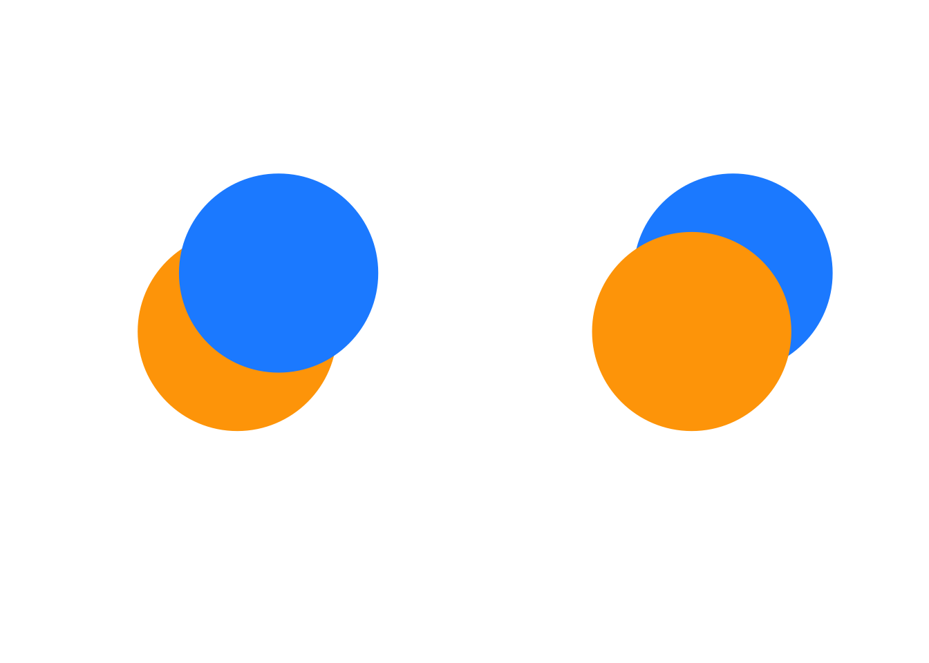
Graphics, including data encodings, are created in layers: each marking is closer to our eyes than the previous marking. The implications are several. First, when the correct attributes of markings are used, we can perceive one marking closer than another. In the left graphic, for example, we perceive the orange circle behind the blue circle, while in the right graphic, we perceive the blue circle behind the orange circle:

These particular effects are created in code, simply by our code order for the markings, overlapping the markings, and choosing fill colors to distinguish the two shapes. We can create the same perception in other ways, too.
Samara (2014) describes these design choices as creating a sense of near and far. We may create a sense of depth, of foreground and background, using any of size, overlapping the forms or encodings, the encodings relative values (lightness, opacity). Samara (2014) writes, “the seeming nearness or distance of each form will also contribute to the viewer’s sense of its importance and, therefore, its meaning relative to other forms presented within the same space.” Ultimately we are trying to achieve a visual hierarchy for the audience to understand at each level.
When designing graphics, and especially when comparing encodings or annotating them, we must perceptually layer and separate types of information or encodings. As Tufte (1990) explains, “visually stratifying various aspects of the data” aides readability. By layering or stratifying, we mean placing one type of information over the top of a second type of information. The grammar of graphics, discussed earlier, enables implementations of such a layering. To visually separate the layered information, we can assign, say, a hue or luminance, for a particular layer. Many of the graphics discussed separate types of data through layering.
9.3 Layering and opacity
Opacity / transparency provide another attribute very useful in graphics perception. For layered data encoded in monochrome, careful use of transparency can reveal density:
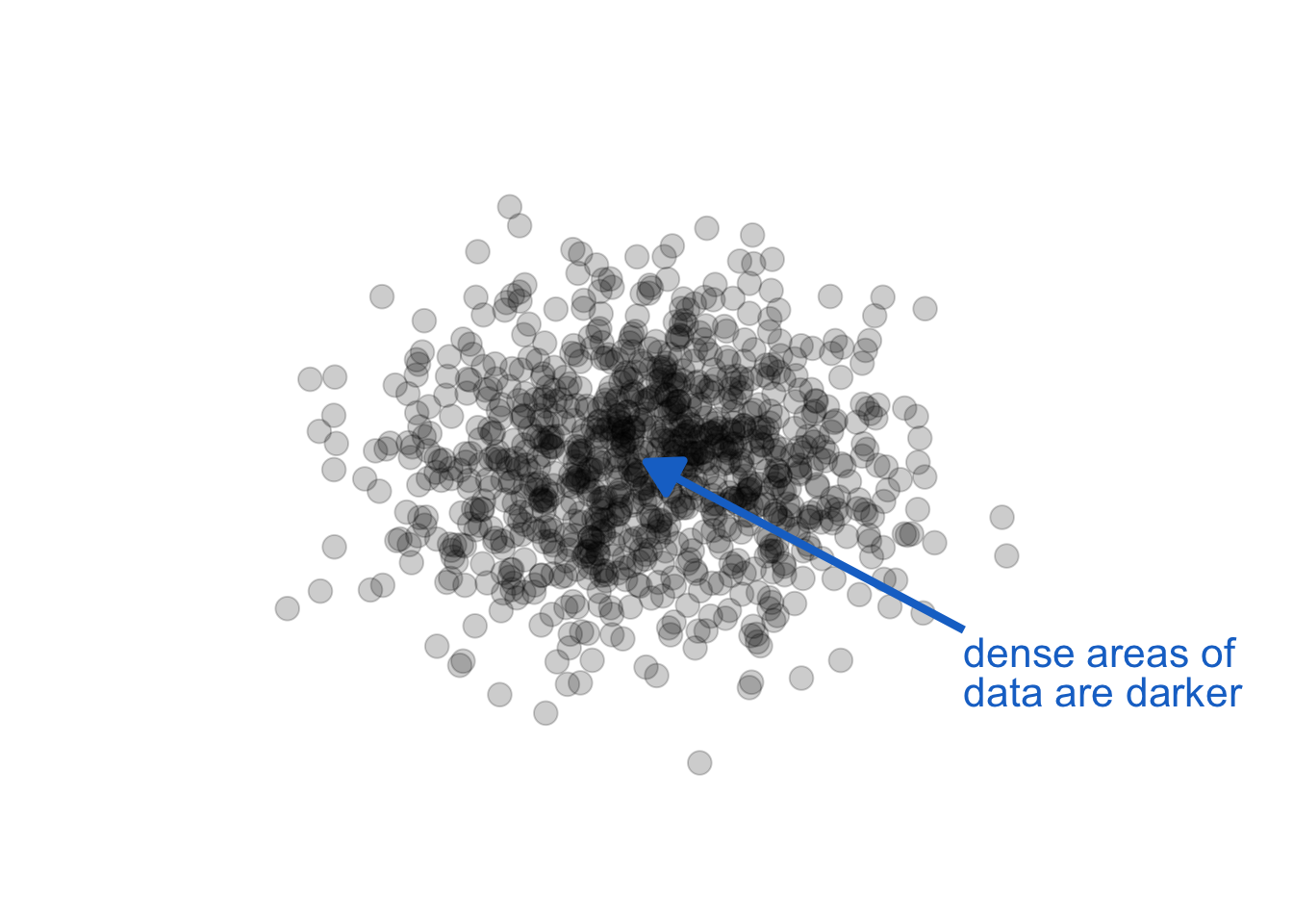
The key in the above use is monochrome (a single color and shade). When we also use color, especially hue, as a channel to represent other data information, we get unintended consequences. Opacity, combined with other color attributes can change our perception of the color, creating encodings that make no sense. Let see this in action by adding opacity to our foreground / background example above, left graphic:
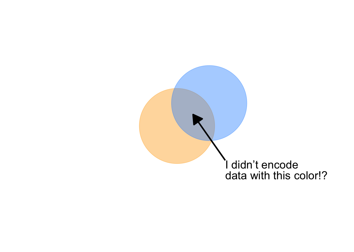
Notice, also, a question arises: is orange or blue in the foreground? With this combination of attributes, we lose our ability to distinguish foreground from background.
9.4 Encoding data-ink, xenographics
For a growing collection of interesting approaches to visualizing data in uncommon ways, consult the website Lambrechts (2020). But we have already seen a few less common data encodings. Recall, for example, instances of tracking information encoded as dots within circles in Figure 4.4. Let’s consider a couple more. Getting back to our example Citi Bike project, we identified various data visuals used in earlier exploratory work. In that earlier study, Saldarriaga (2013), researchers visualized bike and docking station activity data in the form of heatmaps overlaying maps, and heatmaps as a grid wherein the x-axis encoded time of day, the y-axis encoded docking station names as categorical data, hue at a given time and docking station encoded the imbalance between incoming and outgoing bikes, and a luminosity gradient at the same location encoded activity level, as shown in Figure 9.4.
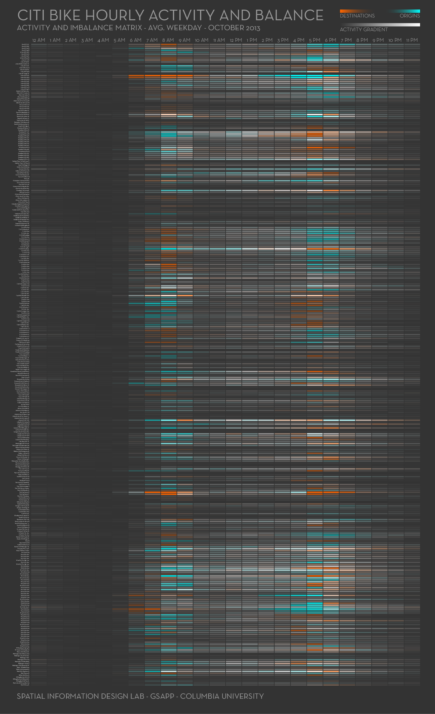
The more interesting aspect of this graphic is that, as explained in its legend, the dual, diverging hue, luminance encoding enables markings to disappear if either a) incoming and outgoing activity is balanced or b) the activity level is very low. The limitations of the overall encoding, however, include an unfamiliar listing of docking stations by name on the y-axis. As we proposed in the memo, Example 3.1, let’s try encoding these variables differently. Let’s try addressing the admitted challenge of encoding geographic location with time in a way that allows further, meaningful encodings. We will do this in stages. First, we consider activity level, which we naturally think of as a daily pattern. Other graphics, Armstrong and Bremer (2017) and Bremer (2017), have explored daily patterns of activity, and encode that activity level using polar coordinates. We borrow from that work, encoding bike activity level the way we think about time — circular, think of a 24-hour clock. Our first graphic is in Figure 9.5. We read the graphic as reflecting activity level over time, which is encoded circular, with midnight at the top, 6am to the right, noon at the bottom, 18 hours (6pm) to the left. To help visualize time of day, we label sunrise and sunset, and shade areas before and after sunrise as dark and light.
As did Nadieh, we encode an average activity level along the black line, activity level at a given time as the distance from that average. And the color within that distance from average activity level encodes the quantiles (think boxplot) of activity. As with encoding average activity level, we annotate with reference activity levels: 5, 20, and 35 rides per minute. What is remarkable is the observed magnitude of change from average (black circle) ride rates that exist throughout the day, which reflects this rebalancing problem. Minutes in only light blue show when 50 percent of the ride rates exist. Minutes that include dark blue show when the highest (outside black circle) or lowest (inside black circle) rate of rides happen. Finally, the remaining minutes with medium blue show when the rest of the rates of rides occur.
We now address the limitation of the prior work. In this regard, we can learn from the famous graphic by Minard of Napoleon’s march, see Figure 9.6.
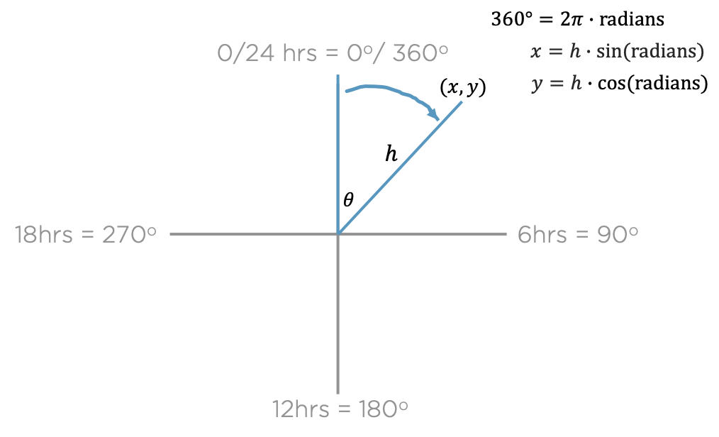
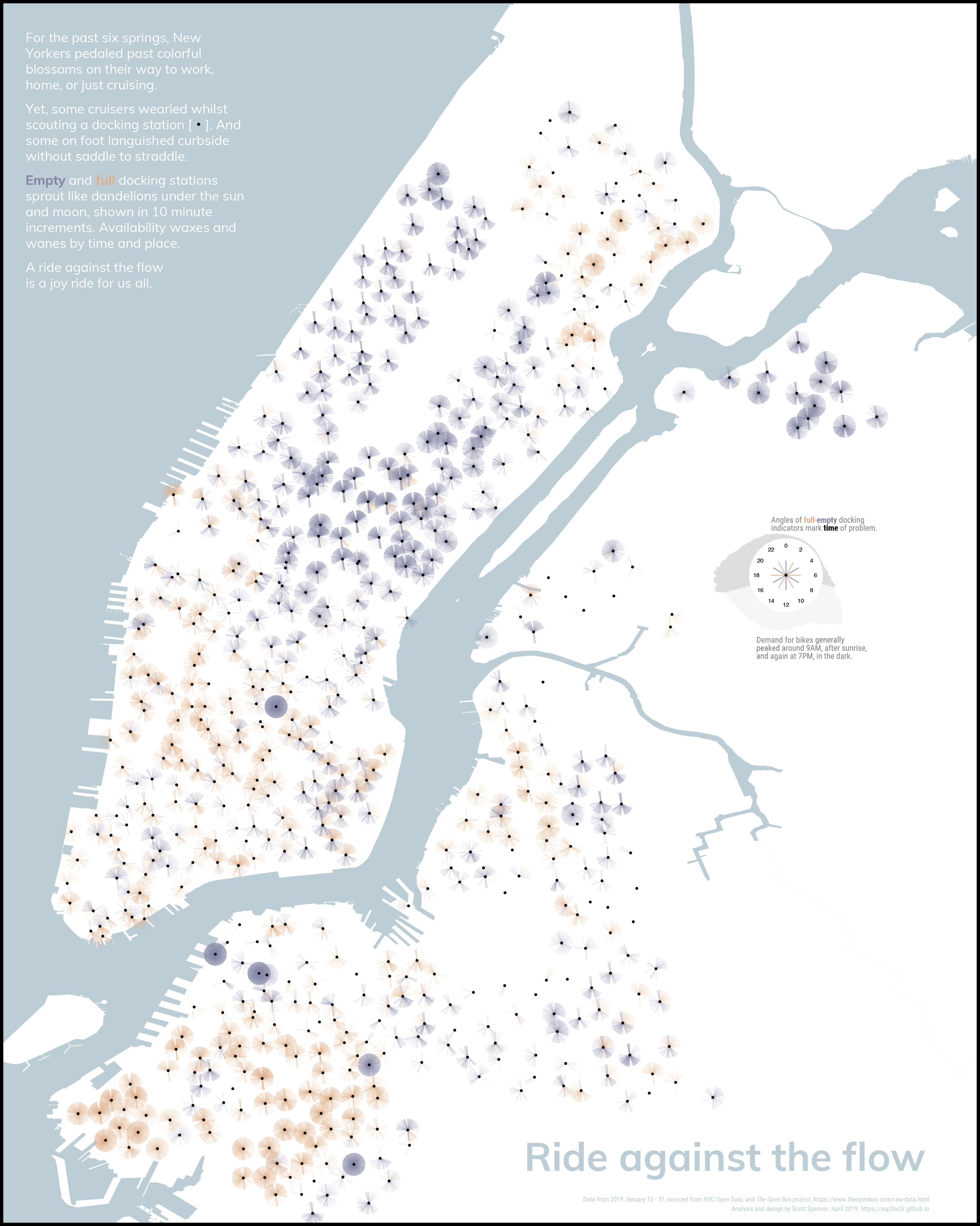
In Minard’s graphic, as Tufte explains, he overlays the path of Napoleon’s march onto a map in the form of a ribbon.1 While the middle of that ribbon may accurately reflect geographic location, the width of that ribbon does not. Instead, the width of the ribbon encodes the number of solders at that location, wherein time is also encoded as coinciding with longitude. That encoding gives a sense of where the solders were at a given time, while also encoding number of solders. We try a similar approach with Citi Bike, shown in Figure 9.7. We place each docking station the a black dot (\(\cdot\)) overlaying a geographic map of New York City. At each station, we encode using color an empty or full station as a line segment ( | ) starting at the station dot and extending towards time of day, the length of a unit circle. The line segments are partly transparent so that an individual empty or full station won’t stand out, but repeated problems at that time of day over the three weeks of the data (January 2019) would be more vivid and noticeable. Finally, we annotate the graphic with a narrative and a key that explains these encodings, along with encoding the general activity levels of the graphic in Figure 9.5.
The infographic adds, as its title, a call to action: ride against the flow (Spencer 2019, longlisted Kantar Information is Beautiful Awards). When encoding custom graphics, basic math can come in handy. The encodings (colored line segments) for empty and full docking stations at each station were created by mapping the hour of a day to the angle in degrees/radians of a unit circle, and calculating the end of the line segments as an offset from the docking station geolocation using basic trigonometry,
