15 Visual Perception: Gestalt Principles and Preattentive Attributes
In the previous chapter, we explored how visual variables encode data and how coordinate systems structure spatial relationships. But before data becomes visible, it must pass through human perception. Understanding how the visual system processes information allows us to design graphics that communicate effectively—leveraging the brain’s automatic pattern recognition while avoiding perceptual traps that obscure meaning.
This chapter examines two foundational concepts from psychology and vision science: Gestalt principles and preattentive attributes. These ideas explain why certain visual arrangements immediately suggest relationships, groupings, and distinctions, while others require conscious, effortful analysis. By mastering these perceptual mechanisms, we can construct visualizations where the viewer instantly grasps structure without reading legends or consulting scales.
15.1 Grid Systems: The Foundation of Visual Organization
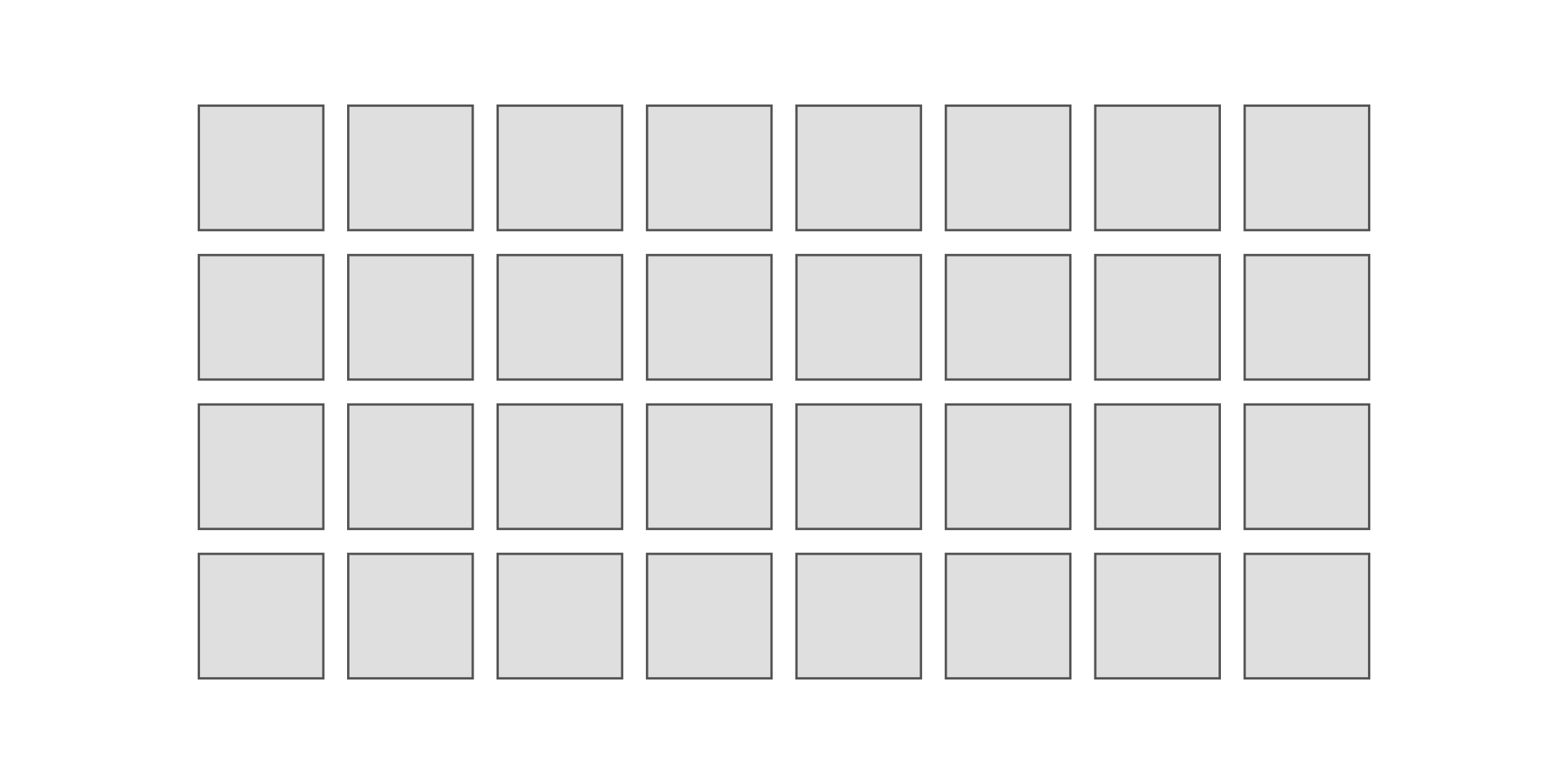
Before exploring how perception organizes visual elements, we must understand the canvas upon which we arrange them. Grid systems provide the structural framework for most data visualizations, establishing consistent spacing, alignment, and proportional relationships. A well-designed grid creates invisible order that supports comprehension; a poorly designed grid creates visual noise that obstructs it.
The fundamental grid consists of repeating units separated by gutters—negative space that prevents elements from crowding together. Consider a basic layout grid of 8 columns by 4 rows, with consistent gutters between units:
This regular structure provides the foundation for organization. But grids alone do not create meaning—the viewer sees only uniform repetition. Meaning emerges when we manipulate visual properties within this structure, activating the perceptual mechanisms that automatically group, distinguish, and highlight elements.
15.2 The Gestalt Tradition: Perception as Pattern Seeking
The Gestalt school of psychology emerged in Germany during the early twentieth century, with Max Wertheimer, Kurt Koffka, and Wolfgang Köhler challenging the prevailing view that perception builds sensations into complex wholes through association. Their radical insight, captured in the maxim “the whole is other than the sum of its parts,” proposed that perception operates holistically—we see organized patterns and structures before we discern individual elements (Ware 2020; Koffka 1935).
Consider viewing a constellation. We do not see isolated points of light; we perceive a connected shape—a bear, a hunter, a swan. This organization happens automatically, without conscious effort. The Gestalt psychologists identified several principles explaining how the visual system creates such organizations from raw sensory input, principles that prove remarkably consistent across cultures and individuals.
These principles matter for data visualization because they determine what viewers perceive effortlessly versus what requires deliberate attention. A well-designed graphic aligns its visual structure with these automatic organizational tendencies. A poorly designed one fights against them, forcing viewers to work against their own perceptual systems to extract meaning.
15.3 The Dot Grid: A Systematic Exploration
To understand how these principles operate in data graphics, we will systematically explore them using a consistent visual substrate: a grid of dots arranged in 8 rows and 8 columns. This simple structure provides a neutral canvas where we can isolate each principle, demonstrating how identical elements transform into perceived groups, patterns, and relationships through subtle visual manipulations.
The base grid uses equal spacing between all elements, creating a uniform field without inherent organization:
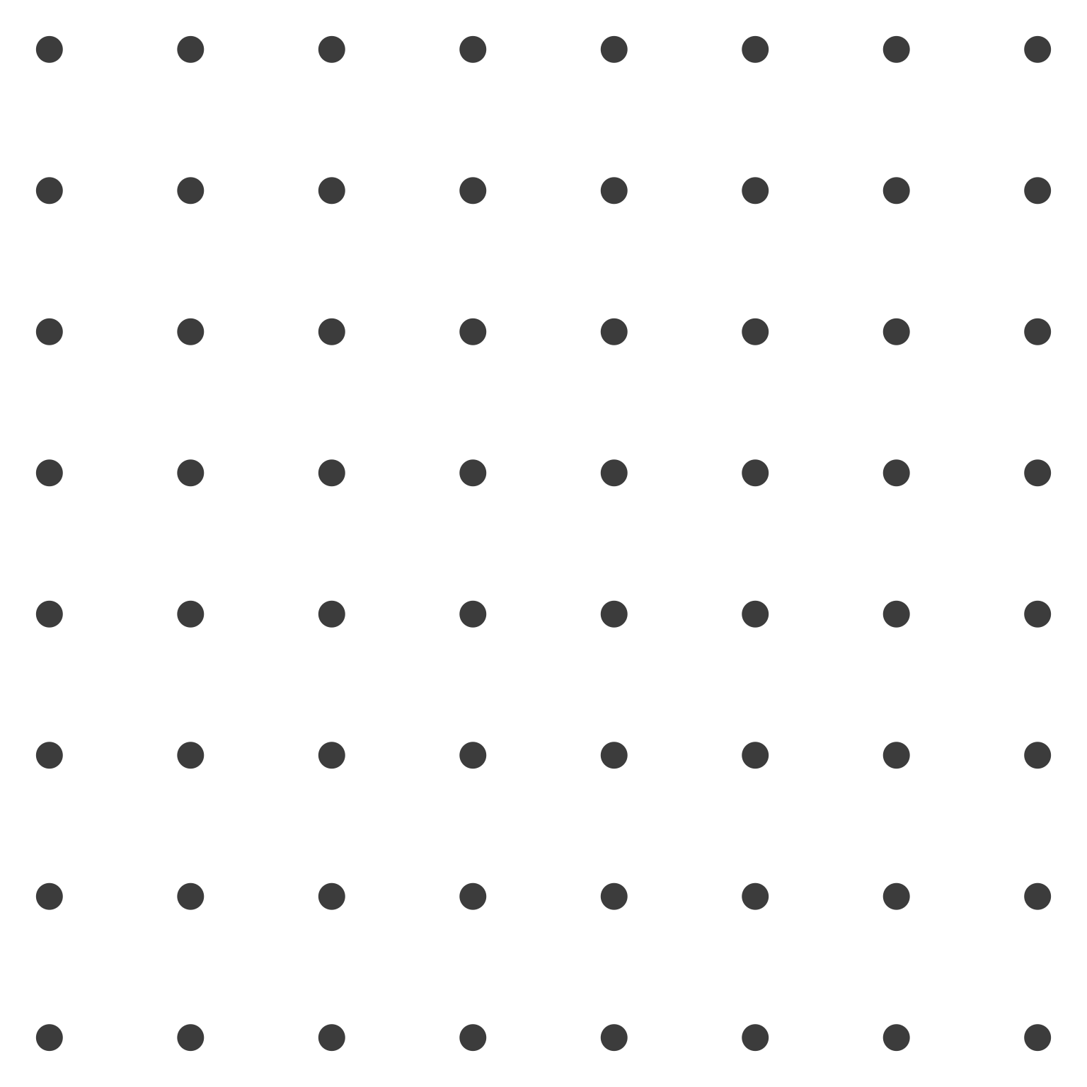
In this uniform field, no organization emerges. The viewer sees 64 identical dots arranged in a regular pattern, but perceives no subgroups, no hierarchies, no relationships beyond the overall grid structure itself. We will now systematically modify this base grid to demonstrate each perceptual principle.
15.4 Gestalt Principles
15.4.1 Principle 1: Proximity
The principle of proximity states that elements close together appear grouped. Our visual system automatically assumes spatial nearness indicates relatedness, a tendency so strong that it overrides other cues. Two dots touching appear as a pair; two dots separated by the same distance as other elements appear as individuals.
This principle operates constantly in data graphics. Scatterplots exploit proximity to reveal clusters—points near each other in data space appear near each other visually, suggesting common underlying structure. Small multiples use proximity to relate charts across columns or rows. Violating proximity through arbitrary spacing destroys these perceived relationships.
We demonstrate proximity by shortening the vertical space between rows, creating perceived vertical groupings:
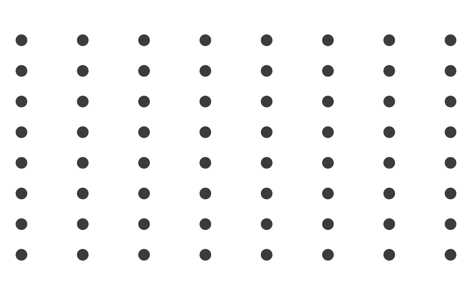
Though every dot remains identical in size, color, and shape, we now perceive vertical columns as distinct units. The compressed horizontal spacing creates automatic grouping without any conscious effort from the viewer.
15.4.2 Principle 2: Similarity
The principle of similarity states that elements sharing visual properties—color, size, shape, orientation—appear grouped. Unlike proximity, which depends on spatial relationships, similarity operates through shared visual attributes. All black dots seem related regardless of their spatial distribution.
Similarity drives many standard visualization techniques. Color coding creates categorical groups instantly. Size encoding distinguishes magnitudes at a glance. Shape variation differentiates data series. But similarity also creates problems when unintended: using color for both category and emphasis confuses viewers about which similarity matters.
We demonstrate similarity by alternating row colors between black and gray:
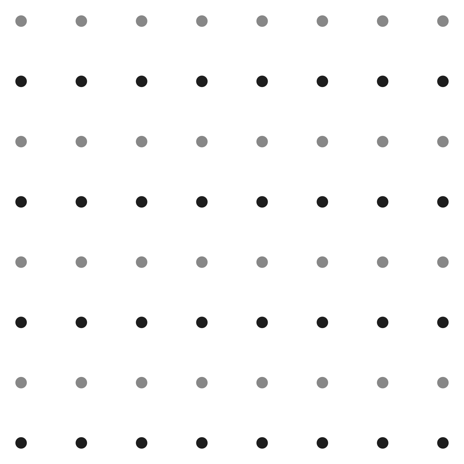
Now we perceive horizontal bands: dark rows 1, 3, 5, 7 group together visually, as do light rows 2, 4, 6, 8. The color similarity overrides the spatial structure—we see rows rather than columns or isolated dots. This demonstrates how powerful similarity is: a single attribute change completely reorganizes perception.
15.4.3 Principle 3: Enclosure
The principle of enclosure states that elements surrounded by a common border or region appear grouped. Unlike proximity, which requires physical closeness, enclosure can group elements spread across space. A box drawn around scattered points makes them a set.
Enclosure appears constantly in visualization through bounding boxes, background fills, and spatial partitions. Dashboards use enclosure to separate widgets. Small multiples use facet borders. Legends enclose related symbols. The enclosing element need not be visible—a shared background color creates enclosure just as effectively as a drawn border.
We demonstrate enclosure by adding a gray square behind a cluster of interior dots:
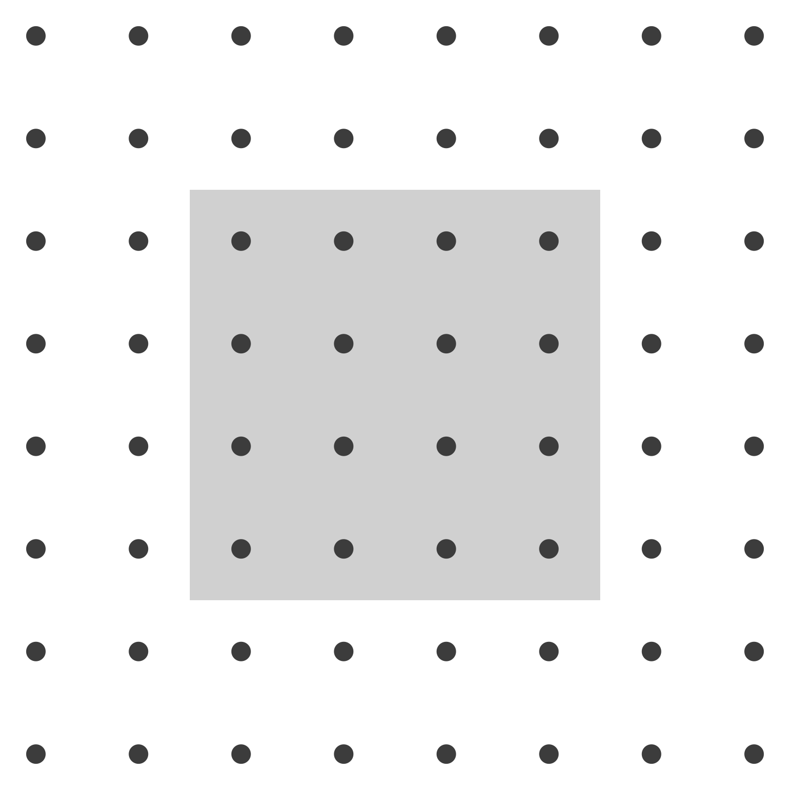
Despite equal spacing between all dots, we perceive a distinct central group. The gray rectangle creates a visual container that groups enclosed elements. The surrounding dots, lacking enclosure, appear as background. This principle explains why legends work: the bounding box groups symbols with their labels.
15.4.4 Principle 4: Closure
The principle of closure states that the visual system prefers complete forms over incomplete ones. When parts of a shape are missing or obscured, we mentally fill in the gaps to perceive a whole. A circle partially hidden behind a rectangle appears as a complete circle, not as two separate arcs.
This principle enables clean, minimal designs. We need not draw every edge; the viewer’s perceptual system completes the figure. Icons use closure to suggest complex objects with minimal strokes. Charts use it implicitly when grid lines intersect data elements—closure makes the data visible despite the overlay.
We demonstrate closure with a non-filled circle partially blocked by a gray rectangle:
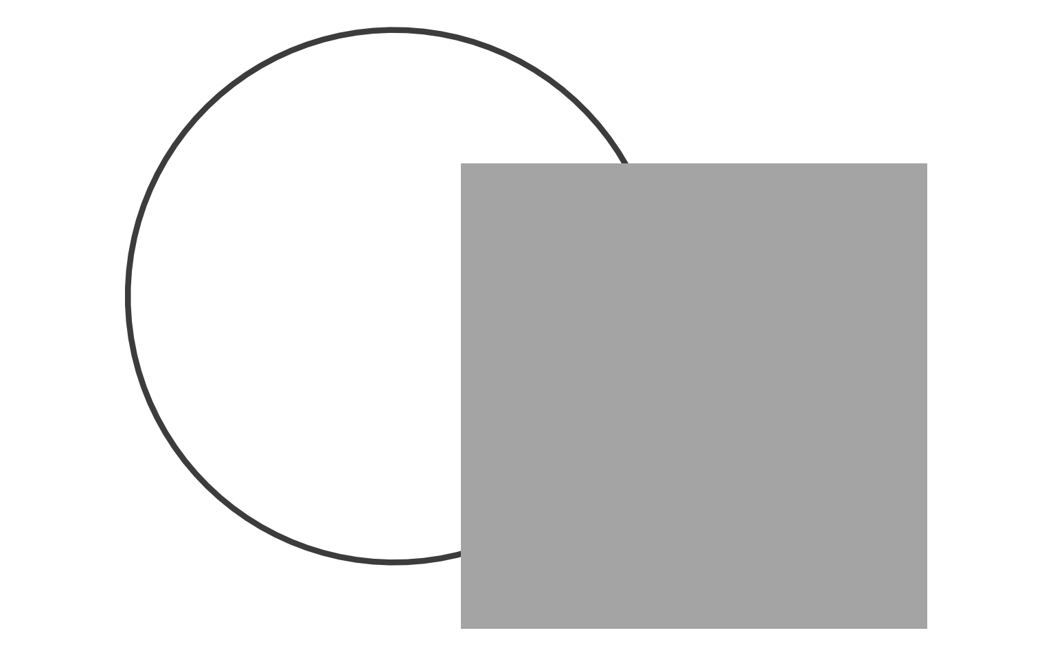
Though the rectangle obscures the circle’s center, we perceive a complete ring behind it. The visible arcs trigger automatic completion. This demonstrates why occlusion in visualizations need not confuse—the visual system reconstructs hidden information when sufficient cues exist.
15.4.5 Principle 5: Continuity
The principle of continuity states that the visual system prefers smooth, continuous paths over abrupt changes. When viewing intersecting lines, we perceive the continuous paths rather than the angular junctions. This preference for smoothness organizes perception along trajectories.
Continuity underlies line charts and area charts—we perceive trends as continuous changes rather than discrete points. It also explains why aligned elements group: a straight row or column appears as a single continuous entity. Discontinuous elements break this perception.
We demonstrate continuity with a wiggly line passing through a non-filled rectangle:
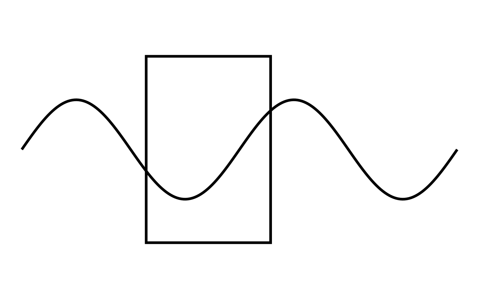
The wiggly line appears to pass continuously through the rectangle, maintaining its trajectory despite the gap in visibility where the rectangle occludes it. We perceive one continuous path rather than two separate segments, demonstrating continuity’s power to create perceived connections across space.
15.4.6 Principle 6: Connectedness
The principle of connectedness states that elements joined by lines or curves appear grouped. A simple line connecting two distant circles makes them a pair, overcoming proximity effects. This principle proves remarkably strong—connected elements group even when disconnected elements sit closer together.
Connectedness enables network diagrams, line charts, and any visualization showing relationships between spatially separated elements. It also appears in subtle forms: grid lines connect data points to axes; leader lines connect labels to data; trend lines connect time-series points into trajectories.
We demonstrate connectedness with four dots connected by vertical lines:

The vertical lines create two distinct pairs. Despite equal spacing between all four dots, we perceive related pairs connected by lines versus isolated individuals. Connectedness overrides proximity—elements joined by lines group regardless of their spatial distribution.
15.5 Preattentive Attributes
While Gestalt principles organize perception of complex scenes, preattentive attributes enable instantaneous detection of individual elements. Research identifies approximately twelve visual properties that pop out automatically: color, orientation, size, shape, motion, flicker, and several others (Christopher G. Healey, Booth, and Enns 1996).
These attributes work because the visual system processes them in parallel across the entire visual field, without requiring attention to shift from location to location. A red dot among green dots pops out because color channels process the entire field simultaneously, flagging the unique hue.
Effective visualizations encode critical distinctions with preattentive attributes. A dashboard might use color to highlight exceptions, size to show magnitude, or motion to indicate updates. The key constraint: preattentive attributes work best for binary or categorical distinctions. Gradual variation (a spectrum from light to dark red) requires serial processing and loses the pop-out effect.
We demonstrate each preattentive attribute using our 8×8 dot grid, making a single element distinctive while keeping all others uniform.
15.5.1 Attribute 1: Orientation
Orientation refers to the angular position of an element. A vertical rectangle among horizontal rectangles pops out immediately because orientation is processed preattentively. This attribute enables rapid detection of directional patterns—trends in time series, flows in network diagrams, anomalies in oriented textures.
We demonstrate orientation with small vertical rectangles throughout the grid, except one horizontal rectangle at position (row 5, column 1):
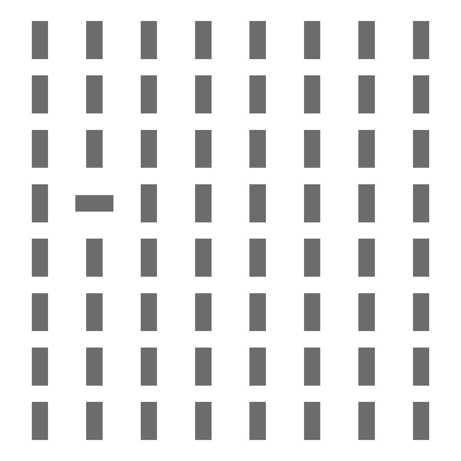
The horizontal rectangle immediately attracts attention. You found it without consciously scanning each element—orientation creates the pop-out effect.
15.5.2 Attribute 2: Shape
Shape distinguishes elements by their geometric form. A square among circles, or a triangle among rectangles, pops out automatically. Shape coding works well for categorical data with few categories (typically 3-5 shapes), though viewers struggle to distinguish more numerous shape categories.
We demonstrate shape with non-filled circles throughout the grid, except one triangle at the same target position:
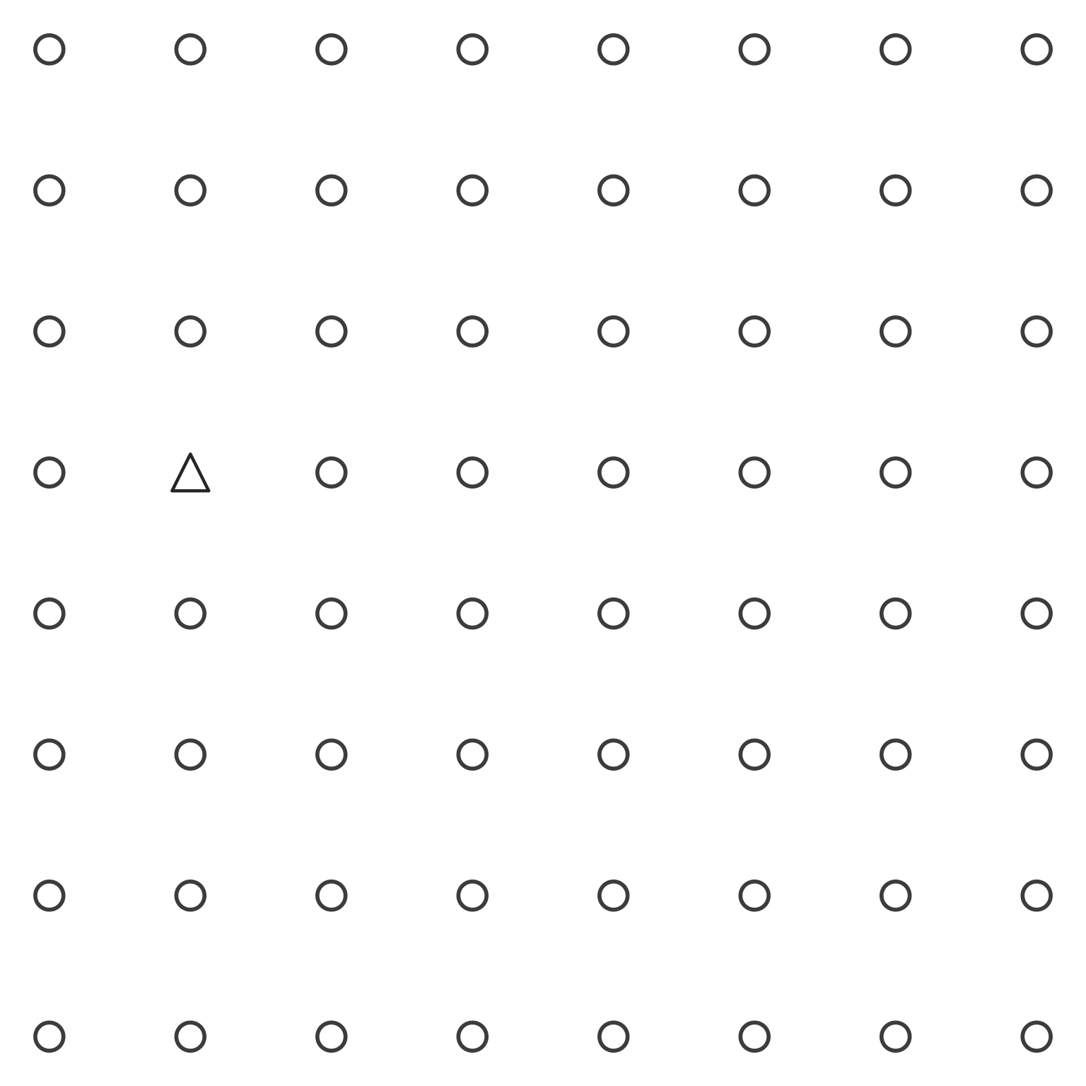
The triangle immediately stands out. Shape differences capture attention without search, making shape useful for distinguishing categories in scatterplots and icon arrays.
15.5.3 Attribute 3: Luminance (Value)
Luminance (or value) refers to lightness or darkness. A black dot among gray dots pops out instantly because luminance contrasts are processed in parallel across the visual field. This attribute provides one of the most reliable preattentive channels, working even for viewers with color vision deficiencies.
We demonstrate luminance with light gray dots throughout the grid, except one black dot at the target position:

The black dot immediately draws the eye. Luminance contrast creates one of the strongest pop-out effects, which explains why black text on white backgrounds (or vice versa) remains the standard for readability.
15.5.4 Attribute 4: Size
Size distinguishes elements by their spatial extent. A large dot among small dots pops out automatically. Size encoding works well for quantitative data—larger values appear as larger marks—but viewers judge size differences less precisely than position differences.
We demonstrate size with uniformly sized dots throughout the grid, except one larger dot at the target position:
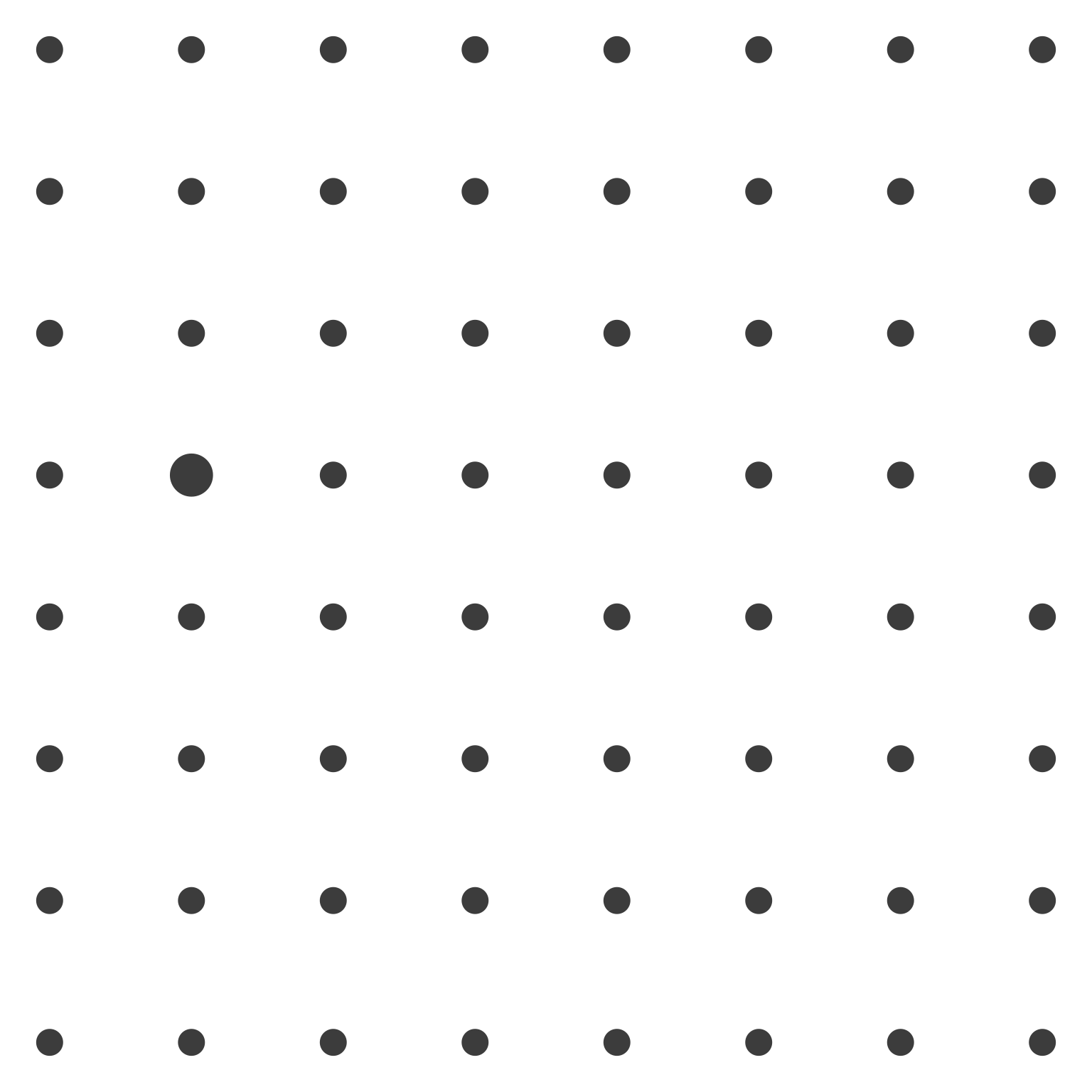
The larger dot stands out immediately. Size differences attract attention, making size useful for emphasizing important data points or encoding magnitude in bubble charts.
15.5.5 Attribute 5: Hue (Color)
Hue refers to the chromatic quality of color—red versus blue versus green. A red dot among black dots pops out instantly. Hue provides the most commonly used preattentive attribute in data visualization, enabling categorical distinction with immediate perceptual impact.
However, hue has limitations. Approximately 8% of males have some form of color vision deficiency, making red-green distinctions problematic. Additionally, viewers can reliably distinguish only 6-8 different hues before confusion sets in.
We demonstrate hue with black dots throughout the grid, except one red dot at the target position:
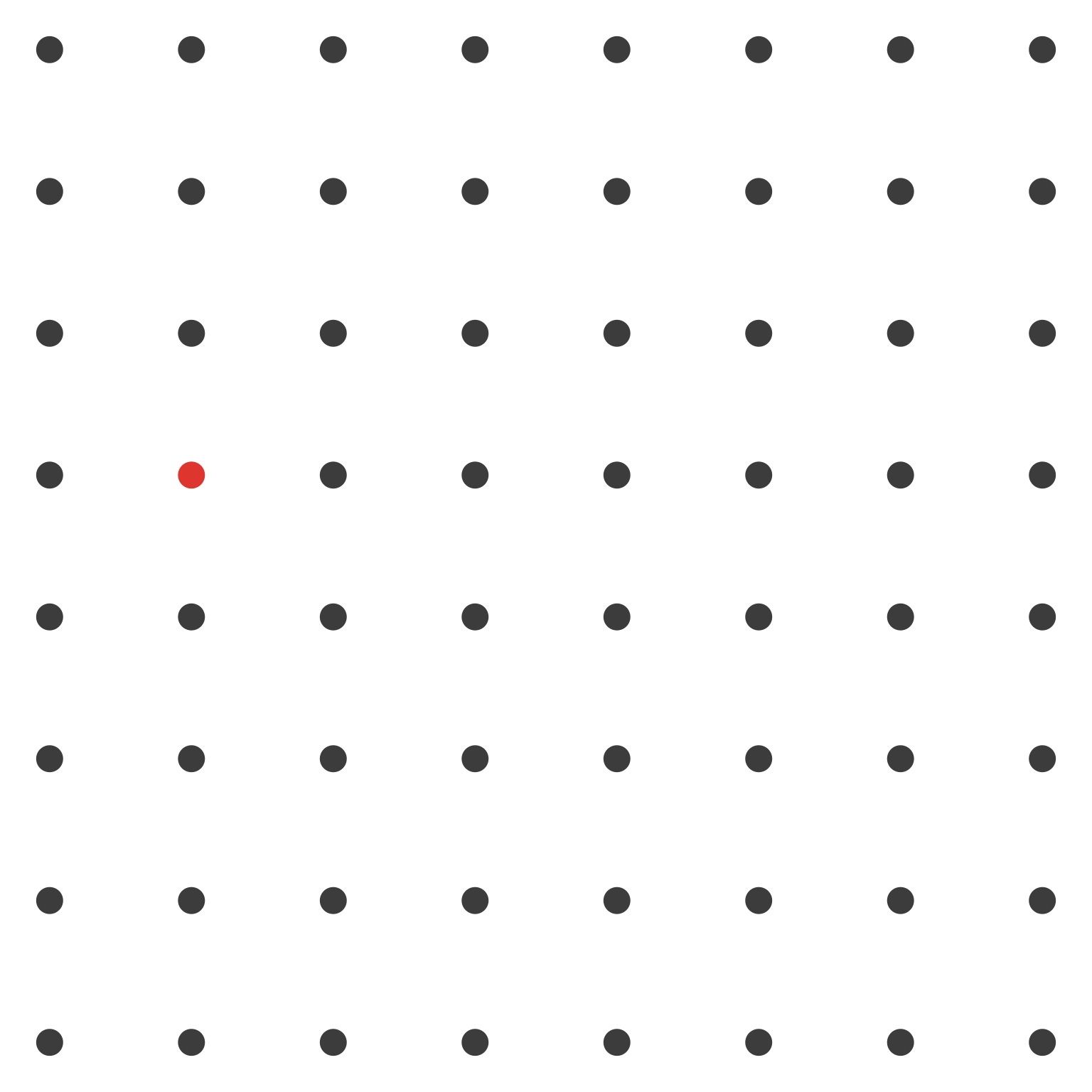
The red dot captures attention instantly. This pop-out effect makes hue the most powerful tool for highlighting exceptions, distinguishing categories, and drawing attention to critical values in dashboards.
15.5.6 Attribute 6: Enclosure (as Preattentive Marking)
Enclosure can also operate as a preattentive attribute when used to mark individual elements. A circle drawn around a dot makes it distinctive, creating a pop-out effect. This differs from Gestalt enclosure (which groups multiple elements) by applying to single items as highlighting.
We demonstrate enclosure as a preattentive attribute by placing a circle around only the target dot at position (5, 2):
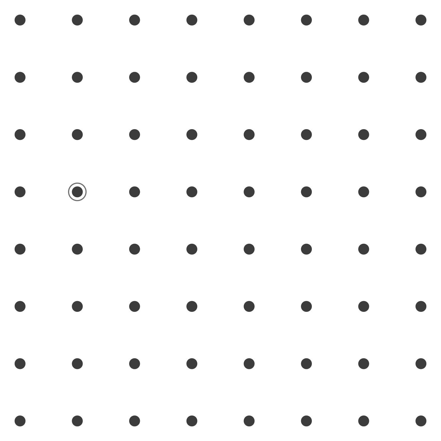
The dot with the surrounding circle appears distinctive. The presence or absence of enclosure creates a binary distinction that pops out preattentively, useful for highlighting selected elements in dense displays.
15.6 Combining Principles and Attributes
These Gestalt principles and preattentive attributes rarely operate in isolation. Effective visualizations typically combine multiple mechanisms to create layered perceptual organizations. Understanding how principles interact—whether reinforcing or competing—enables sophisticated design choices.
When principles align, perception strengthens. When they conflict, confusion results. A designer might use both proximity and similarity to group elements, or might deliberately violate proximity to separate elements that share color similarity.
15.6.1 Example: Grouping and highlighting with similarity and enclosure
Consider how we might apply these principles to a scatterplot scenario. We assemble mental models of grouping through differences in similarity, proximity, enclosure, size, color, shading, and hue. In the left panel of Figure 16.18, for example, we naturally see two groups of data points—one in gray, the other in black—with an outlier visible among the black points.
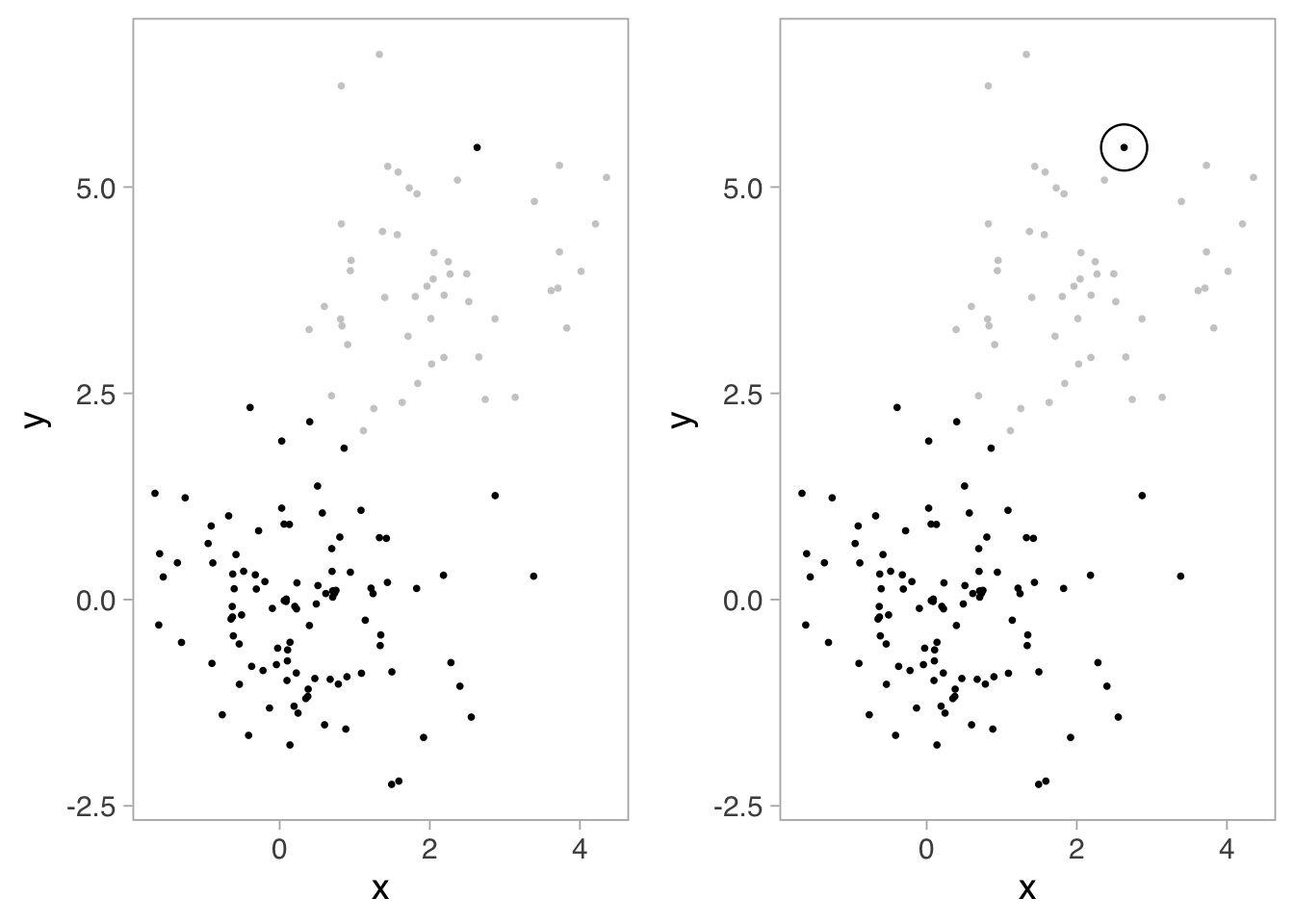
In the left panel of Figure 16.18, similarity creates the primary grouping. All gray points appear related; all black points appear related. The color difference (luminance/shading) separates the two clusters preattentively—you perceive the groups instantly without conscious effort.
The right panel adds enclosure to further organize perception. The large circle around the distinctive black point creates a secondary grouping within the black cluster. This demonstrates how principles layer: similarity operates at the primary level (gray vs. black), while enclosure operates at a secondary level (highlighting a specific point within the black group).
This combination illustrates sophisticated design: similarity for categorical grouping, enclosure for emphasis. The viewer perceives both relationships automatically—no legend consultation required. Several authors1 provide in-depth reviews of these ideas.
When principles align, perception strengthens. When they conflict, confusion results. A designer might use both proximity and similarity to group elements, or might deliberately violate proximity to separate elements that share color similarity. Understanding how these mechanisms interact enables designers to create layered visual hierarchies where multiple information dimensions can be perceived simultaneously.
15.7 Exercise: Identifying Principles in Practice
The following exercises provide practice identifying Gestalt principles and preattentive attributes in real visualization contexts. For each example, analyze which principles organize the visual field and which attributes enable rapid information extraction.
Exercise 15.1 (Employee Training Analysis) Examine the dashboard below showing employee training metrics. Identify: 1. Which Gestalt principles create the overall layout structure 2. Which preattentive attributes highlight critical metrics 3. How principles combine to create visual hierarchy
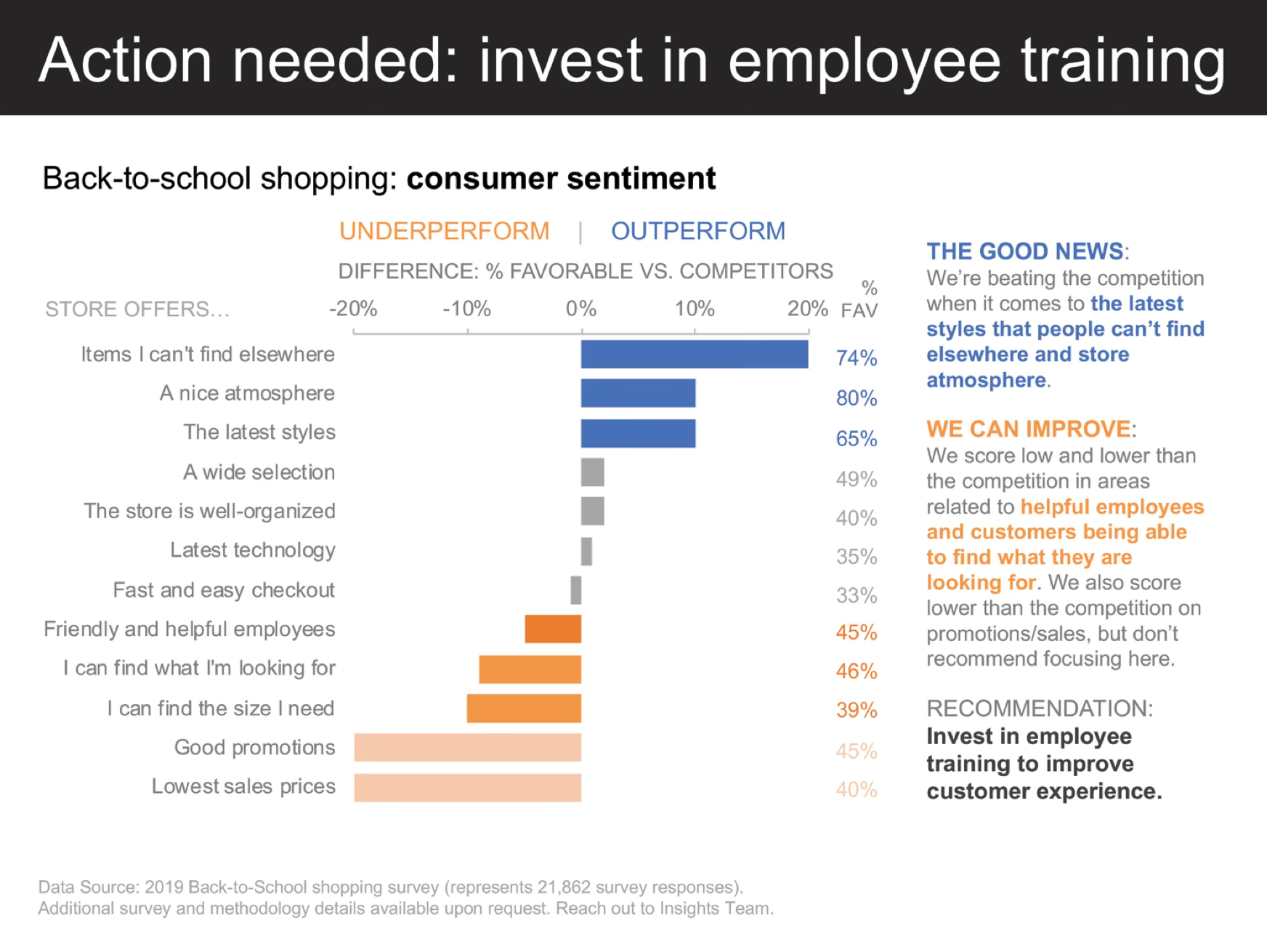
Analysis questions:
- How does proximity group related training metrics together?
- What role does similarity play in the color coding of different training categories?
- How do enclosure (cards, panels) separate different functional areas of the dashboard?
- Which preattentive attributes (color, size, position) draw immediate attention to priority areas?
- How does the overall visual hierarchy guide the viewer’s attention from summary to detail?
While dashboards organize static information spatially, process visualizations must convey sequence and flow. The same Gestalt principles apply, but connectedness and continuity become particularly crucial as viewers follow paths through complex workflows.
Exercise 15.2 (Role Filling Process) Examine the visualization below showing the role filling process workflow. Identify: 1. How connectedness creates perceived flow and sequence 2. How proximity and similarity organize the process stages 3. Which preattentive attributes distinguish different types of information
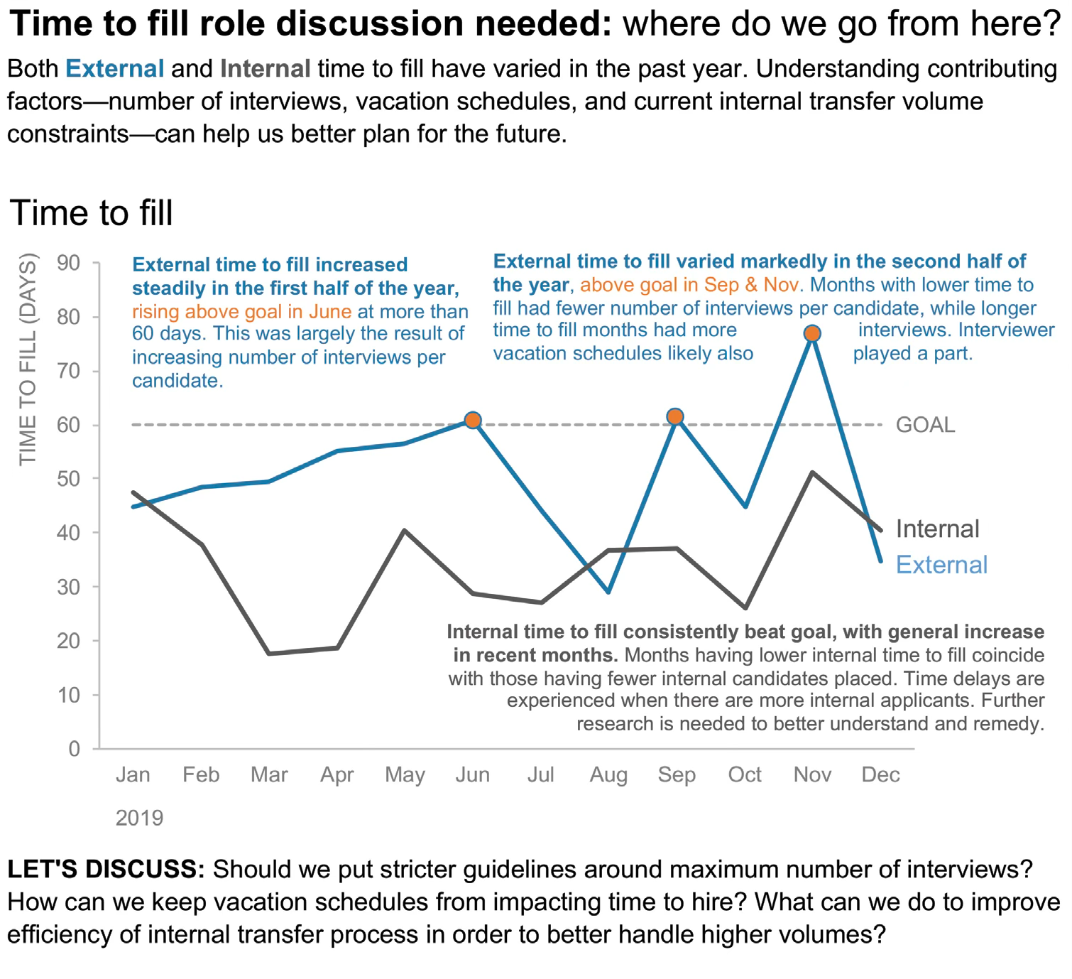
Analysis questions:
- How does connectedness (arrows, lines) create a sense of flow through the process?
- What role does similarity play in grouping related process stages or categories?
- Which preattentive attributes (color, shape, size) distinguish between different types of data or actions?
- How does proximity help organize information within each stage of the process?
- What visual elements create closure, helping you perceive each stage as a complete unit?
Temporal visualizations present unique perceptual challenges. Unlike dashboards or process flows where spatial relationships dominate, time series rely heavily on continuity and similarity to make trends visible across the dimension of time.
Exercise 15.3 (Market Size Over Time) Examine the time series visualization below showing market size evolution. Identify: 1. How continuity organizes perception of trends over time 2. How similarity (color, line style) distinguishes different data series 3. How enclosure or other principles separate and highlight key regions
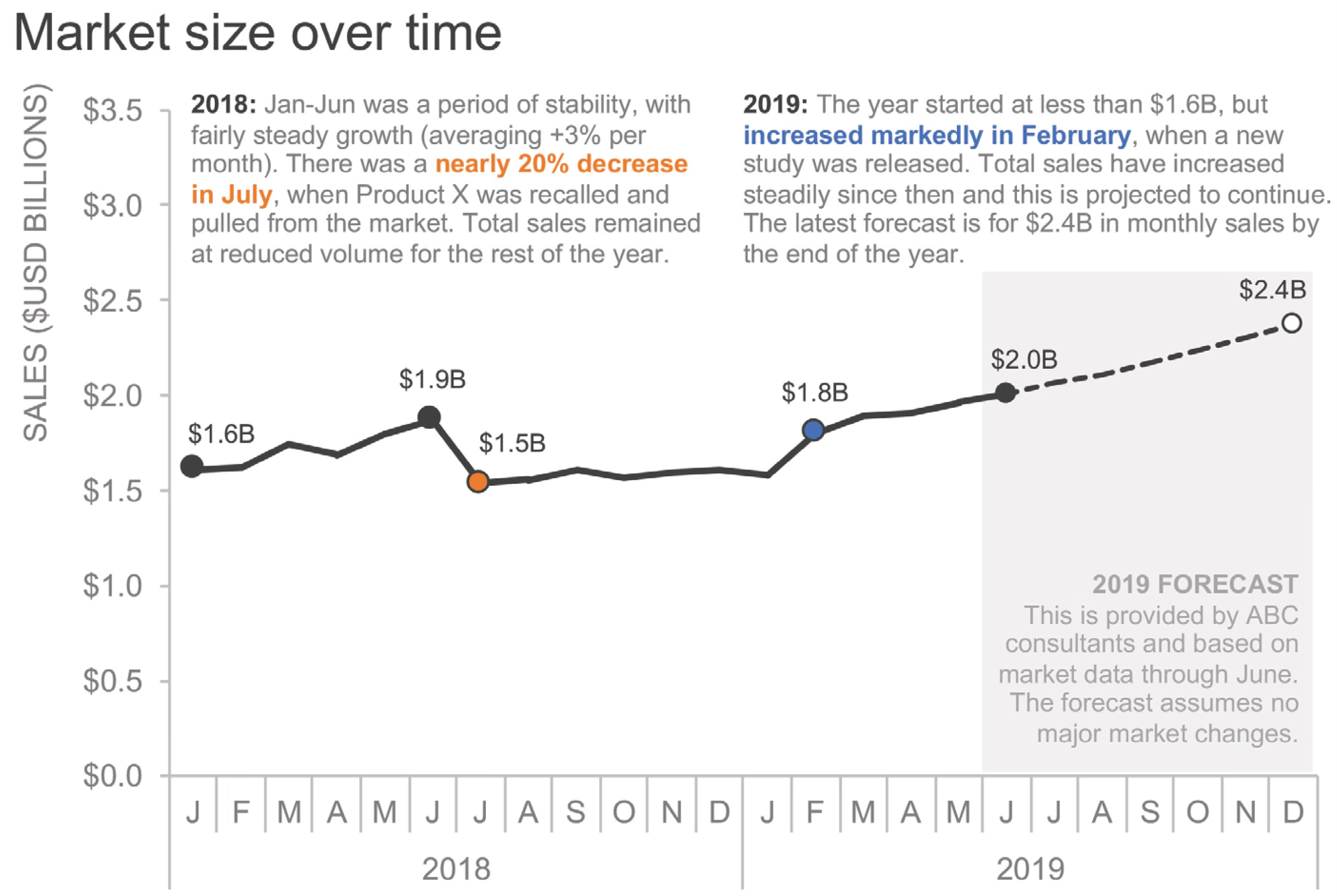
Analysis questions:
- How does continuity help you perceive trends and patterns across the time periods?
- What role does similarity (color, line thickness, or style) play in distinguishing different market segments or metrics?
- Which preattentive attributes immediately draw your attention to the most important data points or trends?
- How do the visual elements create a clear hierarchy between the main trend and supporting data?
- If you were to redesign this for a presentation, which Gestalt principles would you emphasize to tell a clearer story?
15.8 Looking ahead
We have established the perceptual foundations of data visualization: the Gestalt principles that organize visual elements into meaningful wholes, and the preattentive attributes that enable instantaneous detection of important information. Through systematic exploration with the 8×8 dot grid, we have seen how proximity, similarity, enclosure, closure, continuity, and connectedness automatically create perceived groups and relationships. We have also examined how orientation, shape, luminance, size, hue, and enclosure-as-highlighting make individual elements pop out without conscious search.
But understanding these perceptual mechanisms is only the beginning. Next, Chapter 16 delves deeper into how specific visual encodings function in practice—exploring color in detail, examining which channels enable accurate comparison, and learning to avoid perceptual pitfalls that undermine even technically correct designs.
We will confront the practical challenges of visual decoding: the context-dependency of color perception, the limits of human judgment across different encoding channels, and the accessibility barriers that exclude viewers with atypical vision. The goal is to move from theoretical understanding to practical application.
Effective visualization requires:
- Leveraging automatic perceptual organization—using Gestalt principles to structure information
- Employing preattentive attributes strategically—making critical distinctions immediately visible
- Understanding encoding effectiveness—knowing which channels support accurate comparison
- Respecting perceptual limitations—designing within the constraints of human vision
- Testing with real viewers—verifying that designs communicate as intended
With these perceptual principles in hand, we turn to the practical work of designing encodings that human perception can decode accurately and efficiently.