17 Encoding uncertainty, estimates, and forecasts
As Alice ventured deeper into Wonderland, she encountered the Cheshire Cat—who appeared and vanished at will, leaving only his grin behind. “If you don’t know where you’re going,” the Cat observed, “any path will get you there.” But Alice had learned that uncertainty was not the same as ignorance. She could be uncertain about the path ahead while still knowing something about the terrain.
In our journey through visual communication, we have learned to encode data with precision, to maximize data-ink, to respect perceptual constraints. Yet the data themselves are rarely as certain as the lines we draw. Every measurement carries error. Every prediction contains doubt. Every estimate rests on assumptions that may not hold. The question is not whether to communicate uncertainty—silence on this point is itself a communication, one that implies false confidence—but how to communicate it clearly without overwhelming our audience.
17.1 Why uncertainty matters
Consider the consequences of certainty where none exists. A weather forecast predicts “70% chance of rain” but the evening news reports “rain expected.” A medical test shows a “positive result” without explaining the false positive rate. An economic model projects growth figures to two decimal places while ignoring the model’s underlying assumptions. In each case, the omission of uncertainty distorts decisions.
Research confirms what intuition suggests: good decisions rely on knowledge of uncertainty (B. Fischhoff and Davis 2014); (Baruch Fischhoff 2012). When we understand the range of possible outcomes and their relative likelihoods, we can weigh trade-offs appropriately, prepare contingencies, and calibrate our confidence. Yet most authors do not convey uncertainty in their communications, despite its importance (Hullman 2020).
Why this reluctance? Several concerns persist, each worth addressing directly:
Concern: People will misinterpret quantitative expressions of uncertainty, inferring more precision than intended.
Reality: Most people appreciate receiving quantitative information about uncertainty. Without such information, they are more likely to misinterpret verbal expressions—words like “likely” or “probable” vary widely in meaning across individuals and contexts. Clear quantitative expressions, properly framed, improve understanding.
Concern: Laypeople cannot use probabilities effectively.
Reality: When asked clear questions and given the opportunity to reflect, laypeople provide high-quality probability judgments. The barrier is usually unclear communication, not cognitive incapacity.
Concern: Expressing uncertainty undermines credibility.
Reality: Communicating uncertainty protects credibility. Audiences rightly distrust claims of absolute certainty in complex domains. Acknowledging uncertainty—while explaining its bounds and implications—demonstrates intellectual honesty and strengthens trust.
Concern: Credible intervals may be used unfairly in performance evaluations.
Reality: Probability judgments provide more accurate information about what we know and don’t know. They prevent both overconfidence and excessive caution. The alternative—pretending to certainty—invites worse decisions and eventual loss of trust when reality diverges from the confident prediction.
Quantifying uncertainty aids verbal expression, making vague qualifiers precise. It enables better calibration of confidence across multiple decisions. And it respects our audience by giving them the information they need to reason well.
17.2 Approaches to visualizing uncertainty
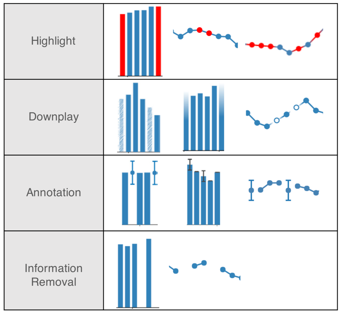
How do we translate the abstract concept of uncertainty into visible form? This question has generated substantial research, with solutions ranging from subtle modifications of familiar encodings to entirely new visual forms. We can organize these approaches into three categories: discretization strategies that make probability countable, encoding modifications that incorporate uncertainty into color and luminance, and explicit representation of data limitations such as missing values.
17.2.1 Discretization: Making probability concrete
One challenge in communicating uncertainty is that probability distributions are abstract. A density curve represents infinite possibilities, but human perception struggles to translate area under a curve into actionable insight. Discretization strategies address this by representing distributions as countable units.
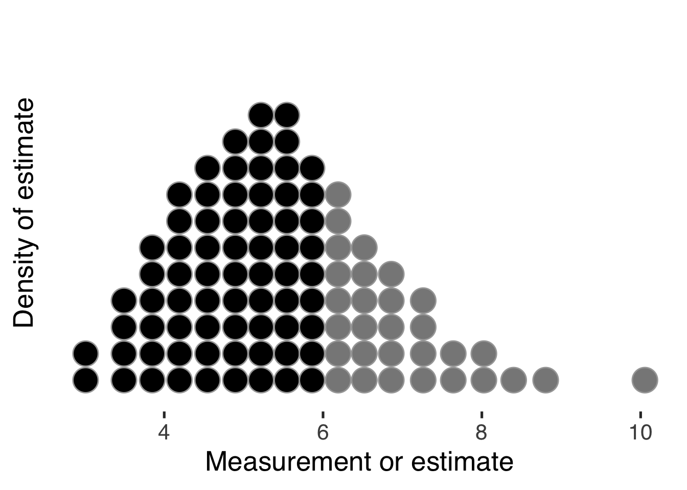
Quantile dotplots (Fernandes et al. 2018; Kay et al. 2016) use discrete dots to represent draws from a probability distribution:
The advantage is immediate: viewers can count or estimate the relative frequency occurring at a given measurement and compare numbers above or below a threshold. This transforms abstract probability into concrete quantity. Research shows that this approach improves decision-making under uncertainty compared to density plots or error bars alone.
Hypothetical outcome plots (Kale et al. 2018) extend this principle by animating multiple possible futures, allowing viewers to experience uncertainty as variability over time rather than as a static summary.
17.2.2 Uncertainty in color and form
Beyond representing entire distributions, we can encode uncertainty directly into the visual channels we use for data values. Value-suppressing uncertainty palettes (Correll, Moritz, and Heer 2018) desaturate colors as uncertainty increases:
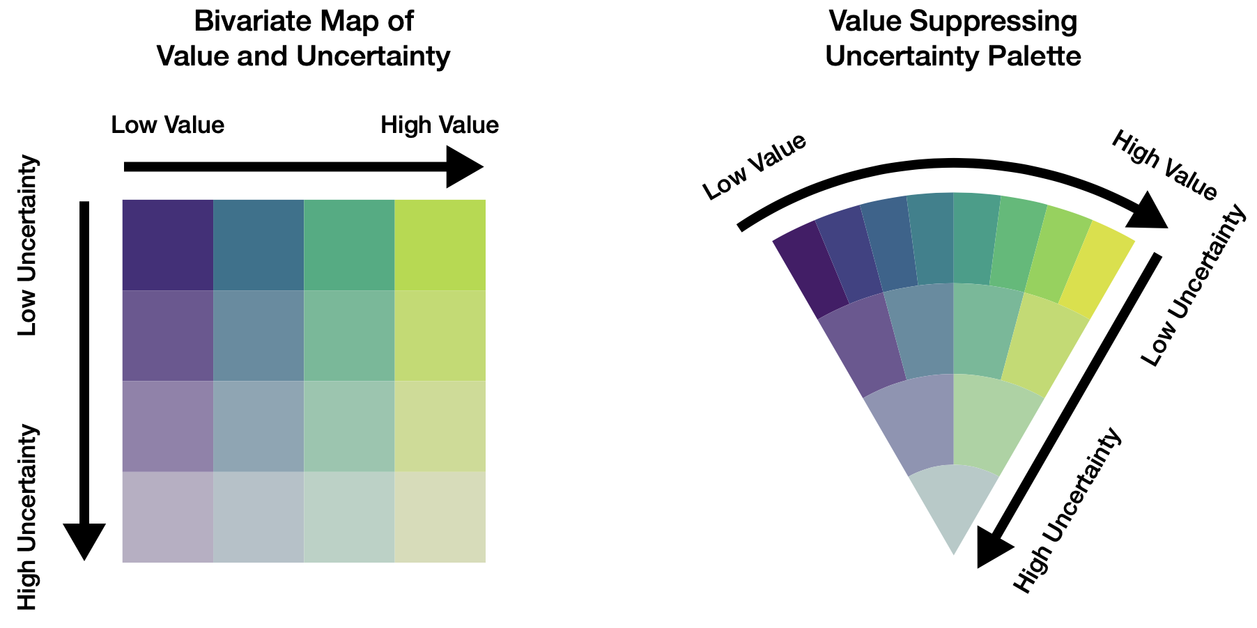
This approach enables dual encoding: hue or luminance represents the point estimate, while saturation represents the confidence in that estimate. Viewers can thus perceive both the most likely value and the range of plausible alternatives without requiring separate visual elements.
Gradient plots and violin plots (Correll and Gleicher 2014) extend this principle to show full distributions along a single dimension. Rather than showing only a point estimate with error bars, these encodings reveal the shape of uncertainty—whether it is symmetric, skewed, multimodal, or bounded. We will see examples of this approach in Figure 17.5 when we discuss communicating model results.
17.2.3 The uncertainty of absence: Missing data
Missing data create another form of uncertainty, one that is particularly insidious because it is invisible by default. When observations are missing, our analysis rests on incomplete foundations. The worst approach, usually, is to simply delete those observations and proceed as if they never existed (Little and Rubin 2019; Baguley and Andrews 2016).
Instead, we should treat missing values as part of our uncertainty. Multiple imputation approaches each missing value as an estimated distribution of possible values, reflecting what we know about what the value might have been. But we must also communicate about missingness itself:
Data are part of our models; understanding what is not there is equally important. The pattern of missingness—whether data are missing randomly or systematically—can bias our conclusions if ignored. Visualization can reveal these patterns and help us account for them.
Exercise 17.1 Find a dataset you have worked with that contains missing values. Create three visualizations: (1) a naive view that simply omits missing data, (2) a view that shows where data are missing, and (3) a view that incorporates uncertainty from missing values through imputation or other methods. How do these different approaches change your interpretation?
17.3 Estimations and predictions from models
Alice watched the White Rabbit consult his pocket watch with evident anxiety. “I’m late, I’m late!” he exclaimed. But Alice noticed he never said how late—five minutes? Five hours? The difference mattered, yet the Rabbit’s urgency conveyed only emotion, not information.
When we communicate estimates and predictions from models, we risk becoming the White Rabbit—proclaiming results with certainty that the underlying data do not support. To avoid this, we must understand what our models actually tell us and what remains uncertain.
Our goal in modeling is typically to understand real processes and their outcomes: what has happened, why, and what may transpire. Data represent events, outcomes of processes. Let’s call these observed variables. But we rarely know enough to predict outcomes with certainty—if we did, we would not need to model at all.
Yet we do have knowledge about processes, even before seeing data. This knowledge—call it prior understanding—comes from earlier experience, theory, or related data. Bayesian modeling formalizes this process: we begin with what we know (the prior), update with what we observe (the data), and arrive at an improved understanding (the posterior) that respects both sources of information.
Visualization plays a crucial role here. Just as visual displays help us find relationships in raw data, they can help us understand what our models tell us—and crucially, what they leave uncertain.
17.3.1 Conceptualizing models
Complementary to visual analyses, we code models to identify, describe, and explain relationships. We have already used a basic regression model earlier when exploring Anscombe’s Quartet. That linear regression could be coded in R as simply lm(y ~ x). But mathematical notation can give us a more informative, equivalent description. Here, that might be1,
\[ \begin{split} y &\sim \textrm{Normal}(\mu, \sigma) \\ \mu &= \alpha + \beta \cdot x \\ \alpha &\sim \textrm{Uniform}(-\infty, \infty) \\ \beta &\sim \textrm{Uniform}(-\infty, \infty) \\ \sigma &\sim \textrm{Uniform}(0, \infty) \end{split} \]
Considering a second example, if we are given a coin to flip, our earlier experiences with such objects and physical laws suggest that when tossed into the air, the coin would come to rest in one of two outcomes: either heads or tails facing up. And we are pretty sure, but not certain, that heads would occur around 50 percent of the time. The exact percentage may be higher or lower, depending on how the coin was made and is flipped. We also know that some coins are made to appear as a “fair” coin but would have a different probability for each of the two outcomes. Its purpose is to surprise: a magic trick! So let’s represent our understanding of these possibilities as an unobserved variable called \(\theta\). \(\theta\) is distributed according to three, unequal possibilities: The coin is balanced, heads-biased, or tails-biased.
17.3.2 Visually communicating models
Then, we can represent our prior understanding of the probability of heads as distributed, say, \(\textrm{Beta}(\theta \mid \alpha, \beta)\) where \(\theta\) is the probability, and \(\alpha\) and \(\beta\) are shape parameters, and the observed data distributed \(\textrm{Binomial}(\textrm{heads} \mid \textrm{flips}, \theta)\). If we were very confident that the coin was fair, we could keep the prior distribution narrowly near a half, but in this example we will leave extra uncertainty for the possibility of a trick coin, say, \(\alpha = \beta = 10\), as shown in the left panel of Figure 17.4. For 8 heads in 10 flips, our model distribution with this data are shown in the middle panel of Figure 17.4.
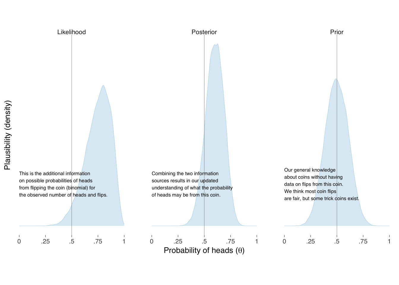
When our model combines the two sources of knowledge together, shown on the right panel of Figure 17.5, we get our updated information on, and uncertainty of, what the underlying probability of heads may be for this coin. Such distributions most fully represent the information we have about, and should be considered when describing our modeling. With the distributions in pocket, of course, we can summarize them in whatever way makes sense to the questions we are trying to answer and for the audience we intend to persuade. Figure 17.5 provides one alternative for expressing our knowledge and uncertainty.
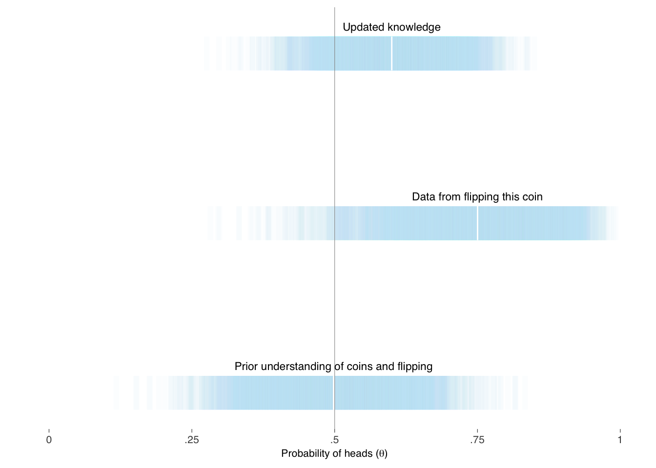
The above is a more intuitive representation of the variation than in table Table 17.1. Tables may, however, complement the information in a graph display.
| Knowledge | Min | 25th | 50th | 75th | Max |
|---|---|---|---|---|---|
| Prior | 0.12 | 0.42 | 0.50 | 0.58 | 0.89 |
| Likelihood | 0.19 | 0.67 | 0.76 | 0.84 | 1.00 |
| Posterior | 0.21 | 0.54 | 0.60 | 0.66 | 0.88 |
Exercise 17.2 Consider the coin flip example above. If you observed 8 heads in 10 flips, what would you conclude? Write a brief paragraph explaining the result to a non-technical audience, first without mentioning uncertainty, then with appropriate uncertainty included. How do these two versions differ in their implications for decision-making?
Modeling is usually, of course, more complex than coin flipping and can be a vast, complex subject. That does not mean it cannot be visualized and explained persuasively. Much can be learned about how to explain what we are doing by reviewing well-written introductions on the subject of whatever types of models we use. There are several references — for example, (McElreath 2020) and (Stan Development Team 2019) — that thoroughly introduce applied Bayesian modeling.
McElreath explains what models are, and step-by-step explains various types in words, mathematically, and through corresponding code examples. These models are various: continuous outcome with one covariate, a covariate in polynomial form, multiple covariates, interactions between covariates, generalized linear models, such as when modeling binary outcomes, count outcomes, unordered and ordered categorical outcomes, multilevel covariates, covariance structures, missing data, and measurement error. Along the way, he explains their interpretations, limitations, and challenges.
Modeling complex relationships brings additional considerations. When we include multiple covariates in our models, we must think carefully about how variables relate to each other. Including a variable can change the apparent relationship between two other variables—a phenomenon called confounding. Understanding these relationships is crucial for both building accurate models and communicating their results. We explore these challenges in Chapter 18.
17.4 Uncertainty as honesty
Alice emerged from Wonderland not with certainty about which path to take, but with confidence in her ability to navigate uncertainty. She learned that pretending to know what you do not know is more dangerous than admitting the limits of your knowledge.
So it is with data communication. The temptation is strong to present our findings as more definitive than they are—to omit error bars, to hide model assumptions, to delete inconvenient data. But this false confidence serves neither our audience nor our credibility. Better to communicate clearly what we know, what we do not know, and the boundaries between them.
The principles we have explored—discretization to make probability concrete, dual encoding to show value and uncertainty simultaneously, explicit treatment of missing data, and the Bayesian approach to combining prior knowledge with observed data—provide tools for this honest communication. They enable us to respect our audience’s intelligence while helping them reason effectively under uncertainty.
Our three guides would agree on this point. Holmes, the detective, knew that premature conclusions lead to errors; he gathered evidence until the pattern became clear. Tukey, the explorer, insisted on looking at data from multiple angles, acknowledging that any single view is partial. Kahneman, the psychologist, demonstrated how human judgment falters when uncertainty is ignored.
The path forward requires all three perspectives: the careful observation of the detective, the exploratory mindset of the statistician, and the psychological awareness of the cognitive scientist. With these tools, we can venture deeper into the Wonderland of data—not to escape uncertainty, but to navigate it with skill and integrity.
17.5 Looking ahead
We have focused on communicating uncertainty in individual estimates and predictions. But data analysis rarely stops at single variables. We want to understand how variables relate to each other—how education correlates with earnings, how temperature affects ice cream sales, how advertising spend connects to revenue.
These relationships bring new challenges. When we see two variables moving together, we naturally want to know: Does one cause the other? Are they both influenced by something else? Is the relationship real or a coincidence of this particular dataset?
The uncertainty we have learned to communicate now becomes even more crucial. A correlation coefficient of 0.7 sounds impressive, but with what confidence interval? A regression slope of 2.3 seems meaningful, but how sensitive is it to unmeasured confounders? The next chapter explores how to visualize and communicate these relationships between variables—how to show correlation clearly while maintaining appropriate humility about causation.
Note that in this toy example the “priors” or “unobserved variables” \(\alpha\), \(\beta\), and \(\sigma\) are distributed \(\textrm{Uniform}\) over infinity, which is what the above
lm()assigns. This is poor modeling as we always know more than this about the covariates and relationships under the microscope before updating our knowledge with data \(x\) and \(y\).↩︎