18 Communicating correlation and causation
Alice followed the White Rabbit through the garden, where she noticed that the roses were always red on the side facing the sun and white on the shaded side. “The sun causes the redness,” she concluded. But then she saw roses that were red on the shaded side too, and some white roses in full sun. She realized the pattern was more complex than simple cause and effect.
In our data work, we constantly encounter relationships between variables. Sales and advertising spend move together. Ice cream consumption correlates with drowning incidents. Countries with more storks have higher birth rates. The challenge is not finding these patterns—our statistical tools make correlation easy to detect—but understanding what they mean and, more importantly, communicating that meaning clearly.
18.1 The seduction of causation
Every student of statistics learns the mantra: correlation does not imply causation. Yet the temptation to interpret correlation as causation persists because causal stories are more compelling. “X causes Y” feels stronger than “X and Y are associated.” Audiences prefer deterministic narratives over probabilistic ones.
But correlation arises from multiple sources, and only one represents true causation. Consider what might explain why two variables move together. Perhaps X genuinely influences Y, which is the causal story we want to tell. Or perhaps Y actually influences X, which is reverse causation—common when we study behaviors and outcomes. Maybe a third variable Z influences both, creating a spurious association that disappears when we account for Z. The relationship might appear merely by chance in this particular dataset, a coincidence that would not replicate. Or our sample collection method might create apparent relationships where none exist in the broader population.
When communicating correlations, we must make these possibilities explicit. A scatterplot showing a strong relationship between two variables demands discussion of what mechanisms might explain it and what alternative explanations remain viable. The visual evidence of association is only the beginning of the story, not the end.
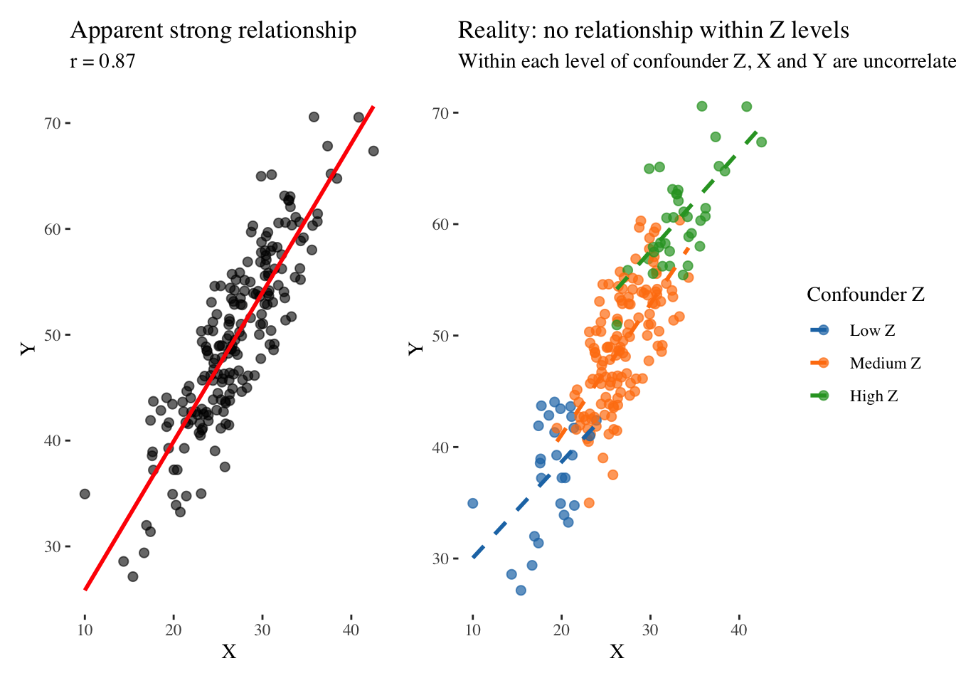
Consider this simulated example that illustrates how a common cause creates spurious correlation. We generate data where a confounding variable influences both X and Y, yet X and Y have no direct relationship:
The left panel shows what we might publish if we only looked at X and Y: a strong positive correlation suggesting that as X increases, Y increases. But the right panel reveals the truth. When we stratify by levels of the confounder Z, the relationship completely disappears. Within each group defined by Z, X and Y are unrelated. The apparent correlation was entirely an artifact of Z influencing both variables.
This example illustrates why we must always ask what else might explain a relationship before concluding that one variable causes another. The correlation between ice cream sales and drowning deaths does not mean ice cream consumption causes drowning; a common cause—hot weather—increases both. The relationship between children sleeping with lights on and myopia does not mean light exposure damages eyesight; genetic factors likely influence both. The correlation between Nobel laureates and chocolate consumption in countries does not mean chocolate makes you smarter; wealthier countries have both more research institutions and more chocolate consumption. The relationship between students attending private tutoring and higher grades does not prove tutoring is effective; motivated students and affluent families select into tutoring, and these same factors lead to higher grades regardless of tutoring.
Communicating these correlations requires acknowledging uncertainty about causation. We must present the association clearly while discussing alternative explanations and what evidence would be needed to distinguish among them.
18.2 Visualizing relationships through Tukey’s eyes
John Tukey, our explorer guide, taught us to look at data from multiple angles before drawing conclusions. This approach is especially important when exploring relationships between variables because a single view may reveal pattern or hide it, and we cannot know which until we examine the data from several perspectives.
The scatterplot remains our fundamental tool for examining relationships, but how we construct it matters enormously. When we add a fitted line to a scatterplot, we suggest a functional relationship that can be used for prediction. When we add error bands around that line, we acknowledge uncertainty in the prediction. But we must ask whether the relationship we are fitting is truly the right one.
Consider what happens when we fit a linear model to inherently non-linear data. We generate data following a sinusoidal pattern and compare two approaches to visualization:
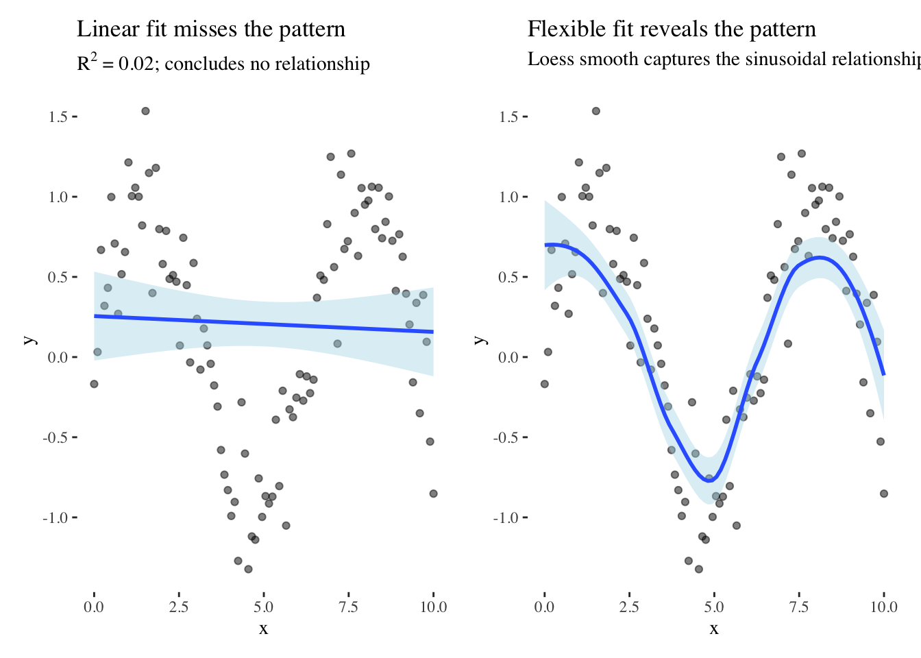
The linear fit in the left panel completely fails to capture the relationship, yielding an R-squared near zero and potentially leading us to conclude that no relationship exists. Yet the data clearly contain a strong pattern—a sinusoidal relationship—that the linear model is simply the wrong tool to detect. The loess smooth in the right panel, which makes no assumption about functional form, immediately reveals the pattern.
Tukey would advise us to look at the raw data without overlays first, then fit flexible models before committing to specific functional forms. We should examine residuals to identify systematic departures from our model, and consider transformations that might reveal simpler structure. The residuals often tell us more than the fitted model itself because they reveal what our model failed to capture.
When exploring relationships, we should consider multiple views of the same data. A scatterplot with a trend line emphasizes the basic pattern and direction of association. A correlation matrix with color coding shows the relationship in context with others, helping us understand its relative strength among many possible associations. A time series of both variables reveals whether the relationship holds across time or varies by period, exposing instability that a simple scatterplot might hide. Each view tells a slightly different story, and the responsible communicator uses multiple views not to confuse but to illuminate different facets of the relationship.
Systematic patterns in residuals suggest our model is missing structure. A funnel shape suggests heteroscedasticity, meaning the variability changes across the range of the predictor. Curvature suggests non-linearity that our model failed to capture. Outliers suggest unusual observations that merit investigation rather than automatic exclusion. When communicating relationships, consider showing residuals alongside the main plot. This transparency acknowledges model uncertainty and invites the audience to question whether the relationship is as simple as the main plot suggests.
18.3 Mapping causality with directed acyclic graphs
The most pernicious problem in interpreting correlations is confounding, where variables influence both the apparent cause and apparent effect, creating spurious associations that lead us astray. When we select variables for a model without considering causal structure, we risk reinforcing these confounds rather than revealing true relationships. Worse, we might control for the wrong variables, inadvertently creating spurious associations where none existed.
Pearl (2009) and McElreath (2020) provide frameworks for thinking about causation through directed acyclic graphs, which are simple diagrams showing how variables might influence each other. These DAGs help us identify what we need to control for in our analysis and, crucially, what we must not control for. Making our causal assumptions explicit through DAGs allows both us and our audience to scrutinize whether our analytic choices are appropriate for the claims we want to make.
18.3.1 Understanding DAG structures through visualization
Consider the fundamental problem of confounding, where a common cause creates spurious association between two variables that have no direct causal link. We can visualize this structure as a DAG where Z influences both X and Y:

In this structure, if we do not account for Z, X and Y will appear related even when they have no direct causal connection. The path X ← Z → Y creates statistical association without causal influence. To estimate the true causal effect of X on Y, or lack thereof, we must control for Z by including it in our model or stratifying our analysis by Z levels.
Now consider a collider structure, which is more subtle and dangerous because controlling for the wrong variable can create spurious association:
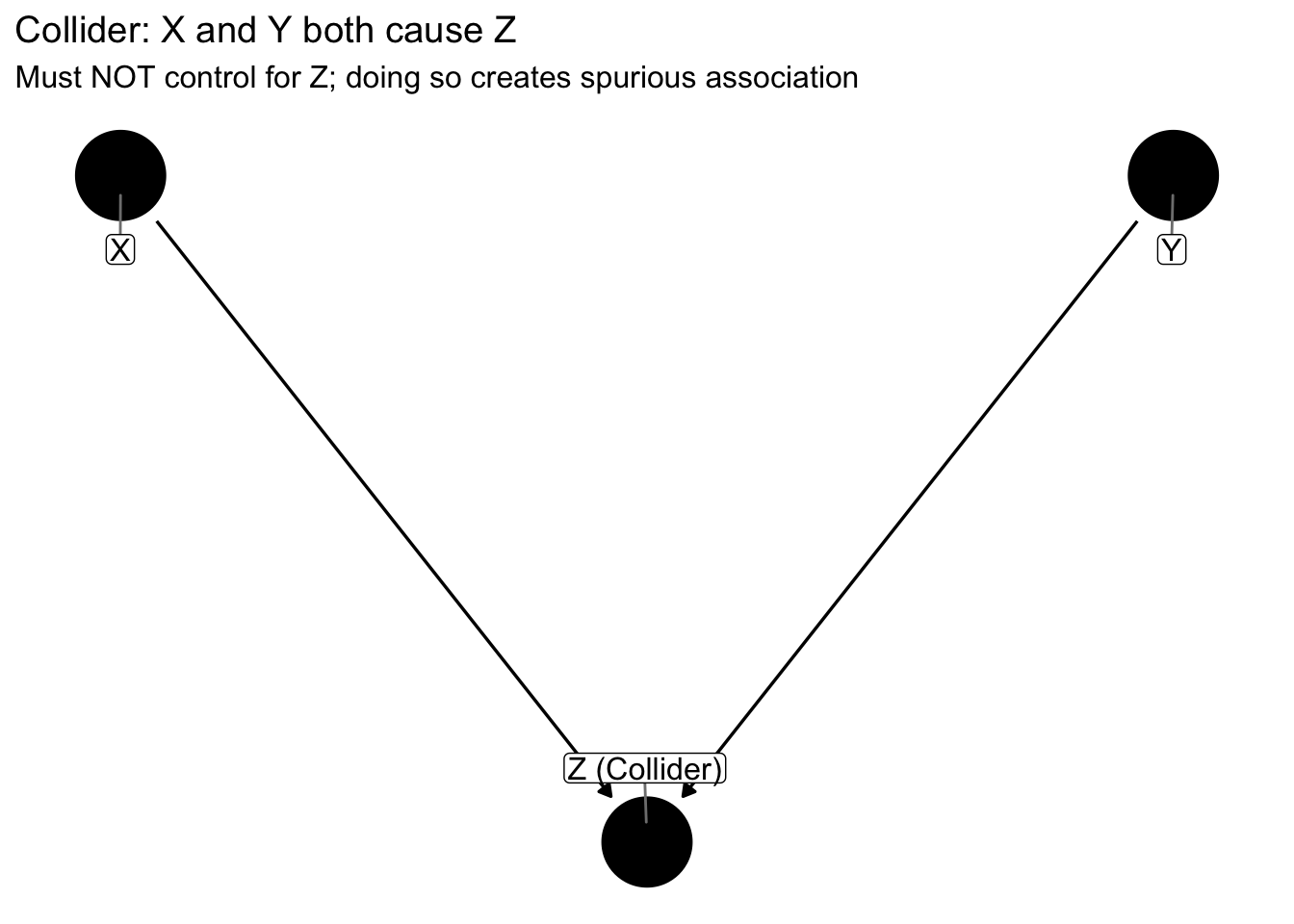
In a collider structure, X and Y both influence Z. If we condition on Z by including it in our regression model, selecting only observations with certain Z values, or stratifying by Z, we open a path between X and Y that creates spurious association. This is the opposite of confounding: with confounders we must control, with colliders we must not control.
A third important structure is the mediator, where the causal effect flows through an intermediate variable:
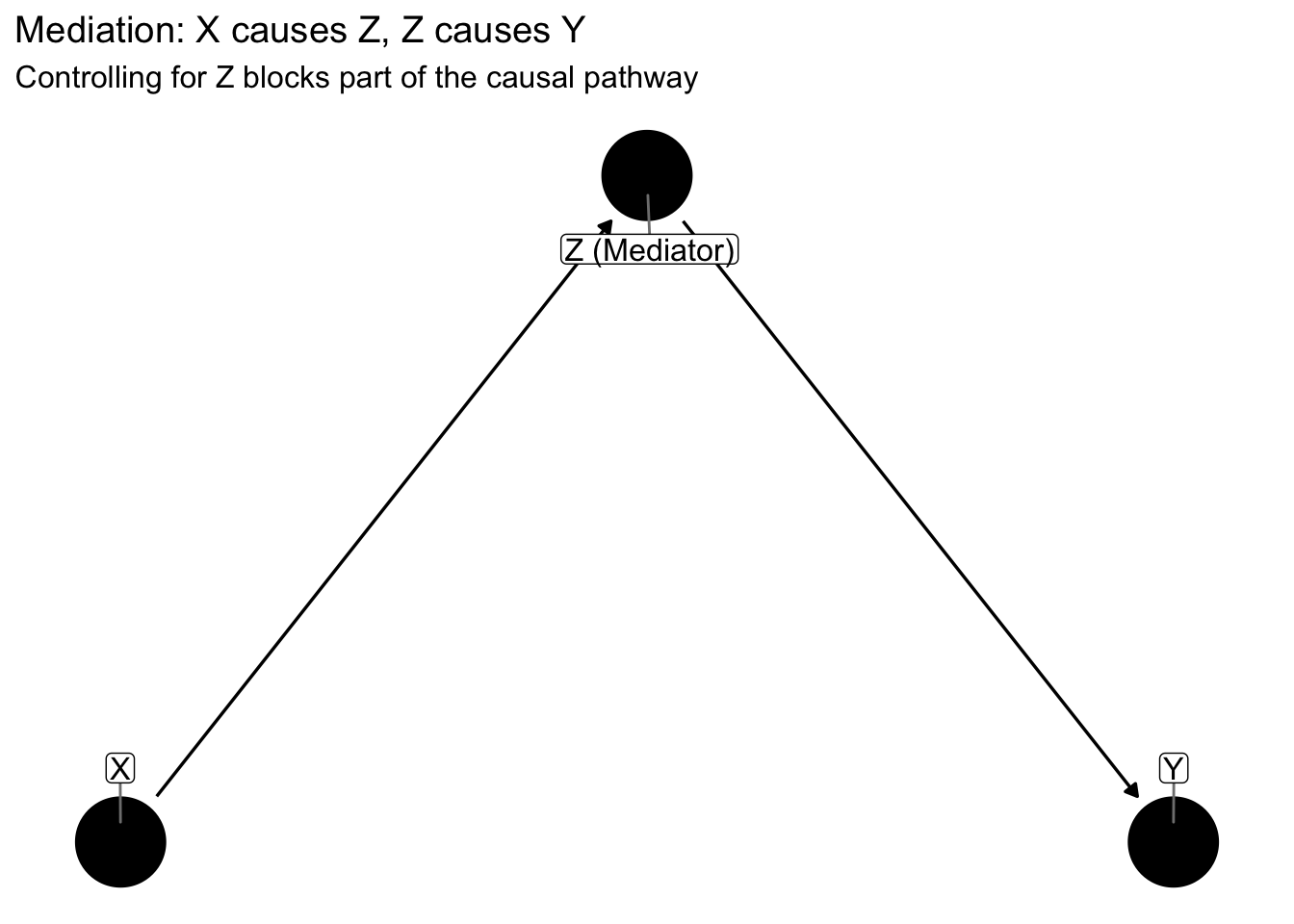
When X influences Y entirely through a mediator Z, the total causal effect is the sum of paths through Z. If we control for Z, we block the indirect path and estimate only any direct effect, potentially underestimating the total causal effect of X on Y. Whether controlling for a mediator is appropriate depends on whether we want the total effect or the direct effect.
18.3.2 Confounding in action: An example
Let us simulate confounding more concretely. Imagine we are studying whether exercise reduces cholesterol. We collect data on exercise hours per week and cholesterol levels, and we find that people who exercise more have lower cholesterol. We might conclude that exercise causes lower cholesterol and recommend that people exercise more.
But unbeknownst to us, age influences both exercise and cholesterol. Older people tend to exercise less due to physical limitations, and older people naturally have higher cholesterol due to biological aging. Age confounds the association, making it appear that exercise reduces cholesterol when in reality age drives both.
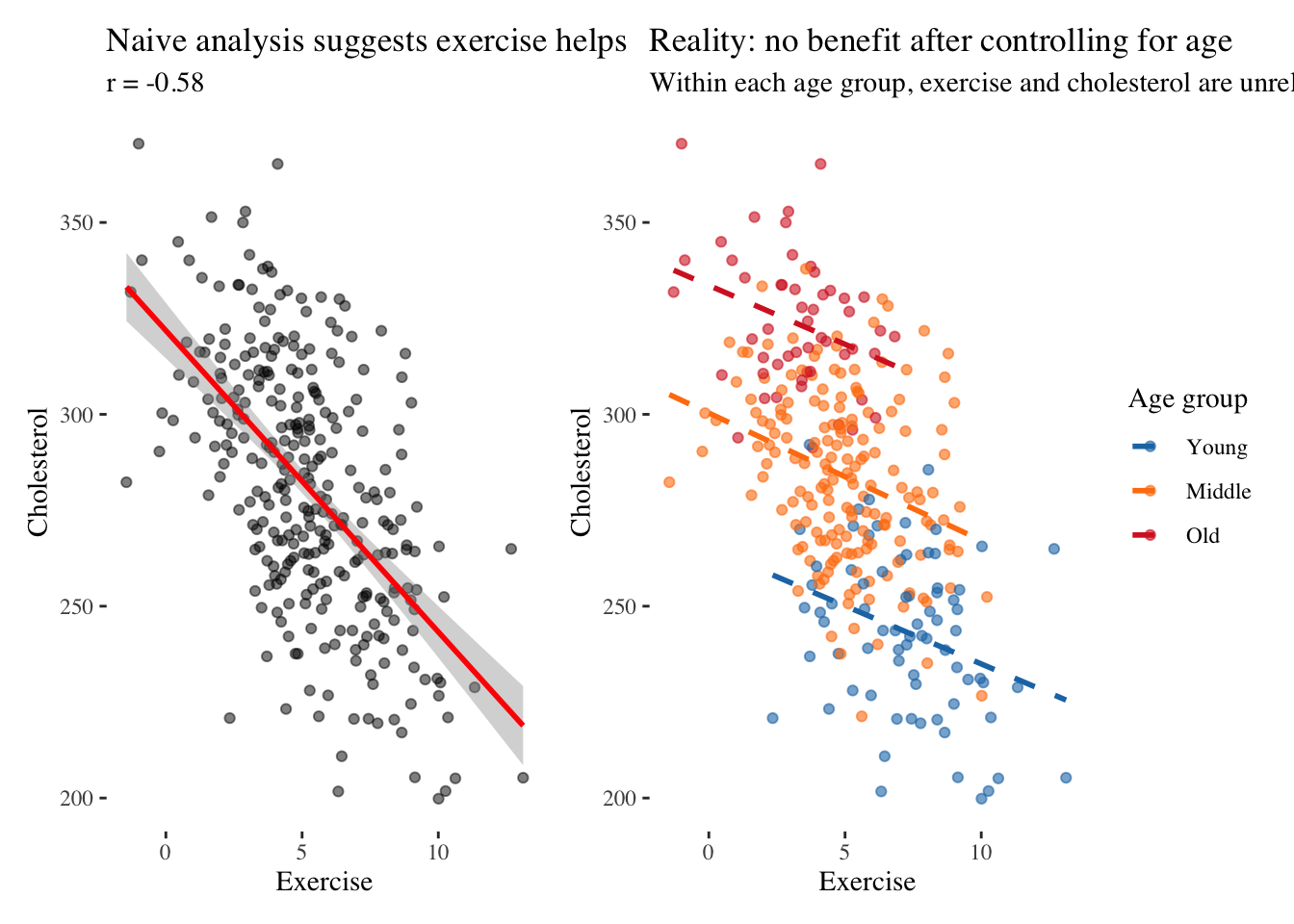
The left panel shows what we might publish if we analyzed the data naively: exercise strongly predicts lower cholesterol with a correlation around negative 0.7. We might conclude that exercise causes lower cholesterol and recommend that people exercise more. But the right panel reveals the truth. When we stratify by age group, within each group there is essentially no relationship between exercise and cholesterol. The apparent benefit was entirely due to age: younger people exercise more and have lower cholesterol, but exercise itself has no causal effect on cholesterol in this simulated scenario.
This example illustrates why drawing DAGs before analyzing data is essential. The DAG Age → Exercise and Age → Cholesterol would have warned us that we must control for age to estimate the true effect of exercise. Without the DAG, we might not have measured age at all, or might not have thought to include it in our model.
McElreath emphasizes that DAGs are not just tools for analysis but for communication. When presenting analyses, include a DAG showing your hypothesized causal structure. It need not be elaborate—simple arrows showing directions of influence suffice. This transparency helps audiences understand what variables you believe causally influence others, what confounders you attempted to control, and what assumptions your causal claims rest upon. The DAG makes your reasoning explicit and open to scrutiny.
18.4 Communicating observational causal claims
Randomized controlled experiments provide the gold standard for causal inference because random assignment ensures treatment and control groups are comparable in expectation. But in observational data, where we cannot randomize, we must rely on other strategies that attempt to approximate the experimental ideal. Each strategy rests on assumptions that may or may not hold in any given situation, and our communication must address these assumptions honestly.
Natural experiments occur when the world provides randomization for us. A policy change might affect some regions but not others for reasons unrelated to the outcome. A lottery might determine who receives a treatment. A natural disaster might impact some areas randomly. These situations create as-if random assignment that we can exploit if we can argue convincingly that the assignment mechanism is unrelated to potential outcomes.
Difference-in-differences compares changes over time between treated and untreated groups. If a policy is implemented in one state but not a similar neighboring state, we compare how outcomes changed in each state after the policy. The crucial assumption is that without the policy, both states would have followed parallel trends. This assumption is untestable but can be made more plausible by showing parallel trends in the pre-period.
Regression discontinuity exploits sharp cutoffs where treatment assignment changes discontinuously. If students with test scores above 70 receive tutoring, we compare those scoring 69 and 71. The intuition is that students just above and just below the threshold are similar in all respects except receiving the treatment, mimicking random assignment near the cutoff.
Instrumental variables identify something that affects treatment but does not directly affect the outcome. Distance to a hospital might affect whether you receive a treatment but does not directly affect your health except through treatment received. If we can find such an instrument, we can estimate the causal effect for those whose treatment status is influenced by the instrument.
Each approach has assumptions that must be communicated. For instrumental variables, we must explain why the instrument is valid and what would happen if the assumption fails. For difference-in-differences, we must show parallel pre-trends and discuss what might violate the parallel trends assumption. The responsible causal communicator does not hide these complexities but highlights them, inviting the audience to evaluate the strength of the evidence.
Tufte’s principle of showing evidence applies powerfully here. When making causal claims, we should visualize the raw association clearly, then show how controlling for confounders changes the estimate, then present sensitivity analyses showing how conclusions change under different assumptions. Consider this difference-in-differences visualization:
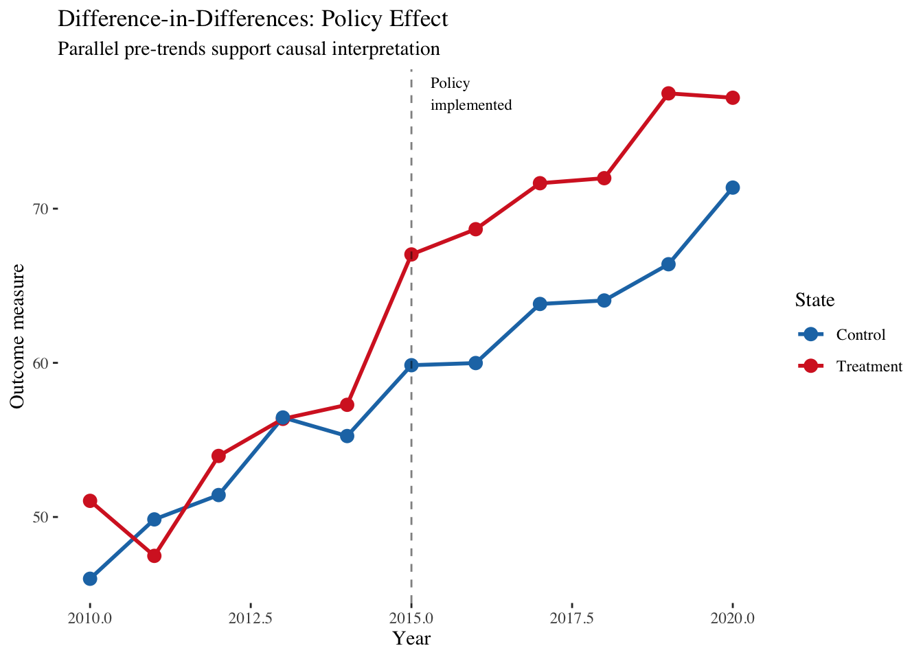
This visualization makes the causal argument transparent. The parallel trends before 2015 suggest the states were comparable, providing evidence for the parallel trends assumption. The divergence after 2015 suggests a causal effect. But the visualization also invites scrutiny: were the trends truly parallel? Might other confounds explain the divergence? The graphic presents both the evidence and its limitations.
18.5 Building the case from association to evidence
The path from correlation to credible causal claim requires multiple forms of evidence that converge on the same conclusion. We should look for consistency across studies to ensure the relationship appears in different datasets and contexts, not just our particular sample. We should establish temporal ordering to ensure the cause precedes the effect, ruling out reverse causation. We should demonstrate dose-response, where more of the cause leads to more of the effect, which is harder to explain by confounding. We should identify mechanisms through which the cause produces the effect, providing a plausible biological, psychological, or physical pathway. And we should ensure coherence, meaning the relationship fits with what we know about related phenomena and does not contradict established knowledge.
When communicating, structure your narrative to build this evidence progressively. Begin by establishing the basic association clearly and transparently. Then show that the relationship is robust across subgroups, time periods, and different measures. Present the proposed mechanism explaining how X produces Y. Address alternative explanations directly, explaining why confounding, reverse causation, and selection bias are insufficient to explain the pattern. Acknowledge uncertainty and limitations honestly rather than hiding them.
This cumulative approach respects the audience’s intelligence. Rather than asserting causation based on a single correlation, you guide them through the reasoning process, showing them the evidence that supports your claim while acknowledging what remains uncertain. The goal is not to eliminate all doubt—that is impossible—but to demonstrate that the causal explanation is more plausible than alternatives given the available evidence.
18.6 Synthesis: The humility of association
Alice learned that jumping to conclusions was dangerous in Wonderland. The caterpillar’s advice to explain herself applies to our data work as well. When we find correlations, we must explain what they might mean while acknowledging what we do not know.
Our three guides offer complementary wisdom on this challenge. Holmes, the detective guide, would insist on evidence that survives scrutiny. A correlation is merely a clue that demands investigation. Holmes would ask what other variables might explain the pattern, whether we have ruled out alternative explanations, and whether the association is consistent across multiple datasets and contexts. He would not rest until the evidence became undeniable.
Tukey, the explorer guide, would demand multiple views. A single scatterplot is never sufficient. He would explore residuals, try transformations, examine subsets of the data, and fit flexible models before committing to any interpretation. The relationship we see might be an artifact of our chosen view, and only by looking from multiple angles can we gain confidence that the pattern is real.
Kahneman, the psychologist guide, would warn us about our own cognitive biases. We are pattern-seeking creatures who see causation everywhere. Our brains are wired to tell causal stories, and this wiring often leads us astray when dealing with complex multivariate data. We must be vigilant against our tendency to see causation in mere association.
The responsible communicator synthesizes these perspectives. We show correlations clearly, using multiple visualizations to reveal different aspects. We explain possible interpretations while explicitly acknowledging uncertainty about causation. We distinguish what we know from what we merely suspect. And we invite the audience to reason with us, to examine our evidence, question our assumptions, and draw their own tentative conclusions.
The path from correlation to causation is treacherous, littered with confounds, colliders, and coincidences. But it is navigable with care, transparency, and humility. Our task is not to eliminate uncertainty but to illuminate it, to show our audience both the patterns in the data and the boundaries of what those patterns can tell us. In doing so, we enable them to make better decisions based on a realistic understanding of what we know and what remains unknown.