6 Heuristics and biases
We have examined the tools of persuasion: rhetorical appeals, narrative structures, and careful language. Yet these tools operate on audiences whose minds do not process information as disembodied logic machines. We must understand how humans actually think—not how they should think, but how they do think—if our communications are to achieve their purposes.
6.1 Two systems of thought
Kahneman (2013) identifies two distinct cognitive systems that govern human judgment. System One operates automatically and effortlessly, generating impressions, feelings, and intentions without conscious deliberation. When we see a face and immediately sense anger, when we recoil from a sudden movement, when we feel drawn to a familiar story—we engage System One. System Two, by contrast, is slow, effortful, and deliberate. It monitors, checks, and overrides System One when stakes are high or errors are detected, but it is lazy—it conserves effort and often accepts System One’s suggestions uncritically.
Consider the difference:

The angry face requires no calculation—you perceive the emotion instantly. But the arithmetic problem demands concentration, working memory, and sustained effort. This distinction matters profoundly for data communication because our audiences process our visualizations, narratives, and arguments primarily through System One, even when the underlying analysis required System Two rigor.
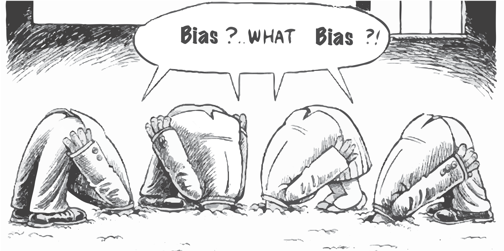
System One relies on heuristics—mental shortcuts that work well in most situations but produce systematic errors in others. These errors are biases: predictable deviations from rational judgment that affect experts and novices alike. We cannot eliminate these biases in ourselves or our audiences, but we can design communications that work with, rather than against, the grain of human cognition.
For examples of how different presentations engage different systems, consider two visualizations of the same data. Figure 5.2 presents individual images of plastic bottles—a concrete, immediately comprehensible display that engages System One. Figure 5.3 presents the same information as a Sankey diagram—abstract, requiring System Two effort to trace flows and interpret proportions. The same data, different cognitive demands.
On how humans process information, we have decades of empirical and theoretical research available (Gilovich, Griffin, and Kahnman 2009), and theoretical foundations have long been in place (Miller and Gelman 2020).
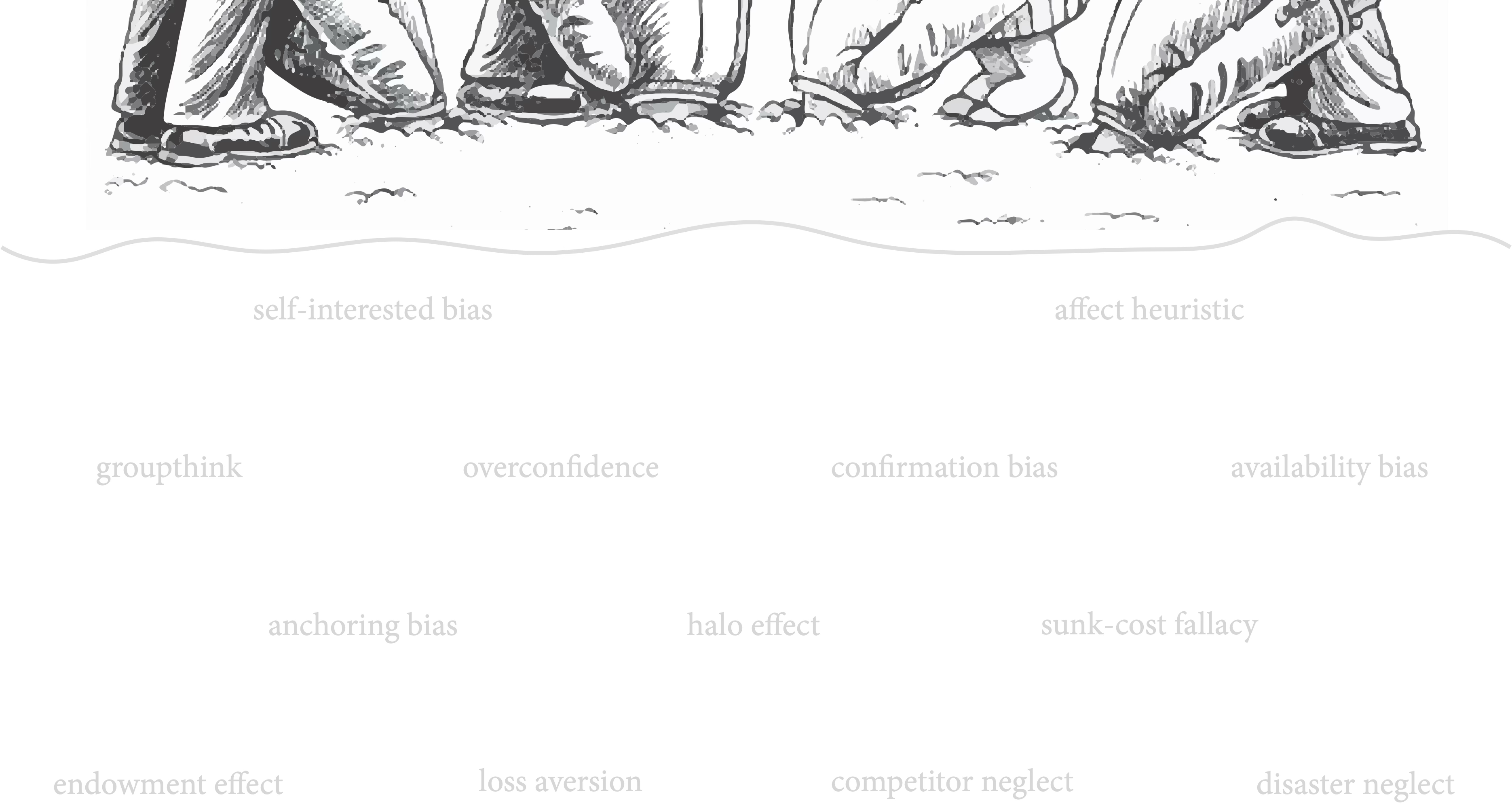
Kahneman, Lovallo, and Sibony (2011) gives executives ways to guard against some biases by asking questions and recommending actions:
self-interested biases | Is there any reason to suspect the team making the recommendation of errors motivated by self-interest? Review the proposal with extra care, especially for over optimism.
the affect heuristic | Has the team fallen in love with its proposal? Rigorously apply all the quality controls on the checklist.
groupthink | Were there dissenting opinions within the team? Were they explored adequately? Solicit dissenting views, discreetly if necessary.
saliency bias | Could the diagnosis be overly influenced by an analogy to a memorable success? Ask for more analogies, and rigorously analyze their similarity to the current situation.
confirmation bias | Are credible alternatives included along with the recommendation? Request additional options.
availability bias | If you had to make this decision in a year’s time, what inform-ation would you want, and can you get more of it now? Use checklists of the data needed for each kind of decision.
anchoring bias | Where are the numbers from? Can there be … unsubstantiated numbers? … extrapolation from history? … a motivation to use a certain anchor? Re-anchor with data generated by other models or benchmarks, and request a new analysis.
halo effect | Is the team assuming that a person, organization, or approach that is successful in one area will be just as successful in another? Eliminate false inferences, and ask the team to seek additional comparable examples.
sunk-cost fallacy, endowment effect | Are the recommenders overly attached to past decisions? Consider the issue as if you are a new executive.
overconfidence, optimistic biases, competitor neglect | Is the base case overly optimistic? Have a team build a case taking an outside view: use war games.
disaster neglect | Is the worst case bad enough? Have the team conduct a premortem: imaging that the worst has happened, and develop a story about the causes.
loss aversion | Is the recommending team overly cautious? Align incentives to share responsibility for the risk or to remove risk.
We increase persuasion by addressing these issues in anticipation that our audience will want to know. It’s very hard to remain aware of our own biases, so we need to develop processes that identify them and, most importantly, get feedback from others to help protect against them.
6.2 General strategies for mitigating bias
Before examining how specific biases manifest in data communication, consider five general approaches that reduce bias even without knowing the specific bias at play:
Make analogies and examples comparable to the proposal. When we use analogies that differ from our proposal in important ways, we invite selective reasoning. If the analogous success had advantages our project lacks, we may be fooling ourselves.
Present ideas from a neutral perspective. Becoming too emotional suggests bias. When we advocate passionately, audiences wonder what we are overlooking. A measured tone invites engagement rather than defensiveness.
Consider multiple anchors in the proposal. Any single starting point shapes subsequent reasoning. By presenting multiple reference points—different baselines, alternative benchmarks, varied comparison groups—we reduce the chance that one arbitrary anchor distorts conclusions.
Genuinely admit uncertainty in the proposal, and recognize multiple options. Acknowledging what we do not know signals intellectual honesty. When we present only one path forward, audiences suspect we have not considered alternatives.
Identify additional data that may provide new insight. What information would change our conclusion? If we cannot answer this question, we may be too certain. Specifying what would disconfirm our view demonstrates rigorous thinking.
These strategies share a common thread: they require us to step outside our own perspective and consider how a skeptical colleague might view our work. Get colleagues to help us. External perspectives see what we cannot see in ourselves.
6.3 Biases in data communication
Understanding these biases abstractly is useful; recognizing how they manifest in data communication is essential. We organize these biases into three groups: those affecting how we seek and process information, those involving emotion and certainty, and those arising from how we present and interpret data.
6.3.1 Information processing biases
Confirmation bias leads us to seek information that supports our beliefs and dismiss what contradicts them. When presenting findings that challenge existing views, we face an uphill battle. The Dodgers memo (Example 4.2) navigates this by acknowledging current practice before advocating change: it validates that “our decisions based on other most likely events” represent the status quo, then demonstrates why this approach leaves “wins unclaimed.” By showing respect for existing methods while revealing limitations, the memo reduces defensiveness. To mitigate this bias in your audience: present disconfirming evidence early, acknowledge strengths of current approaches, and frame new findings as building upon rather than replacing prior knowledge.
Anchoring bias gives first impressions disproportionate influence. The initial number your audience encounters becomes the anchor against which all subsequent numbers are compared. The same improvement seems modest when anchored against impressive baselines but dramatic when anchored against concerning ones. Be intentional about sequencing: anchor with the cost of inaction when advocating change, or with modest baselines when presenting gains.
Availability bias makes vivid, recent, or emotionally charged examples come to mind more easily than abstract statistics, distorting our sense of frequency. A single memorable customer complaint may overshadow data showing 99% satisfaction. Counteract this by making statistics memorable through narrative concretizing, as discussed in Section 5.8, or by explicitly contextualizing: “This represents 0.3% of transactions, or 3 in every 1,000.”
6.3.2 Emotional and confidence biases
The affect heuristic leads us to judge risks and benefits by how we feel about them, not by objective analysis. Audiences feeling positively toward data-driven decisions will underestimate risks; those feeling anxious will magnify them. This explains why the same analysis persuades some and alienates others. Calibrate your appeals to your audience’s emotional starting point, building positive associations through familiar metaphors before presenting findings requiring those associations.
Overconfidence and optimistic bias lead us to systematically overestimate our knowledge and the likelihood of success. This affects both communicators—making us too certain of findings—and audiences—making them dismissive of uncertainty. Combat this through explicit calibration: report confidence intervals rather than point estimates, acknowledge limitations, and use phrases like “our analysis suggests” rather than “our analysis proves.” Modeling epistemic humility encourages audiences to adopt similar humility.
6.3.3 Presentation and interpretation biases
Framing effects mean the same information leads to different conclusions depending on presentation. Tversky and Kahneman (1981) showed people respond differently to “90% survival rate” versus “10% mortality rate”—logically equivalent statements triggering different emotional responses. Data visualization involves three framing channels:
Baseline framing: Where you start the y-axis shapes interpretation. Truncated baselines emphasize change; full-range baselines emphasize magnitude. Neither is wrong, but each tells a different story. Disclose your choices.
Temporal framing: Your time window frames the narrative. Unemployment from 2008 tells recession-and-recovery; from 2019 tells pandemic disruption. Both are true but incomplete. Consider what story your timeframe serves.
Comparison framing: What you compare against shapes evaluation. Twenty percent market share looks impressive compared to launch-day’s 2% but modest compared to the leader’s 45%. Your chosen comparison anchors audience evaluation.
To mitigate framing effects: present multiple frames where possible, disclose your framing choices, and ask what alternatives a skeptic would choose.
Base rate neglect leads us to ignore underlying frequencies when evaluating specific cases. A 99% accurate test sounds reliable until learning the condition occurs in only 1 in 10,000 people—making most positives false. In data communication, striking individual cases without population context distort perception. A vivid fraud case may overshadow millions of legitimate transactions. Always contextualize specifics within broader patterns. Use frequency formats: “3 in every 1,000” is often more intuitive than “0.3%.” Icon arrays showing individual cases within larger populations make base rates visually concrete rather than abstractly statistical.
The narrative fallacy is our tendency to construct causal stories from sequences of events. We observe sales increasing after a campaign and conclude causation—ignoring seasonality, competitors, or regression to the mean. Taleb (2007) warns that “we like stories, we like to summarize, and we like to simplify.” This compression serves communication but endangers causal reasoning. The Dodgers memo (Example 4.2) navigates this by explicitly distinguishing correlation from causation and grounding narrative in probabilistic reasoning. To mitigate: distinguish “X happened, then Y happened” from “X caused Y,” present alternative explanations, acknowledge chance, and ask what skeptics would say.
6.4 Designing visualizations that reduce bias
Beyond general mitigation strategies, specific visualization design choices can help or hinder accurate interpretation. Four design principles particularly address the biases we have examined.
Make uncertainty visible. Overconfidence diminishes when we see distributions rather than point estimates. Error bars, confidence intervals, gradient plots, and hypothetical outcome plots make uncertainty tangible. Compare “Sales will be $1.2M” against a visualization showing the full distribution from $800K to $1.6M with median at $1.2M. The second presentation invites appropriate humility.
Use frequency formats and icon arrays. As discussed regarding base rate neglect, frequency formats improve reasoning about conditional probabilities. Icon arrays—grids of symbols representing individual cases—make statistical relationships concrete. Showing 3 red icons among 997 gray communicates “3 in 1,000” more intuitively than percentages. This leverages our visual system: we perceive the red icons as a small minority within a much larger population.
Deploy small multiples for comparison. When audiences must compare conditions—before versus after, treatment versus control—small multiples reduce the memory burden that leads to biased comparison. Displaying all conditions simultaneously enables visual comparison without requiring audiences to recall one view while viewing another. Tufte (1990) captured this: “At the heart of quantitative reasoning is a single question: Compared to what?”
Maintain consistent encoding across alternatives. When presenting alternative scenarios, use consistent visual encodings. If Option A uses bar charts and Option B uses pie charts, audiences may respond to encoding differences rather than data differences. Consistency ensures perception reflects data, not presentation choices.
6.5 Practical strategies for bias-aware communication
We cannot eliminate biases, but we can design processes that reduce their impact:
Seek disconfirming evidence deliberately. Before finalizing a presentation, ask: What would prove this wrong? If you cannot answer, you have not looked hard enough. Include this evidence in your communication—it builds credibility and inoculates against accusations of cherry-picking.
Use pre-mortems. Imagine your recommendation has been implemented and failed spectacularly. Construct the story of how it failed. This exercise surfaces risks and alternatives that optimistic planning obscures. Share these scenarios with your audience—they demonstrate thoroughness and invite collaborative problem-solving.
Embrace outside views. Reference class forecasting—comparing your project to similar completed projects—grounds your estimates in actual history rather than optimistic projections. When presenting forecasts, anchor them to comparable past outcomes.
Separate idea generation from evaluation. When brainstorming, postpone criticism to encourage divergent thinking. When evaluating, postpone advocacy to encourage objective assessment. Explicitly label which mode you are in: “Now we are generating options; judgment comes later.”
Build feedback loops. Ask colleagues to review drafts specifically for signs of bias: Have I considered alternatives? Am I too attached to my conclusion? Do my numbers anchor expectations inappropriately? External perspectives see what we cannot see in ourselves.
6.6 Exercises
Exercise 6.1 (Bias audit) Select a data visualization from a news source or business report. Identify at least three potential biases that could affect how audiences interpret the visualization:
- What framing choices were made (baseline, time window, comparison group)?
- Does the visualization make base rates salient or obscure them?
- What narrative does the visualization suggest? What alternative narratives are consistent with the same data?
- Which of Kahneman’s biases from the executive checklist might affect interpretation?
Write a brief critique (250–300 words) identifying the biases and suggesting how the visualization could be redesigned to reduce their impact.
Exercise 6.2 (Pre-mortem exercise) Take a data communication you have created or are developing. Conduct a pre-mortem: imagine that six months from now, your communication has failed—your audience misunderstood your message, made a poor decision, or rejected your analysis.
Write a one-page narrative explaining how this failure occurred. Which biases (in you, in your audience, or both) contributed? What did you overlook? What alternative interpretation of your data led them astray?
Then revise your communication to address the vulnerabilities you identified.
Exercise 6.3 (Frame shifting) Take a single dataset and create three visualizations that frame it differently:
- A visualization that emphasizes stability or success
- A visualization that emphasizes volatility or concern
- A visualization that provides balanced context
Use different baselines, time windows, or comparison groups to achieve each framing. Then write a brief reflection: Which framing is most appropriate for what purpose? What disclosures would an ethical communicator provide with each version?
Exercise 6.4 (Base rate contextualization) Find a news story that presents a striking statistic or individual case without adequate base rate context. Calculate or research the relevant base rate. Then design a visualization (sketch or implement) that makes the base rate visually salient—perhaps using an icon array, unit chart, or frequency format. How does contextualizing the statistic change its impact?
6.7 Looking ahead
We have examined how human minds process information—through two systems, subject to predictable biases, requiring careful calibration. These cognitive realities constrain how we communicate, but they need not defeat our purposes. By understanding how audiences think, we can design communications that respect cognitive limitations while achieving analytical rigor.
Yet how we organize and present information matters as much as what we say. The next chapter examines how to integrate text, data, and visual elements into coherent communication. Drawing on Butterick (2018) and others, we will explore how thoughtful typography and layout reduce cognitive load, making it easier for audiences to process our message. When text and data work together—when visual hierarchy guides attention and white space creates breathing room—our communications become not just readable but persuasive. The cognitive benefits of good design complement the psychological insights we have developed in this chapter.