5 Persuasion
Having established the utility framework for decisions and the craft of creating purposeful communication, we now confront a fundamental tension: how do we effectively guide audiences toward action without sacrificing intellectual honesty? Like the Cheshire Cat’s guidance to Alice—we must know where we want to go before choosing our path—we need clarity about whether and how to use persuasion in data communication.
The late Robert Abelson certainly believed we should when he published Abelson (1995). But since then, this question has come under public scrutiny as we try to correct the replication crisis in data science research. A special interest group has formed in service of this correction. Wacharamanotham et al. (2018) explains,
we propose to refer to transparent statistics as a philosophy of statistical reporting whose purpose is to advance scientific knowledge rather than to persuade. Although transparent statistics recognizes that rhetoric plays a major role in scientific writing [citing Abelson], it dictates that when persuasion is at odds with the dissemination of clear and complete knowledge, the latter should prevail.
Gelman (2018) poses the question, too, echoing the spirit of John Tukey’s call to embrace uncertainty rather than hide it behind false certainty:
Consider this paradox: statistics is the science of uncertainty and variation, but data-based claims in the scientific literature tend to be stated deterministically (e.g. “We have discovered … the effect of X on Y is … hypothesis H is rejected”). Is statistical communication about exploration and discovery of the unexpected, or is it about making a persuasive, data-based case to back up an argument?
Only to answer:
The answer to this question is necessarily each at different times, and sometimes both at the same time.
Just as you write in part in order to figure out what you are trying to say, so you do statistics not just to learn from data but also to learn what you can learn from data, and to decide how to gather future data to help resolve key uncertainties.
Traditional advice on statistics and ethics focuses on professional integrity, accountability, and responsibility to collaborators and research subjects.
All these are important, but when considering ethics, statisticians must also wrestle with fundamental dilemmas regarding the analysis and communication of uncertainty and variation.
Gelman seems to place persuasion with deterministic statements and contrasts that with the communication of uncertainty.
Exercise 5.1 How do you interpret Gelman’s statement? Must we trade uncertainty for persuasive arguments? Discuss these issues and the role of persuasion, if any, in the context of a data analytics project.
Critics of using persuasion do not really understand its appropriate use in this context; they sometimes, and incorrectly, assume it means making stuff up, embellishing, or being too emotional. Or they may be incompletely thinking about its use in a particular context, like one party’s viewpoint in a legal dispute. But that is not so. The ideals of law typically ask that different parties present evidence for and against. And a combined, balanced view hopefully emerges from separate parties presentations. Thus, in that context it is common fallacy to consider persuasion in the context of only one party’s view.
Other contexts, such as the very core of our scientific method, rely on persuasion. Like Sherlock Holmes weighing evidence to persuade Inspector Lestrade, we must try to understand all relevant evidence and reason about which evidence is more persuasive, and to make decisions from the more persuasive information. Other components to persuasion can help us break down biases that hold authors and audiences from properly considering and reasoning with all the evidence.
To mean anything, data requires context, and the choice of explaining context — what goes in, what stays out; what’s highlighted, or not — is always subjective. But all these choices should be guided by transparent communications, balancing evidence for and against, and preparing audiences to openly and fully consider everything relevant so as to enable decisions, to enable change.
5.1 Methods of persuasion
A means of persuasion “is a sort of demonstration (for we are most persuaded when we take something to have been demonstrated),” writes Aristotle and Reeve (2018). Consider, first, appropriateness of timing and setting, Kairos. Can the entity act upon the insights from your data analytics project, for example? What affect may acting at another time of place mean for the audience? Second, arguments should be based on building common ground between listener and speaker, or listener and third-party actor. This process helps to lessen biases and enable decision makers to be open to all evidence. Common ground may emerge from shared emotions, values, beliefs, ideologies, or anything else of substance. Aristotle referred to this as pathos. Third, Arguments relying on the knowledge, experience, credibility, integrity, or trustworthiness of the speaker — ethos — may emerge from the character of the advocate or from the character of another within the argument, or from the sources used in the argument. Fourth, the argument from common ground to solution or decision should be based on the syllogism or the syllogistic form, including those of enthymemes and analogies. Called logos, this is the logical component of persuasion, which may reason by framing arguments with metaphor, analogy, and story that the audience would find familiar and recognizable. Persuasion, then, can be understood as researching the perspectives of our audience about the topic of communication, and moving from their point of view “step by step to a solution, helping them appreciate why the advocated position solves the problem best” (Perloff 2017). The success of this approach is affected by our accuracy and transparency.
These four modes—kairos, pathos, ethos, and logos—appear throughout the memos we analyzed in the previous chapter. The Citi Bike memo Example 4.1 establishes common ground (pathos) by referencing Dani Simmons’s quote about rebalancing challenges, demonstrating that the author shares the audience’s understanding of the problem. It builds credibility (ethos) by citing specific data sources (NYC OpenData) and previous research (the Columbia University study). The Dodgers memo Example 4.2 uses Sandy Koufax to establish common ground through a shared premise that perfect games are rare and valuable—a logical starting point that precedes the analogy arguing against modal outcomes (logos), while establishing credibility (ethos) through references to Statcast data and statistical software. Both memos follow logical structures that move from problem to proposed solution.
The Dodgers memo Example 4.2 employs kairos through its implicit timing. The memo arrives at a moment when the organization is already engaged with analytics questions (evidenced by the very existence of a Director of Quantitative Analytics), suggesting the organizational context is receptive to data-driven proposals. By presenting the idea as a natural next step in the team’s analytical evolution rather than a radical departure, the memo aligns its request with the organization’s current trajectory and readiness.
Exercise 5.2 In the Citi Bike memo Example 4.1, identify possible audience perspectives of the communicated topic. In what ways, if at all, did the communication seek to start with common ground? Do you see any appeals to credibility of the author or sources? What forms of logic were used in trying to persuade the audience to approve of the request? Consider whether other or additional approaches to kairos, pathos, ethos, and logos could improve the persuasive effect of the communication.
Exercise 5.3 In the Dodgers memo example Example 4.2, identify possible audience perspectives of the communicated topic. In what ways, if at all, did the communication seek to start with common ground? Do you see any appeals to credibility of the author or sources? What forms of logic were used in trying to persuade the audience to take action? Consider whether other or additional approaches to kairos, pathos, ethos, and logos could improve the persuasive effect of the communication.
Exercise 5.4 In the second Dodgers example — the draft proposal Example 4.3 — is the communication approach identical to that in the Dodgers memo? If not, in what ways, if at all, did the communication seek to start with common ground? Do you see any appeals to credibility of the author or sources? What forms of logic were used in trying to persuade the audience to take action? Consider whether other or additional approaches to kairos, pathos, ethos, and logos could improve the persuasive effect of the communication.
Exercise 5.5 As with the above exercises, examine your draft data analytics memo. Identify how the audience may view the current circumstances and solution to the problem or opportunity you have described. Remember that it tends to be very difficult to see through our biases, so ask a colleague to help provide perspective on your audience’s viewpoint. Have you effectively framed the communication using common ground? Explain.
5.2 Accuracy
Having established that persuasion requires building common ground through pathos, demonstrating credibility through ethos, and constructing logical arguments through logos, we now turn to a fundamental requirement that undergirds all three: accuracy. Without accuracy, even the most emotionally resonant, credibly delivered, and logically sound argument collapses. Like Daniel Kahneman’s System 2—deliberate, effortful, and precise—our language requires careful calibration.
Consider what happens when we overstate our case. The temptation often arises from good intentions: we believe strongly in our findings, we want to convince our audience to act, and we fear that nuance will dilute our message. Yet this impulse backfires. Strunk and White (2000), in their classic guide to writing, warn:
A single overstatement, wherever or however it occurs, diminishes the whole, and a carefree superlative has the power to destroy, for readers, the object of your enthusiasm.
The damage extends beyond the specific claim. When audiences discover an exaggeration—even a minor one—they begin to question everything else we have said. Trust, once lost, is difficult to rebuild. This principle holds especially true in data communication, where our audiences often possess enough background knowledge to spot inflated claims.
Two prominent legal scholars, one a former United States Supreme Court Justice, articulate the standard more rigorously. Scalia and Garner (2008) explain:
Scrupulous accuracy consists not merely in never making a statement you know to be incorrect (that is mere honesty), but also in never making a statement you are not certain is correct. So err, if you must, on the side of understatement, and flee hyperbole. . . Inaccuracies can result from either deliberate misstatement or carelessness. Either way, the advocate suffers a grave loss of credibility from which it is difficult to recover.
The legal context proves instructive for data communication. In both arenas, the advocate’s credibility is paramount. We cannot expect audiences to act on our recommendations if they doubt our reliability. Therefore, we must scrutinize every claim, asking: Can the data truly support this? Have I qualified appropriately? Would a skeptical but reasonable reader accept this statement?
Research communication demands similar vigilance. Booth et al. (2016) advise:
But in a research argument, we are expected to show readers why our claims are important and then to support our claims with good reasons and evidence, as if our readers were asking us, quite reasonably, Why should I believe that?… Instead, you start where your readers do, with their predictable questions about why they should accept your claim, questions they ask not to sabotage your argument but to test it, to help both of you find and understand a truth worth sharing (p. 109)…. Limit your claims to what your argument can actually support by qualifying their scope and certainty (p. 129).
Qualification is not weakness—it is intellectual honesty. When we write “our analysis suggests” rather than “our analysis proves,” we signal appropriate epistemic humility. When we specify the limitations of our data, we demonstrate that we have thought critically about our methods. Audiences trust communicators who acknowledge uncertainty more than those who feign omniscience.
5.3 Transparency
Accuracy and transparency work in tandem. While accuracy ensures we do not overstate what the data shows, transparency reveals how we arrived at our conclusions. Without transparency, audiences must take our word for it—a proposition that grows less tenable as data analyses become more complex.
Tufte (2006) emphasizes this connection: “The credibility of an evidence presentation depends significantly on the quality and integrity of the authors and their data sources.”
What does transparency entail in practice? At minimum, it requires that we disclose our data sources, our analytical methods, and any assumptions we have made. When we transform raw data—through cleaning, filtering, or aggregation—we should document these steps so others can follow our reasoning. When we choose one statistical model over another, we should explain our rationale.
Transparency also means acknowledging the limitations of our analysis. Every dataset has boundaries: temporal constraints, sampling biases, missing values. Every model makes assumptions that may not hold in all contexts. When we surface these limitations proactively, we demonstrate intellectual maturity and build trust with our audience.
The modern push for reproducible research extends these principles. Making our code and data available allows others to verify our results, catch errors we might have missed, and build upon our work. While full reproducibility may not always be practical—proprietary data, privacy constraints, or computational costs can create barriers—we should strive for it where possible and explain honestly when we cannot.
Transparency serves persuasion in unexpected ways. Audiences who understand our methods can better appreciate the rigor of our analysis. Those who see our data can verify our claims independently. And when we acknowledge uncertainty openly, we paradoxically strengthen our position: we appear confident enough in our core findings that we need not hide their limitations.
Be accurate. Be transparent.
5.4 Syllogism and enthymeme
With accuracy and transparency established as foundational principles, we now turn to the logical architecture of persuasion itself. How do we structure arguments so that audiences find them not just coherent, but compelling?
Aristotle identified three modes of persuasion: ethos (credibility), pathos (emotion), and logos (logic). We have explored the first two extensively. Now we examine logos—the logical component—and its most rigorous expression: the syllogism.
As Scalia and Garner (2008) observe:
Leaving aside emotional appeals [for the moment], persuasion is possible only because all human beings are born with a capacity for logical thought. It is something we all have in common. The most rigorous form of logic, and hence the most persuasive, is the syllogism.
Syllogisms provide the skeleton beneath our rhetorical flesh. At their core, they offer a three-part structure: a major premise establishing a general rule, a minor premise connecting a specific case to that rule, and a conclusion that necessarily follows. Formally:
All A are B.
C is A.
Therefore, C is B.
In practice, we rarely state syllogisms so rigidly. The word “all” sounds absolute; “therefore” feels pedantic. But the underlying structure remains essential. Consider how we might apply this to data communication:
Organizations that use predictive analytics outperform competitors (major premise).
Our company does not currently use predictive analytics (minor premise).
Therefore, we are missing a competitive advantage (conclusion).
Such logical scaffolding, even when implicit, gives our audiences a clear path from premise to conclusion.
Often, we compress syllogisms further through enthymemes—abbreviated arguments where one premise remains unstated. The effectiveness depends entirely on our audience. If they can naturally supply the missing premise from their own knowledge, the enthymeme feels elegant rather than incomplete. If they cannot, the argument collapses.
For example, we might say: “Since our customer churn has increased 20% while competitors have held steady, we need to investigate our retention strategies.” The implied major premise—that significant divergence from competitors signals internal problems—goes unsaid. This works if our audience accepts the premise; it fails if they reject it or fail to grasp it.
The research on syllogistic reasoning reveals important complications. Copeland, Gunawan, and Bies-Hernandez (2011) and Evans, Barston, and Pollard (1983) demonstrate that audiences do not always process logical arguments as disembodied structures. Biases intervene. Credibility perceptions color judgment. The same logical form, presented by different communicators or in different contexts, produces different persuasive effects.
These findings do not invalidate syllogistic logic; they remind us that logic operates within human psychology, not above it. The most perfectly constructed syllogism fails if the audience distrusts the messenger or feels emotionally alienated. Conversely, strong ethos and pathos can amplify the persuasive power of logical arguments, creating a rhetorical whole greater than its parts.
This integration—logic serving narrative, narrative embodying logic—brings us to our next topic: the rhetoric of narrative.
5.5 Narrative as argument
Logic provides the structure; narrative provides the vehicle. When we embed logical arguments within stories, we tap into capacities that humans have evolved over millennia. We are, as Harari (2014) observes, the storytelling animal. Information packaged as narrative proves more memorable, more engaging, and often more persuasive than the same information presented abstractly.
Rodden (2008) captures this integration: “A rhetoric of narrative is logical, but also emotive and ethical.” The narrative does not replace logic; it embodies it. Characters, events, and conflicts give abstract principles concrete form. When we tell a story about how a company failed because they ignored early warning signals in their data, we illustrate the principle more powerfully than if we simply stated “one should monitor leading indicators.”
We might assume that narrative belongs exclusively to fiction1 and has no place in serious business communication. This assumption misleads us. Narrative pervades non-fiction and proves especially valuable in contexts where we must move people to action. Legal briefs, policy proposals, investment pitches—all employ narrative techniques to make their cases compelling.
The Dodgers memo Example 4.2 demonstrates this principle through its opening reference to Sandy Koufax’s perfect game. This is not mere decoration or emotional manipulation (pathos); it is a carefully constructed logical argument (logos) through analogy. The memo establishes common ground by invoking a fact every baseball analyst accepts: perfect games are so rare that no organization would develop strategy around them. Having secured agreement on this simple case, the memo argues by analogy: if we correctly agree not to plan for perfect games (the most likely single outcome), why do we base other decisions on modal outcomes (other “most likely events”)? The Koufax reference serves as a proof by example—establishing agreement on a simple case, then extending that agreement to a more complex one. This is logos masquerading as story.
The key mechanism involves what Aristotle called dispositio—the arrangement of materials to enable action. A rhetorical narrative adjusts its ideas to the audience while simultaneously adjusting the audience to the ideas. It creates a dynamic exchange where the story’s events demonstrate change or contrast, and the audience recognizes their own situation within that pattern.
Consider what this requires in practice. We must craft descriptions that evoke images—“writing imaginable pictures,” as Aristotle instructed. When we describe a supply chain disruption, we do not merely cite statistics; we conjure the scene: trucks idling at ports, warehouses emptying, customers waiting. These concrete images make abstract problems palpable.
We must also employ narration proper—the sequencing of events that creates momentum and meaning. “First we noticed anomalous patterns in the data. Then we traced them to a single supplier. Finally, we realized the full scope of the vulnerability.” This simple narrative structure transforms isolated observations into a coherent trajectory, one that naturally leads to a recommended action.
The persuasive power of narrative extends beyond any individual story. When audiences recognize the narrative pattern—problem, investigation, insight, solution—they participate in a form of collaborative sense-making. They do not merely receive our argument; they reconstruct it internally, which makes it more deeply their own.
Exercise 5.6 Consider our two memo examples Example 4.1 and Example 4.2. Do either elicit images in the narratives? Explain. In the Citi Bike memo, what might be a reason for quoting Dani Simmons? Does that reason compare with or differ from how you perceive possible reasons for referencing Sandy Koufax in the Dodgers example?
5.6 Priming and emotion
Narrative engages the mind; priming prepares it. Before audiences encounter our main argument, we can shape how they will receive it. This phenomenon—priming—exploits a fundamental feature of human cognition: we interpret new information through the lens of what we have just experienced.
Berger and Stanchi (2018) explains the mechanism:
priming is what happens when our interpretation of new information is influenced by what we saw, read, or heard just prior to receiving that new information. Our brains evaluate new information by, among other things, trying to fit it into familiar, known categories. But our brains have many known categories, and judgments about new information need to be made quickly and efficiently. One of the “shortcuts” our brains use to process new information quickly is to check the new information first against the most recently accessed categories. Priming is a way of influencing the categories that are at the forefront of our brains.
Consider the strategic implications. If we want audiences to evaluate our proposal as innovative, we might begin with examples of other successful innovations. If we want them to see it as prudent risk management, we might start with a cautionary tale about organizations that failed to adapt. The same proposal, framed by different primes, creates different evaluative contexts.
Emotion serves as a particularly potent primer. The research on decision-making increasingly emphasizes what Damasio (1994) established: we make decisions based on emotion, not merely cool calculation. Indeed, Haidt (2001) argues we often begin with emotional intuitions and only afterward construct logical justifications. The emotional reaction comes first; the reasoning follows.
This sequence suggests a tactical opportunity. By opening with emotionally resonant material—a story of frustrated customers, a description of missed opportunities, a vision of what success looks like—we create the affective foundation upon which our logical arguments will rest. Audiences who feel the problem’s urgency before hearing its analysis remain more engaged throughout the detailed presentation.
But we must wield this tool carefully. Audiences can detect manipulation, and when they do, they react against it. Emotional priming that feels heavy-handed or disproportionate to the actual stakes creates skepticism rather than persuasion. The emotion must feel authentic to the situation; it must align with what a reasonable person would feel when confronting the facts.
The line between effective priming and manipulative exploitation lies partly in transparency. When we acknowledge why we are telling a particular story—“I want to illustrate why this matters to the people affected”—we signal respect for our audience’s autonomy. When we hide our rhetorical purposes, we risk breaking trust.
Ultimately, priming works best as preparation, not substitution. It readies the audience to receive our logical arguments with appropriate weight and urgency. It does not replace those arguments; it amplifies them.
5.7 Tone of an argument
We have examined the components of persuasion: logical structure, emotional resonance, narrative form, and careful priming. Yet these elements can be undermined—or amplified—by a factor we have not yet addressed: tone. How we speak to our audience matters as much as what we say.
The default mode for many communicators, especially those trained in competitive environments, treats persuasion as confrontation. Perloff (2017) identifies this pattern:
Many of us view persuasion in macho terms. Persuaders are seen as tough-talking salespeople, strongly stating their position, hitting people over the head with arguments, and pushing the deal to a close. But this oversimplifies matters. It assumes that persuasion is a boxing match, won by the fiercest competitor. In fact, persuasion is different. It’s more like teaching than boxing. Think of a persuader as a teacher, moving people step by step to a solution, helping them appreciate why the advocated position solves the problem best. Persuasion, in short, is a process.
The teaching metaphor illuminates what effective persuasion requires. Teachers do not bludgeon students into accepting facts; they guide discovery, showing learners how pieces fit together so that understanding emerges naturally. Similarly, effective persuaders guide audiences through reasoning so that the conclusion feels like the audience’s own insight rather than an external imposition.
This pedagogical approach demands patience. We must lead gradually, establishing each premise before building upon it. We must frame our message not as the only possible answer, but as the most reasonable among alternatives. This requires acknowledging those alternatives honestly, not dismissing them through caricature or omission.
When we fail to address options our audience knows about, we inadvertently damage our credibility. They notice the omission; they wonder what else we might be hiding. By contrast, when we engage seriously with alternatives—explaining why our recommendation surpasses them—we demonstrate intellectual integrity. Audiences trust communicators who have done their homework, who have considered multiple paths before advocating one.
The tone we strike balances confidence with openness. We assert our findings confidently enough to inspire action, yet remain open enough to acknowledge uncertainty and invite dialogue. This balance proves especially important in data communication, where we deal in probabilities rather than certainties, in models that approximate reality rather than capture it perfectly.
Consider the difference between:
“Our analysis proves that Strategy A will increase revenue by 15%.”
and:
“Our analysis suggests Strategy A offers the highest expected return, though actual outcomes could vary based on market conditions we cannot fully predict.”
The first statement sounds more forceful but invites skepticism from sophisticated audiences who know that business predictions never achieve certainty. The second, while more qualified, actually inspires more confidence because it acknowledges reality honestly.
Effective tone also varies with the audience’s starting position. When audiences begin skeptical, an aggressive tone confirms their suspicion that we are selling something. When they begin receptive, we can move more quickly to recommendations. The skilled persuader reads the room—whether literal or metaphorical—and adjusts accordingly.
The Dodgers memo Example 4.2 and the subsequent proposal Example 4.3 illustrate tone adjustment for context. The memo adopts a conversational, almost colloquial tone: “Our Sandy Koufax pitched a perfect game…” It reads like a hallway conversation with a colleague—informal, narrative-driven, emotionally engaging. The proposal, addressing the same individual but in a formal request for resources, shifts to structured, professional prose with section headers, budget figures, and methodological detail. The audience hasn’t changed, but the rhetorical situation has: a memo seeking preliminary approval requires different tonal calibration than a proposal requesting funding. Both maintain intellectual honesty, but the latter demonstrates greater formality appropriate to organizational resource allocation.
Finally, tone encompasses how we handle disagreement. When audiences raise objections, do we treat them as obstacles to overcome or as legitimate concerns to address? The latter approach—engaging seriously with counterarguments, modifying our position when warranted, explaining clearly when we maintain it—builds lasting credibility. The former approach might win a single argument but loses the relationship.
With these foundations in place—logical structure, emotional resonance, narrative form, appropriate priming, and careful tone—we now examine specific techniques that make narratives persuasive. These are not mere stylistic flourishes; they are patterns that have proven effective across contexts and cultures, patterns that skilled communicators deploy strategically.
5.8 Narrative patterns
Stories are built upon narrative patterns (Riche et al. 2018). These patterns operate as rhetorical technologies: reusable structures that serve the intent of persuading and convincing audiences. When we recognize these patterns, we gain conscious control over tools that otherwise operate intuitively. When we deploy them deliberately, we increase our persuasive effectiveness.
Patterns for argumentation serve several functions. They can clarify complex relationships, make abstract concepts tangible, or amplify a message through strategic repetition. Let’s consider three such patterns that prove especially valuable in data communication: comparison, concretizing, and repetition.
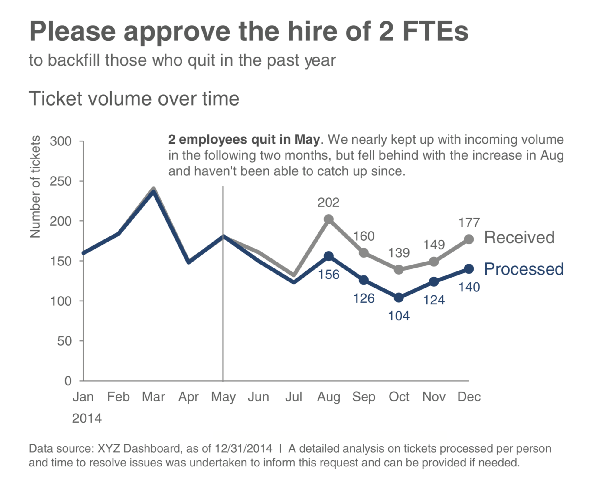
Comparison allows the narrator to show equality of both data sets, to explicitly highlight differences and similarities, and to give reasons for their difference. We have already seen various forms of graphical comparison used for understanding. In (Knaflic 2015), the author offers an example showing graphical comparison to support a call to action, see Figure 5.1.
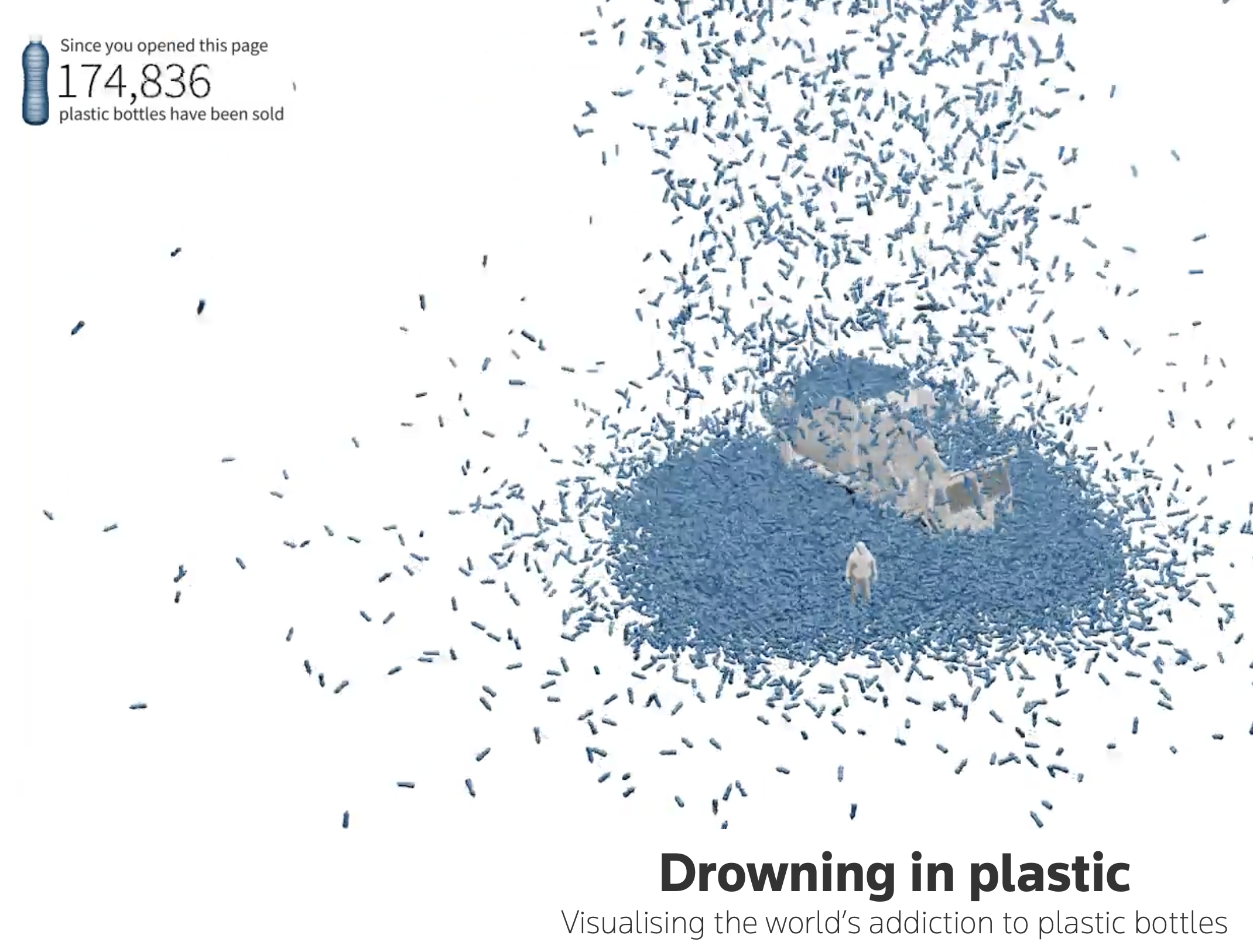
While comparison clarifies relationships between quantities, concretizing addresses a different challenge: making abstract numbers feel tangible and real. This pattern usually implies that each data point is represented by an individual visual object (e.g., a point or shape), making them less abstract than aggregated statistics. Let’s consider, first, an example from Reuters. In their article Scarr and Hernandez (2019), the authors encode data as individual images of plastic bottles collecting over time, Figure 5.2, also making comparisons between the collections and familiar references, to demonstrate the severity of plastic misuse.
From a persuasive point of view, how does this form of data encoding compare with their secondary graphic, see Figure 5.3, in the same article:
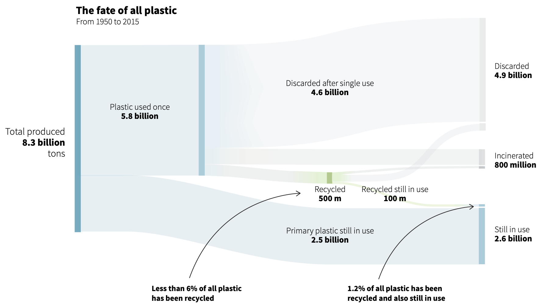
Exercise 5.7 Do the two graphics intend to persuade in different ways? Explain.
The power of concretizing extends across domains. Consider how the New York Times Manjoo (2019) represents each instance of tracking an individual who browsed various websites. Figure 5.4 represents a snippet from the full information graphic. The full graphic concretizes each instance of being tracked. Notice each colored dot is timestamped and labeled with a location. The intended effect is to convey an overwhelming sense to the audience that online readers are being watched — a lot.
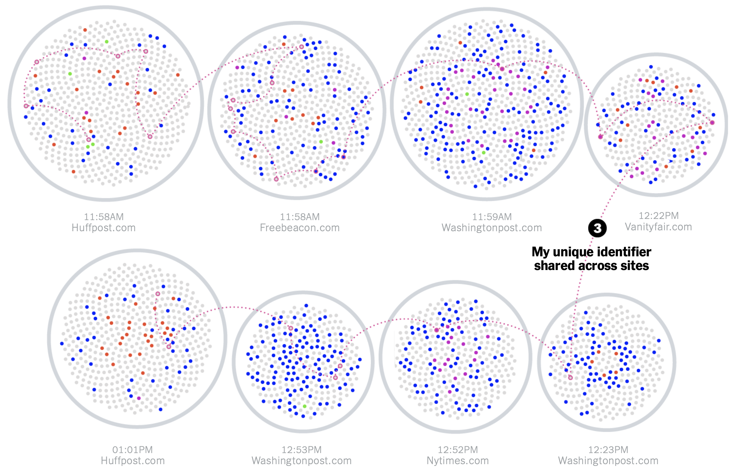
Review the full infographic and consider whether the use of concretizing each timestamped instance, labeled by location, heightens the realization of being tracked more than just reading the more abstract statement that “hundreds of trackers followed me.”
Like concretizing, repetition is an established pattern for argumentation. Repetition can increase a message’s importance and memorability, and can help tie together different arguments about a given data set. Repetition can be employed as a means to search for an answer in the data. Let’s consider another information graphic, which exemplifies this approach. Roston and Migliozzi (2015) uses several rhetorical devices intended to persuade the audience that greenhouse gasses cause global warming. A few of the repeated graphics and questions are shown in Figure 5.5, reproduced from the article.
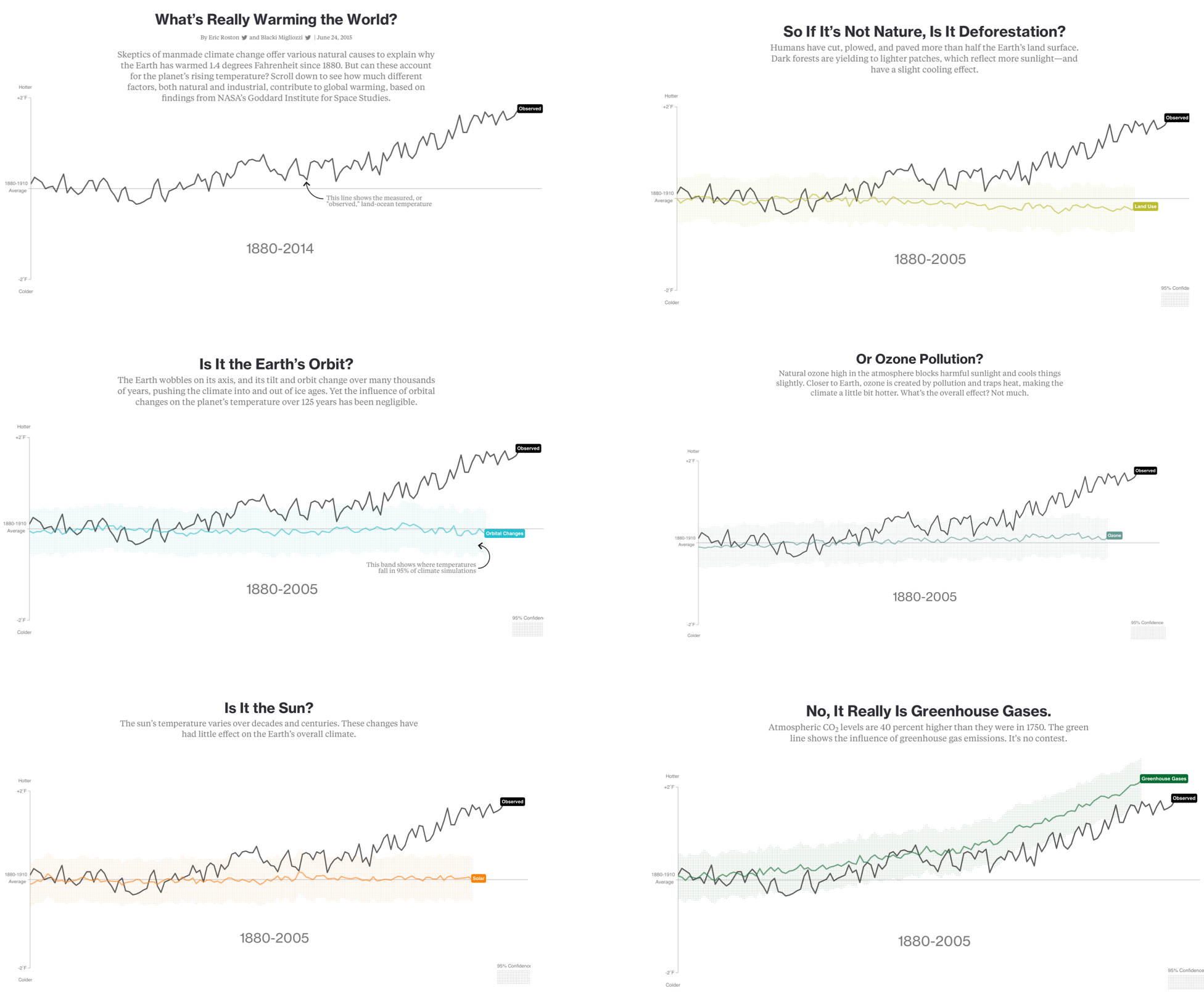
By repeating this structure across multiple questions, the graphic creates cumulative force. Each instance reinforces the pattern, making the overall argument feel inevitable rather than speculative.
These three patterns—comparison, concretizing, and repetition—often work together. Comparison clarifies the stakes; concretizing makes them felt; repetition drives them home. In the most effective data communications, we see all three operating in concert, supported by the logical, ethical, and emotional appeals we have discussed. But patterns alone do not persuade. They must be deployed in service of substantive arguments, arguments grounded in evidence and guided by sound statistical reasoning. Let us turn, then, to how statistics itself can be marshaled for persuasion.
5.9 Statistical persuasion
We have examined rhetorical patterns—comparison, concretizing, repetition—that give structure and force to our communications. But patterns alone do not constitute statistical argument. They must be deployed in service of substantive evidence, evidence that meets the rigorous standards of statistical reasoning. How, then, does statistics itself inform persuasion?
The answer begins with a principle we have already encountered: comparison. Without comparison, statistical facts float in isolation, meaningless. With comparison, they gain context, significance, and persuasive weight.
5.9.1 Comparison is crucial
Tufte identifies comparison as the fundamental act of statistical reasoning: “The fundamental analytical act in statistical reasoning is to answer the question ‘Compared with what?’” This observation applies equally to persuasion. A number without context cannot move an audience to act. A number situated within appropriate comparisons can.
Abelson (1995), too, forcefully argues that comparison is central: “The idea of comparison is crucial. To make a point that is at all meaningful, statistical presentations must refer to differences between observation and expectation, or differences among observations.” Abelson tests his argument through a statistical example,
The average life expectancy of famous orchestral conductors is 73.4 years.
He asks: Why is this important; how unusual is this? Would you agree that answering his question requires some standards of comparison? For example, should we compare with orchestra players? With non-famous conductors? With the public? With other males in the United States, whose average life expectancy was 68.5 at the time of the study reported by Abelson? With other males who have already reached the age of 32, the average age of appointment to a first conducting post, almost all of whom are male? This group’s average life expectancy was 72.0.
The Dodgers proposal Example 4.3 employs comparison through its statistical demonstration rather than budget figures. The proposal presents a modeling example—decisions to steal second base—that reveals a gap between current managerial practice and optimal strategy. By showing that managers are too conservative compared with what the model prescribes, the proposal implies they are leaving opportunities on the table. This comparison between “what is” (current decisions) and “what could be” (model-optimal decisions) demonstrates unrealized value without specifying dollar amounts. The audience can infer that if such gaps exist in base-stealing, similar gaps likely exist in other decisions, compounding the potential gains from analytics investment.
5.9.2 Elements of statistical persuasion
Beyond comparison, several properties of data and its presentation govern persuasive force. Abelson captures these in a memorable acronym: MAGIC—magnitude, articulation, generality, interestingness, and credibility. Let us consider each in turn, for together they determine whether statistical evidence moves audiences or leaves them unmoved.
Magnitude of effects. The strength of a statistical argument depends on the quantitative magnitude of support for its qualitative claim. Large, practically meaningful effects persuade more readily than small, marginal ones. Yet researchers often obscure magnitude by focusing on statistical significance rather than practical significance. Consider describing effect sizes—the actual difference between means, the proportion of variance explained—rather than merely reporting p-values. The information yield from null hypothesis tests is ordinarily quite modest, because all one carries away is a possibly misleading accept-reject decision. To drive home this point, let’s model a realization from a linear relationship between two independent, random variables:
Executing the code above produces the following results:
Data simulation:
set.seed(9)
y <- rnorm(n = 1000, mean = 1, sd = 1)
x <- rnorm(n = 1000, mean = 0, sd = 1)
Model fitting:
model_fit <- lm(y ~ x)Results:
| term | estimate | std.error | statistic | p.value |
|---|---|---|---|---|
| (Intercept) | 1.0051706 | 0.0303137 | 33.158912 | 0.0000000 |
| x | -0.0627763 | 0.0305902 | -2.052173 | 0.0404133 |
Yet we know there is no actual relationship between the two variables. p-values say little, and can mislead. Here’s what a p-value of less than, say, 0.01 means:
If it were true that there were no systematic difference between the means in the populations from which the samples came, then the probability that the observed means would have been as different as they were, or more different, is less than one in a hundred. This being strong grounds for doubting the viability of the null hypothesis, the null hypothesis is rejected.
More succinctly we might say it is the probability of getting the data given the null hypothesis is true: mathematically, \(P(\textrm{Data} \mid \textrm{Hypothesis})\). There are two issues with this. First, and most problematic, the threshold for what we’ve decided is significant is arbitrary, based entirely upon convention pulled from a historical context not relevant to much of modern analysis.
Secondly, a p-value is not what we usually want to know. Instead, we want to know the probability that our hypothesis is true, given the data, \(P(\textrm{Hypothesis} \mid \textrm{Data})\), or better yet, we want to know the possible range of the magnitude of effect we are estimating. To get the probability that our hypothesis is true, we also need to know the probability of getting the data if the hypothesis were not true:
\[ P(\textrm{H} \mid \textrm{D}) = \frac{P(\textrm{D} \mid \textrm{H}) P(\textrm{H})}{P(\textrm{D} \mid \textrm{H}) P(\textrm{H}) + P(\textrm{D} \mid \neg \textrm{H}) P(\neg \textrm{H})} \]
Decisions are better informed by comparing effect sizes and intervals. Whether exploring or confirming analyses, show results using an estimation approach — use graphs to show effect sizes and interval estimates, and offer nuanced interpretations of results. Avoid the pitfalls of dichotomous tests2 and p-values. Dragicevic (2016) writes, “The notion of binary significance testing is a terrible idea for those who want to achieve fair statistical communication.” In short, p-values alone do not typically provide strong support for a persuasive argument. Favor estimating and using magnitude of effects. Let’s briefly consider the remaining characteristics that Abelson describes of statistical persuasion. These:
Articulation of results. Beyond magnitude, we must consider how clearly we express our findings. Articulation refers to the comprehensible detail in which we phrase conclusions. A well-articulated result minimizes unnecessary exceptions while maintaining precision; it achieves parsimony without sacrificing accuracy. Audiences cannot be persuaded by findings they cannot understand.
The Dodgers proposal Example 4.3 demonstrates sophisticated articulation through its formal structure. Rather than presenting information as a continuous block of text, it organizes material into labeled sections addressing problem framing, data sources, methodology, expected outcomes, budget, and timeline. Each section uses descriptive headers that convey the so what rather than merely labeling information. This architectural clarity allows the Chief Analytics Officer to grasp the proposal’s scope quickly, locate specific details, and evaluate the argument’s coherence.
Generality of effects. Statistical arguments gain force when they apply broadly. Generality refers to the breadth of contexts where results replicate. A finding that holds across multiple populations, time periods, and conditions persuades more powerfully than one narrowly circumscribed. Yet we must be honest about boundaries—claiming excessive generality undermines credibility when audiences test our claims and find them wanting.
Interestingness of argument. For statistical evidence to persuade, it must matter. Interestingness requires that our findings have the potential to change what people believe about issues they care about. Trivial findings, however rigorously established, fail to move audiences because they do not see why they should care.
Credibility of argument. All these elements rest upon credibility—the believability of our research claim. Credibility requires methodological soundness: did we collect and analyze data appropriately? It requires theoretical coherence: do our findings make sense within existing knowledge? And it requires the transparency we discussed earlier: can others verify our work?
Together, these five elements—magnitude, articulation, generality, interestingness, and credibility—determine whether statistical evidence persuades. But their power depends upon how we communicate them. Let us return, then, to comparison, examining how the language we use to describe quantities affects understanding.
In language describing quantities, we have two main ways to compare. One form is additive or subtractive. The other is multiplicative. We humans perceive or process these comparisons differently. Let’s consider an example from Andrews (2019):
The Apollo program crew had one more astronaut than Project Gemini. Apollo’s Saturn V rocket had about seventeen times more thrust than the Gemini-Titan II.
We process the comparative language of “seventeen times more” differently than “1,700 percent more” or “33 versus 1.9”. Add and subtract comparisons are easier for people to understand, especially with small numbers. Relative to additive comparisons, multiplying or dividing are more difficult. This includes comparisons expressed as ratios: a few times more, a few times less. People generally try to interpret multiplying operations through pooling, or repeat addition.
In Andrews’s example, it may be better to show a graphical comparison,

These considerations about comparison and the MAGIC elements raise a larger question: how do statistics and narrative interact? We have examined each as a form of persuasion. We have seen examples of their combination. But does the combination strengthen or weaken the persuasive effect?
Some researchers suggest the answer depends on the strength of the underlying data. Krause and Rucker (2020) conducted an empirical study suggesting narrative can improve the persuasiveness of weak data but may detract from strong numerical evidence. In their study, participants reviewed either less favorable data (a relatively heavy phone that shattered in a 3-foot drop) or more favorable data (a lighter phone surviving a 30-foot drop), presented either as a simple list or embedded within a narrative. When data were less favorable, narrative improved persuasion. When data were more favorable, narrative reduced persuasion—respondents preferred the data presented plainly.
This finding seems to suggest that narrative serves as a distraction, diverting attention from weak evidence while interfering with strong evidence. But closer examination of the study reveals a crucial detail: the narrative was not about the phone itself. Instead, it described a couple hiking who encountered an emergency and used the phone. The phone specifications appeared as background details—essentially “product placements”—rather than central elements of the story.
This distinction matters immensely. When narrative treats data as peripheral, it does shift focus away from the evidence. But when narrative centers on the data, exploring how the numbers were generated, what they represent, and why they matter, the story enhances rather than diminishes statistical persuasion. The narrative becomes a vehicle for understanding the statistics, not a distraction from them.
The lesson: we need not choose between narrative and data. We must integrate them thoughtfully, using narrative to illuminate the data and data to ground the narrative. We achieve this integration through tools that bridge abstract and concrete: metaphor, simile, and analogy.
5.10 Comparison through metaphor, simile, analogy
Having established the importance of grounding narrative in data rather than treating data as mere background, we now turn to tools that help audiences grasp abstract statistical concepts. Metaphor, simile, and analogy serve as cognitive bridges: they translate unfamiliar statistical ideas into familiar experiences, making the abstract concrete and the complex comprehensible.
Metaphor operates by mapping concepts from a source domain (something familiar) onto a target domain (the abstract concept we want to explain). When we say a statistical model “learns” from data, we use the source domain of human education to illuminate the target domain of machine learning. This mapping does more than explain—it shapes how we think about the target domain, highlighting certain features while obscuring others.
Lakoff and Johnson (1980) demonstrated that metaphor is not merely a literary device but a fundamental mechanism of human cognition3. We think metaphorically, whether we realize it or not. Recognizing this, we can deploy metaphors deliberately to enhance persuasion.
Consider the range of source domains available to data communicators. We might draw from the human body (“the heart of the analysis”), animals (“outliers are like canaries in a coal mine”), buildings (“foundations of our model”), machines (“the engine driving our results”), games (“playing the odds”), cooking (“following the recipe for replication”), or natural phenomena (“the data reveals a clear pattern, like a path through snow”). Each domain carries associations that subtly shape interpretation.
What makes a metaphor effective? Cognitive linguists suggest several criteria. The source domain must be genuinely familiar to the audience—explaining Bayesian updating through quantum mechanics helps no one. The mapping should illuminate rather than confuse, highlighting essential features of the target domain without importing misleading associations. And the metaphor should cohere throughout the communication, creating consistency rather than mixing incompatible images (“the engine driving our foundation” creates cognitive dissonance).
Let’s consider how effective communicators deploy these tools.
In a first example, we return to Andrews (2019). As a book-length communication, it has more space to build the metaphor, and does so borrowing from the source domain of music:
How do we think about the albums we love? A lonely microphone in a smoky recording studio? A needle’s press into hot wax? A rotating can of magnetic tape? A button that clicks before the first note drops? No!
The mechanical ephemera of music’s recording, storage, and playback may cue nostalgia, but they are not where the magic lies. The magic is in the music. The magic is in the information that the apparatuses capture, preserve, and make accessible. It is the same with all information.
After setting up this metaphor, he repeatedly refers back to it as a form of shorthand each time:
When you envision data, do not get stuck in encoding and storage. Instead, try to see the music. … Looking at tables of any substantial size is a little like looking at the grooves of a record with a magnifying glass. You can see the data but you will not hear the music. … Then, we can see data for what it is, whispers from a past world waiting for its music to be heard again.
The music metaphor succeeds because nearly everyone has experienced the difference between seeing musical notation and hearing actual music. This shared experience allows Andrews to communicate a sophisticated epistemological point—that data, like music, is more than its physical representation—without requiring technical vocabulary.
Other data scientists deploy metaphor with similar sophistication. McElreath (2020) uses the mythology of the golem—a clay creature animated by magic—to represent statistical models: powerful but dangerous if uncontrolled. Rosenbaum (2017) draws on Frost’s poem about a road not taken to illuminate the counterfactual nature of causal inference. These metaphors do not merely decorate; they structure thinking.
But metaphor is not our only tool for creating rhetorical impact. Beyond conceptual mapping, we can manipulate the very structure of our sentences to emphasize key points, create rhythm, and guide attention. These syntactic patterns—repetition, inversion, parallel structure—work alongside metaphor to make our prose memorable and persuasive.
Exercise 5.8 Find other examples of metaphor and simile used to describe data science concepts. Do you believe they aide understanding for any particular audience(s)? Explain.
5.11 Patterns that compare, organize, grab attention
Metaphor shapes how audiences think; syntactic patterns shape how they feel and remember. Just as visual patterns like comparison and repetition help audiences process data, verbal patterns help them process prose. Farnsworth (2011) collects these techniques under the heading of classical rhetoric: “make the words they arrange more emphatic or memorable or otherwise effective.”
Consider three basic techniques. First, unexpected word placement—beginning sentences with elements that normally appear later, or delaying the main clause—creates emphasis through violation of expectation. But restraint matters: reserve such techniques for crucial points, lest readers habituate to them. More is less; less is more. Second, rhythmic patterns make prose pleasurable to read, engaging audiences at a sensory level. Third, strategic delay—holding the main point until the end—builds suspense and delivers climactic impact.
These patterns prove especially valuable when we need to express complex comparisons or contrasts. Where data visualization uses graphical repetition and parallel structure, prose uses verbal equivalents. The principles align: make relationships clear, emphasize what matters, create coherence through pattern.
Data science writing offers rich examples of these techniques in practice. Consider how Rosenbaum (2017) uses structural repetition to clarify the concept of a covariate:
These patterns can be the most effective and efficient ways to show comparisons and contrasts. While Farnsworth provides a great source of these rhetorical patterns in more classical texts, we can find plenty of usage in something more relevant to data science. In fact, we have already considered a visual form of repetition in Section 5.8. Let’s consider example structure (reversal of structure, repetition at the end) used in another example text for data science, found in Rosenbaum (2017):
A covariate is a quantity determined prior to treatment assignment. In the Pro-CESS Trial, the age of the patient at the time of admission to the emergency room was a covariate. The gender of the patient was a covariate. Whether the patient was admitted from a nursing home was a covariate.
The first sentence begins “A covariate is …” Then, the next three sentences reverse this sentence structure, and repeat to create emphasis and nuance to the reader’s understanding of a covariate. Here’s another pattern (Repetition at the start, parallel structure) from Rosenbaum’s excellent book:
One might hope that panel (a) of Figure 7.3 is analogous to a simple randomized experiment in which one child in each of 33 matched pairs was picked at random for exposure. One might hope that panel (b) of Figure 7.3 is analogous to a different simple randomized experiment in which levels of exposure were assigned to pairs at random. One might hope that panels (a) and (b) are jointly analogous to a randomized experiment in which both randomizations were done, within and among pairs. All three of these hopes may fail to be realized: there might be bias in treatment assignment within pairs or bias in assignment of levels of exposure to pairs.
Repetition and parallel structure are especially useful where, as in these examples, the related sentences are complex or relatively long. Let’s consider yet another pattern (asking questions and answering them):
Where did Fisher’s null distribution come from? From the coin in Fisher’s hand.
Rhetorical questions or those the author answers are a great way to create interest when used sparingly. In your own studies, seeing just a few examples invites direct imitation of them, which tends to be clumsy when applied. Immersion in many examples, however, allows them to do their work by way of a subtler process of influence, with a gentler and happier effect on our resulting style of narrative.
These patterns—repetition, inversion, rhetorical questions—give our prose structure and emphasis. But structure without precision is like architecture without materials. We must also attend to the individual words we choose, for in data communication, precision matters intensely.
5.12 Le mot juste — the exact word
Goodman (2008), writing about the craft of prose, emphasizes the importance of finding the exact word. The French express this ideal as le mot juste—the precisely right word, the one that captures exactly what we mean without approximation or waste.
This ideal proves especially challenging in data communication. We describe quantitative relationships with natural language, yet words and numbers do not map cleanly onto each other. Consider the gap between what we intend and what audiences understand when we use words to express quantities.
The literary example of Humpty Dumpty illustrates the danger of linguistic arbitrariness:
"When I use a word," Humpty Dumpty said in rather a scornful tone, "it means just what I choose it to mean—nothing more nor less."
"The question is," said Alice, "whether you can make words mean so many different things" (Carroll 2013).
Humpty Dumpty assumes unilateral control over meaning. But communication requires shared understanding, and empirical research reveals how far we fall short of this ideal when using quantitative language. Words that express probabilities and quantities carry meanings that vary dramatically across individuals.
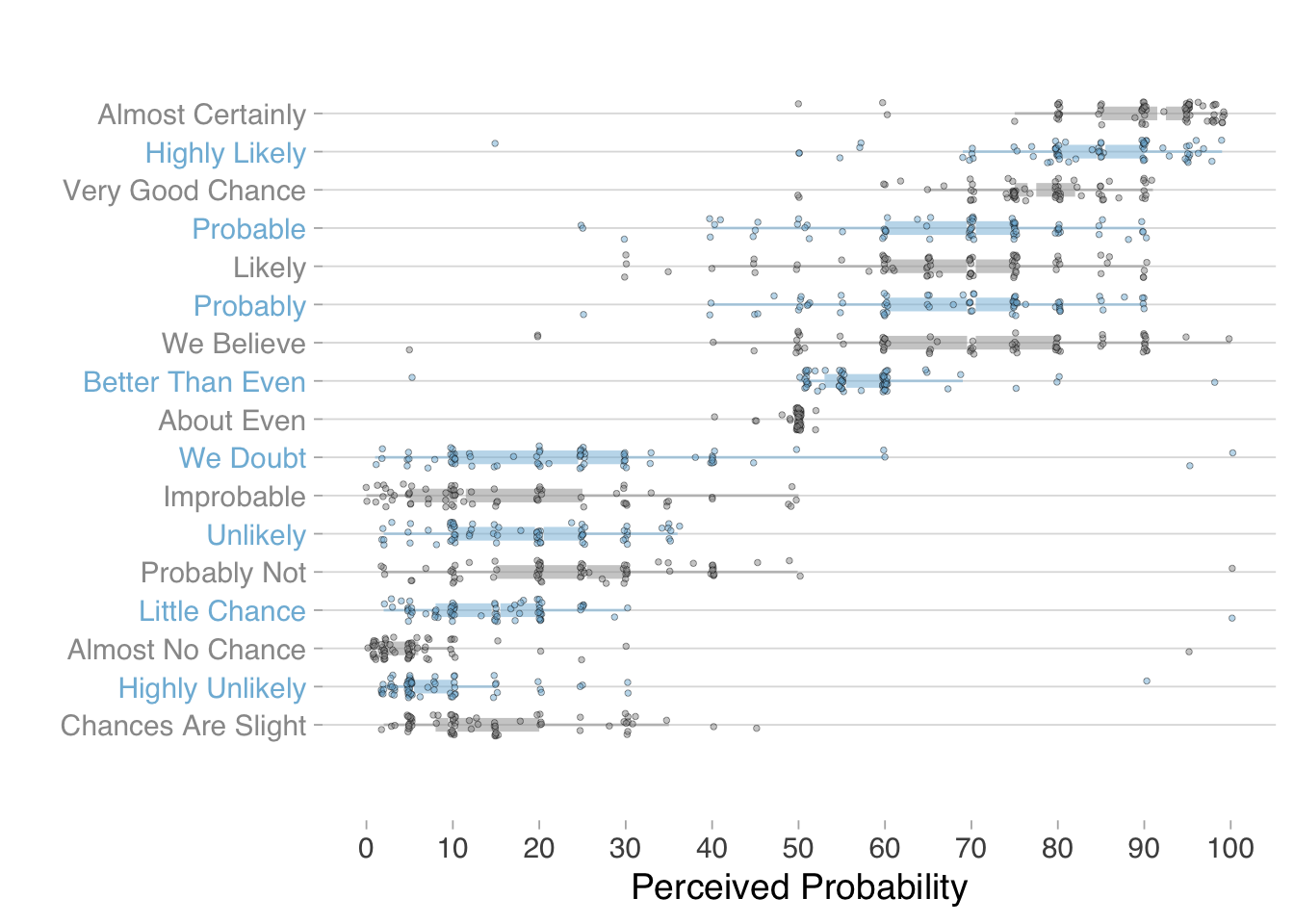
Barclay et al. (1977) documented this variation in a study of NATO military officers, asking them to assign numerical probabilities to phrases commonly used in intelligence reports. Decades later, zonination (2015) replicated this study with online participants, using the same phrase list. The combined results, visualized in Figure 5.7, reveal striking disagreement: the same phrase might suggest a 30% probability to one person and a 70% probability to another.
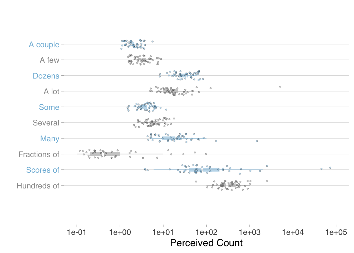
Probability words are not the only ones that create comprehension gaps. Consider words describing magnitude or quantity—terms like "several," "many," "a few," or "numerous." Do these terms convey the same numbers to different people?
These empirical findings carry practical implications for data communicators. The variation in word interpretation does not mean we should abandon natural language in favor of pure numerals—words provide context, tone, and accessibility that numbers alone cannot. Rather, we should deploy words strategically while recognizing their limitations.
When precision matters most, pair words with numbers. Instead of saying "there is a significant chance of rain," say "there is a 70% chance of rain" or "there is a high (70%) chance of rain." The number anchors the word, reducing interpretive variance. When presenting statistical results, use confidence intervals alongside verbal descriptions of uncertainty. When communicating to diverse audiences, test your language: ask a sample of readers what numbers they associate with your quantitative terms, and calibrate accordingly.
Moreover, when a key argument hinges on a specific statistic, consult the empirical evidence on word variation to guide your word choice. If you need to communicate that an outcome has a 70% probability, the studies by Barclay and Zonination show that phrases like "likely" or "probable" will be interpreted anywhere from 50% to 80% by different readers—too wide a range for precision. Instead, use the specific number (70%) or, if you must use a word, choose one whose empirical range centers on your intended meaning. This evidence-based approach to language selection treats word choice as a design decision informed by data, consistent with the analytical rigor we bring to other aspects of communication.
The pursuit of le mot juste remains worthwhile, but we must recognize that no single word will convey the same meaning to every audience. Precision in data communication requires not just choosing the right word, but supporting that word with the numerical evidence that makes its meaning clear.
Yet even with precise language, clear comparisons, and transparent reasoning, our audiences remain subject to systematic patterns of thinking that can lead them astray. To communicate effectively, we must understand not only how to construct persuasive arguments, but also how the human mind processes them—complete with all its shortcuts, biases, and heuristics that shape interpretation.
Orwell (2017), for example, argues against political tyranny through narrative in 1984.↩︎
Indeed, we are being warned to abandon significance tests (McShane et al. 2019).↩︎
Seminal works on metaphor include (Farnsworth 2016); (Kövecses 2010); (Ricoeur 1993); (Lakoff and Johnson 1980).↩︎