14 Visual design and perception
Having explored how to integrate text and data through typography, layout, and grid systems, we now turn to the visual representation of data itself. While we have discussed how to organize information spatially, we have not yet examined how to encode data values into visual form—how to transform numbers into shapes, colors, and positions that human eyes can interpret. This transformation is the essence of data visualization, and it requires understanding both the grammar of graphics and the mechanisms of human perception.
14.1 Why show data graphically?
Data visualization is not merely about making numbers look appealing—it is about harnessing the remarkable pattern-recognition capabilities of human vision. Our brains process visual information in parallel, instantly detecting shapes, relationships, and anomalies that would take minutes or hours to uncover through textual or tabular analysis. But to understand why visualization is so powerful, we must first recognize what happens when we strip away the essential ingredient that gives data graphics their meaning.
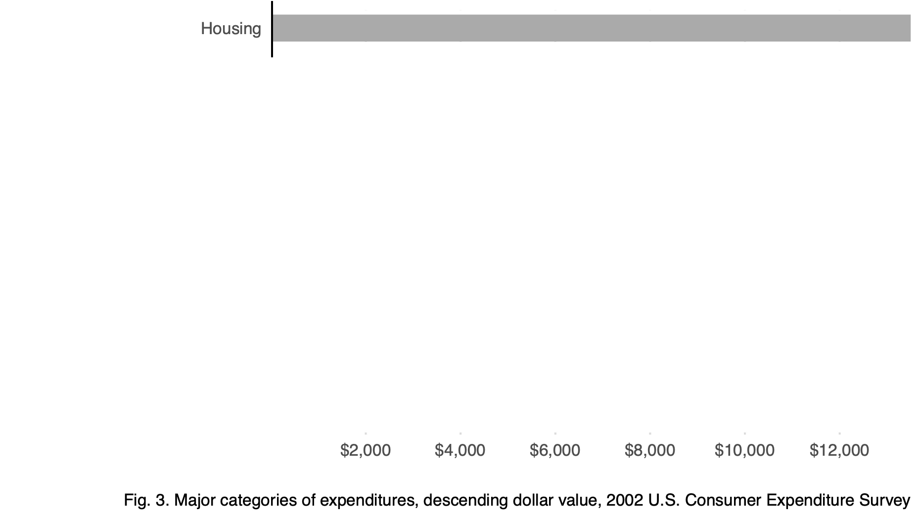
Consider a single bar standing alone. What does it mean? Is it large or small? Good or bad? Increasing or decreasing? Without context, a single datum rendered visually tells us almost nothing.
As Koponen and Hildén (2019) observe in The Data Visualization Handbook:
A data graphic acquires its meaning from comparison. While text can use different types of content structures, an abstract visualization just presents relationships between data points. Thus, a single bar, map symbol or shape does not convey information. It only becomes meaningful by its relationship with other elements in the image—in other words, it is polysemic.
Now compare that isolated bar to a chart showing multiple categories:
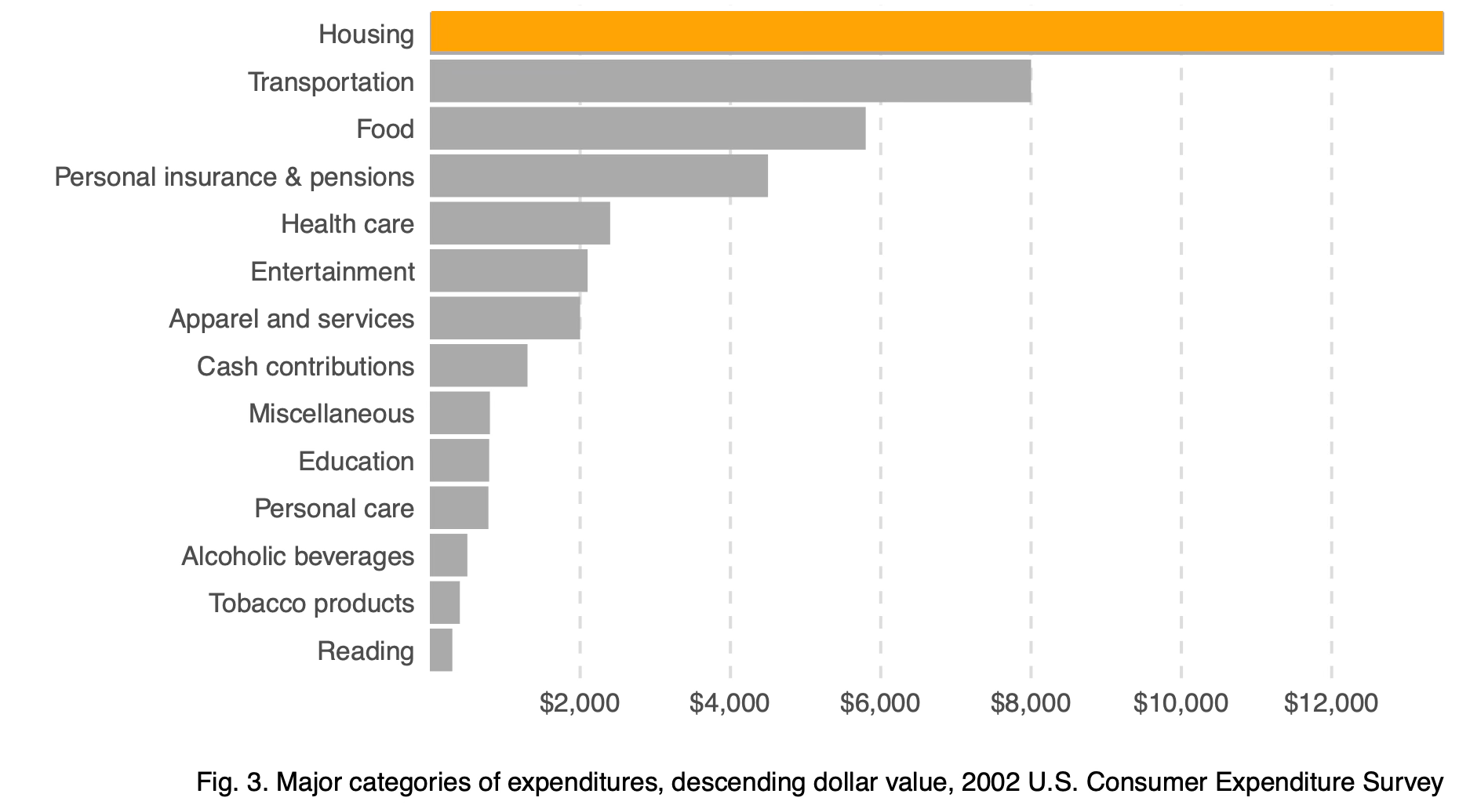
The comparative chart allows us to rank values, identify outliers, and understand proportions. This is the fundamental power of data visualization: comparison creates meaning.
The necessity of visual comparison becomes even clearer when we examine datasets that appear identical through summary statistics alone. This famous example, known as Anscombe’s Quartet, was constructed by statistician Francis Anscombe in 1973 to demonstrate why graphs are essential for data analysis. Each dataset has the same mean, variance, and linear regression line—yet their visual patterns are radically different. Consider these four datasets:
| x | y | x | y | x | y | x | y |
|---|---|---|---|---|---|---|---|
| 10 | 8.04 | 10 | 9.14 | 10 | 7.46 | 8 | 6.58 |
| 8 | 6.95 | 8 | 8.14 | 8 | 6.77 | 8 | 5.76 |
| 13 | 7.58 | 13 | 8.74 | 13 | 12.74 | 8 | 7.71 |
| 9 | 8.81 | 9 | 8.77 | 9 | 7.11 | 8 | 8.84 |
| 11 | 8.33 | 11 | 9.26 | 11 | 7.81 | 8 | 8.47 |
| 14 | 9.96 | 14 | 8.10 | 14 | 8.84 | 8 | 7.04 |
| 6 | 7.24 | 6 | 6.13 | 6 | 6.08 | 8 | 5.25 |
| 4 | 4.26 | 4 | 3.10 | 4 | 5.39 | 19 | 12.50 |
| 12 | 10.84 | 12 | 9.13 | 12 | 8.15 | 8 | 5.56 |
| 7 | 4.82 | 7 | 7.26 | 7 | 6.42 | 8 | 7.91 |
| 5 | 5.68 | 5 | 4.74 | 5 | 5.73 | 8 | 6.89 |
Reviewing the raw data is cognitively taxing. Scanning for differences in the relationships between x and y across datasets requires sequential, focused attention. Summary statistics do not differentiate these datasets—each x and y variable shares the same mean and standard deviation, and linear regression produces practically identical coefficients. We can verify this computationally:
| Dataset | x mean | x sd | y mean | y sd |
|---|---|---|---|---|
| 1 | 9 | 3.32 | 7.5 | 2.03 |
| 2 | 9 | 3.32 | 7.5 | 2.03 |
| 3 | 9 | 3.32 | 7.5 | 2.03 |
| 4 | 9 | 3.32 | 7.5 | 2.03 |
The regression results are equally indistinguishable:
| Dataset | Intercept | Slope | R² | |
|---|---|---|---|---|
| x1 | 1 | 3.000 | 0.5 | 0.667 |
| x2 | 2 | 3.001 | 0.5 | 0.666 |
| x3 | 3 | 3.002 | 0.5 | 0.666 |
| x4 | 4 | 3.002 | 0.5 | 0.667 |
Despite these identical statistical summaries, the underlying data patterns differ dramatically. Only when we visualize the data do the distinctions become apparent:
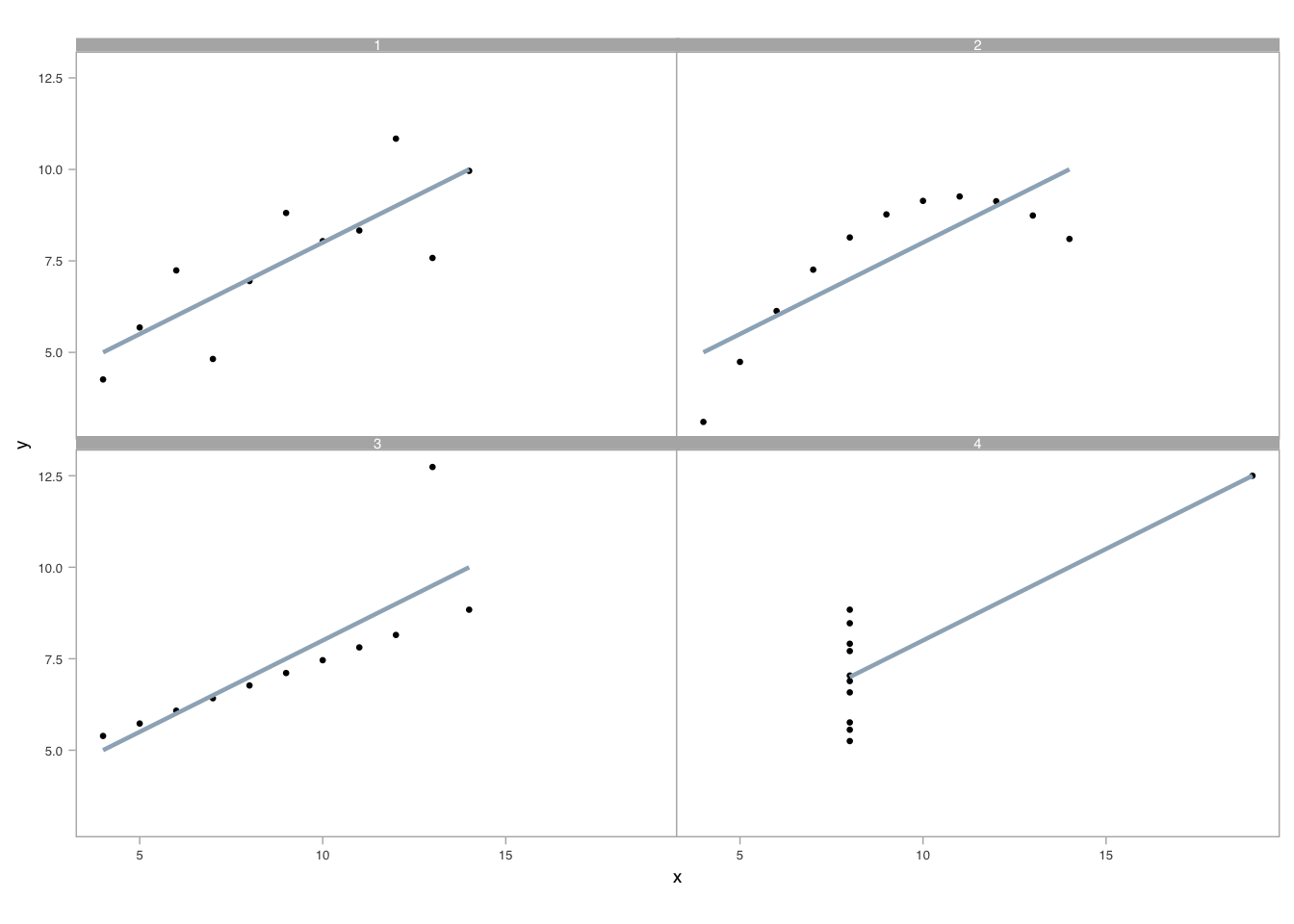
A well-crafted visual display reveals what statistics obscure. Pattern recognition occurs in parallel, leveraging our attunement to preattentive visual attributes (Ware 2020). Unlike sequential processing required for table lookups, visual perception allows us to detect geometry, assemble grouped elements, and estimate relative differences simultaneously (Cleveland 1985, 1993).
Having established that comparison creates meaning and that visualization reveals patterns hidden in statistics, we now turn to the mechanics of building effective graphics. Creating visualizations that support accurate perception requires understanding the fundamental building blocks: the coordinate systems that map data to space, the scales that transform values into visual positions, and the encodings that translate abstract numbers into visible marks. In the sections that follow, we build up visuals from first principles—examining how these components work together to transform data into visible meaning.
14.2 Graphs, coordinate systems, and scales
The foundation of any data graphic is its coordinate system—the mathematical framework that maps data values to positions in space. Understanding coordinate systems is essential because the same data can tell very different stories depending on how we map it to visual space.
14.2.1 Cartesian coordinates
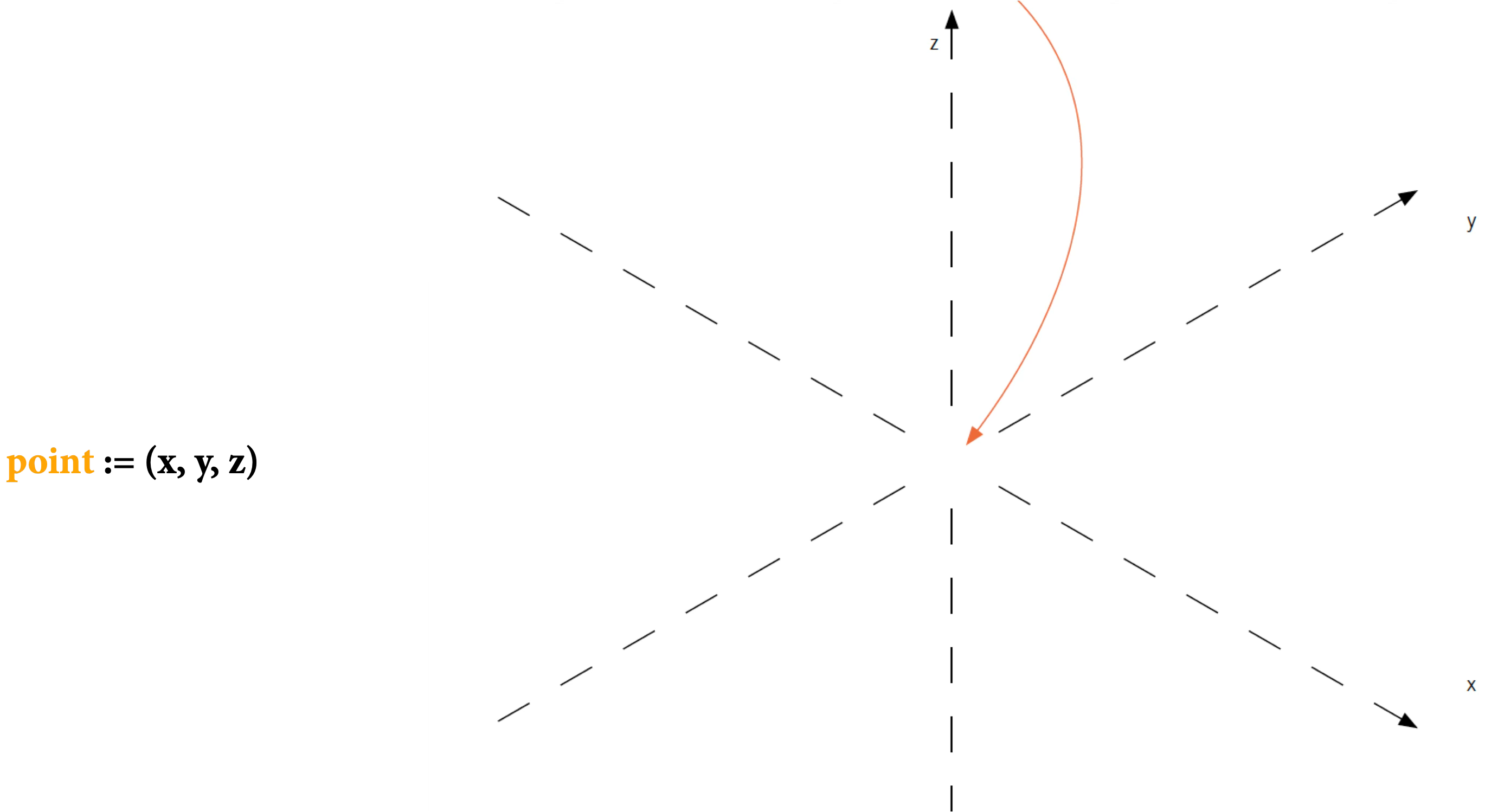
We begin with the simplest and most familiar coordinate system: the two-dimensional Cartesian system. This is the foundation upon which most data graphics are built. In Cartesian coordinates, x and y axes run orthogonally (at right angles) to each other, creating a grid where every data point has a unique address defined by its horizontal and vertical position.
Why start with Cartesian coordinates? Because this system leverages our most accurate perceptual capability: judging position along a common scale. When two points share the same baseline, we can compare their heights with remarkable precision. The orthogonal axes also create a straightforward mapping from data values to visual space that is easy to interpret and universally understood.
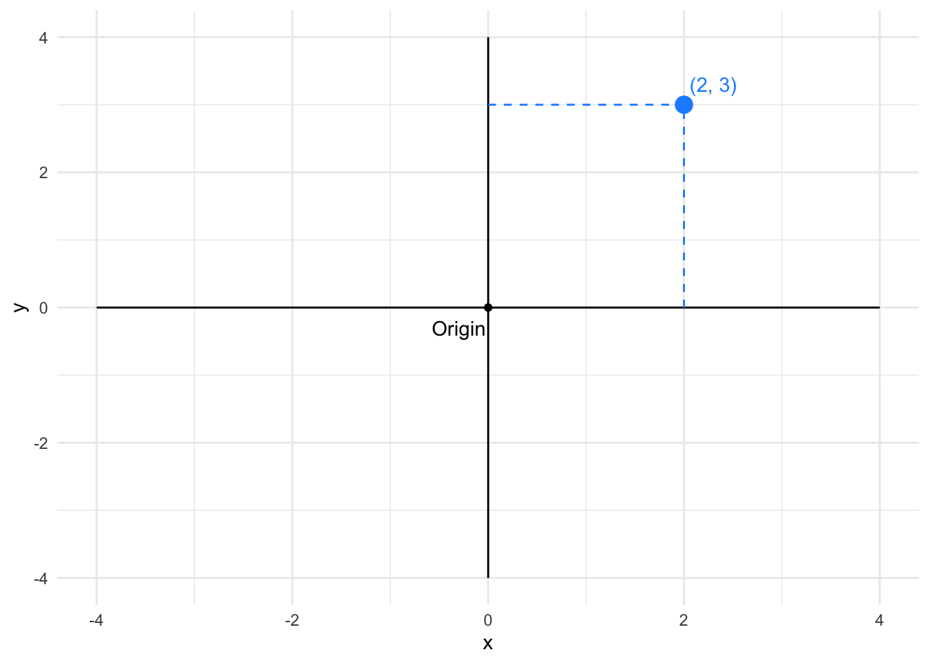
In Cartesian coordinates, the distance between points corresponds directly to the difference in their data values. This makes Cartesian systems excellent for comparing magnitudes and detecting patterns in two quantitative variables.
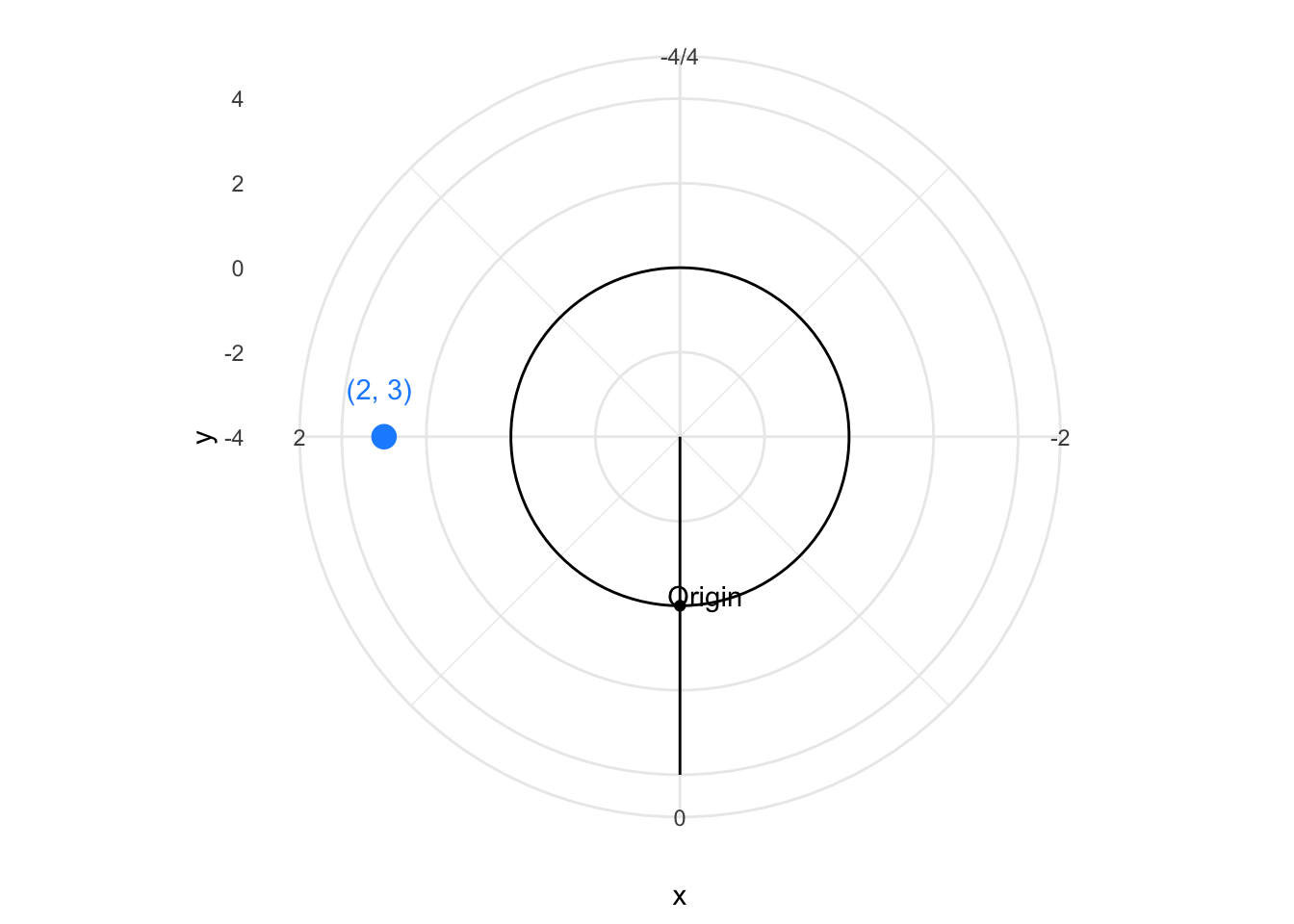
14.2.2 Polar coordinate system
Once we understand Cartesian coordinates, we can explore variations that suit different data structures. The polar coordinate system represents one such variation, particularly useful when our data has cyclical or radial characteristics. In polar coordinates, positions are defined by an angle (θ) and a radius (r) from a central origin. The same point that was at (2, 3) in Cartesian coordinates appears at a different location in polar space.
Why would we trade the simplicity of Cartesian grids for the circular logic of polar coordinates? Because certain data naturally fits a radial layout—think of time repeating in daily or annual cycles, compass directions wrapping around 360 degrees, or hierarchical data radiating from a central point. The circular arrangement can emphasize periodicity and make patterns in cyclical data immediately visible.
Polar coordinates are particularly useful for cyclical data—time of day, compass directions, seasonal patterns—where the circular layout naturally represents periodic relationships.
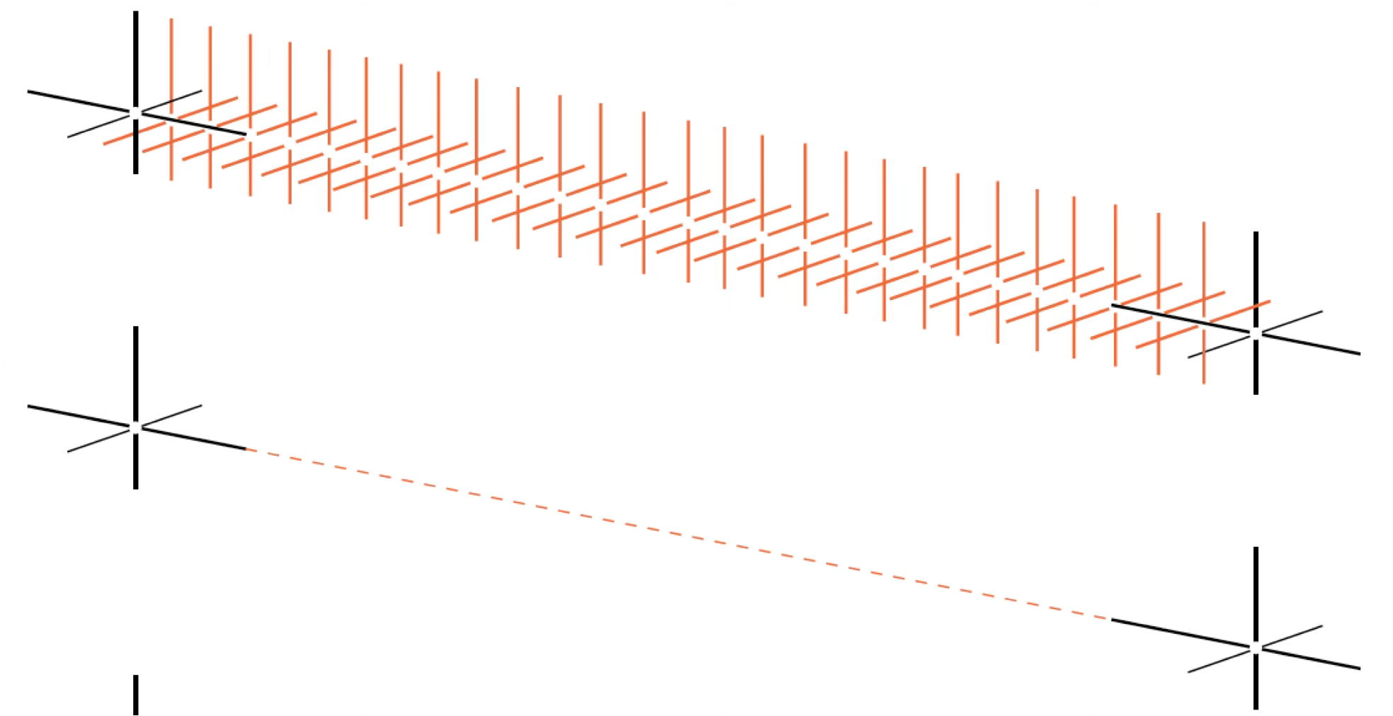
To understand the transformation from Cartesian to polar, imagine the Cartesian grid anchored at its bottom-left corner at (-4, -4). Now picture pulling the top vertical edge around in a circle, like opening folding fan. The horizontal axis becomes the radius extending outward from the center, while the vertical axis wraps around to become the angle. Points that were aligned horizontally in Cartesian space now lie along radial lines, and points that were vertically aligned now trace concentric circles.
14.2.3 Map projections
Having explored abstract coordinate systems for general data, we now turn to a specialized but ubiquitous case: geographic maps. Maps present a unique challenge because they must represent the curved, three-dimensional surface of the Earth on a flat, two-dimensional plane. This transformation is fundamentally impossible to perform without distortion—mathematicians have proven that you cannot flatten a sphere without stretching, tearing, or compressing some regions.
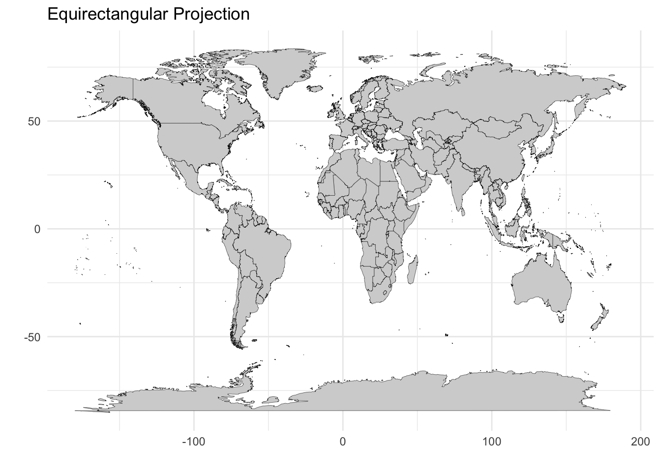
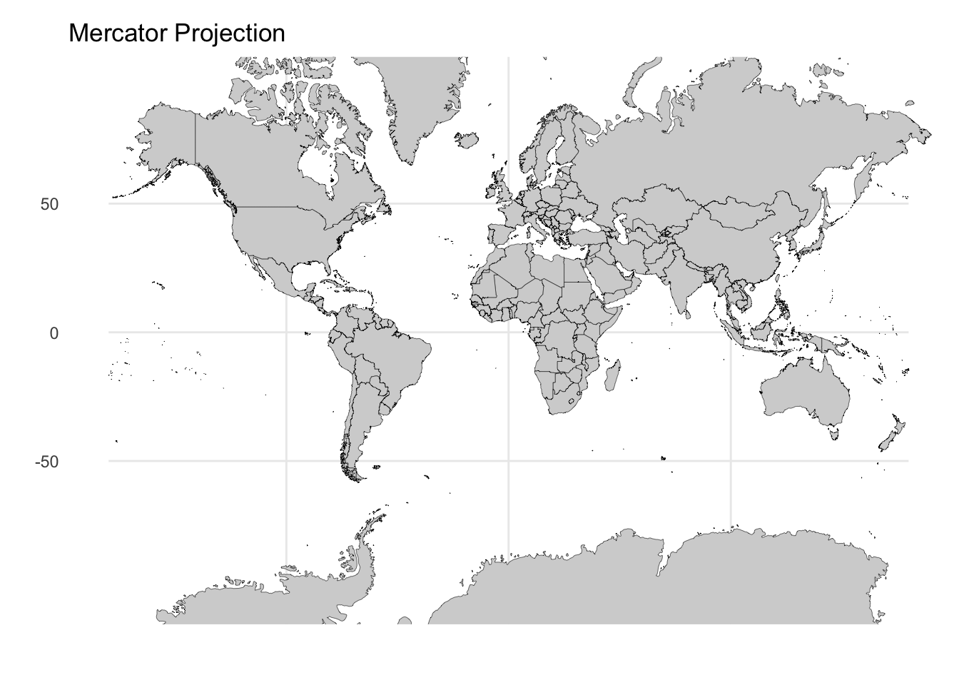
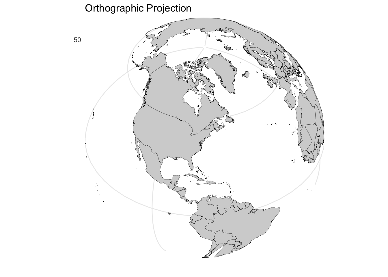
Consequently, there is no single “correct” map projection. Each method involves explicit tradeoffs between preserving area, shape, distance, or direction. The projection you choose should align with your analytical goal: Are you comparing sizes of countries? Plotting navigation routes? Understanding global spatial relationships? Consider how the same world boundary data appears under three different projections, each with distinct characteristics:
Equirectangular projection: This is the simplest approach, treating latitude and longitude as Cartesian x and y coordinates. While it preserves the grid-like structure and is computationally straightforward, it significantly distorts area at high latitudes—Greenland appears much larger than it actually is relative to equatorial regions.
Mercator projection: Developed for navigation, this projection preserves angles and local shapes, making it ideal for plotting compass bearings. However, this comes at a severe cost: areas near the poles are dramatically inflated. On a Mercator map, Greenland appears comparable in size to Africa, when in reality Africa is approximately 14 times larger.
Orthographic projection: This perspective projection shows the Earth as it appears from space, preserving true distances from the center point and maintaining the visual appearance of the globe. While intuitive for understanding global relationships, it can only display one hemisphere at a time and distorts features near the edges.
The choice of projection should align with your communication goal. Use Mercator when showing navigation routes or preserving local shapes matters. Use equirectangular for simple grid-based analysis where computational simplicity outweighs area distortion. Use orthographic or other equal-area projections when comparing sizes across different latitudes is essential.
14.2.4 Transforming scales: When linear mapping fails
So far, we have assumed that data values map linearly to visual positions—a value of 8 is twice as far from zero as a value of 4. But many real-world datasets violate this assumption. Consider COVID-19 case counts spanning from single digits to millions, stock prices with exponential growth patterns, or population densities ranging from sparse rural areas to dense urban centers. On a linear scale, such data becomes unreadable: early values disappear into a flat line while late values shoot off the chart.
Scale transformations solve this problem by changing the mathematical relationship between data values and their visual positions. Understanding when and how to transform scales is essential for revealing patterns across the full range of your data.
Just as we can choose different coordinate systems, we can transform the scales that map data values to visual positions. Understanding the distinction between data transformation and scale transformation is crucial.
When we transform data, we mathematically modify the values before plotting. When we transform the scale, we keep the original data values but change how the axis maps them to positions. Both approaches change the visual appearance but in subtly different ways.
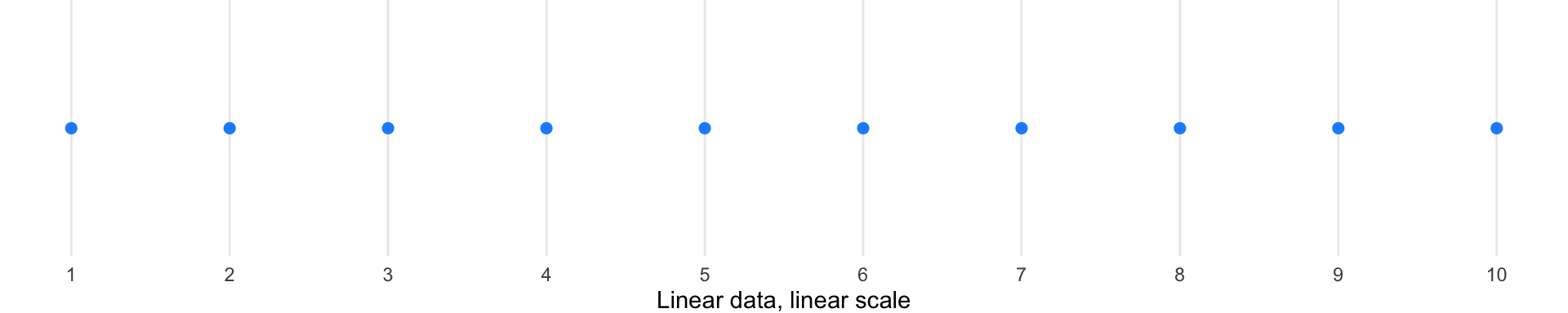
Consider data ranging from 1 to 10. The diagrams below illustrate how each transformation affects the visual spacing—quadrant diagrams on the left show which transformation is applied, with corresponding visualizations on the right:
Linear scale (baseline): Points are evenly spaced according to their actual values. No transformation—both data and scale remain linear.
Log-transformed data: When we mathematically transform the data using logarithms, the values themselves change, and then we plot them on a linear scale.
Log scale: Here we keep the original data values but change how the axis positions them—compressing the high end and expanding the low end.
Square root transformations: These offer gentler compression than logarithms and can handle zero values.
Log transformations are particularly useful for data spanning multiple orders of magnitude, as they compress large ranges and expand small ones. However, they cannot handle zero or negative values. Square root transformations offer a gentler compression and can handle zeros.
The New York Times demonstrated the power of scale transformation during the COVID-19 pandemic, showing the same data on both linear and logarithmic scales:
On a linear scale, an exponential outbreak appears as a rapidly steepening curve, making early stages look flat and late stages look catastrophic. On a logarithmic scale, exponential growth becomes a straight line, making it easier to compare growth rates across regions at different stages of outbreak and to identify when exponential growth begins to slow.
14.3 Data encodings for visual comparison
Now that we understand the spatial frameworks for positioning data, we turn to the marks themselves—the geometric elements that represent data values. Visual encodings translate abstract numbers into visible properties that human perception can decode. The choice of mark profoundly affects what patterns viewers can perceive.
14.3.1 From points to volumes: Choosing the right mark
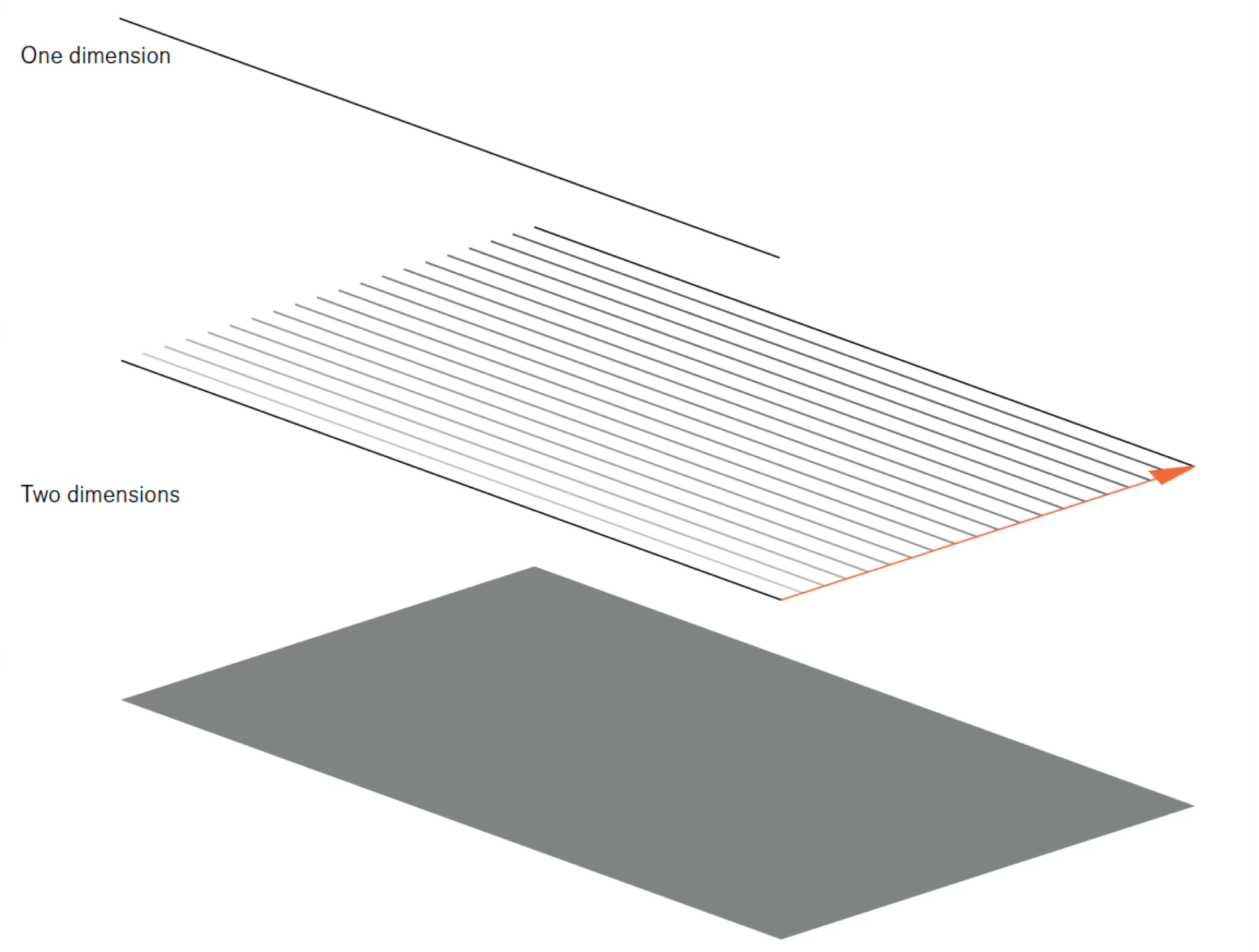
Consider how the dimensionality of your mark shapes the story you can tell. A zero-dimensional point conveys position alone. A one-dimensional line adds connection and sequence. A two-dimensional surface introduces area and magnitude. A three-dimensional volume, though challenging to represent accurately on flat displays, suggests mass and density.
Each mark type serves different analytical purposes. Points excel at showing individual observations and outliers. Lines reveal trends and continuity across ordered data. Surfaces emphasize accumulation and magnitude. Understanding this progression—from the simplest point to the most complex volume—helps you select marks that align with your analytical goals.
14.3.1.1 Points
The simplest mark is a point—a location in space with no extent. In practice, points must have some size to be visible, but their essence is position:
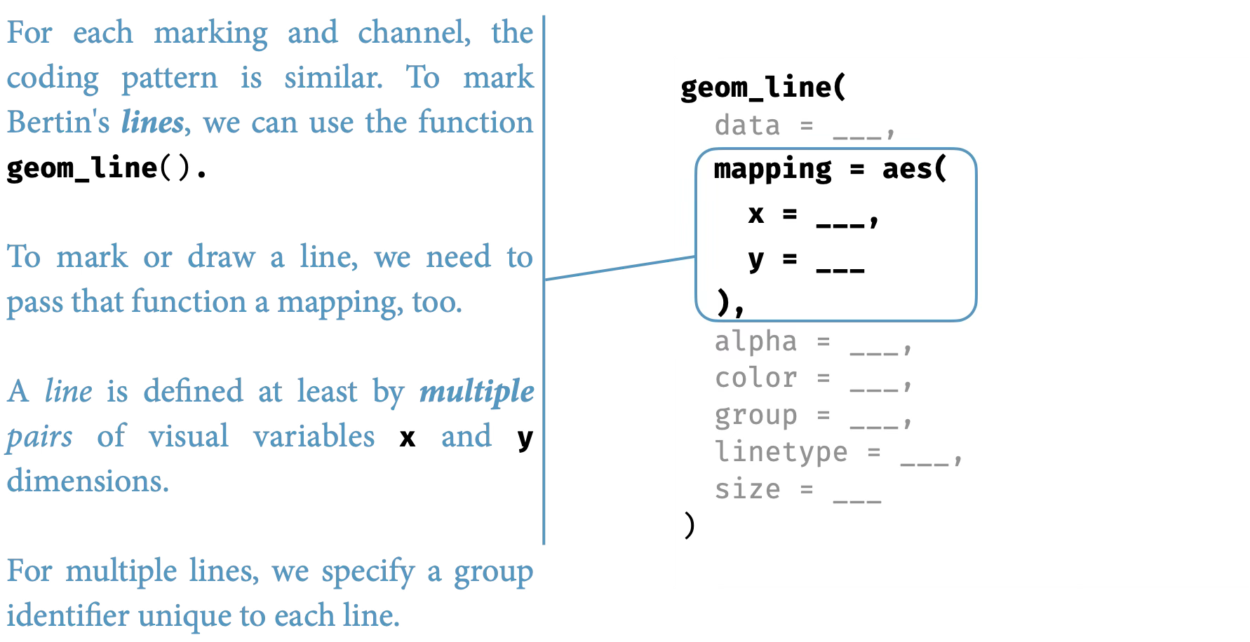
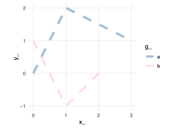
14.3.1.2 Lines
When individual observations are ordered—by time, sequence, or rank—a line connects them into a continuous path. Unlike isolated points, lines create relationships. They suggest continuity, trend, and flow:
A line is an infinite collection of points, creating a one-dimensional path through space:
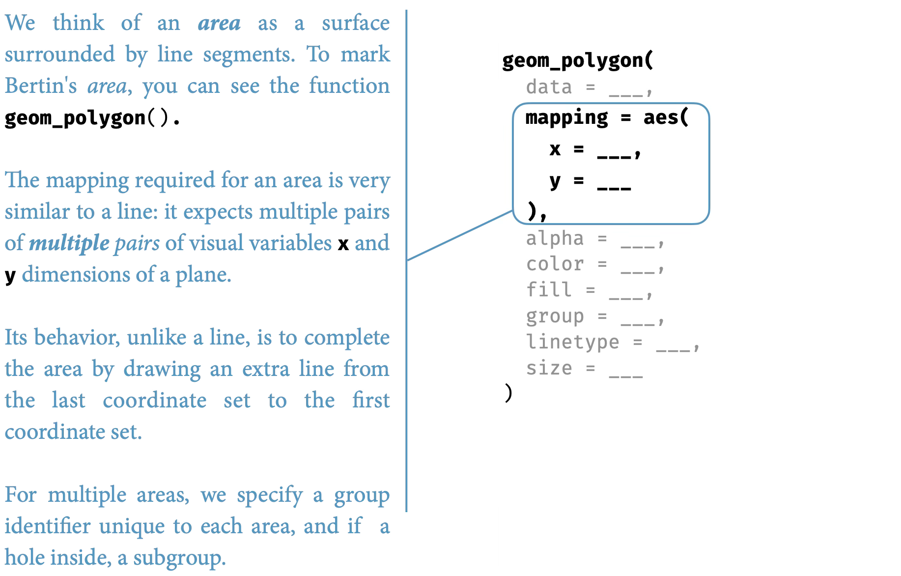
14.3.1.3 Surfaces
When magnitude matters as much as position, surfaces or areas fill the space beneath or between lines, creating two-dimensional regions. Areas have intrinsic visibility—they do not require arbitrary sizing to be seen—and they naturally suggest volume, accumulation, and totality:
A surface or area is bounded by lines, creating a two-dimensional region that we can perceive directly:
14.3.1.4 Volumes
Volume adds a third dimension, though in two-dimensional displays it must be represented through perspective or shading. Volumes suggest mass, density, and three-dimensional structure, but they are notoriously difficult to judge accurately:
14.3.2 Color as a visual variable
Beyond geometric marks, color provides three distinct perceptual channels for encoding data. Unlike position and length, which are inherently ordered, color’s three dimensions serve different purposes:
Hue is what we typically mean by “color”—the quality that distinguishes red from blue from green. Our visual system treats hue as categorical, making it excellent for distinguishing groups but poor for showing ordered quantities.
Chroma (also called saturation) describes color intensity—the difference between a pale pink and a vivid red. Chroma can encode ordered data, though our ability to judge saturation differences is less precise than judging position.
Luminance (brightness) ranges from light to dark. Like chroma, luminance can encode ordered quantities, but it is more versatile because it works even for viewers with color vision deficiencies.
Together, these three color dimensions provide:
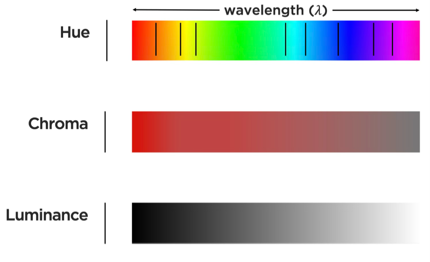
Different visual variables suit different data types. Position and length work well for quantitative data. Color hue excels at distinguishing categorical data. Luminance and saturation can encode ordered data but are less precise than position for quantitative judgments.
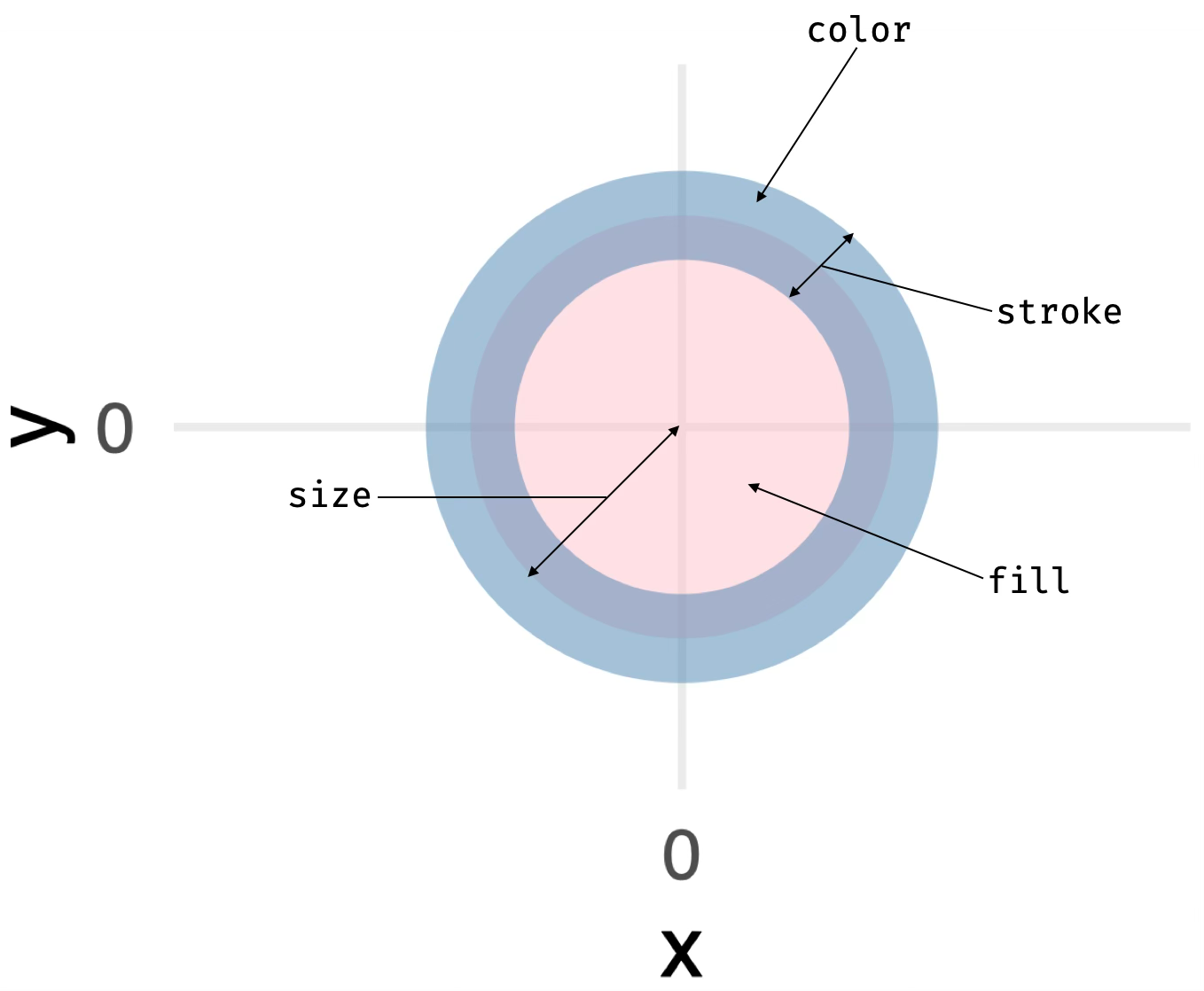
14.3.3 Bertin’s visual variables: A systematic framework
By now, you may recognize that we face a design decision every time we create a visualization: Which visual property should represent which data variable? In 1967, French cartographer Jacques Bertin provided the first comprehensive answer to this question. His Semiology of Graphics (Bertin 1983, 2010) analyzed how humans perceive visual information and systematized the available encoding channels.
Bertin’s insight was that not all visual variables are equally effective for all data types. Some variables (like position) can represent any kind of data accurately. Others (like color hue) excel at categorical distinctions but fail for quantitative comparisons. By understanding Bertin’s framework, we can make informed encoding choices rather than relying on software defaults or personal habit.
Bertin identified the fundamental visual channels available for encoding data:
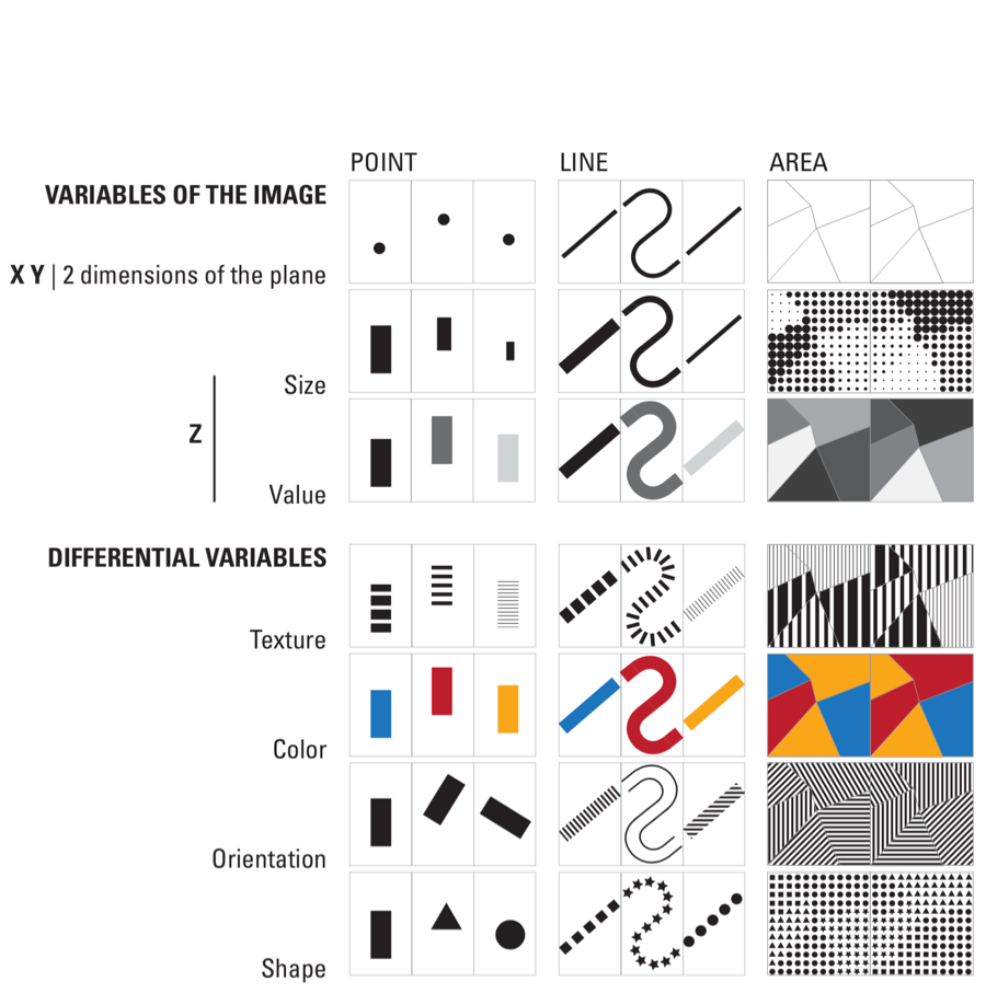
Bertin organized these variables by their suitability for different data types. Position is the most powerful—humans can judge positions along common scales with high precision. Length from a common baseline is nearly as effective. Area, angle, and color saturation are progressively less accurate for quantitative judgments. Color hue works best for distinguishing categories.
14.4 Identify use of Bertin’s channels
Theory becomes useful when applied. We have examined Bertin’s visual variables and the types of data they encode—now let’s practice identifying how professional visualizations map data to these channels. In the following exercises, you will analyze published graphics by systematically deconstructing their encodings: for each visual element, identify which Bertin channel it uses, what data variable it represents, and whether the mapping effectively serves the communication goal.
Work through each example carefully, documenting your observations before checking the analysis provided. This deliberate practice builds the analytical skills necessary to evaluate and improve your own visualizations.
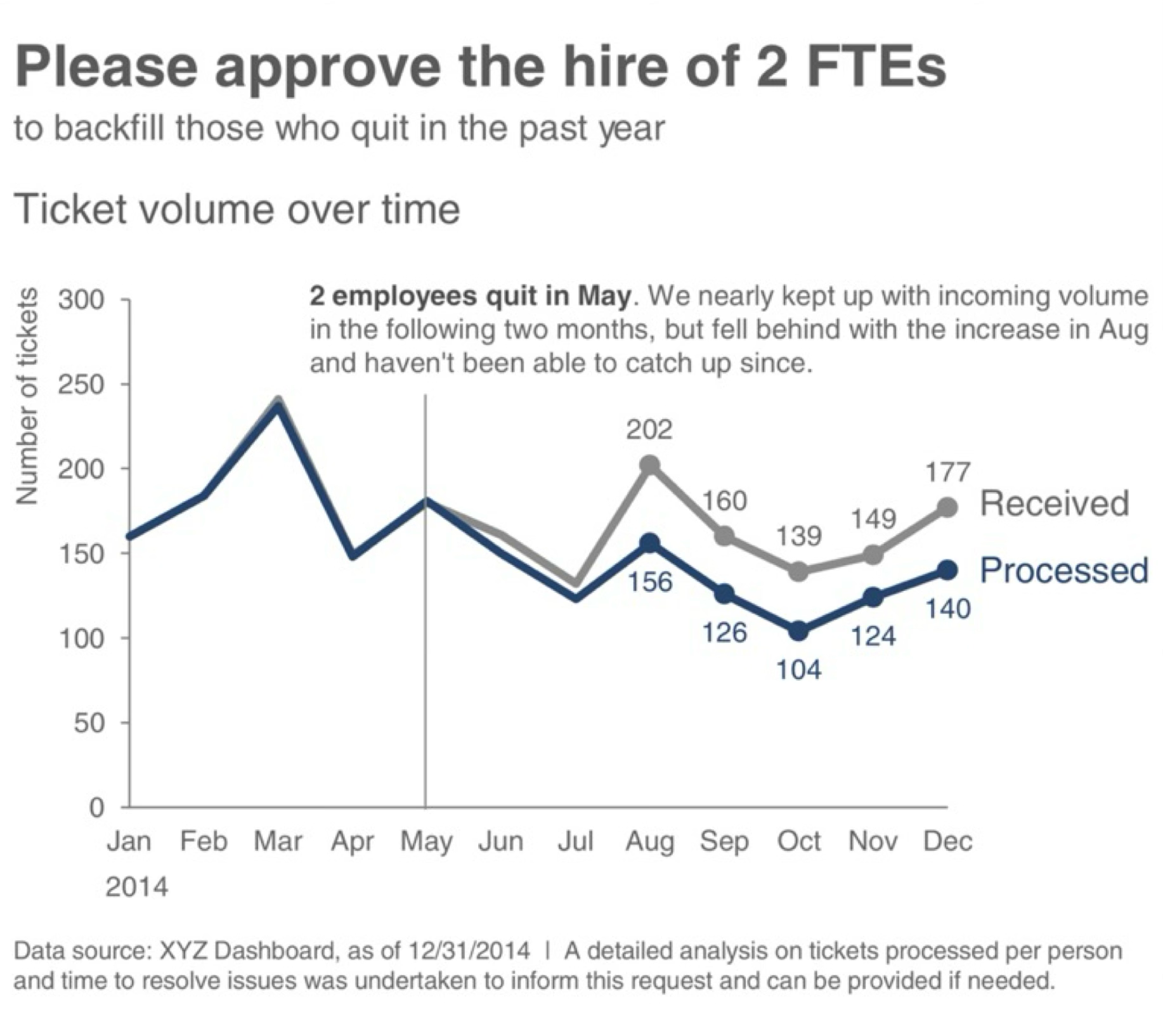
Exercise 14.1 (Ticket Volume Dashboard) The graphic below comes from Cole Nussbaumer Knaflic’s Storytelling with Data, a widely-cited resource on visualization best practices. Study the dashboard and identify its visual encodings before reading the analysis.
Step 1: Identify the visual channels
List every visual property you see that varies systematically: positions, colors, shapes, sizes. Then determine what data each represents.
Step 2: Map data to channels
For each channel you identified, specify: - Which Bertin channel is used (position, length, color hue, luminance, etc.)? - What data type does it encode (categorical, ordered, quantitative, temporal)? - What specific data variable is mapped to it? - Is this mapping appropriate given what we know about perceptual accuracy?
Step 3: Evaluate the design
After mapping all channels, evaluate: - Are quantitative comparisons supported by the most accurate channels (position/length)? - Does color serve a clear categorical distinction role? - Are there redundant encodings reinforcing the same dimension? - Could alternative encodings better serve the communication goal?
Analysis:
This time-series chart maps data to visual channels as follows:
| Visual Channel | Data Variable | Data Type | Appropriateness |
|---|---|---|---|
| Horizontal position (x-axis) | Time (months) | Ordered/Temporal | Excellent—position is most accurate for ordered data; left-to-right reading matches temporal progression |
| Vertical position (y-axis) | Ticket volume | Quantitative | Excellent—vertical position from baseline enables precise magnitude comparison |
| Line elements | Sequential data points | Connection | Good—lines emphasize trend and continuity between time points |
| Color hue | Ticket category | Categorical | Good—distinct hues differentiate series, but check for color blindness accessibility |
The design effectively leverages position—our most accurate perceptual channel—for the critical quantitative and temporal comparisons. Color hue serves a secondary categorical role without competing with the position encodings.
Questions for further consideration:
- Does the y-axis start at zero? For area-based judgments (the filled area under or between lines), zero baselines prevent perceptual distortion.
- How many distinct hues are used? Research suggests we can reliably distinguish 6-8 categorical colors.
- What alternative designs might work? Small multiples (faceting by category) could reduce the cognitive load of comparing overlapping lines, though at the cost of screen space.
Before proceeding to the next exercise, take a moment to reflect: Did your initial analysis match the systematic breakdown above? What encodings did you notice first, and what did you overlook? Developing this analytical discipline—checking each channel systematically rather than relying on first impressions—is crucial for rigorous visualization critique.
Exercise 14.2 (Crime Information) Now examine this geographic visualization from the Los Angeles Times. Geographic displays introduce special complexity: position carries semantic meaning (actual spatial locations) rather than serving purely as a data mapping.
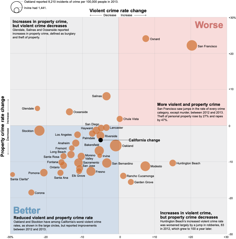
Your task: Working systematically, identify at least five distinct visual encodings. For each, specify in writing:
- The visual channel (which Bertin variable: position, size, color hue, luminance, orientation, shape, etc.)
- The data attribute (what specific data variable: crime type, location coordinates, incident count, time, etc.)
- The data type (categorical, ordered, quantitative, temporal, geographic)
- The encoding appropriateness (does Bertin’s framework endorse this channel for this data type?)
Analysis prompts to guide your work:
- Position: How is position used?
- Size: If point size varies, what does it represent? Is size appropriate for that data type?
- Color: How many color channels are active?
- Shape: Are different shapes used, or is shape constant? What would shape encode if varied?
- Texture/Density: In areas with many overlapping points, how does the graphic handle density?
Critical evaluation questions:
- How does the graph handle overlapping points in high-density areas? Does overlap obscure or aggregate?
- Does the base graph support or compete with the data message?
Extension: Consider alternative designs.
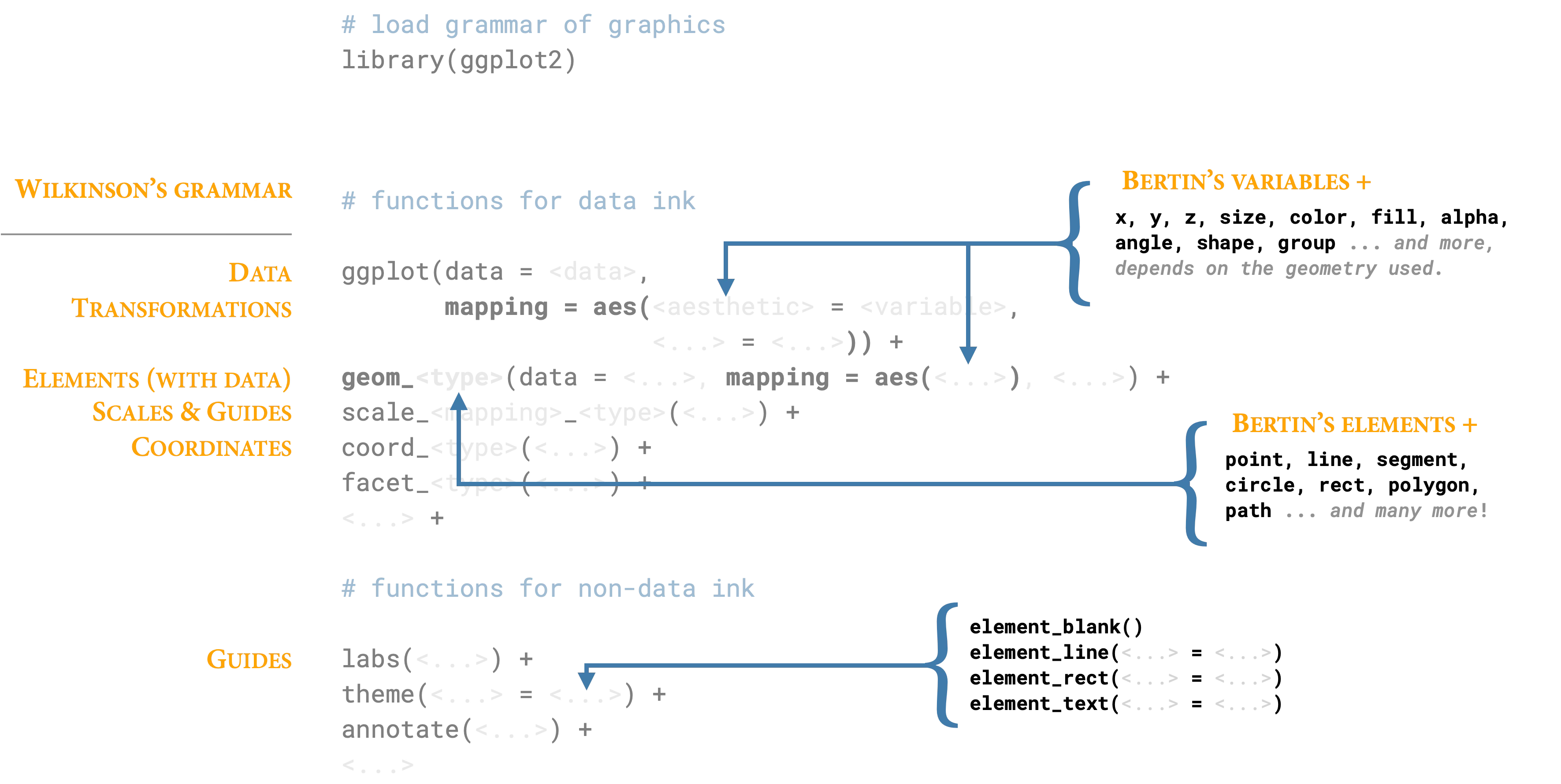
14.5 Grammar of graphics: A layered approach
We have examined individual encodings—position, color, size, shape—and practiced identifying them in published graphics. But knowing the vocabulary is not the same as knowing the grammar. To construct meaningful visualizations, we need systematic principles for combining these elements into coherent wholes.
Enter Leland Wilkinson. In 1999, Wilkinson—then a statistician at Bell Labs—published The Grammar of Graphics, a work that fundamentally restructured how we think about data visualization. Wilkinson did not merely propose “a” grammar among many possibilities; he argued for “the” grammar, a comprehensive formal system that underlies all statistical graphics. Where previous approaches treated charts as discrete types to be memorized (bar charts, line charts, scatter plots), Wilkinson revealed these as surface manifestations of deeper structural patterns.
14.5.1 Wilkinson’s foundational insight
Wilkinson’s breakthrough was recognizing that graphics share the same foundational structure as language. Just as a finite set of grammatical rules generates infinite meaningful sentences, a finite set of graphical components generates infinite meaningful visualizations. The Oxford English Dictionary defines grammar as “that department of the study of a [thing] which deals with its inflectional forms or other means of indicating the relations of [parts in things].” Wilkinson applied this concept to graphics: visualization requires rules for how data variables, geometric elements, and aesthetic attributes combine.
As Wilkinson insisted:
We often call graphics charts. There are pie charts, bar charts, line charts, and so on. [We should] shun chart typologies. Charts are usually instances of much more general objects. Once we understand that a pie is a divided bar in polar coordinates, we can construct other polar graphics that are less well known. We will also come to realize why a histogram is not a bar chart and why many other graphics that look similar nevertheless have different grammars. Elegant design requires us to think about a theory of graphics, not charts.
Wilkinson’s insight does not negate the value of chart catalogs, which provide useful taxonomies and inspiration. Harris’s Information Graphics remains the most comprehensive reference (Harris 1999)1. But these starting points should not limit our thinking—the grammar enables us to move beyond pre-defined templates.
This perspective liberates us from memorizing chart types. Instead, we learn to combine fundamental components that Wilkinson formalized:
- Data operations: Creating variables from datasets
- Transformations: Mathematical operations (sum, mean, rank, log, sqrt)
- Scales: Mappings from data to visual space (linear, log, sqrt)
- Coordinates: Spatial frameworks (Cartesian, polar, map projections)
- Elements: Geometric marks (points, lines, areas)
- Aesthetic attributes: Visual properties (position, size, color, shape)
- Guides: Axes, legends, and other reference marks
14.5.2 Theory to practice—Hadley Wickham’s contribution
Wilkinson provided the theoretical framework, but the grammar remained largely abstract until Hadley Wickham implemented it in R’s ggplot2 package. Wickham—a statistician at Rice University and later RStudio—recognized that Wilkinson’s grammar could guide software design. In his 2010 paper “A Layered Grammar of Graphics,” (Wickham 2010) emphasized a crucial dimension Wilkinson had noted but not fully developed: layering.
Wickham observed that complex graphics are not monolithic structures but rather stacks of independent layers. Each layer contains its own data, transformations, and aesthetic mappings, yet layers combine through simple addition. This insight shaped ggplot2’s design: we build graphics incrementally, adding one layer at a time, with each layer contributing distinct information.
Consider the logical progression:
- Base layer: Coordinate system and guides (axes, legends)
- Context layer: Background elements, reference lines, or geographic boundaries
- Data layer: Primary geometric elements with aesthetic mappings
- Annotation layer: Text labels, highlights, explanatory marks
- Final layer: Scales and theme adjustments
Each layer operates independently—we can modify, add, or remove layers without breaking the overall structure. This modularity makes iteration and experimentation practical.
14.5.3 Demonstrating layers: From simple to complex
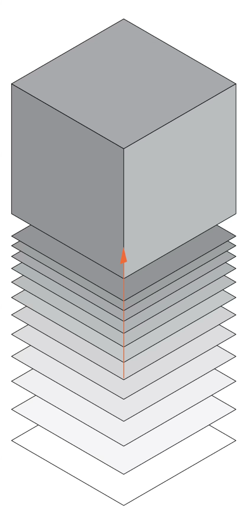
To appreciate the power of layering, consider how a complex visualization emerges through progressive accumulation of simple elements. The visualization below—recreating Nadieh Bremer’s “Let The Music Play” (showing the Top 2000 songs from Dutch radio station NPO Radio 2)—demonstrates this principle clearly.
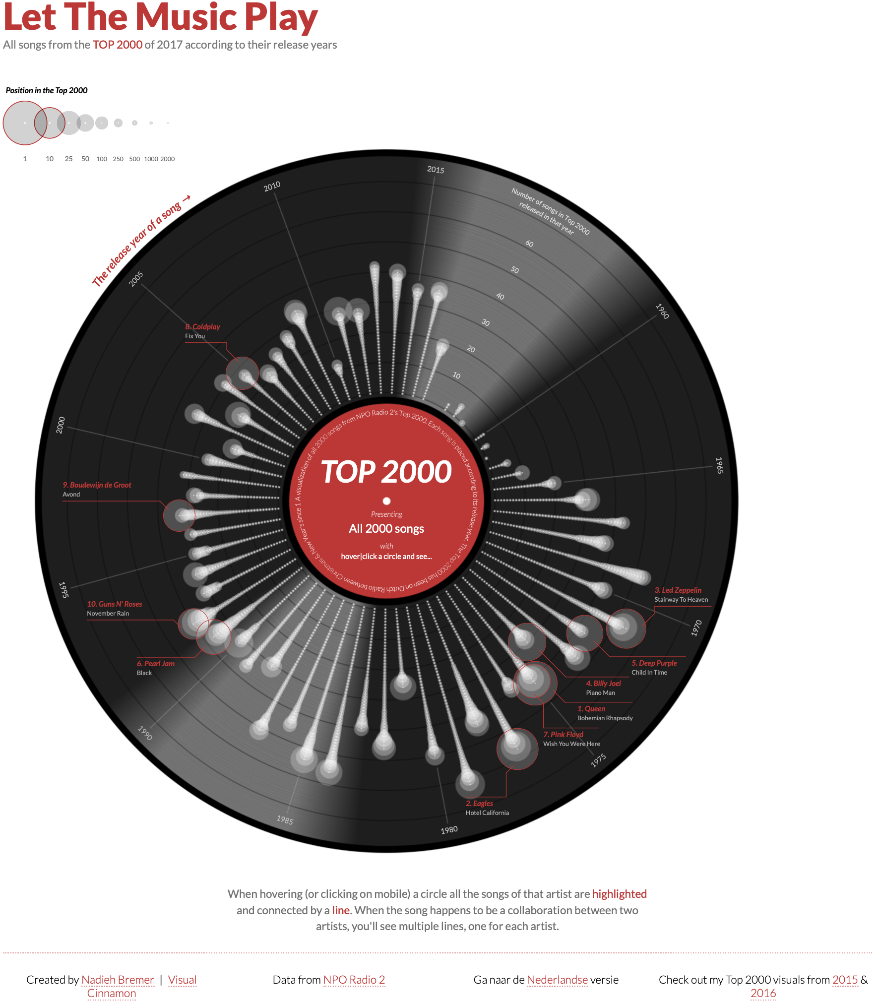
The full graphic appears intricate, but decomposing it reveals how each layer adds specific information. Below we examine how this complex visualization builds up through progressive layering (Spencer 2020).
The build-up proceeds as follows:
Layer 1: Foundation We begin with a polar coordinate system and a central red circle establishing the origin and focal point.
Layer 2: Background A dark circular “vinyl record” area provides visual context, immediately signaling “music” through cultural association.
Layer 3: Structure
Concentric circles and radial grid lines create the coordinate framework—year rings and angular positions where songs will be placed.
Layer 4: Data Individual songs appear as points positioned by release year (radial distance) and chart position (angular position). Each point represents one observation.
Layer 5: Connections Lines connect related songs—collaborations, covers, samples—adding relational information beyond individual data points.
Layer 6: Annotation Labels, legends, and explanatory text complete the graphic, providing context and enabling interpretation.
This decomposition reveals that complexity emerges not from sophisticated individual elements but from the systematic accumulation of simple layers. Each layer is comprehensible in isolation; together they create a rich, multi-dimensional representation. The grammar of graphics provides the rules for how these layers combine—ensuring that adding a new data series or aesthetic mapping follows predictable, debuggable patterns.
14.5.4 Grammar in action: building from simple marks
To see the grammar at work, let’s examine how the same underlying data flows through different geometric elements. Figure 14.24 maps Wilkinson’s components to their ggplot2 implementations:
The progression from points to lines to areas illustrates how the grammar generates different visual forms from the same fundamental components. A point mark is the simplest case: we map data variables to x and y positions, and the grammar creates one point per observation. Nothing could be more basic—a zero-dimensional mark positioned in two-dimensional space.
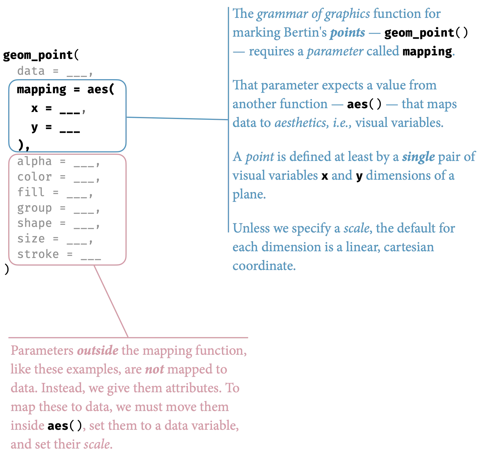
Change the geometric element to a line mark, and the same position mappings create continuous connections. The grammar now draws line segments between ordered points, emphasizing sequence and trend. The data and aesthetics remain constant; only the geometric interpretation changes.
An area mark extends this logic further, filling the space between the line and a baseline. The aesthetic mappings are identical—same data variables, same scales, same coordinates—but the geometric interpretation creates a filled region that emphasizes magnitude and accumulation.
This is the grammar’s power: by varying one component (the geometric element) while holding others constant, we create meaningfully different visualizations. The grammar makes these variations systematic rather than arbitrary.
14.5.5 Order matters: Layering and occlusion
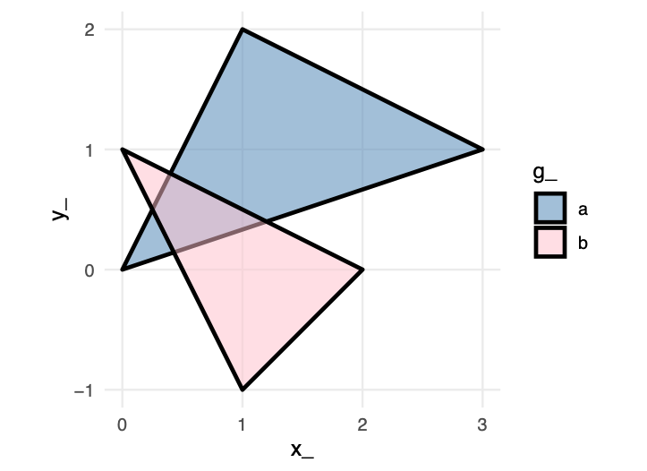
The sequence of layers determines what viewers see. Later layers appear on top of earlier ones, creating occlusion. This ordering is not arbitrary—it represents a deliberate design choice about which information should be visually dominant.
Consider the example below showing two overlapping circles. In the first version, the orange circle is drawn first, then the blue:

Now observe what happens when we reverse the order—the exact same data, the same visual elements, but the blue circle is drawn first:

These particular effects are created in code, simply by our code order for the markings, overlapping the markings, and choosing fill colors to distinguish the two shapes. We can create the same perception in other ways, too.
Samara (2014) describes these design choices as creating a sense of near and far. We may create a sense of depth, of foreground and background, using any of size, overlapping the forms or encodings, the encodings relative values (lightness, opacity). Samara (2014) writes, “the seeming nearness or distance of each form will also contribute to the viewer’s sense of its importance and, therefore, its meaning relative to other forms presented within the same space.” Ultimately we are trying to achieve a visual hierarchy for the audience to understand at each level.
When designing graphics, and especially when comparing encodings or annotating them, we must perceptually layer and separate types of information or encodings. As Tufte (1990) explains, “visually stratifying various aspects of the data” aides readability. By layering or stratifying, we mean placing one type of information over the top of a second type of information. The grammar of graphics, discussed earlier, enables implementations of such a layering. To visually separate the layered information, we can assign, say, a hue or luminance, for a particular layer. Many of the graphics discussed separate types of data through layering.
This principle becomes crucial in complex visualizations. When combining multiple data series, should the most important series appear on top? Should reference lines or annotations occlude data points or sit behind them? When using filled areas with transparency, does the overlap color convey meaningful information or create confusion? The designer must consciously decide which elements should be visually dominant, as this hierarchy guides the viewer’s attention and shapes their interpretation. If we had reversed the order of the layers when re-constructing Bremer’s graphic, what might we see as a result?
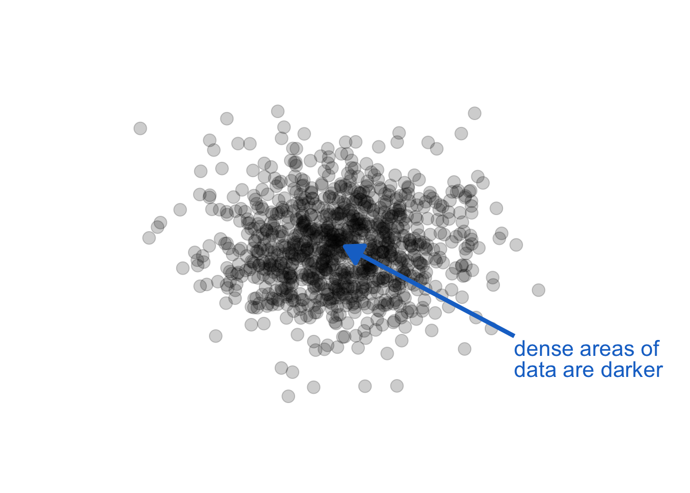
14.5.6 Layering and opacity
Opacity / transparency provide another attribute very useful in graphics perception. For layered data encoded in monochrome, careful use of transparency can reveal density:
The key in the above use is monochrome (a single color and shade). When we also use color, especially hue, as a channel to represent other data information, we get unintended consequences. Opacity, combined with other color attributes can change our perception of the color, creating encodings that make no sense. Let see this in action by adding opacity to our foreground / background example above:
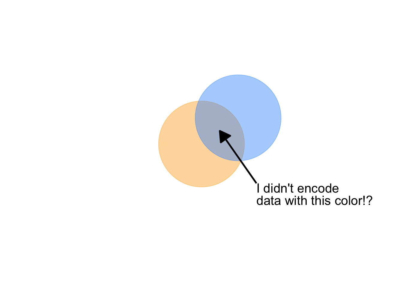
Notice, also, a question arises: is orange or blue in the foreground? With this combination of attributes, we lose our ability to distinguish foreground from background.
14.6 Deconstructing Lupi’s “Nobels, No Degrees”
To apply our understanding of the grammar, let’s deconstruct an apparent complex visualization. Giorgia Lupi’s “Nobels, No Degrees” visualizes Nobel Prize winners who did not have a university degree . Here’s the original published graphic:
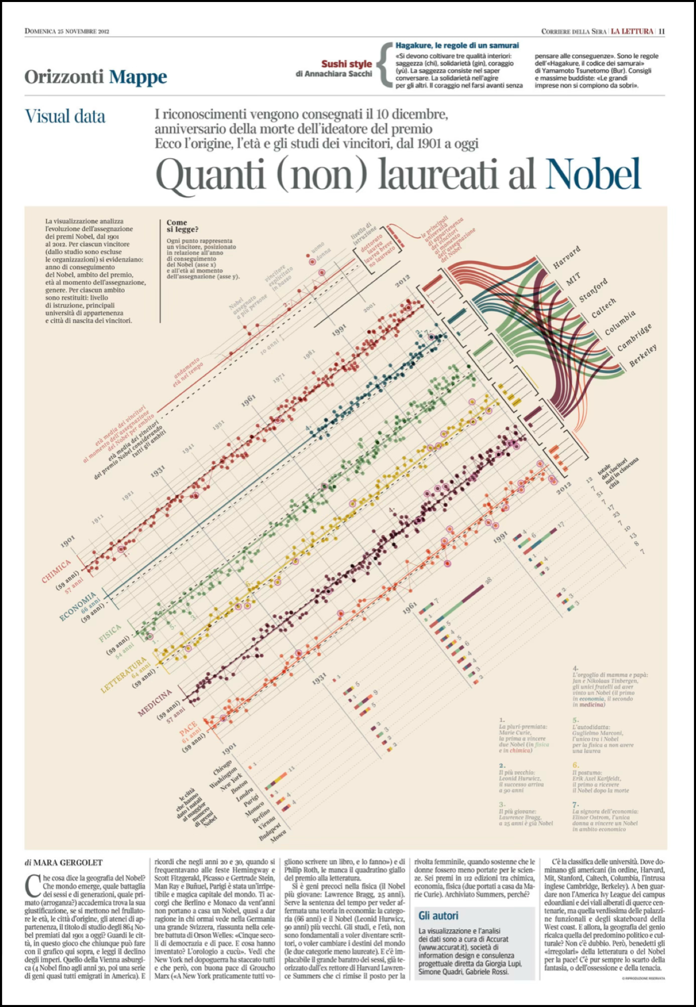
The graphic is visually striking, but what data does it encode, and through which visual variables? Let’s rotate the graphic and pull it from the paper’s circulation for use here:
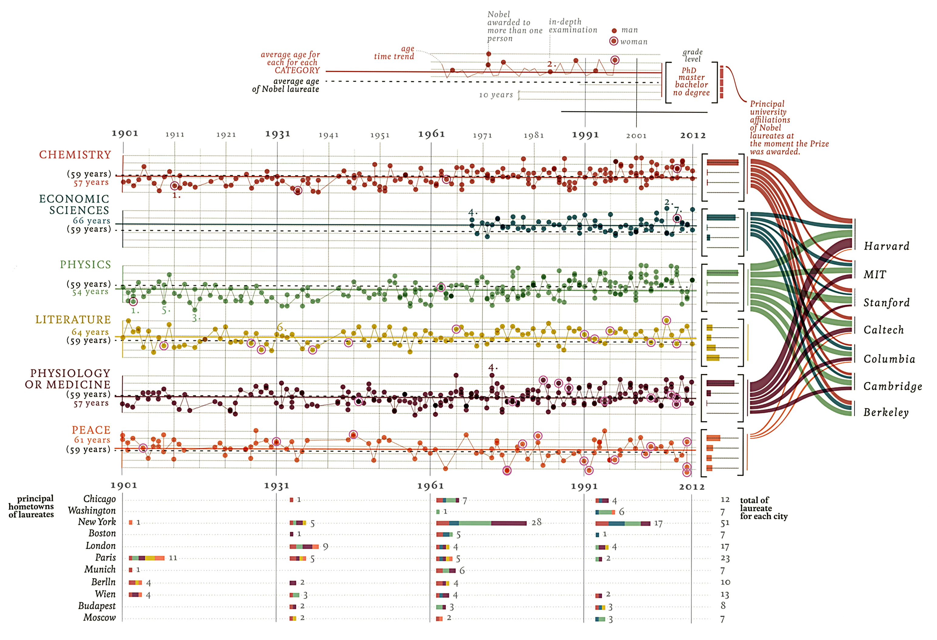
You may notice that some of the complexity is really just organizing four different types of graphs next to one another, and each on its own is a more common business graphic: multiples of a scatter plot and line chart, stacked bar charts, histogram charts, and a sankey or flow diagram. Once we carefully separate out each of the graphics, we find standard ideas in terms of Bertin’s ideas for channels and attributes.
Exercise 14.3 (Deconstruction) Study the original Lupi graphic and identify:
Data variables: What information about each Nobel laureate is being displayed? (Year, category, age, lifespan, etc.)
Visual encodings: Which Bertin variables are used for each data variable? Are any data variables encoded redundantly through multiple visual channels?
Layer structure: What is the logical order of layers? Which elements establish the framework (axes, categories) and which encode the data?
Design choices: What makes this graphic memorable? Which encodings are essential for understanding the data, and which serve aesthetic purposes?
Critique: According to the principles we’ve discussed, which encodings work well? Which might impede accurate interpretation?
14.7 Anatomy of a data graph
Every visualization consists of marks on a page—points, lines, shapes—positioned within a coordinate system and enhanced with various visual attributes. Understanding the structural components helps us make intentional design choices about what to emphasize and what to minimize. Figure 14.37 illustrates the standard components of a statistical graphic. Some components encode data directly: the marks themselves (points, lines, bars) and their visual properties (position, color, size). Other components provide essential context: axes tell us what values the positions represent, legends explain color or size encodings, and titles orient us to the graphic’s purpose.

The balance between data-carrying elements and contextual elements shapes how easily audiences can interpret a visualization. Too little context, and viewers cannot decode the encodings. Too much decoration, and the data gets lost in visual noise. Effective design requires judgment about which components serve the communication goal and which merely add clutter.
Every component is optional—except the data marks themselves. A graphic with just points and no axes requires external context to interpret. A graphic with elaborate borders, backgrounds, and annotations may obscure the patterns the data reveals. The grammar of graphics gives us the vocabulary to discuss these components precisely and to modify them systematically.
14.8 Specifying layered graphics for language models
Having established the grammar of graphics and its implementation through ggplot2, we now turn to a practical question: how do we communicate these specifications to AI systems? The layered approach provides a natural structure for prompts—we can specify graphics layer by layer, following the same logical progression we use when building visualizations manually.
14.8.1 The system prompt as grammar specification
Effective prompts to language models require the same precision we demand in our own thinking. Just as Wilkinson’s grammar decomposes graphics into fundamental components, our prompts should decompose requests into systematic specifications. We begin with a system prompt that establishes the computational environment, coding conventions, and our layered approach to visualization.
This system prompt accomplishes several purposes. It establishes the grammar framework explicitly, ensuring the AI understands we are not requesting a “chart type” but rather constructing a visualization from composable elements. It specifies the software environment—R’s ggplot2 being the canonical implementation of the layered grammar. Most importantly, it commits both human and AI to a step-by-step layered approach, mirroring how experienced visualization practitioners actually work.
14.8.2 From grammar to language model prompt
Consider how we might specify the California crime quadrant visualization using our grammar framework. We have already deconstructed this graphic (see Figure 14.22 in the exercise above)—now we reconstruct it through layered specifications. The raw data is available here: https://github.com/ssp3nc3r/diw/blob/main/data/lacrime_yoy_changes.csv. This example will also demonstrate how we can add explanatory elements to provide context, a technique we will explore more fully when we discuss annotations and explanatory graphics in later sections. The key constraint: we specify from the data outward, without referring to the original visualization’s appearance. We let the grammar generate the appropriate visual form.
Consider the reasons we wrote the prompt this way:
Let’s see what a result may look like:
The resulting visualization (Figure 14.38) demonstrates how grammar-based specification produces effective graphics without requiring reference to existing designs. The layered structure—data preparation, coordinate system, background context, reference lines, data marks, scales, guides, and theme—emerges naturally from the specification.
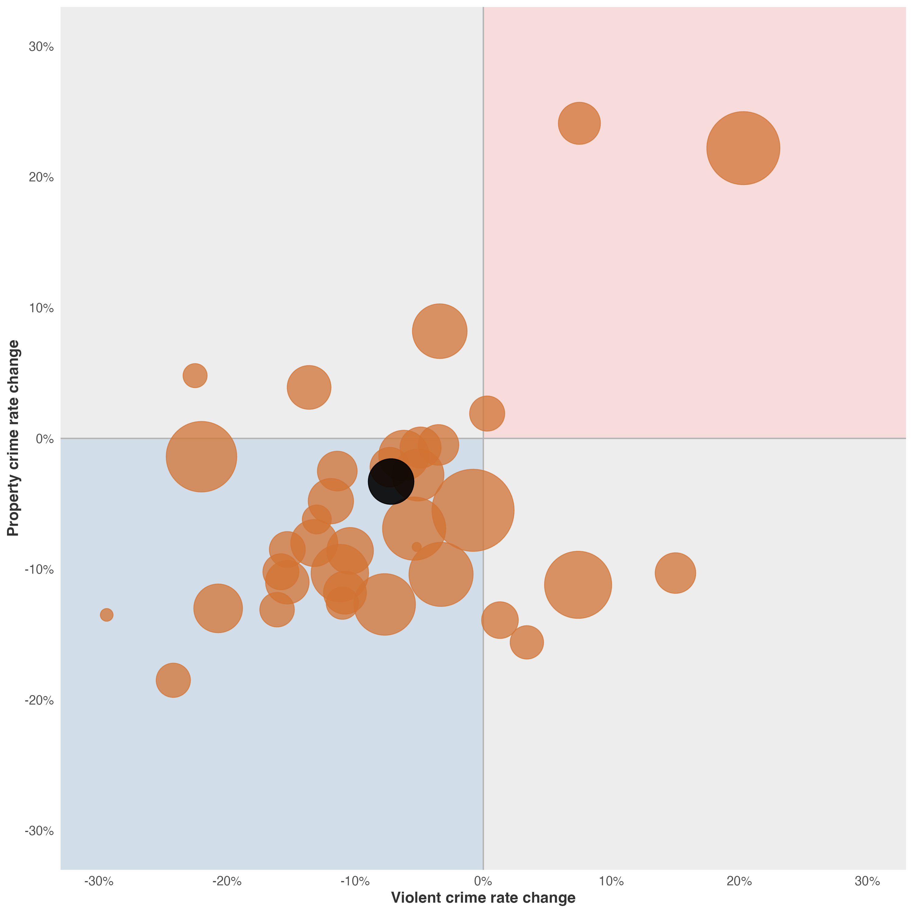
This approach scales to more complex visualizations. By training ourselves to think in layers—data, transformations, coordinates, geometry, aesthetics, guides, theme—we develop specifications that AI systems can implement reliably. More importantly, we develop the analytical discipline to deconstruct any visualization we encounter, understanding how its components serve (or fail to serve) its communicative purpose.
I should note, as one of your first encounters with a prompt here, it may appear daunting—at over 200 words, it seems to require more effort than simply writing the code yourself. This verbosity serves a pedagogical purpose: it demonstrates the complete grammar of graphics in action, with each layer explicitly articulated so you can see how data flows through transformations into visual form. Even a modest laptop-sized model could work with it.
And consider what this specification produces. The resulting code spans approximately 50 lines, carefully structured across data preparation, coordinate systems, geometric elements, and aesthetic mappings. For this example—even with verbosity—the ratio is roughly 4:1—four words of specification for every line of generated code. This investment pays dividends: the specification is technology-agnostic (the same prompt could generate Python with plotnine or altair, or JavaScript with D3.js), self-documenting (the intent is embedded in the specification itself), and reusable (you can modify individual layers without rewriting everything).
As you internalize the grammar, your prompts will naturally become more concise without sacrificing grammar and could adjust based on model capabilities. The verbose specification above is training wheels—necessary for learning, but eventually supplanted by fluency.
The key insight: we are not asking the AI to “make a chart.” We are describing a computational pipeline that transforms data into visual representations through systematic operations. Once you think in these terms, specification becomes as natural as describing your analysis to a colleague.
Let’s now return to the example from Knaflic as an exercise. We analyzed Cole Nussbaumer Knaflic’s ticket volume dashboard (see Figure 14.21). This graphic tells a compelling story: ticket processing capacity collapsed after two employees quit in May, creating a growing backlog. The visualization uses position along a common scale for temporal comparison, line elements to show continuity, and color hue to distinguish received versus processed tickets.
Now, using the layered grammar framework, write a specification prompt to recreate this visualization. The data file https://github.com/ssp3nc3r/diw/blob/main/data/knaflic-ticket-volume.csv contains 12 rows—one per month in 2014—with three columns: month, received, and processed.
Exercise 14.4 (Write a Layered Specification) Write a complete specification prompt that an AI could use to generate the Knaflic ticket volume visualization. Your specification should:
Analyze the communication goal: What story does this graphic tell? How do the data support that narrative?
Specify each layer following Wilkinson’s grammar:
- Data: Load the CSV and identify the structure
- Transformations: Any calculations needed?
- Coordinate system: What axes? What limits?
- Geometric elements: Lines? Points? Annotations?
- Aesthetic mappings: Position to what variables? Color to what categories?
- Scales: Linear? Any custom labels?
- Guides: Axis labels, legends?
- Theme: Clean, minimal, or detailed?
Include implementation details: Request working R code using ggplot2.
Add an annotation layer: Include a vertical reference line at May to highlight when the employees quit, plus text annotation explaining the insight.
Data structure reference:
month,received,processed
Jan,160,160
Feb,185,185
...
Dec,177,140
Test your prompt: Does it clearly separate data operations from visual mappings? Does it follow the layered approach? Would another reader understand what visualization should emerge? Now try changing the prompt to require code from Python and either its plotnine or altair library. And again asking for the result in D3.js and javascript within a single html file as code.
14.9 Looking ahead
We have established the foundations of visual design: the components of graphics, coordinate systems and scale transformations, visual encoding channels following Bertin’s framework, the layered grammar that structures our choices, and the practical implementation of these concepts in code. These foundations provide the theoretical framework for making design decisions.
But theory must be applied. Next, Chapter 16 delves deeper into the practical aspects of encoding data—exploring specific visual channels like position, length, angle, area, volume, color, and texture in greater detail. We will examine which channels are most effective for different types of data and communication goals, and we will learn to avoid common pitfalls that plague even experienced designers.
The goal is not merely to create graphics that are technically correct, but to craft visual communications that guide attention, reveal patterns, and enable understanding. The principles we have outlined here will serve as our compass in that endeavor.
We understand that effective visualization requires:
- Comparison as the source of meaning—single data points communicate nothing without context
- Appropriate coordinate systems and scales—the mathematical framework shapes perception
- Matching encodings to data types—following Bertin’s guidance on which visual variables suit which data
- Thinking in layers and grammar—not memorizing chart types but composing from fundamental elements
- Attention to order and occlusion—designers control what viewers see through layering decisions
With these principles in hand, we turn to the practical work of decoding visual information and understanding how human perception processes the encodings we create.