16 Perceptions of visual decoding
In the previous chapter, we established the grammar of graphics—the systematic framework for constructing visualizations through coordinate systems, geometric elements, and aesthetic mappings. We examined how layers accumulate to create complex graphics and how Bertin’s visual variables provide a vocabulary for encoding data. Now we must confront a crucial question: How do these encodings actually work in the human visual system?
The gap between the marks we make on a page and the understanding our audiences derive from them is mediated by perception. We may design a graphic with perfect fidelity to the grammar, yet fail to communicate if we ignore how the eye and brain process visual information. Color provides the most compelling example of this gap. We can specify color mathematically—precise RGB values or HSL coordinates—but the perceived result depends on context, surrounding colors, individual differences in vision, and the inherent nonlinearity of human color perception.
This chapter bridges theory and perception. We begin with color—the most powerful and most treacherous of visual encodings—exploring its mathematical foundations, its perceptual relativity, and the accessibility challenges it presents. Then we turn to empirical research on visual comparison, examining which encoding channels enable accurate judgment and which systematically mislead. Finally, we consider principles for maximizing information while respecting perceptual limitations.
16.1 Color
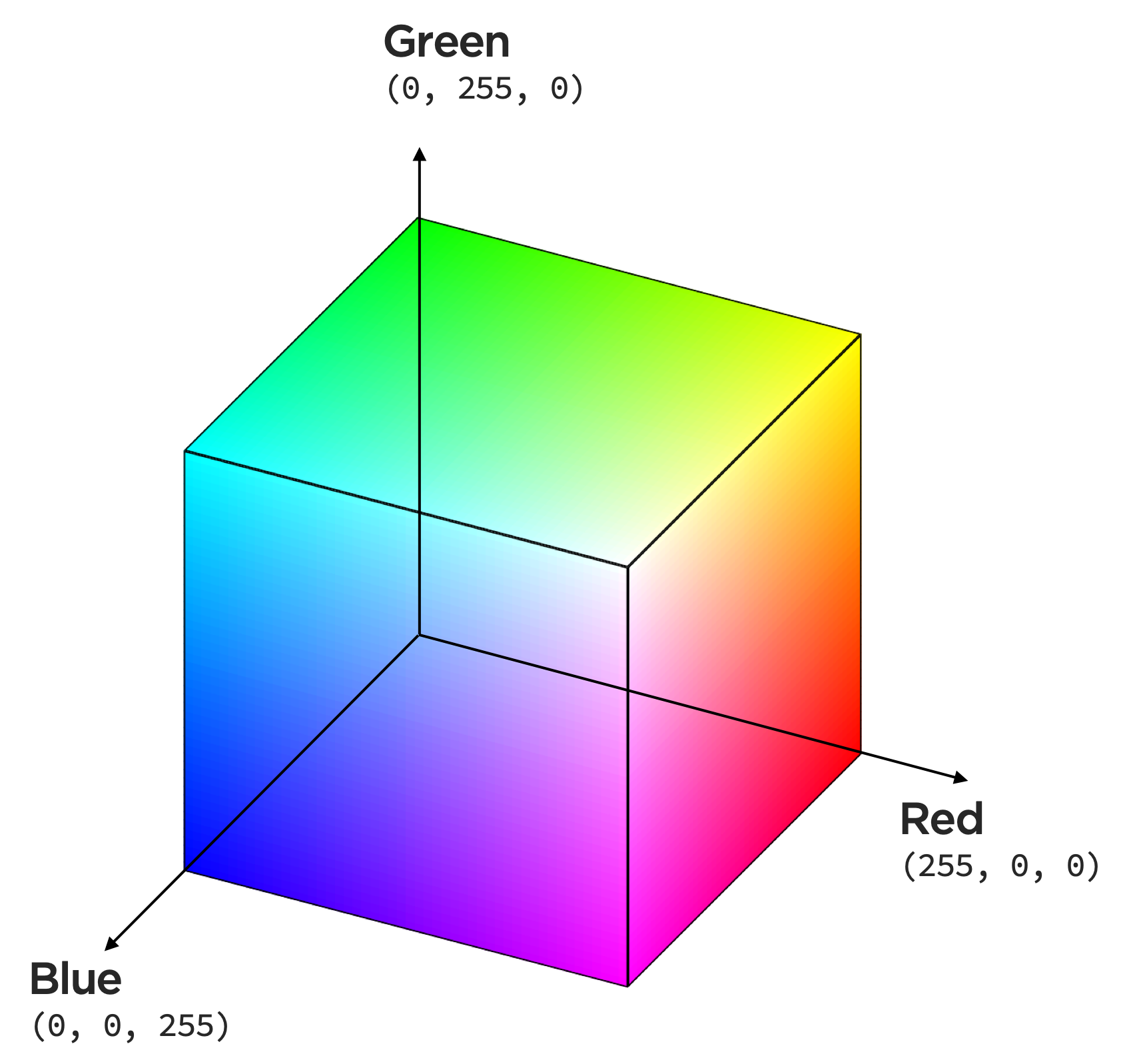
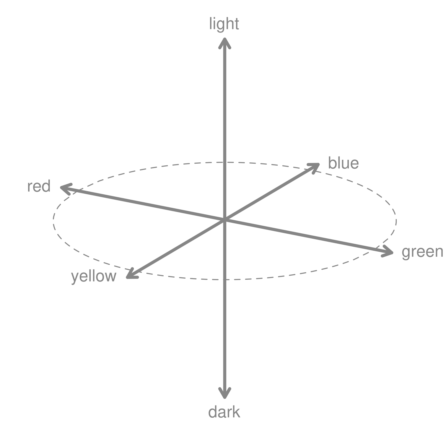
Color dominates modern data visualization, yet it remains poorly understood. We can encode data using color spaces, which are mathematical models. The common color model RGB has three dimensions — red, green, and blue, each having a value between 0 and 255 (\(2^8\)) — where those hues are mixed to produce a specific color.
Notice the hue, chroma (saturation), and luminance of this colorspace,
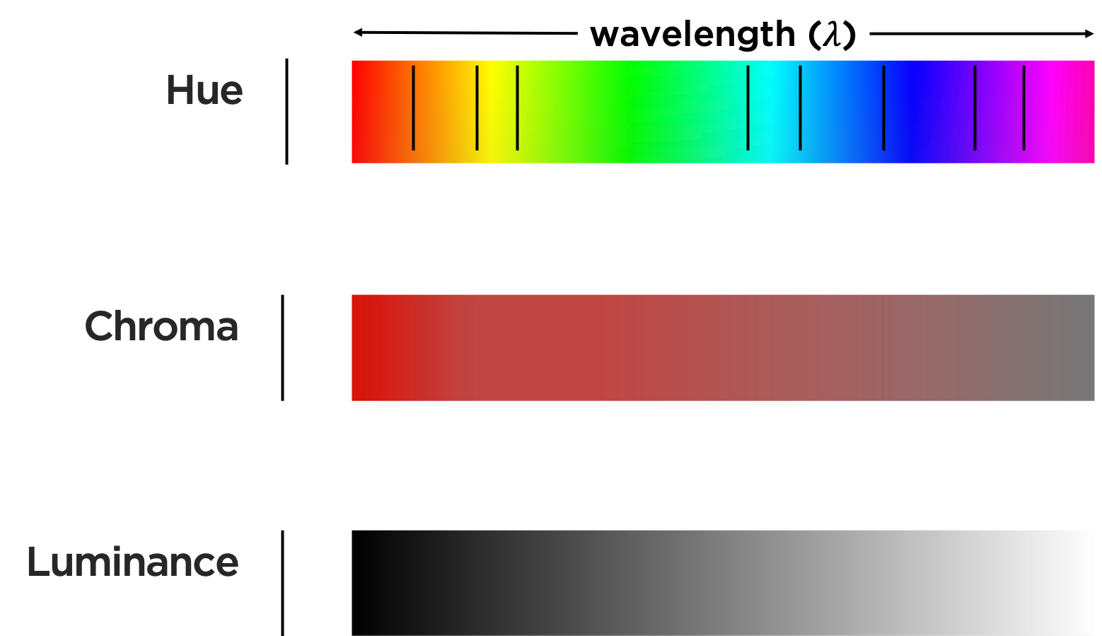
seems to have uneven distances and brightness along wavelength.
Let’s consider how we might, as illustrated below, map data to these characteristics of color.
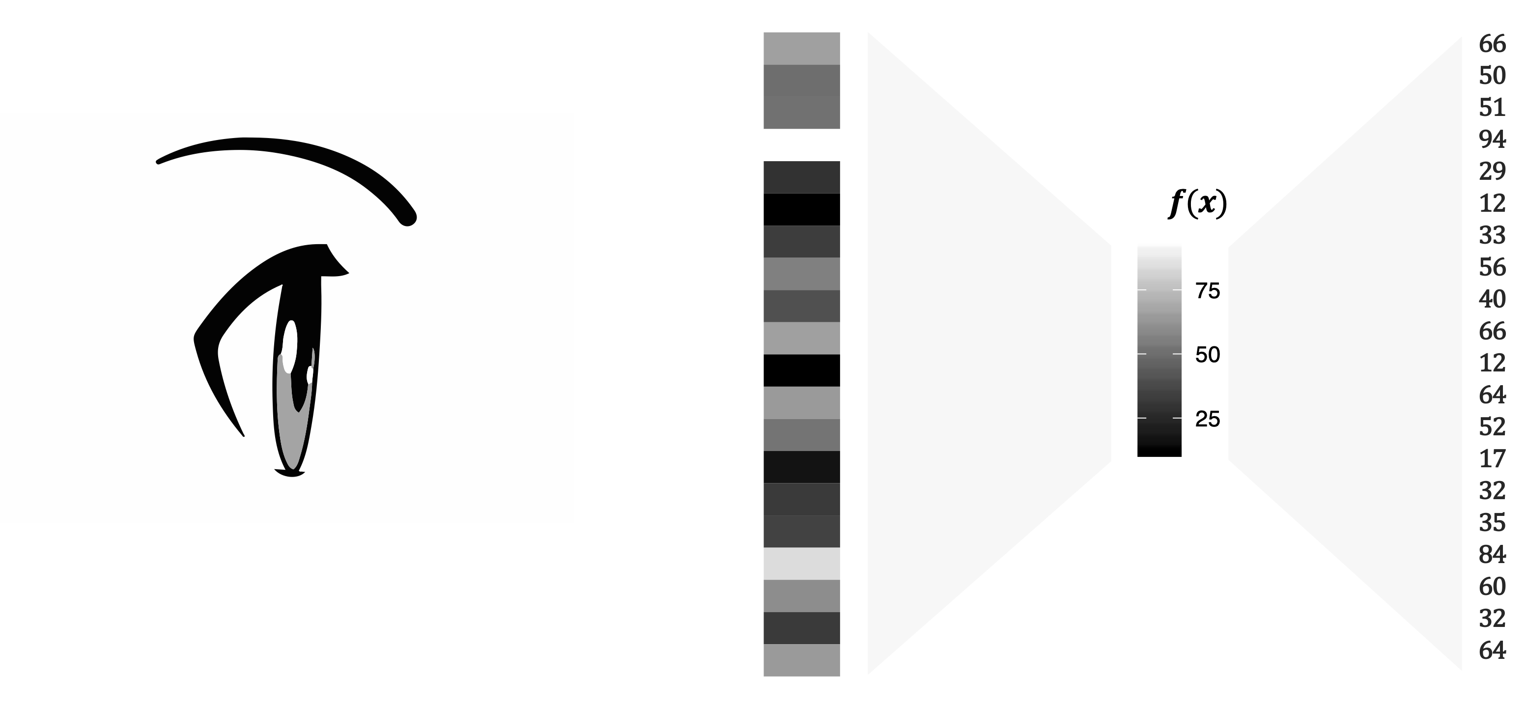
Luminance is the measured amount of light coming from some region of space. Brightness is the perceived amount of light coming from that region of space. Perceived brightness is a very nonlinear function of the amount of light emitted. That function follows the power law:
\[ \textrm{perceived brightness} = \textrm{luminance}^n \]
where the value of \(n\) depends on the size of the patch of light. Ware (2020) reports that, for circular patches of light subtending 5 degrees of visual angle, \(n\) is 0.333, whereas for point sources of light \(n\) is close to 0.5. Let’s think about this graphically. Visual perception of an arithmetical progression depends upon a physical geometric progression (Albers 2006). In a simplification shown in Figure 16.4, this means: if the first 2 steps measure 1 and 2 units in rise, then step 3 is not only 1 unit more (that, is, 3 in an arithmetical proportion), but is twice as much (that is, 4 in a geometric proportion. The successive steps then measure 8, 16, 32, 64 units.
Color intervals are the distance in light intensity between one color and another, analogous to musical intervals (the relationship between notes of different pitches).
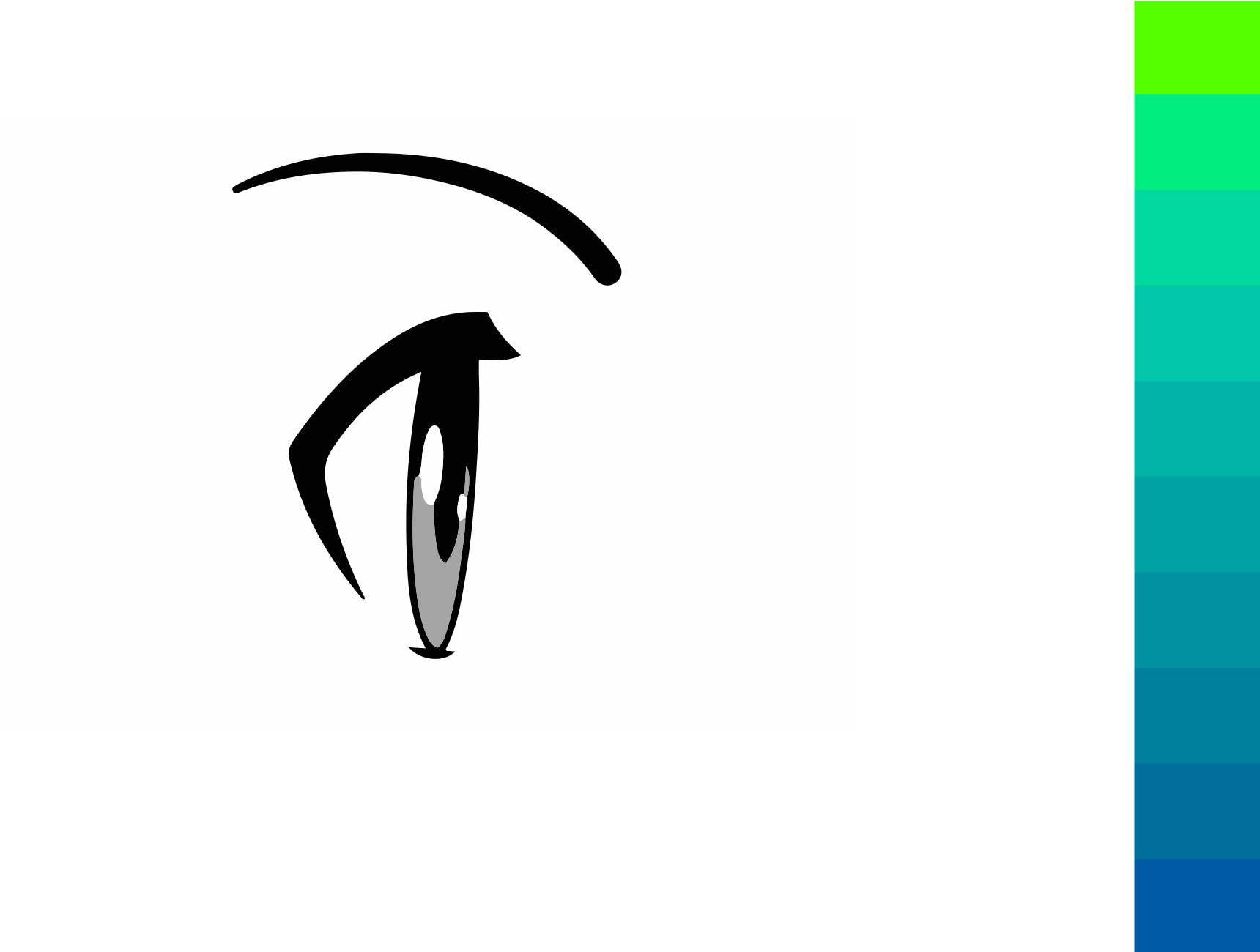
Uneven wavelengths between what we perceive as colors, as we saw in the RGB color space, results in, for example, almost identical hues of green across a range of its values while our perception of blues change more rapidly across the same change in values. We also perceive a lot of variation in the lightness of the colors here, with the cyan colors in the middle looking brighter than the blue colors.
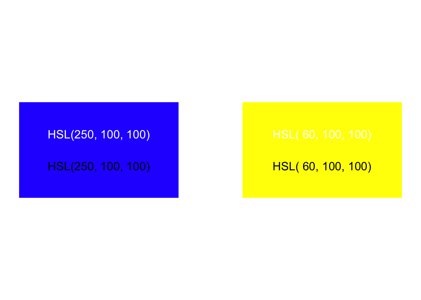
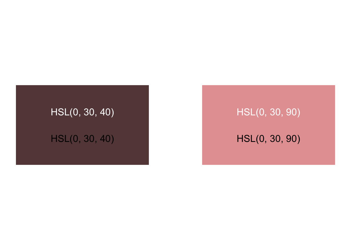
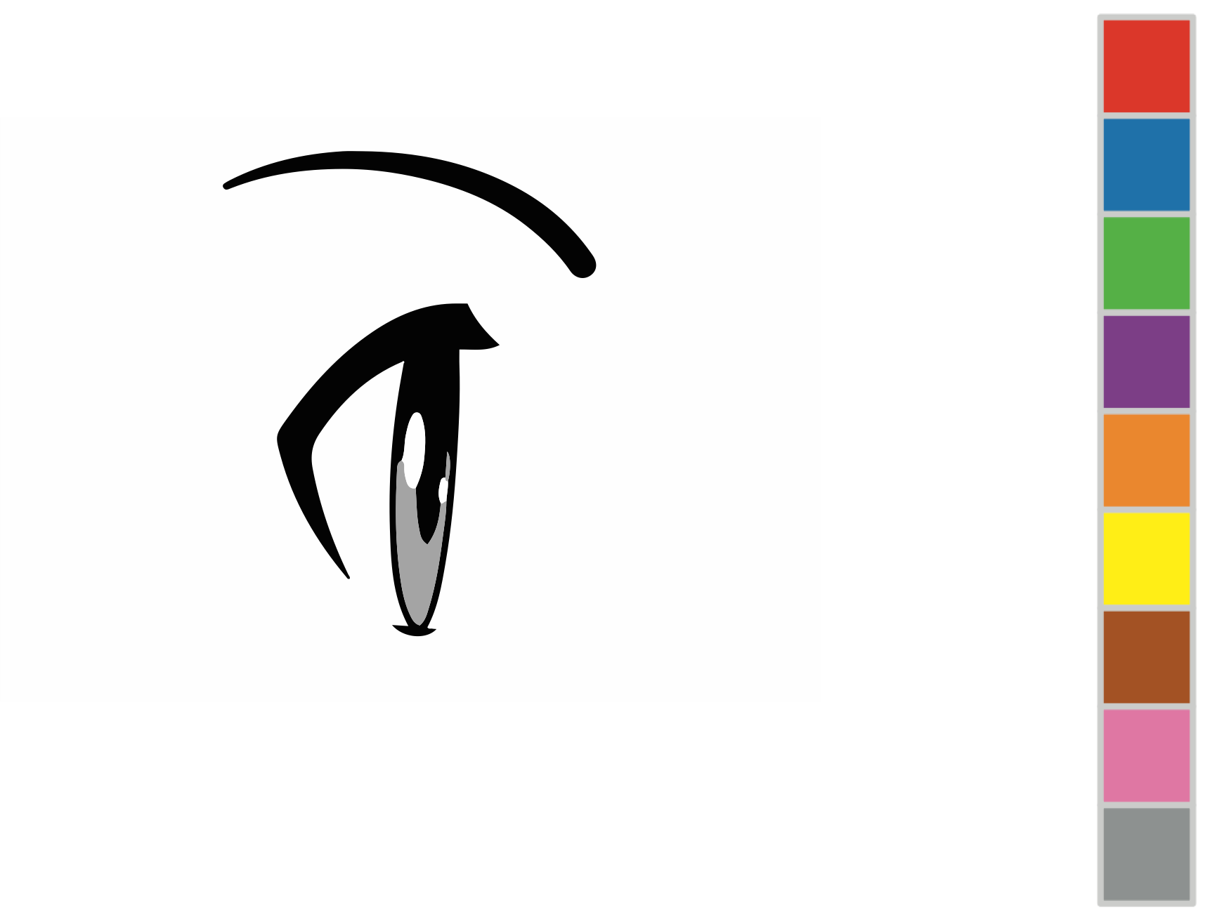
The problem exists in each channel or attribute of color. Let’s consider examples by comparing the hue, saturation, and luminance of two blocks. Do we perceive these rectangles as having the same luminance or brightness?
Do we perceive these as having the same saturation?
Do we perceive these as having equal distance between hues?
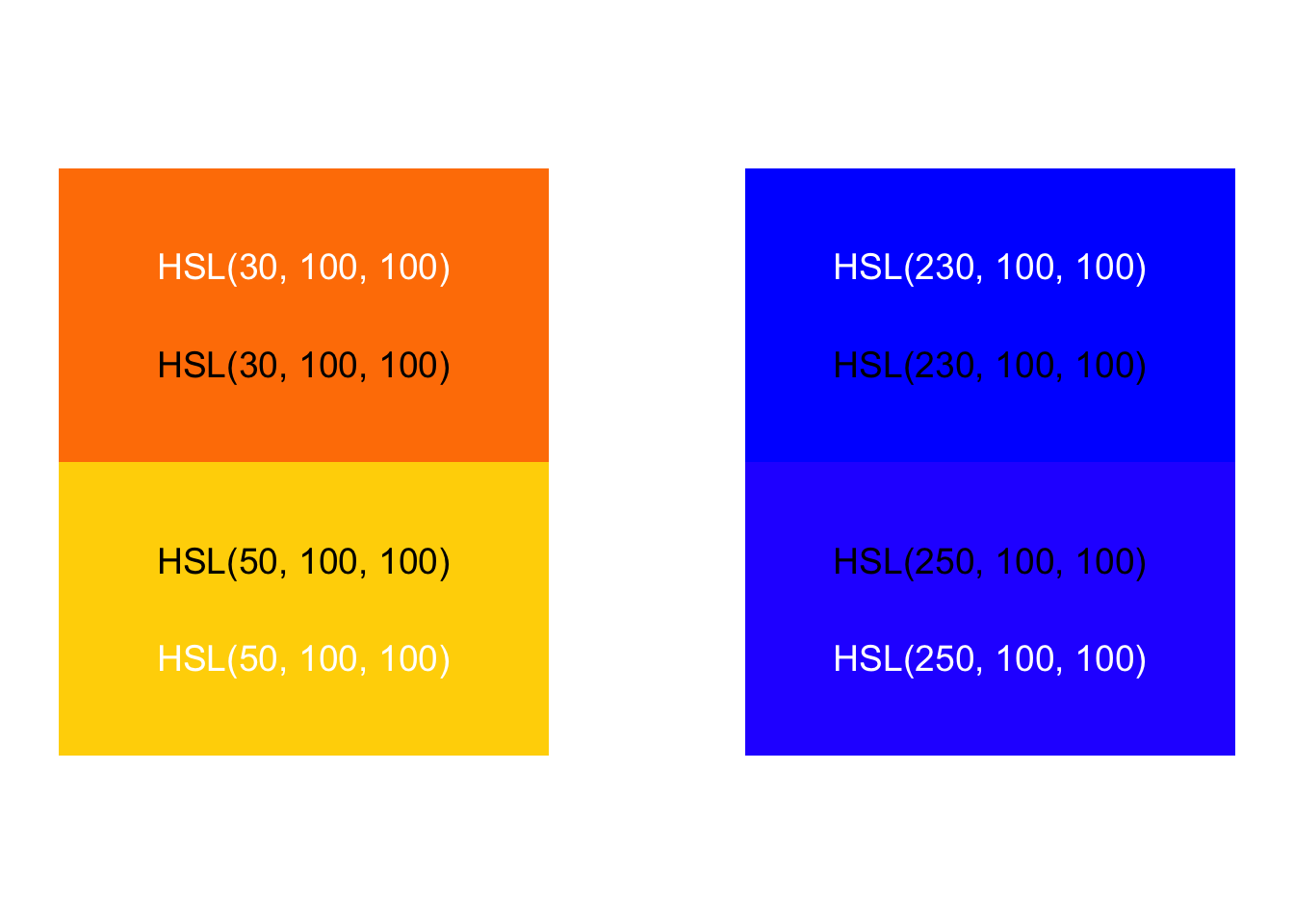
There’s a solution, however. Other color spaces show changes in color we perceive as uniform. Humans compute color signals from our retina cones via an opponent process model, which makes it impossible to see reddish-green or yellowish-blue colors. The International Commission on Illumination (CIE) studied human perception and re-mapped color into a space where we perceive color changes uniformly. Their CIELuv color model has two dimensions — u and v — that represent color scales from red to green and yellow to blue.
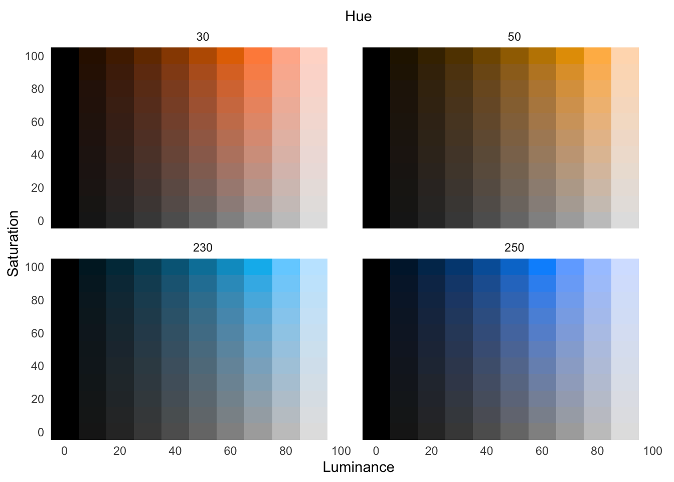
More modern color spaces improve upon CIELuv by mapping colors as perceived into the familiar and intuitive Hue-Chroma-Luminance1 dimensions. Several modern color spaces, along with modification to accommodate colorblindness, are explained in the expansive Koponen and Hildén (2019). In contrast with the perceptual change shown with an RGB colorspace above, the change in value shown below of our green-to-blue hues in 10 equal steps using the HCL model are now perceptually uniform.
For implementations of perceptually uniform color spaces in R, see Spencer (2020) and Zeileis, Hornik, and Murrell (2009). Using the perceptually uniform colorspace HSLuv, let’s explore the above hue changes, across various saturation and luminance:
With categorical data, we do not want one color value to appear brighter than another. Instead, we want to choose colors that both separate categories while holding their brightness level equal.
When mapping data to color channels — hue, saturation, or lightness — use a perceptually uniform colorspace.
16.2 Relativity of color
The perceptual challenges we have examined—nonlinear brightness, simultaneous contrast, edge effects—are not merely technical obstacles to overcome. They reveal a fundamental truth about color: it is inherently relative. A color does not exist in isolation; its appearance depends entirely on context, surrounding colors, and the visual system’s comparative mechanisms.
This principle of color relativity found its most influential expression in the work of Josef Albers. A German-born artist and educator who taught at the Bauhaus and later at Black Mountain College and Yale University, Albers revolutionized how we understand color through his book Interaction of Color (Albers 2006). Originally published in 1963 and based on his teaching methods developed over decades, the book demonstrated through systematic exercises how colors influence each other’s appearance. Albers showed that the same red could appear pink, brown, or vibrant depending on its surrounding colors—a phenomenon he called “color action.”
Albers’ influence extends far beyond art education. His systematic approach to studying color relativity provided the foundation for understanding how visual context shapes perception. For data visualization, his insights are crucial: the colors we choose for our graphics do not exist in isolation, and the background, neighboring marks, and overall composition will alter how audiences perceive our encodings.
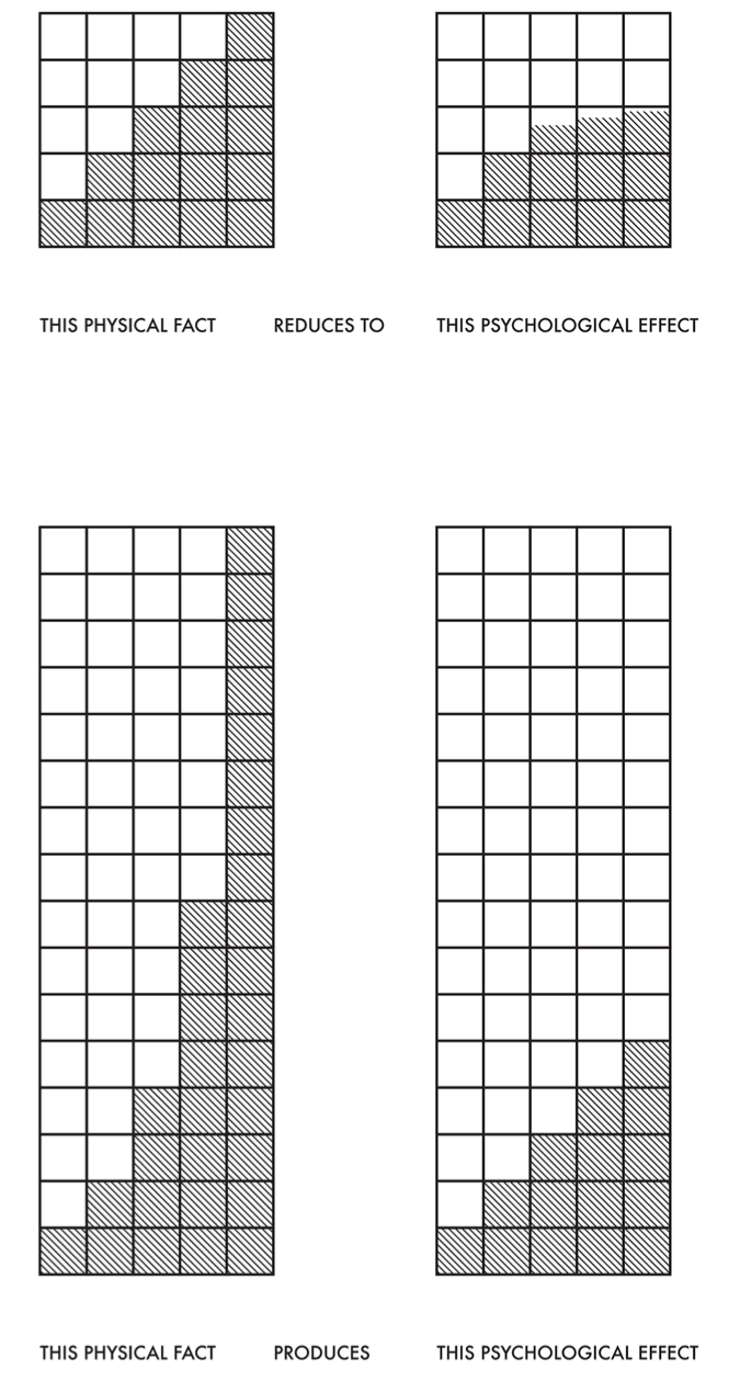
Notice, for example, that each of the 10 equal blocks from green to blue in our earlier HSLuv comparison appear to show a gradient in hue. We also see this for each step in luminance (but not across blocks of saturation). That isn’t the case—the hue is uniform within each block or step. Our eyes, however, perceive a gradient because the adjacent values create an edge contrast. Humans have evolved to see edge contrasts, as in Figure 16.13.
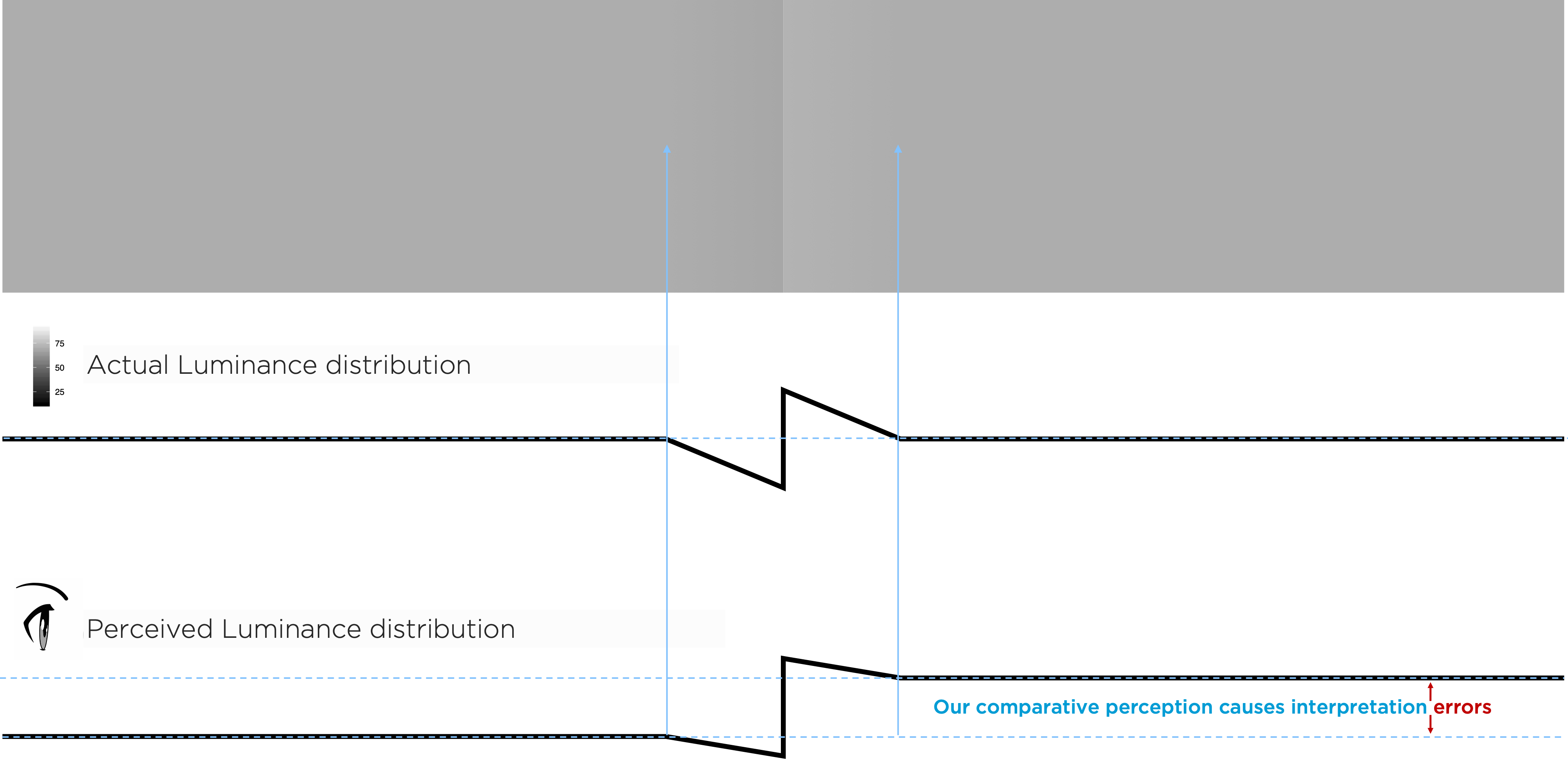
We see comparative — not absolute — luminance value. The edge between the left and right gray rectangles in Figure 16.13, created by a luminance adjustment tricks us into seeing each rectangle as uniform and differing in shade, though the outer portions of each have the same luminance. Need proof? Cover the edge portion between them!
Similarly, our comparative perception has implications for how to accurately represent data using luminance. Background or adjacent luminance — or hue or saturation — can influence how our audience perceives our data’s encoded luminance value. The small rectangles in the top row of Figure 16.14 all have the same luminance, though they appear to change. This misperception is due to the background gradient.

One color can interact to appear as two. The inner blocks on the left are the same color, and the two inner blocks on the right are the same, but different background colors change our perception:
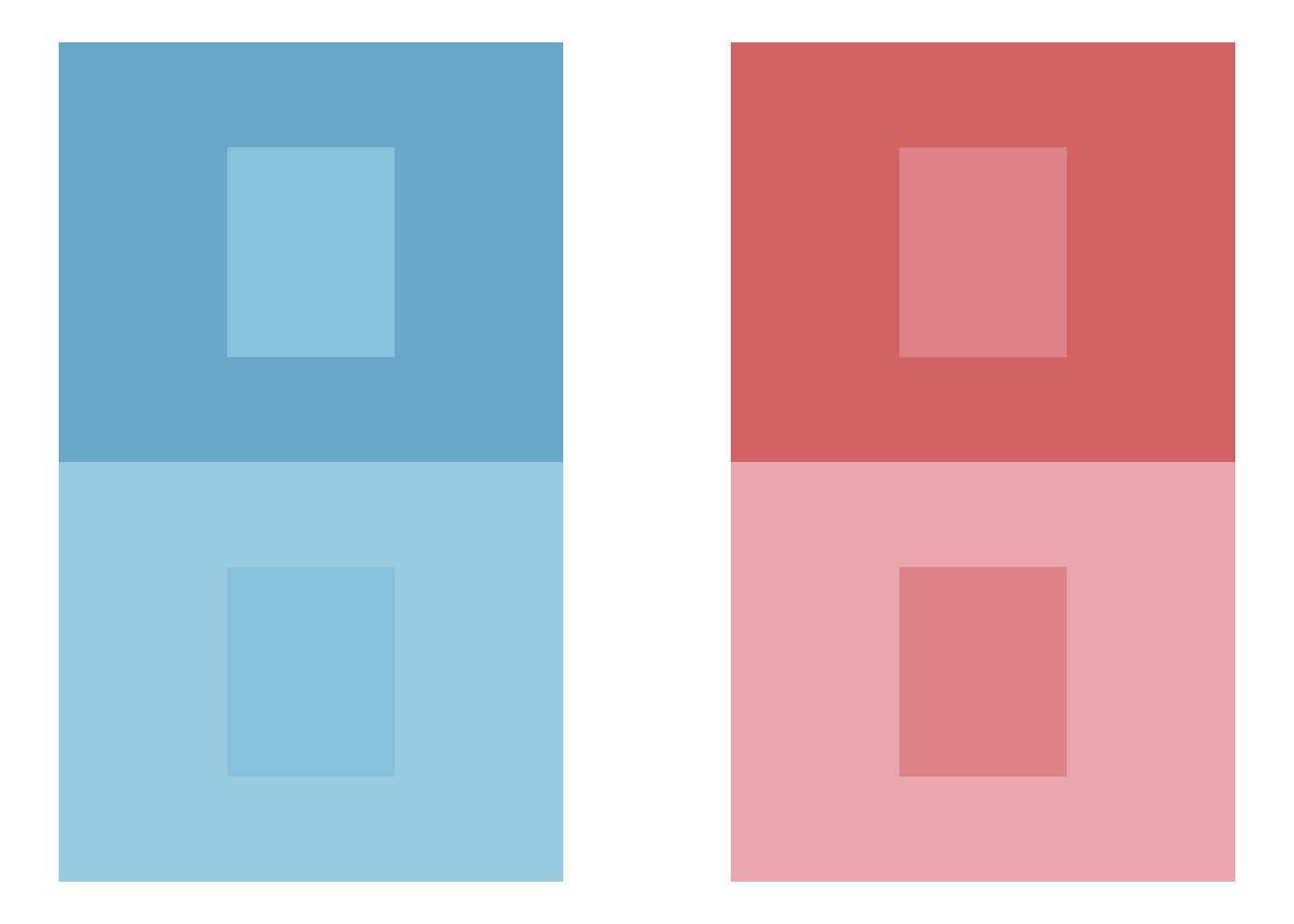
Two different colors can interact to appear as one. In this case, the background colors change our perceptions of the two different inner blocks such that they appear the same:

And contrasting hues with similar luminance can create vibrating boundaries:
These examples were adapted from those in Albers (2006), which discusses yet more ways the relativity of color can mislead us.
Exercise 16.1 Locate two or three graphics on the internet, each with different types of data-ink encodings you believe are well-designed. Be adventurous. Describe those encodings without using names of charts.
Exercise 16.2 Locate two graphics, each with different types of data-ink encodings you believe are problematic. Describe the encodings, what makes them problematic, and suggest a more appropriate encoding.
Exercise 16.3 Explain how you might use the apparent problem of vibrating boundaries to help an audience. Hint: think about why we use gestalt principles.
16.3 Color blindness
Accounting for the relative nature of color is already challenging. To make our work more difficult, individuals experience color differently. Some individuals, for example, have difficulties differentiating hues like between red and green. Color vision deficiency affects approximately 8% of males and 0.5% of females of Northern European ancestry, with varying prevalence across other populations. When we rely solely on color hue to encode critical information, we exclude significant portions of our audience.
Designing for color accessibility requires more than avoiding red-green combinations. We must ensure that information remains accessible through alternative encodings—position, size, shape, or text labels—that do not depend on color discrimination. The tools for checking color accessibility have improved dramatically; we can now simulate how graphics appear to viewers with various types of color vision deficiency and adjust our designs accordingly.
Even for viewers with typical color vision, accessible design benefits everyone. High-contrast designs that accommodate color blindness also improve readability in bright sunlight, on poor displays, or for viewers with aging eyes. The goal is robust communication—designs that work across the full spectrum of human visual capability.
16.4 Perceptions of visual decoding
Color presents unique perceptual challenges, but it represents only one of many visual channels available for encoding data. Beyond the specific complexities of color perception lies a broader question: How accurately do we decode different types of visual encodings? Chapter Chapter 15 established how similarity and enclosure enable automatic grouping and highlighting through preattentive processing. Now we turn to empirical research on channel effectiveness—which encodings enable accurate quantitative judgment and which systematically mislead.
Graphical interpretation comes with limitations. Our accuracy in estimating the quantities represented in visual encoding depends on the geometries used for encoding. Consider how we might assess the relationship between data points and a fitted curve—specifically, whether the variation of observations around a fitted line is uniform or changes systematically across the x-axis.
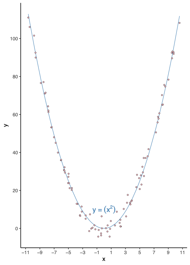
Before reading further, study Figure 16.18 and answer this question: Are the vertical residuals—the vertical distances from each data point to the fitted curve—uniform across the x-axis, or do they vary systematically?
Take a moment to form your own assessment.
What makes this question so difficult? The fundamental problem is a mismatch between what we ask viewers to compare and what the visualization actually marks. We want to compare vertical distances from each point to the curve, but the graphic only marks two things: the data points themselves and the fitted curve. The vertical distances—the very thing we need to assess—remain unmarked. Viewers must mentally construct these distances, computing vertical gaps from visual elements that don’t directly encode them. This mental computation is error-prone because our visual system naturally wants to assess the closest perpendicular distance to the curve, not the vertical distance we care about. The curvature compounds this challenge: each point sits at a different angle relative to the curve, making consistent vertical comparison nearly impossible.
Now consider: what could we add or change in this visualization to make the residual pattern clearer? Before we continue with this analysis, let’s discuss more tools at our dissposal.
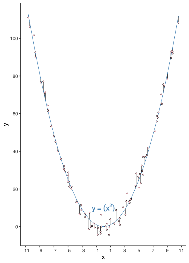
Figure 16.19 shows the same data with a crucial enhancement: vertical line segments that directly mark what we want to compare. These segments connect each data point to the fitted curve, encoding the vertical distances as visible lengths. Notice how this solves the core problem—the residuals are now directly represented in the visual field rather than requiring mental construction. Before we discuss why this helps, consider: What do these segments make directly comparable that was invisible before? And can you imagine taking this principle even further—perhaps not adding segments to this plot at all, but creating an entirely different visualization where residual magnitudes become even more directly comparable?
Exercise 16.4 (Assessing residual patterns) Part 1: The Core Problem
- Looking only at Figure 16.18, we ask you to compare “vertical residuals”—the vertical distances from points to the curve. But what visual markings actually represent these distances? What markings are present, and how do they differ from what you need to compare? How does this mismatch between task and encoding make assessment difficult?
Part 2: Marking What Matters
Figure 16.19 adds vertical line segments from each data point to the fitted curve. How does this change what is visually marked? What do these segments make directly comparable that was unmarked (and thus invisible) before?
Can you envision taking this principle further—creating an entirely different visualization where residual magnitudes themselves become the primary visual markings, rather than additions to an existing plot? Sketch or describe your alternative.
Part 3: The Deeper Principle (we’ll return to this)
- What general principle about matching visual encodings to comparison tasks might explain why the segments help? We’ll explore this after examining how different encoding types affect our perception.
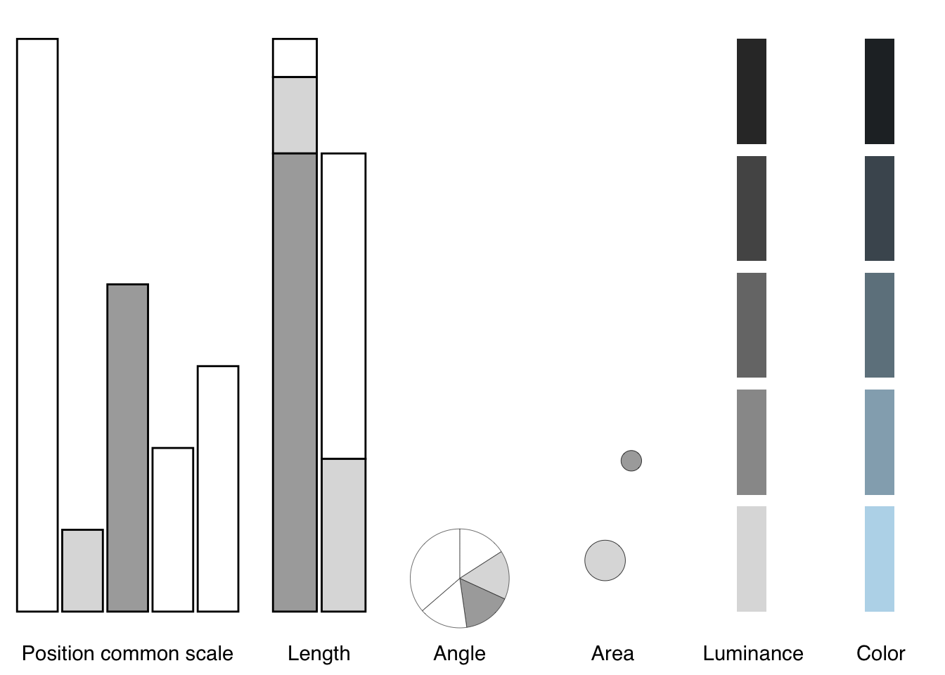
Cleveland (1985) has thoroughly reviewed our perceptions when decoding quantities in two or more curves, color encoding (hues, saturations, and lightnesses for both categorical and quantitative variables), texture symbols, use of visual reference grids, correlation between two variables, and position along a common scale. Empirical studies by Cleveland and McGill (1984) and Heer and Bostock (2010) have quantified our accuracy and uncertainty when judging quantity in a variety of encodings.
The broader point is to become aware of issues in perception and consider multiple representations to overcome them. Several references mentioned in the literature review delve into visual perception and best practices for choosing appropriate visualizations.@koponen2019, for example, usefully arranges data types within visual variables and orders them by our accuracy in decoding, shown in Figure 16.20:

Placing encodings in the context of chart types, Figure 16.21, we decode them from more to less accurate, position encoding along common scales (e.g., bar charts, scatter plots), length encodings (e.g., stacked bars), angles (e.g., pie charts), circular areas (e.g., bubble charts), luminance, and color (Munzner 2014):
A thorough visual analysis may require multiple graphical representations, and each requires inspection to be sure our interpretation is correct. With the encoding hierarchy in mind, let’s return to the exercise we posed earlier. We asked: What general principle explains why the vertical segments help us assess residuals?
We can now frame the answer clearly: Mark what you want viewers to compare, using the most accurate perceptual encoding available.
The original plot (Figure 16.18) fails on the first requirement. It shows data points and a fitted curve, but these markings don’t represent the vertical distances we need to assess. Viewers must mentally construct those distances, and our visual system—lacking direct length encodings—defaults to judging perpendicular distance to the curve instead of vertical distance. The mismatch between question and markings produces natural perceptual error.
The enhanced plot (Figure 16.19) fixes this by adding direct visual markings for what we want to compare. The vertical segments encode residuals as lengths we can directly perceive and compare. Because all segments share the same orientation, we can assess them using our most accurate perceptual channel for magnitude comparison.
This illustrates the fundamental principle: Match your visual markings to your analytical question. When we ask viewers to compare vertical residuals, we should mark those residuals directly—not force mental computation from unrelated visual elements.
But we can go even further. The interactive visualization below demonstrates the next step—transforming length encodings into the most accurate encoding of all:
Hover over points in the left panel to see how segments map to residuals. The left panel improves upon the original by marking residuals as comparable lengths. But the right panel advances further: by subtracting the fitted curve and plotting residuals at their actual values, we transform length comparison into position along a common scale—the most accurate perceptual encoding in the Cleveland and McGill hierarchy.
In the residual plot, each value’s magnitude is encoded as its vertical position relative to the horizontal line at y = 0, which represents the fitted curve. Positive residuals appear above this baseline, negative residuals below. Because all points share this common reference, we assess magnitudes with the same precision we use reading bar charts—judging position from a shared origin. The zero line transforms abstract “distance from curve” into concrete “position on a scale.”
This progression—unmarked distances → marked segments → position on common scale—shows how each step better aligns what we ask viewers to compare with what the visualization marks and how effectively human perception can decode it.
The broader lesson: When possible, transform difficult judgments (distances to curves, angles, areas) into easier judgments (position along common scales, length). The Cleveland and McGill research quantifies what we can now apply intuitively: use position and length for precise comparisons, reserve more challenging encodings for contexts where exact values matter less.
Understanding which visual encodings enable accurate perception provides crucial guidance for design. Yet beyond choosing the right encodings lies another challenge: eliminating everything that does not serve the communication goal. Every mark on the page demands attention; unnecessary marks compete with essential information, degrading the signal with noise.
This principle—that we should maximize the information conveyed while minimizing visual clutter—finds its most influential expression in the work of Edward Tufte. While the empirical research we have discussed tells us which encodings work best for human perception, Tufte’s framework addresses how much of that encoding we need and what we can remove.
16.5 Maximize information
Maximize the information in visual displays within reason. Tufte (2001a) measures this as the data-ink ratio:
\[ \begin{aligned} \textrm{data-ink ratio} =\; &\frac{\textrm{data-ink}}{\textrm{total ink used to print the graphic}} \\ \\ =\; &\textrm{proportion of a graphic's ink devoted to the} \\ &\textrm{ non-redundant display of data-information}\\ \\ =\; &1.0 - \textrm{proportion of a graphic that can be} \\ &\textrm{erased without loss of data-information} \\ \\ \end{aligned} \]
That means identifying and removing non-data ink. And identifying and removing redundant data-ink. Both within reason. Just how much requires experimentation, which is arguably the most valuable lesson2 from Tufte’s classic book, The Visual Display of Quantitative Information. In it, he systematically redesigns a series of graphics, at each step considering what helps and what may not. Tufte, of course, offers his own view of which versions are an improvement. His views are that of a designer and statistician, based on his experience and theory of graphic design.
Some of his approaches have also been subject to experiments (Anderson et al. 2011), which we should consider within the context and limitations of those experiments. More generally, for any important data graphic for which we do not have reliable information on its interpretability, we should perform tests on those with a similar background to our intended audiences.
Let’s reconsider the example figure from Knaflic:
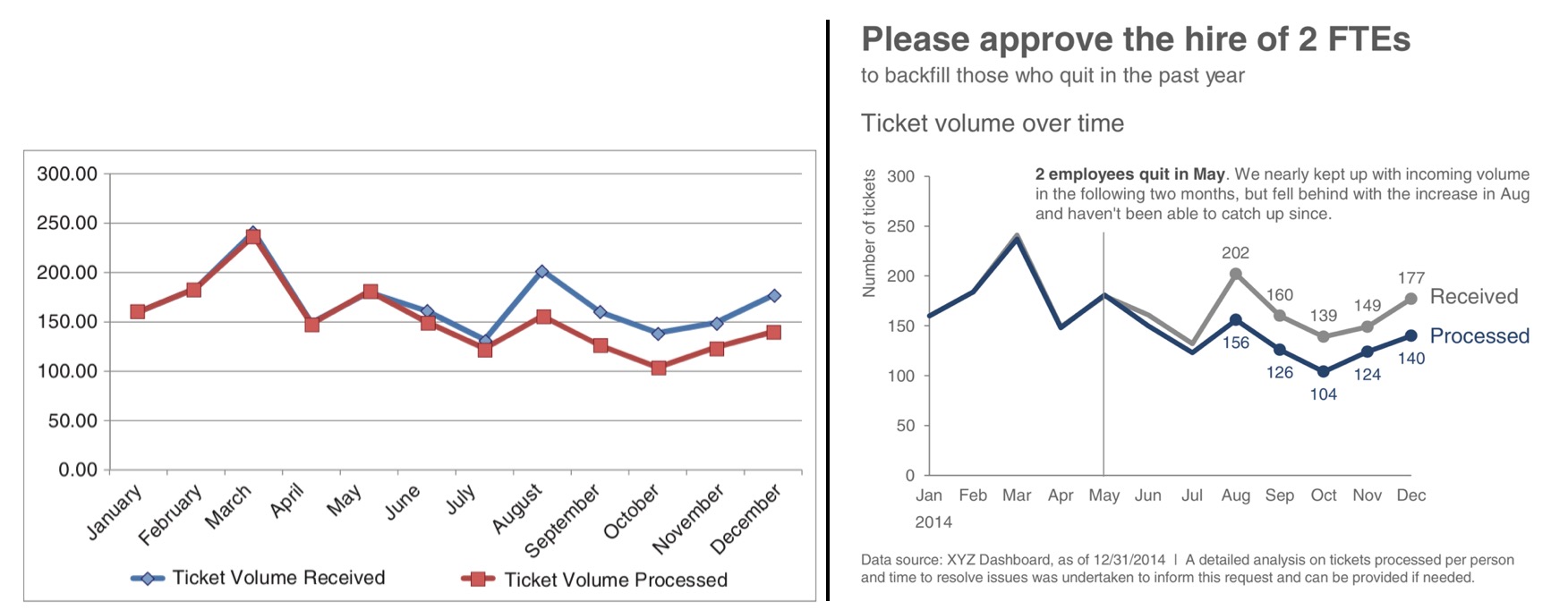
Compare Knaflic’s before-and-after example.
Exercise 16.5 Try to articulate all differences. Consider whether her changes follow Tufte’s principles, and whether each of her changes would improve her audience’s understanding of the intended narrative and supporting evidence.
Consider another example that maximizes information while maintaining clarity. Bremer (2017) explored daily patterns of activity using polar coordinates to encode time as a 24-hour cycle. We can apply similar reasoning to visualize bike share activity levels, as shown in Figure 16.23. The graphic reflects activity level over time, encoded circularly with midnight at the top, 6am to the right, noon at the bottom, and 18 hours (6pm) to the left. To help visualize time of day, areas before sunrise are shaded dark and after sunrise as light.

As with Bremer’s approach, we encode an average activity level along the black line, with activity level at a given time shown as the distance from that average. The color within that distance from average activity level encodes the quantiles (think boxplot) of activity. We annotate with reference activity levels: 5, 20, and 35 rides per minute. What is remarkable is the observed magnitude of change from average (black circle) ride rates throughout the day. Minutes in only light blue show when 50 percent of the ride rates exist. Minutes that include dark blue show when the highest (outside black circle) or lowest (inside black circle) rate of rides happen. The remaining minutes with medium blue show when the rest of the rates of rides occur.
Exercise 16.6 Analyze Figure 16.23 using Tufte’s principles. What non-data ink has been removed? What data-ink ratios are achieved? How does the polar coordinate system serve the communication goal?
Another famous example of maximizing information comes from Charles Joseph Minard’s visualization of Napoleon’s march on Moscow, often cited as one of the greatest data graphics ever created (Tufte 2001b). Minard overlays the path of Napoleon’s march onto a map in the form of a ribbon, shown in Figure 16.24.

While the middle of that ribbon may accurately reflect geographic location, the width of that ribbon does not. Instead, the width encodes the number of soldiers at each location, while time is also encoded as coinciding with longitude. This encoding simultaneously shows where the soldiers were at a given time and how many remained. The graphic encodes six different variables in two dimensions: the size of the army, its location on a two-dimensional surface, direction of movement, and temperature during the retreat.
Exercise 16.7 Study Figure 16.24 carefully. Identify every variable being encoded. Which encodings represent data-ink versus non-data ink? How does Minard achieve such high information density while maintaining readability?
For the next example, revisiting the Dodgers, consider the following example analysis related to understanding game attendance as a function of fan preferences for game outcome certainty, since maximizing attendance is a marketing objective:
Example 16.1 To help us understand game attendance as a function of fan preference for certainty or uncertainty of the game outcome, we created a model. It included variables like day of the week, time of day, and the team’s cumulative fraction of wins. We believe that some uncertainty helps attract people to the game. But how much? It also seems reasonable to believe that the function is non-linear: a change in probability of a win from 0 percent to 1 percent may well attract fewer fans than if from 49 percent to 50 percent. Thus, we modeled the marginal effect of wins as quadratic. Our overall model, then, can be described as:
\[ \textrm{Normal}(\theta, \sigma) \]
for game \(i\), where \(\theta\) represents the mean of attendance, \(\sigma\) the variation in attendance, and \(\theta\) itself decomposed:
\[ \begin{aligned} \theta_i \sim &\alpha_{1[i]} \cdot \textrm{day}_i + \alpha_{2[i]} \cdot \textrm{time}_i + \\ &\beta_{1[i]} \cdot \frac{\sum{\textrm{wins}_i}}{\sum{\textrm{games}_i}} + \beta_{2[i]} \cdot p(\textrm{win}_i) + \beta_{3[i]} \cdot p(\textrm{win}_i)^2 \end{aligned} \]
With posterior estimates from the model, we calculated the partial derivative of estimates of win uncertainty (\(\beta_2\) and \(\beta_3\)) to find a maximum:
\[ \textrm{Maximum} = \frac{-\beta_2}{2 \cdot \beta_3 } \]
For the analysis, we used betting market odds as a proxy for fans’ estimation of their team’s chances of winning. The betting company Pinnacle made these data available for the 2016 season, which we combined with game attendance and outcome data from Retrosheets.
The analysis included the exploratory graphic on the left, using default graphic settings, in Figure 16.25, and the communicated graphic on the right.

Exercise 16.8 Try to articulate all differences between the exploratory and communicated graphic. Consider whether the changes follow Tufte’s principles, if so, which, and whether each of the changes would improve the marketing audience’s understanding of the intended narrative and supporting evidence. Can you imagine other approaches?
16.6 Looking ahead
We have traversed the territory from mathematical color spaces through perceptual relativity, accessibility constraints, and empirical research on graphical effectiveness. The principles we have established—using position and length for precise comparison, reserving angle and area for contexts where exact values matter less, designing for color accessibility from the start, and maximizing data-ink within reason—provide actionable guidance for visualization practice.
Yet these principles operate at the level of individual encodings and single graphics. Real data communication often requires more: coordinating multiple views, handling uncertainty and variability, representing complex multivariate relationships. The next section of this book addresses these challenges, examining how we encode uncertainty, how we manage the data-ink ratio in practice, and how we ensure our visualizations remain faithful to the underlying data while serving the communication goal.
The transition from understanding perceptual principles to applying them marks the shift from visualization theory to visualization craft. With the foundations we have built—grammar, perception, and empirical validation—we are now equipped to tackle the design decisions that distinguish adequate graphics from exceptional ones.
Same as Hue-Saturation-Brightness.↩︎
Indeed, most criticisms of Tufte’s work misses the point by focusing on the most extreme cases of graphic representation within his process of experimentation, completely losing what we should learn — how to reason and experiment with data graphics. Focus on learning the reasoning and experimentation process.↩︎