Slide 3
ggplot() +
    theme_void() +
    coord_equal() +
    ggforce::geom_circle(aes(x0 = -1, y0 = -1, r = 1.5), fill = "#efefef", alpha = 0.3) +
    ggforce::geom_circle(aes(x0 = +1, y0 = -1, r = 1.5), fill = "#777777", alpha = 0.3) +
    ggforce::geom_circle(aes(x0 = +0, y0 = +0.7, r = 1.5), fill = "#efefef", alpha = 0.3) +

    annotate("text", x = -1.1, y = -1.1, label = "Narratives", size = 10/.pt, color = "#bbbbbb") +
    annotate("text", x = +1.1, y = -1.1, label = "Visuals", size = 10/.pt) +
    annotate("text", x = +0,  y = +0.9, label = "Data Analyses", size = 10/.pt, color = "#bbbbbb") +
    annotate("text", x = +0,  y = -1.1, label = "Engage", size = 10/.pt, color = "#bbbbbb") +
    annotate("text", x = -0.7,  y = +0, label = "Explain", size = 10/.pt, color = "#bbbbbb") +
    annotate("text", x = +0.7,  y = +0, label = "Enlighten", size = 10/.pt, color = "#bbbbbb") +
    annotate("text", x = +0,  y = -0.4, label = "Change", color = "white", fontface = "bold", size = 10/.pt)

Slide 13
# create graph object
ggplot() +

  # set non-data graph elements
  theme_minimal() +

  # choose cartesian coordinate system
  coord_cartesian(
    xlim = c(-4, 4),
    ylim = c(-4, 4),
  ) +

  # draw x and y axis
  geom_segment(
    mapping = aes(
      x = 0,
      y = -4,
      xend = 0,
      yend = 4
    ),
    color = "black"
  ) +
    geom_segment(
    mapping = aes(
      x = -4,
      y = 0,
      xend = 4,
      yend = 0
    ),
    color = "black"
  ) +

  # draw and label origin
  geom_point(
    mapping = aes(
      x = 0,
      y = 0
    ),
    color = "black"
  ) +
  geom_text(
    mapping = aes(
      x = 0,
      y = 0,
      label = "Origin"
    ),
    color = "black",
    nudge_x = -0.3,
    nudge_y = -0.3
  ) +

  # draw and label blue point
  geom_point(
    mapping = aes(
      x = 2,
      y = 3
    ),
    color = "dodgerblue"
  ) +
  geom_text(
    mapping = aes(
      x = 2,
      y = 3,
      label = "(2, 3)"
    ),
    color = "dodgerblue",
    nudge_x = 0.3,
    nudge_y = 0.3
  ) +

  # draw blue vertical line
  geom_segment(
    mapping = aes(
      x = -4,
      y = -4,
      xend = -4,
      yend = 4
    ),
    color = "dodgerblue"
  ) +
  labs(
    x = "x",
    y = "y"
  )

Slide 14
# create graph object
ggplot() +

  # set non-data graph elements
  theme_minimal() +

  # choose polar coordinate system
  coord_polar(
  ) +

  # draw x and y axis
  geom_segment(
    mapping = aes(
      x = 0,
      y = -4,
      xend = 0,
      yend = 4
    ),
    color = "black"
  ) +
    geom_segment(
    mapping = aes(
      x = -4,
      y = 0,
      xend = 4,
      yend = 0
    ),
    color = "black"
  ) +

  # draw and label origin
  geom_point(
    mapping = aes(
      x = 0,
      y = 0
    ),
    color = "black"
  ) +
  geom_text(
    mapping = aes(
      x = 0,
      y = 0,
      label = "Origin"
    ),
    color = "black",
    nudge_x = -0.2,
    nudge_y = -0.2
  ) +

  # draw and label blue point
  geom_point(
    mapping = aes(
      x = 2,
      y = 3
    ),
    color = "dodgerblue"
  ) +
  geom_text(
    mapping = aes(
      x = 2,
      y = 3,
      label = "(2, 3)"
    ),
    color = "dodgerblue",
    nudge_x = 0.2,
    nudge_y = 0.2
  ) +

  # draw blue vertical line
  geom_segment(
    mapping = aes(
      x = -4,
      y = -4,
      xend = -4,
      yend = 4
    ),
    color = "dodgerblue"
  ) +
  labs(
    x = "x",
    y = "y"
  )

Slide 15
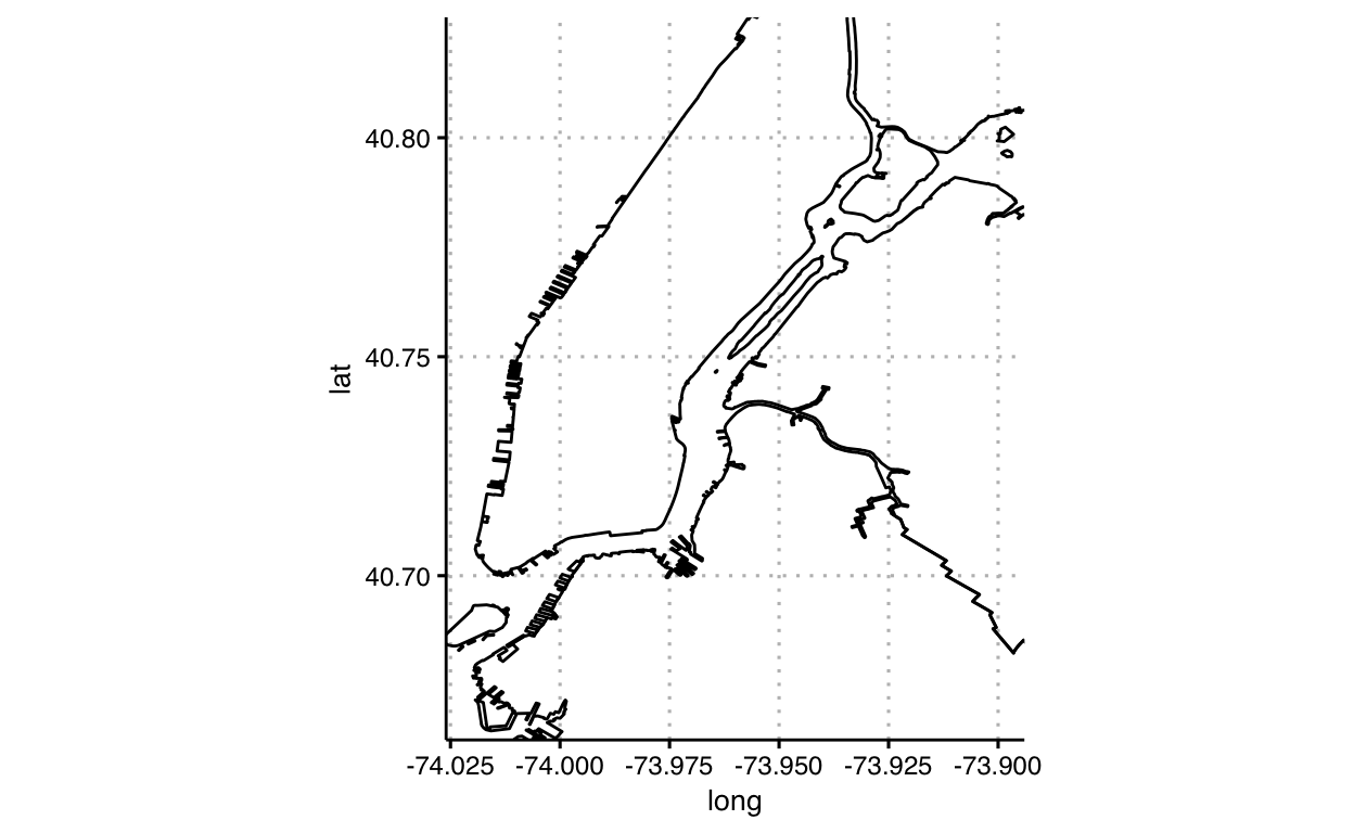
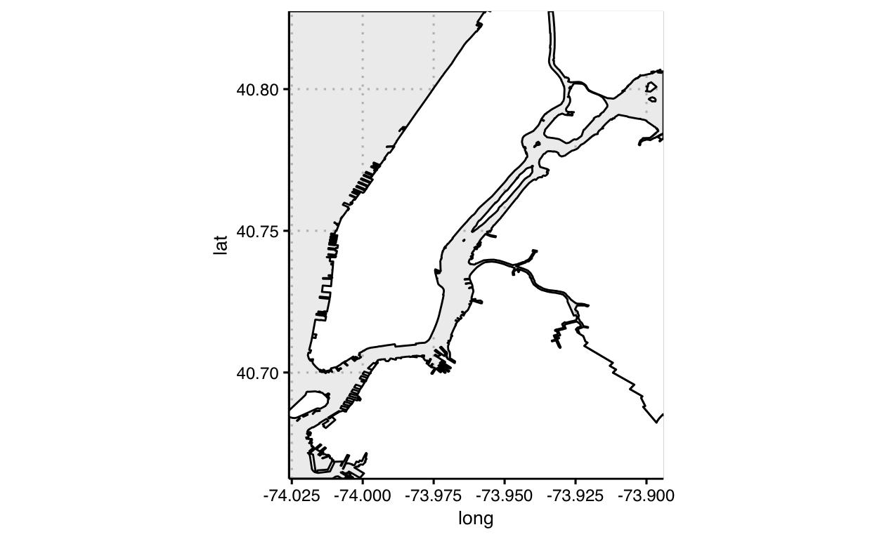
# get data of countries
countries <- map_data("world")

# draw world countries directly onto cartesian coordinates
p <-
  ggplot(
  data = countries,
  mapping = aes(
    x = long,
    y = lat
    )
  ) +
  geom_polygon(
    mapping = aes(
      group = group,
      ),
    fill = "lightgray",
    color = "black",
    lwd = 0.1
    ) +
  theme_minimal() +
  labs(x = "", y = "")


p_cartesian <- p

# draw world countries projected onto mercator coordinates
p_mercator <- p + coord_map("mercator", xlim = c(-180,180) )

# draw world countries projected onto orthographic coordinates and oriented towards New York
p_ortho <- p + coord_map("ortho", orientation = c(41, -74, 0) )

p_cartesian

p_mercator
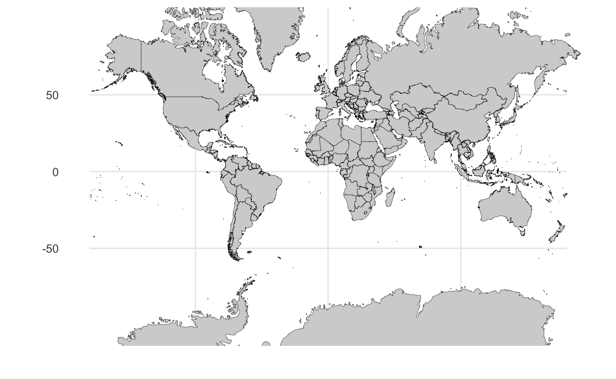
p_ortho

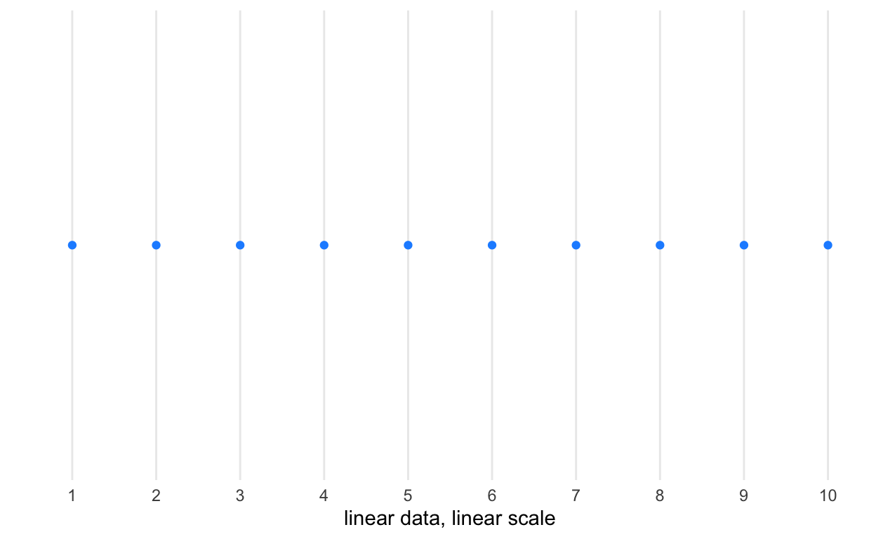
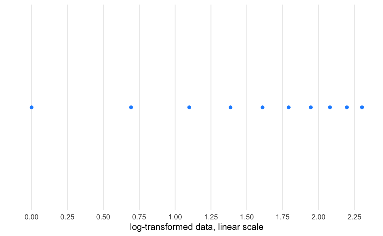
Slide 16
d <-
  data.frame(x_linear = 1:10) %>%
  mutate(x_log10 = log(x_linear),
         x_sqrt = sqrt(x_linear))

p <-
  ggplot(d) +
  scale_y_continuous(breaks = NULL) +
  theme_minimal() +
  theme(panel.grid.minor = element_blank()) +
  labs(x = "", y = "")

# data linear, linear scale
p + geom_point(aes(x = x_linear, y = 0), color = "dodgerblue") +
  scale_x_continuous(n.breaks = 10, name = "linear data, linear scale")
# data transformed to log, linear scale
p + geom_point(aes(x = x_log10, y = 0), color = "dodgerblue") +
  scale_x_continuous(n.breaks = 10, name = "log-transformed data, linear scale")
# linear data, log scale
p + geom_point(aes(x = x_linear, y = 0), color = "dodgerblue") +
  scale_x_log10(n.breaks = 12, name = "linear data, log scale")

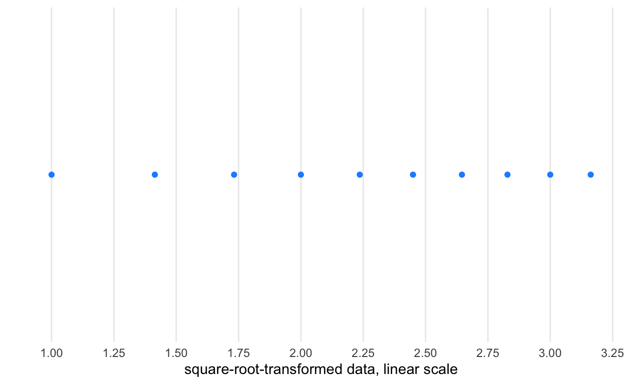
# data transformed to square root, linear scale
p + geom_point(aes(x = x_sqrt, y = 0), color = "dodgerblue") +
  scale_x_continuous(n.breaks = 10, name = "square-root-transformed data, linear scale")
# linear data, square root scale
p + geom_point(aes(x = x_linear, y = 0), color = "dodgerblue") +
  scale_x_sqrt(n.breaks = 10, name = "linear data, square-root scale")

Slide 31
ggplot() +
  theme_void() +
  scale_x_continuous(limits = c(-5, 5)) +
  scale_y_continuous(limits = c(-5, 5)) +
  geom_point(
    mapping = aes(
      x = 0,
      y = 0),
    size = 50,
    color = "orange") +
  geom_point(
    mapping = aes(
      x = 1,
      y = 1),
    size = 50,
    color = "dodgerblue")

ggplot() +
  theme_void() +
  scale_x_continuous(limits = c(-5, 5)) +
  scale_y_continuous(limits = c(-5, 5)) +
  geom_point(
    mapping = aes(
      x = 1,
      y = 1),
    size = 50,
    color = "dodgerblue") +
  geom_point(
    mapping = aes(
      x = 0,
      y = 0),
    size = 50,
    color = "orange")

Slide 35
First, let’s load and transform some data.
# # load data
#
# d <- readr::read_delim("citibike/bikeshare_nyc_raw201901.csv", "\t", escape_double = FALSE, trim_ws = TRUE)
#
#
# # convert am/pm to 24 hours ----
# d <- d %>% mutate(hr24 = ifelse(pm == 0, hour, hour + 12))
#
# # identify empty or full stations from data ----
# d <- d %>%
#   mutate(is_empty = ifelse(avail_bikes == 0, TRUE, FALSE),
#          is_full = ifelse(avail_docks == 0, TRUE, FALSE))
#
# # plot  availability per time ----
#
# # calculate angle, a, b from time
# d <- d %>%
#   mutate(rads = pi / 12 * (hr24 - 1 + minute / 60) ) %>%
#   mutate(a = .0015 * sin(rads),
#          b = .0015 * cos(rads))
#
# dock_long_lat <-
#   d %>%
#   select(`_long`, `_lat`) %>%
#   unique()
Just for ease, let’s set the default theme used for graphics.
theme_clean2 <- theme_clean() +
  theme(panel.grid.major.x = element_line(colour = "gray", linetype = "dotted"),
        plot.background = element_blank())
theme_set(theme_clean2)
Here’s demonstraing a point
d <- read_csv("citibike/201901-citibike-tripdata.csv")
d %>%
  group_by(`start station id`) %>%
  summarise(start_long = mean(`start station longitude`),
            start_lat = mean(`end station latitude`)) %>%
  ggplot() +
  coord_equal() +
  geom_point(aes(x = start_long,
                 y = start_lat) )

Slide 36
d %>%
  mutate(start_hour = hour(starttime)) %>%
  group_by(start_hour) %>%
  summarise(n_rides = n()) %>%
  ggplot() +
  geom_line(aes(x = start_hour, y = n_rides))

Slide 38
library(geojsonio)

spdf <- geojson_read('citibike/Borough_Boundaries.geojson', what = 'sp')
df <- fortify(spdf)

LTGRAYBLUE <- "#becdd6"
BIKECOLOR <- "#8084A3"
DOCKCOLOR <- "#DBAE8C"
XMIN <- -74.02
XMAX <- -73.9
YMIN <- 40.67
YMAX <- 40.82

ggplot() +
  theme(panel.background = element_blank()) +
  geom_map(data = df,
           map=df,
           aes(map_id=id, x=long, y=lat),
           fill=NA, color = "black") +
  coord_equal(xlim=c(XMIN, XMAX),
              ylim=c(YMIN, YMAX))
Slide 39
ggplot() +
  theme(panel.background = element_rect(fill = "#eeeeee")) +
  geom_map(data = df,
           map=df,
           aes(map_id=id, x=long, y=lat),
           fill="white", color = "black") +
  coord_equal(xlim=c(XMIN, XMAX),
              ylim=c(YMIN, YMAX))
Slide 40
ggplot() +
  theme(panel.background = element_rect(fill = "#eeeeee")) +
  geom_map(data = df,
           map=df,
           aes(map_id=id, x=long, y=lat, fill=factor(id)),
           color = "black") +
  coord_equal(xlim=c(XMIN, XMAX),
              ylim=c(YMIN, YMAX))

Slide 41
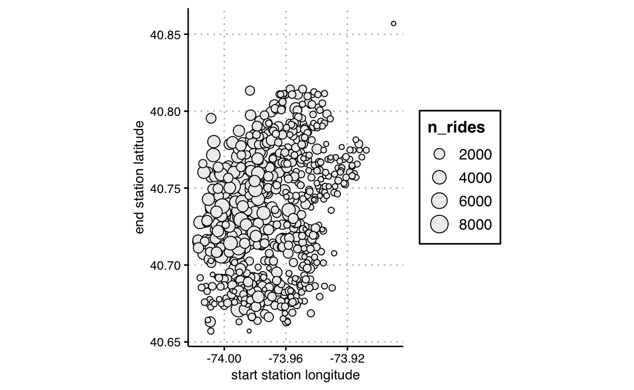
d %>%
  group_by(`start station id`) %>%
  mutate(n_rides = n()) %>%
  slice(1) %>%
  ggplot() +
  coord_equal() +
  geom_point(aes(x = `start station longitude`,
                 y = `end station latitude`,
                 size = n_rides),
             shape = 21,
             fill = "#eeeeee",
             color = "#000000" )
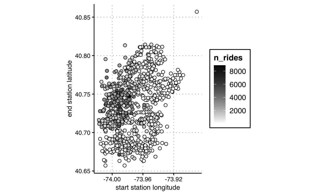
Slide 42
d %>%
  group_by(`start station id`) %>%
  mutate(n_rides = n()) %>%
  slice(1) %>%
  ggplot() +
  coord_equal() +
  scale_fill_gradient(low = "#ffffff", high = "#000000") +
  geom_point(aes(x = `start station longitude`,
                 y = `end station latitude`,
                 fill = n_rides),
             shape = 21,
             color = "#000000",
             size = 2,
             lwd = 0.1)