Slide 44 — layering as hierarchy of information
# load functions
library(tidyverse)
library(ggthemes)
library(ggforce)

# save default theme to switch back
default_theme <- theme_get()

# temporarily set new theme
theme_set( theme_classic(base_family = "sans") )

# simulate some data
set.seed(15)
n <- 15
d <-
  data.frame(
    x = rnorm(n),
    y = rnorm(n),
    z = rnorm(n),
    a = factor(rpois(n, 1), levels = seq(0, 5)),
    n = seq(n)
  )
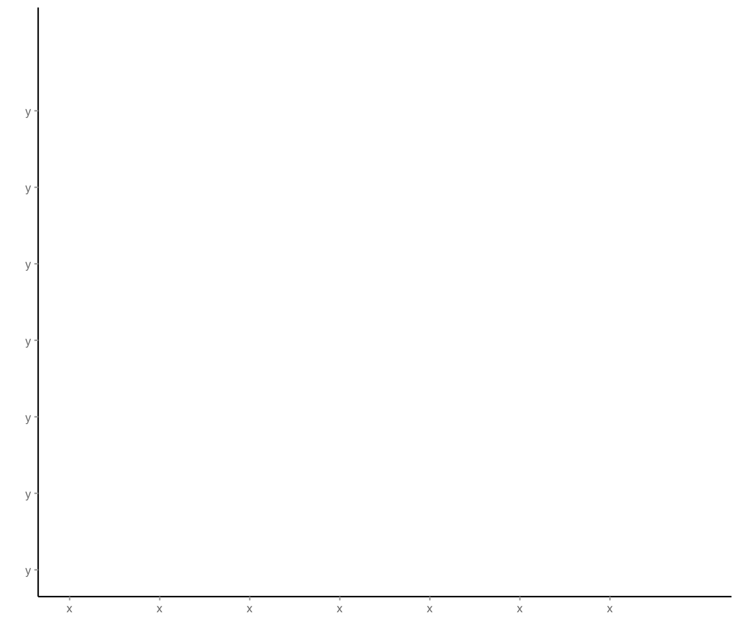
# first layer

layer1 <-
  ggplot(d) +

  # coord_equal() +

  scale_x_continuous(
    name = "",
    limits = c(-1.5, 2),
    breaks = seq(-1.5, 1.5, by = 0.5),
    labels = rep("x", 7)
  ) +

  scale_y_continuous(
    name = "",
    limits = c(-1.5, 2),
    breaks = seq(-1.5, 1.5, by = 0.5),
    labels = rep("y", 7)
  ) +

  scale_fill_viridis_d() +

  scale_color_viridis_d() +

  theme(
    legend.position = "",
    # plot.background = element_blank(),
    plot.title = element_text(face = "bold", color = "#444444"),
    plot.subtitle = element_text(color = "#888888"),
    plot.caption = element_text(color = "#888888"),
    axis.text = element_text(color = "#888888"),
    axis.ticks = element_line(color = "#aaaaaa"),
    axis.title = element_text(color = "#888888")
  )

layer1
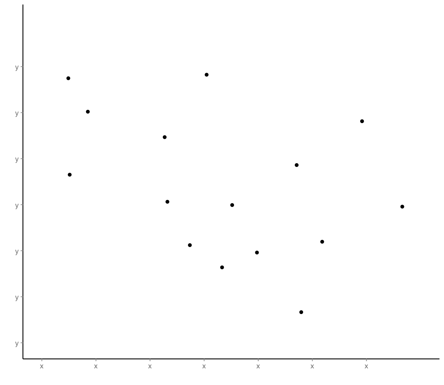
# second layer

layer2 <-

  layer1 +

  geom_point(
    mapping = aes(
      x = x,
      y = y
    )
  )

layer2
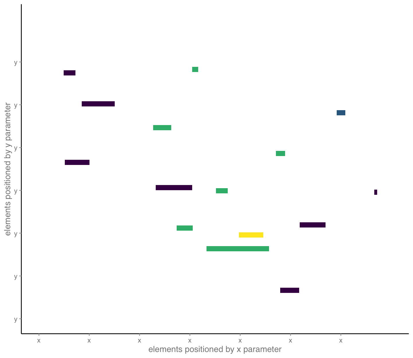
# third layer

layer3 <-

  layer1 +

  scale_x_continuous(
    name = "elements positioned by x parameter",
    limits = c(-1.5, 2),
    breaks = seq(-1.5, 1.5, by = 0.5),
    labels = rep("x", 7)
  ) +

  scale_y_continuous(
    name = "elements positioned by y parameter",
    limits = c(-1.5, 2),
    breaks = seq(-1.5, 1.5, by = 0.5),
    labels = rep("y", 7)
  ) +

  geom_rect(
    mapping = aes(
      xmin = x,
      xmax = x + pmax(abs(z) / 4, 0.03),
      ymin = y - 0.03,
      ymax = y + 0.03,
      fill = a
    )
  )

layer3
# fourth layer

layer4 <-

  layer3 +

  geom_text(
    mapping = aes(
      x = x,
      y = y + 0.05,
      label = "name",
      color = a
    ),
    hjust = 0,
    vjust = 0,
    size = 8/.pt,
    fontface = "italic"
  )

layer4

# fifth layer

layer5 <-

  layer4 +

  # of note, these functions auto place the information and can be
  # finicky, so a bit of trial and error in re-sizing the figure.
  # Here, 7.5 x 6.5 inches seemed pretty good.

  geom_mark_rect(
    mapping = aes(
      x = x + 0.06,
      y = y,
      filter = n == 15,
      label = "Explainer",
      description = "Use these mini-paragraphs or explainers to say something interesting about particular datum. Draw your audience in to explore."
    ),
    label.fontsize = 8,
    con.border = "one",
    con.cap = 0,
    expand = unit(5, "mm"),
    label.colour = "#3e4a89",
    con.colour = "#3e4a89",
    color = "#3e4a89"
  ) +

  geom_mark_rect(
    mapping = aes(
      x = x + 0.09,
      y = y,
      filter = n == 4,
      label = "Explainer",
      description = "Use these mini-paragraphs or explainers to say something interesting about particular datum. Draw your audience in to explore."
    ),
    label.fontsize = 8,
    con.border = "one",
    con.cap = 0,
    expand = unit(7, "mm"),
    label.colour = "#440154",
    con.colour = "#440154",
    color = "#440154"
  )

layer5
layer6 <-

  layer5 +

  labs(title = "Use the graphic title to explain your main takeaway as it\nrelates to your overall narrative, not just what data are shown.",
       subtitle = "You can say even more in the subtitle. What pattern or comparison did you find\ninteresting? By the way, notice the hierarchy of information created by font sizes.",
       caption = "Source: cite the source of your data and explain your analysis."
  )

layer6

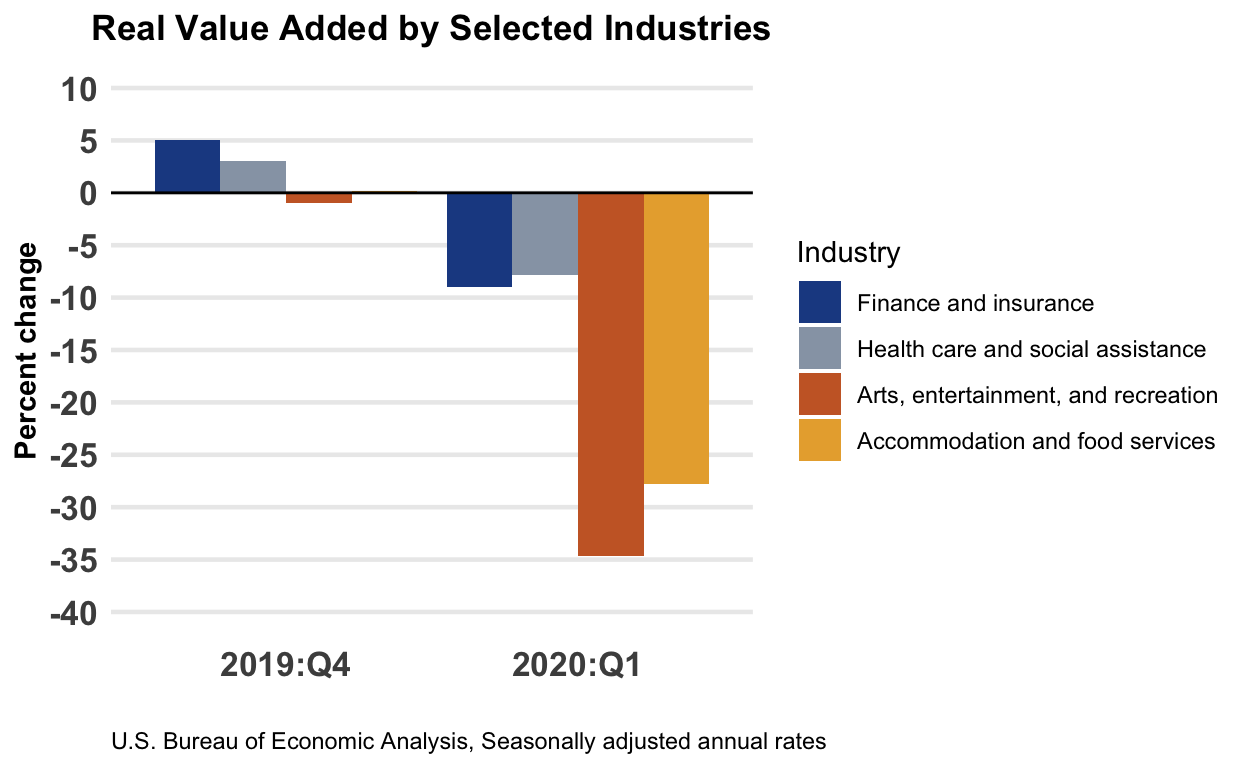
Slide 54 — BEA data, graphic
# data and original graphics from
# https://www.bea.gov/sites/default/files/2020-07/gdpind120-fax.pdf
d <-
  tribble(
    ~Industry,                             ~Quarter,  ~`Percent change`,
    "Overall GDP",                         "2019:Q4", +0.02,
    "Overall GDP",                         "2020:Q1", -0.05,
    "Finance and insurance",               "2019:Q4", +0.05,
    "Finance and insurance",               "2020:Q1", -0.09,
    "Health care and social assistance",   "2019:Q4", +0.03,
    "Health care and social assistance",   "2020:Q1", -0.078,
    "Arts, entertainment, and recreation", "2019:Q4", -0.01,
    "Arts, entertainment, and recreation", "2020:Q1", -0.347,
    "Accommodation and food services",     "2019:Q4", +0.002,
    "Accommodation and food services",     "2020:Q1", -0.278
  ) %>%
  mutate(
    Industry = factor( Industry, levels = unique(Industry) )
  )
# colors based on original graphic
bea_colors <- c("#1E4B92", "#97a3b3", "#CA672F", "#E8AC3B", "#DDDDDD")
p0 <-

  d %>%

  filter(Industry != "Overall GDP") %>%

  ggplot() +

  scale_fill_manual(
    values = bea_colors
  ) +

  scale_y_continuous(
    breaks = seq(-0.4, 0.1, by = 0.05),
    minor_breaks = NULL,
    limits = c(-0.40, 0.10),
    labels = scales::label_percent(accuracy = 1, suffix = "")
  ) +

  geom_bar(
    mapping = aes(
      x = Quarter,
      y = `Percent change`,
      fill = Industry
    ),
    stat = "identity",
    position = "dodge"
  ) +

  geom_hline(
    mapping = aes(
      yintercept = 0
    ),
    color = "black",
    size = 0.5
  ) +

  labs(
    title = "Real Value Added by Selected Industries",
    caption = "U.S. Bureau of Economic Analysis, Seasonally adjusted annual rates",
    x = ""
  ) +

  theme_minimal() +

  theme(
    plot.title = element_text(face = "bold", hjust = 0.5),
    plot.caption = element_text(hjust = 0),
    panel.grid.major.x = element_blank(),
    panel.grid.major.y = element_line(size = 0.8),
    axis.text = element_text(face = "bold", size = 36/.pt),
    axis.title = element_text(face = "bold")
  )

p0
Slide 55 — redesign 1
p1 <-

 d %>%

 ggplot() +

 theme_tufte() +

 scale_x_discrete(position = "top") +

 scale_y_continuous(
   breaks = seq(-0.4, 0.1, by = 0.1),
   minor_breaks = seq(-0.4, 0.1, by = 0.05),
   limits = c(-0.35, 0.07),
   labels = scales::label_percent(accuracy = 1, suffix = "")
 ) +

 scale_fill_manual(
   values = c("gold", "skyblue", "lightgray")
 ) +

 theme(
   plot.title = element_text(face = "bold", size = 48/.pt),
   plot.caption = element_text(hjust = 0),
   axis.title = element_blank(),
   axis.text.y = element_text(face = "bold", size = 30/.pt),
   axis.ticks = element_blank(),
   axis.text.x = element_text(face = "bold", size = 30/.pt),
   legend.position = "top",
   panel.grid.major.y = element_line(color = "#bbbbbb", linetype = "dotted"),
   panel.grid.minor.y = element_line(color = "#bbbbbb", linetype = "dotted")
 ) +

 geom_bar(
   mapping = aes(
     x = Industry,
     y = `Percent change`,
     fill = Quarter
   ),
   stat = "identity",
   position = position_dodge(),
   width = 0.7
 ) +

 geom_bar(
   data = filter(d, Industry == "Overall GDP"),
   mapping = aes(
     x = Industry,
     y = `Percent change`,
     group = Quarter
   ),
   stat = "identity",
   position = position_dodge(),
   width = 0.8,
   fill = "#dddddd"
 ) +

 geom_text(
   data = filter(d, Industry == "Overall GDP"),
   mapping = aes(
     x = Industry,
     y = sign(`Percent change`) * 0.01,
     label = Quarter,
     group = Quarter
   ),
   stat = "identity",
   position = position_dodge(width = 0.8),
   hjust = 0.5
 ) +

 geom_vline(xintercept = 1.5, color = "#dddddd") +

 geom_hline(yintercept = 0) +

 labs(
   title = "As the pandemic set hold, most industries shrank in real value\nadded to GDP, food services and recreation more so than others.",
   subtitle = "(Percent change from previous quarter)",
   caption = "Source: U.S. Bureau of Economic Analysis, Seasonally adjusted annual rates"
 )

# note that we can set the width and height in the r markdown code chunk
# options, we I did for those in slide 44, or we can do something like
# this:
ggsave("redesign01.svg", plot = p1, width = 15, height = 5)
knitr::include_graphics("redesign01.svg")

Slide 56 — redesign 2
p2 <-

 d %>%

 ggplot() +

 theme_tufte() +

 theme(
   plot.title = element_text(face = "bold", size = 48/.pt),
   plot.caption = element_text(hjust = 0),
   axis.title = element_blank(),
   axis.text.y = element_blank(),
   axis.ticks = element_blank(),
   axis.text.x = element_text(face = "bold", size = 36/.pt),
   legend.position = "top"
 ) +

 scale_x_continuous(
   breaks = seq(-0.4, 0.1, by = 0.05),
   minor_breaks = NULL,
   limits = c(-0.40, 0.20),
   labels = scales::label_percent(accuracy = 1, suffix = "")
 ) +

 scale_color_manual(
   values = c("gold", "skyblue")
 ) +

 geom_vline(
   xintercept = 0,
   color = "lightgray"
 ) +

 geom_line(
   mapping = aes(
     x = `Percent change` + if_else(Quarter == "2020:Q1", +0.006, -0.006),
     y = Industry,
     group = Industry
   ),
   size = 1,
   arrow = arrow(ends = "first", type = "closed", length = unit(0.2, "cm"))
 ) +

 geom_point(
   mapping = aes(
     x = `Percent change`,
     y = Industry,
     color = Quarter,
   ),
   size = 4
 ) +

 geom_label(
   data = filter(d, Quarter == "2019:Q4"),
   mapping = aes(
     x = `Percent change`,
     y = Industry,
     label = as.character(Industry),
   ),
   hjust = 0,
   nudge_x = 0.005,
   fontface = "bold",
   label.size = NA
 ) +

 labs(
      title = "As the pandemic set hold, most industries shrank in real value\nadded to GDP, food services and recreation more so than others.",
      subtitle = "(Percent change from previous quarter)",
      caption = "Source: U.S. Bureau of Economic Analysis, Seasonally adjusted annual rates"
 )

ggsave("redesign02.svg", plot = p2, width = 15, height = 5)
knitr::include_graphics("redesign02.svg")

Slide 57 — redesign 3
p3 <-
 d %>%

 ggplot() +

 theme_void() +

 theme(
   plot.title = element_text(face = "bold", size = 48/.pt),
   plot.caption = element_text(hjust = 0, size = 30/.pt),
   axis.text.x = element_text(face = "bold", size = 36/.pt),
   legend.position = ""
 ) +

 scale_color_manual(
   values = c("#000000", "#CA672F", "#E8AC3B", "#1E4B92", "#97a3b3")
 ) +

 scale_x_discrete(
   expand = expansion(add = c(0.8, 0.7))
 ) +

 scale_y_continuous(
   limits = c(-0.35, 0.07),
   labels = scales::label_percent(accuracy = 1, suffix = "")
 ) +

 geom_hline(
   yintercept = 0,
   color = "#888888",
   linetype = "dotted"
 ) +

 annotate(
   "text",
   x = "2020:Q1",
   y = +0.01,
   label = "↑ expanding from previous period",
   fontface = "bold",
   hjust = 0
 ) +

 annotate(
   "text",
   x = "2020:Q1",
   y = -0.01,
   label = "↓ shrinking",
   fontface = "bold",
   hjust = 0
 ) +

 geom_line(
   mapping = aes(
     x = Quarter,
     y = `Percent change`,
     group = Industry,
     color = Industry
   ),
   size = 1,
   arrow = arrow(ends = "last", type = "closed", length = unit(0.2, "cm"))
 ) +

 geom_label(
   data = filter(d, Quarter == "2019:Q4"),
   mapping = aes(
     x = Quarter,
     y = `Percent change`,
     label = paste0(as.character(Industry), " ", paste0(format(`Percent change` * 100, 1), "%")),
     color = Industry
   ),
   hjust = 1,
   nudge_x = 0.005,
   fontface = "bold",
   label.size = NA
 ) +

 geom_label(
   data = filter(d, Quarter == "2020:Q1"),
   mapping = aes(
     x = Quarter,
     y = `Percent change`,
     label = paste0(format(`Percent change` * 100, 1), "%"),
     color = Industry
   ),
   hjust = 0,
   nudge_x = 0.005,
   fontface = "bold",
   label.size = NA
 ) +

 labs(
   title = "As the pandemic set hold, most industries shrank in real value\nadded to GDP, food services and recreation worse than others.",
   subtitle = "(Percent change from previous quarter)",
   caption = "Source: U.S. Bureau of Economic Analysis, Seasonally adjusted annual rates"
 )

ggsave("redesign03.svg", plot = p3, width = 15, height = 15)
knitr::include_graphics("redesign03.svg")
